


-
tysonfreemanAsked on May 9, 2016 at 2:23 PM
-
David JotForm SupportReplied on May 9, 2016 at 2:27 PM
Try enabling mobile responsiveness for your form:
https://www.jotform.com/help/311-How-to-make-forms-Mobile-Responsive
Or adding the mobile responsive widget to your form:
http://widgets.jotform.com/widget/mobile_responsive
If neither of those work, please add your screenshots to this thread and we will be happy to get things adjusted:
https://www.jotform.com/answers/414264-How-to-include-screenshot-image-in-the-support-forum
-
tysonfreemanReplied on May 9, 2016 at 5:42 PM
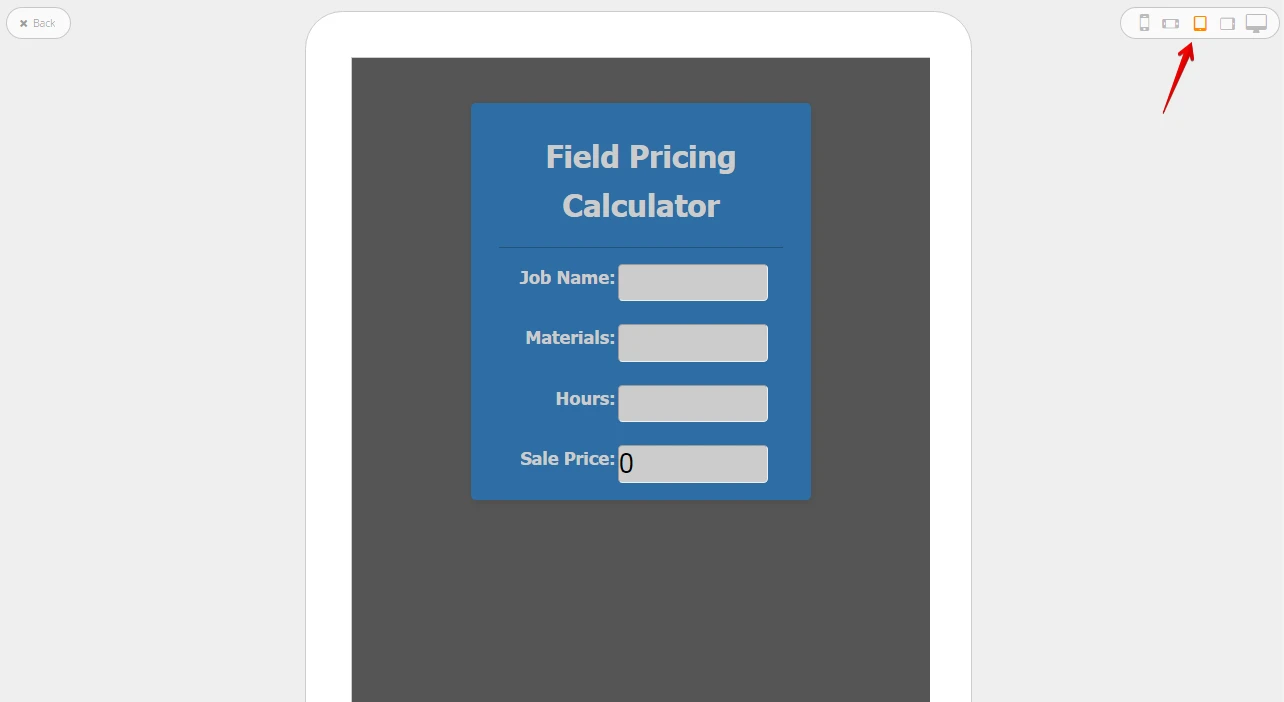
Thank you for the detailed response. I tried selecting the box for responsiveness and tested, but it did not fix. See screenshots below for reference. I want it to appear on the iPad as it does in the preview, however, this is not the case. Please advise.


-
jonathanReplied on May 9, 2016 at 8:38 PM
I see that you were referring to the Preview window when in the Form Designer.
Unfortunately the preview tool in the designer is not that reliable as basis on how the form will be compared to the live view when using viewint it on an iPad mobile browser.
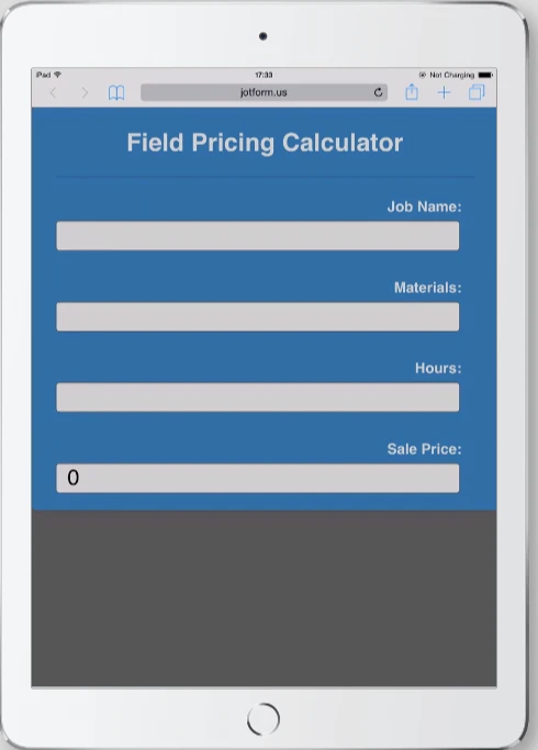
The forms already support mobile browsers by default. This was the reason when you view the form on an actual iPad device, you can see the form fields expand within the view screen of the device -- the form was being responsive this way.
To make the view of your form remains as is when on iPad browser, I think a custom injected CSS code to override the @media device view code should fix it.
I'll get back to this once I have figured out the correct CSS code that work to your form http://www.jotform.us/form/60880534644156 .
Thanks.
-
tysonfreemanReplied on May 9, 2016 at 8:45 PMAwesome. Thanks a bunch.
Tyson Freeman
Lee's Air
5456 W Mission Ave
Fresno, CA 93722
559-227-9569
...
- Templates
- Integrations
- INTEGRATIONS
- See 100+ integrations
- FEATURED INTEGRATIONS
 PayPal
- Slack
- Google Sheets
- Mailchimp
- Zoom
- Dropbox
- Google Calendar
- Hubspot
- Salesforce
- See more Integrations
- Products
- PRODUCTS
- Form Builder
- Jotform Enterprise
- Jotform Apps
- Store Builder
- Jotform Tables
- Jotform Inbox
- Jotform Mobile App
- Jotform Approvals
- Report Builder
- Smart PDF Forms
- PDF Editor
- Jotform Sign
- Jotform for Salesforce Discover Now
- Support

