
-
hiloz1Asked on May 10, 2016 at 4:19 AM
Hello
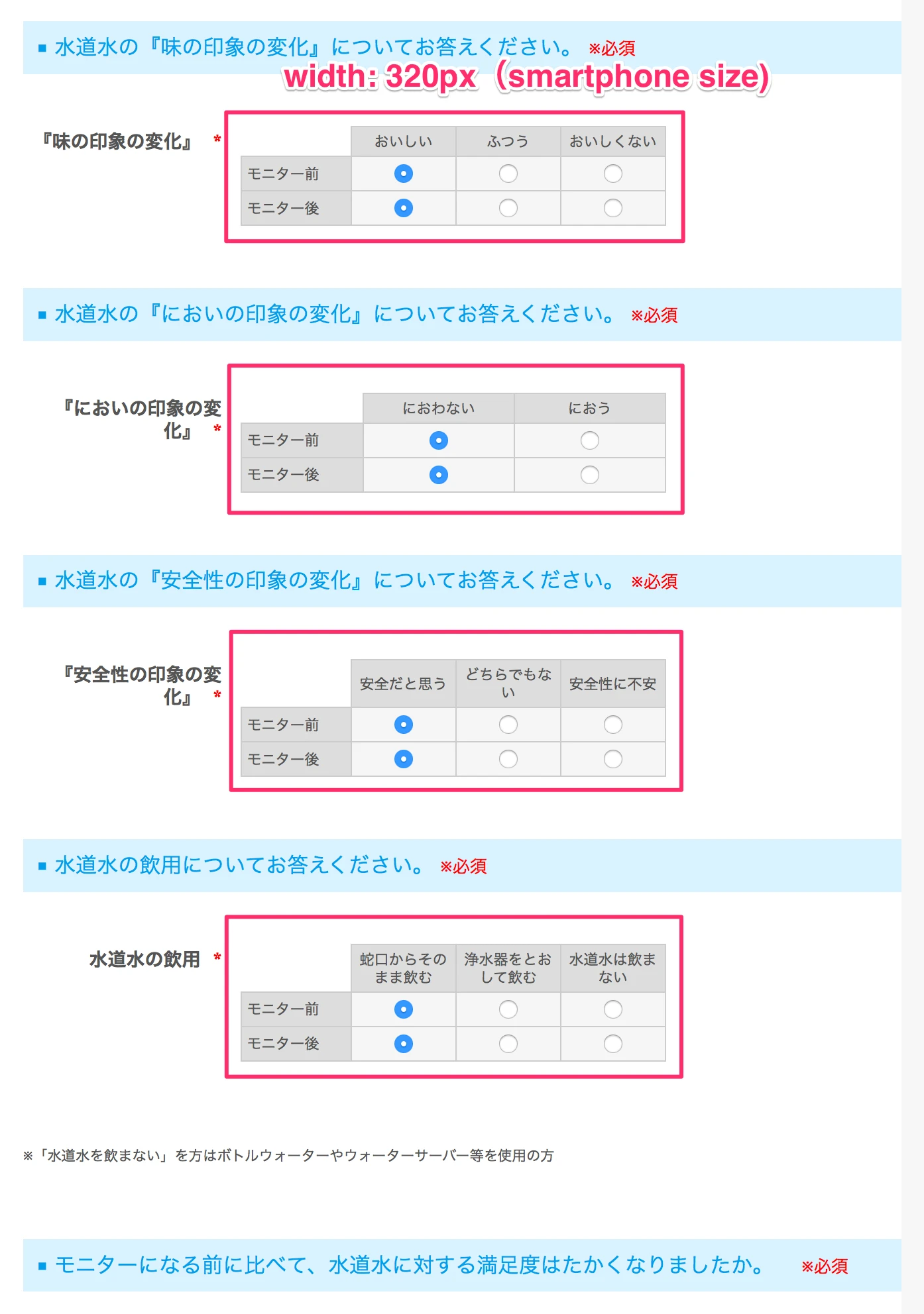
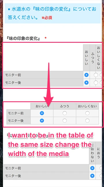
The design of the table of radio buttons will be shifted to the right when viewed in a smartphone.
Request from the client so that it can be displayed without changing the ratio of the cell width in the table there was.
It seems to have changed the size using the media queries, but whether you can so as not to change the ratio change of CSS, with additional.
Thank you.It collapses the design of the table is a smartphone
-
beril JotForm UI DeveloperReplied on May 10, 2016 at 5:32 AM
I am not able to reproduce the same issue that you’re having on mobile phone.

Did you embed your form to your website? If you did, We would appreciate it if you could indicate the URL of your website. At that time, we can assist more properly.
-
hiloz1Replied on May 10, 2016 at 6:24 AM
Hello
The problem is resolved.
This problem has occurred when the form that you created in JotForm was embedded in the iframe in weebly of Widget.
Now, now to display a well-balanced to check the form that you created in the iPhone after implanting export the Source Code in JotForm.
Weebly of CSS in iFrame does not may have been disturbed.
Thank you. -
beril JotForm UI DeveloperReplied on May 10, 2016 at 7:33 AM
It is good to know the problem has been resolved for you. If you need further assistance, feel free to contact us.
- Templates
- Integrations
- INTEGRATIONS
- See 100+ integrations
- FEATURED INTEGRATIONS
 PayPal
- Slack
- Google Sheets
- Mailchimp
- Zoom
- Dropbox
- Google Calendar
- Hubspot
- Salesforce
- See more Integrations
- Products
- PRODUCTS
- Form Builder
- Jotform Enterprise
- Jotform Apps
- Store Builder
- Jotform Tables
- Jotform Inbox
- Jotform Mobile App
- Jotform Approvals
- Report Builder
- Smart PDF Forms
- PDF Editor
- Jotform Sign
- Jotform for Salesforce Discover Now
- Support