


-
TPixJohnAsked on May 16, 2016 at 6:19 PM
Hi,
I like the form builder (it takes a little work, but produces a good form) but I cannot get it to show on mobile devices of any size - when embedded on my own site.
Embed code:
Embed test page - http://www.twistedpixelsphotography.com/testimonials/29-photo-order
This photo order form will work on your site with the direct link, but I need to embed it on a few of pages with related items.
I have tried both the default theme and a number of ready-made "responsive" themes and ensure the "Make this form Responsive" check-box is ticked in Design Mode.
Can you help please?
-
jonathanReplied on May 16, 2016 at 10:25 PM
Please try first re-embedding your form https://www.jotformeu.com/form/61365720370350 on your website using its iframe embed publish code instead.
User guide: Getting-the-Form-iFrame-Code
Make sure to remove first the previous published script code of the form on your website before you add it again using the iframe embed.
It seems that script conflict was causing the problem because there were also other jquery scripts existing on your website page. So using the iframe embed should prevent the conflict.
Let us know if issue still persist.
-
TPixJohnReplied on May 17, 2016 at 7:22 AM
Hi and thank you for the quick response on this.
I have a partial success now; the form shows but only a small portion at the beginning. The rest disappears down behind the page footer.
I have tried removing the fixed height value at the start of the iframe code and using a div styled with clear:both as a break after the iframe, but this hasn't worked worked.
Any ideas?
-
CarinaReplied on May 17, 2016 at 10:12 AM
I could replicate the same situation:

I will make further tests and will let you know as soon as I have more details.
Let us know if we can assist you further.
-
TPixJohnReplied on May 17, 2016 at 2:56 PM
Thank you,
I appreciate you help and I hope you can resolve this.
-
victorReplied on May 17, 2016 at 4:57 PM
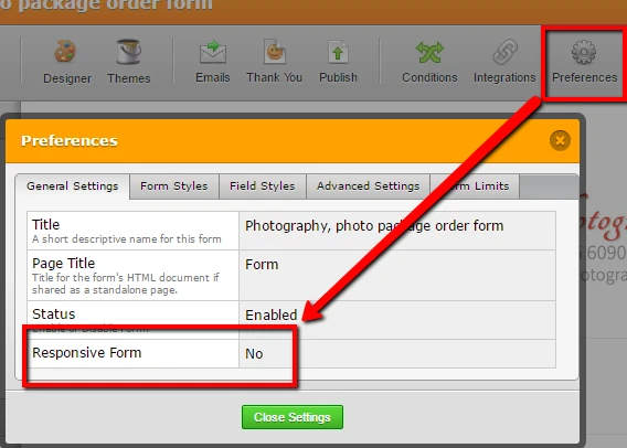
When reviewing your form I noticed that it did not have the RESPONSIVE FORM enabled. Can you enable this from the PREFERENCE settings and let us know if this helps.
-
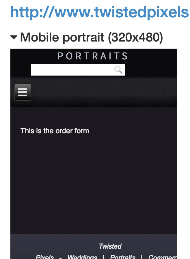
TPixJohnReplied on May 17, 2016 at 5:14 PM
Believe it or not, that actually made the problem worse. The form is now also truncated slightly before the end even on larger screens. - see attached "before" and "after" screen grabs.
Also, I'm confused about that Responsive setting there - I thought there was just the one setting for "Make this form responsive" in the Design mode underForm Layout.
Is there any easy way to stop the form truncating on mobile devices while also not causing an issue on larger screens.
Thanks for your continued efforts on this.
Before:

After:

-
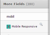
victorReplied on May 17, 2016 at 8:55 PM
Thank you for the update. Can you please try adding the following widget. This widget was created for the forms that had problems with mobile devices.
Also please clear your browsers cache and cookies. Please let us know if this helps.
-
TPixJohnReplied on May 18, 2016 at 4:51 AM
Hi, Sorry... that didn't really help.
It removed the problem of truncating the end of the form on Laptop/Desktop, but the issue on mobile devices persists.
-
CharlieReplied on May 18, 2016 at 10:10 AM
I believe this is more related on the design you have on your website, noticed that the form is actually behind the footer as you have already know. The design on this is because of the parent element <div class="tpixresponsive-embed"></div>. That wrapper is trying to add a 50% padding at the bottom, moving it's own position, however, the form does not move at all:

If you remove the class name tpixresponsive-embed for the <div> element, you'll see that the form will try to make itself mobile responsive. Here's how it looks like:

The result above may not be accurate because the change was directly made on the page source in my browser, not on the website. However, it should technically resolve the problem you are having with the footer on top of the form.
- Templates
- Integrations
- INTEGRATIONS
- See 100+ integrations
- FEATURED INTEGRATIONS
 PayPal
- Slack
- Google Sheets
- Mailchimp
- Zoom
- Dropbox
- Google Calendar
- Hubspot
- Salesforce
- See more Integrations
- Products
- PRODUCTS
- Form Builder
- Jotform Enterprise
- Jotform Apps
- Store Builder
- Jotform Tables
- Jotform Inbox
- Jotform Mobile App
- Jotform Approvals
- Report Builder
- Smart PDF Forms
- PDF Editor
- Jotform Sign
- Jotform for Salesforce Discover Now
- Support


