


-
browningreagleAsked on May 24, 2016 at 3:32 PM
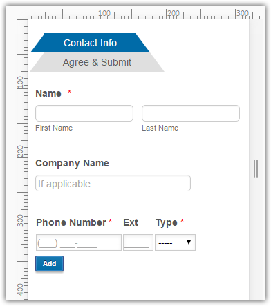
I noticed it first with this form: https://form.jotform.com/61386211062144
I'm still looking into the issue with other forms we've got, but I figured I'd start with this one since it's the most recent, as well as most advanced (widgets, custom CSS, etc). I've added the Mobile Responsive widget, and tried adding the following code below all Custom CSS:
@media screen and (max-width:480px){
#id_14, #id_16, #id_34 {
float: none;
width: 100%;
left: 0;
top: 0;
}}
Unfortunately, it only moved everything that wasn't showing in the right column over top of the fields in the left column. I've set two columns for the form, and have used Custom CSS to re-position several fields so the form looks/flows better.
I've noticed that the Configurable List widget is also affected, as it's simply cut off. There's no way for me to scroll to the right of the form. Landscape view is a little better, but portrait is a complete mess.
Please let me know if you have any recommendations, or need further information. Thanks!
-
MikeReplied on May 24, 2016 at 4:39 PM
You can try with inherit CSS value to reset positioning.
Example:
@media screen and (max-width:480px){
#id_14, #id_16, #id_34, #id_35 {
position : inherit !important;
margin: inherit !important;
}
.form-line {
padding-left: 12px !important;
padding-right: 12px !important;
}
}
You may also need to reset width parameters in the same manner with inherit value.
If you need any further assistance, please let us know.
-
browningreagleReplied on May 24, 2016 at 5:57 PM
EXCELLENT! Thank you Mike! This is definitely a step in the right direction. Correct me if I'm wrong, but is the line @media screen and (max-width:480px){ pretty much saying that any of the coding included in the { } brackets only applies when the form is viewed on mobile devices? The "State" box in the address fields hangs a little lower than "City" & "Zip Code", so is all I need to do is add a couple lines of code in this section?
Would this same code apply towards fixing the Configurable List widget appearance on mobile devices? You can see what I mean by answering "Yes" to the last question on the first page of this form, and another field pops-up which is a Configurable List that's cut-off. I tried adding #id_20 to the code, but nothing happened (of course it can't be that simple). Should I add this code to the Configurable List's custom CSS? Or will this require something entirely different?
Thanks again!
-
MikeReplied on May 24, 2016 at 7:33 PM
Yes, the CSS added to the @media screen and (max-width:480px){ ... } will only be applied to the mobile devices (screen width equal or smaller than 480 pixels).
Unfortunately, there is no some generic CSS available to fix configurable list layouts on the mobile devices. The workaround that may work is described in the following thread.
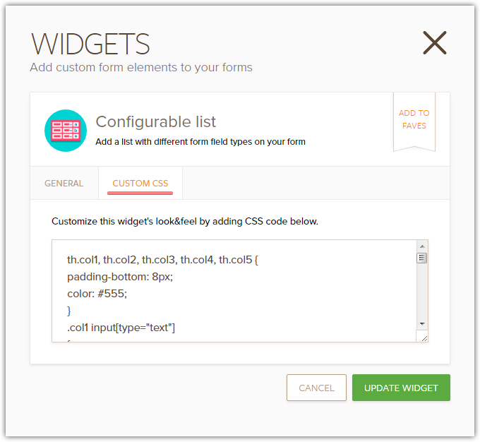
How to control the width of each column in the Configurable List widget
The CSS will need to go directly to the widget's Custom CSS section.
If you need help with the CSS code we can try to look further into this.
-
browningreagleReplied on May 25, 2016 at 12:46 PM
Hmmm... I guess the only way to really make the Configurable List fit is to move the input boxes around. Unfortunately, the headers kinda throw the appearance off a bit when the next row is added, like so:

Is it possible to make it so that any row after the first row will have the Email & Relationship fields moved up so there isn't a gap? The only workaround I've figured out so far is removing the Email & Relationship headers, but I'd prefer to have headers for all five fields if possible.
OR, is there a way to make the form horizontally scrollable on mobile devices?
Thanks again for your help Mike!
-
MikeReplied on May 25, 2016 at 2:26 PM
You are welcome.
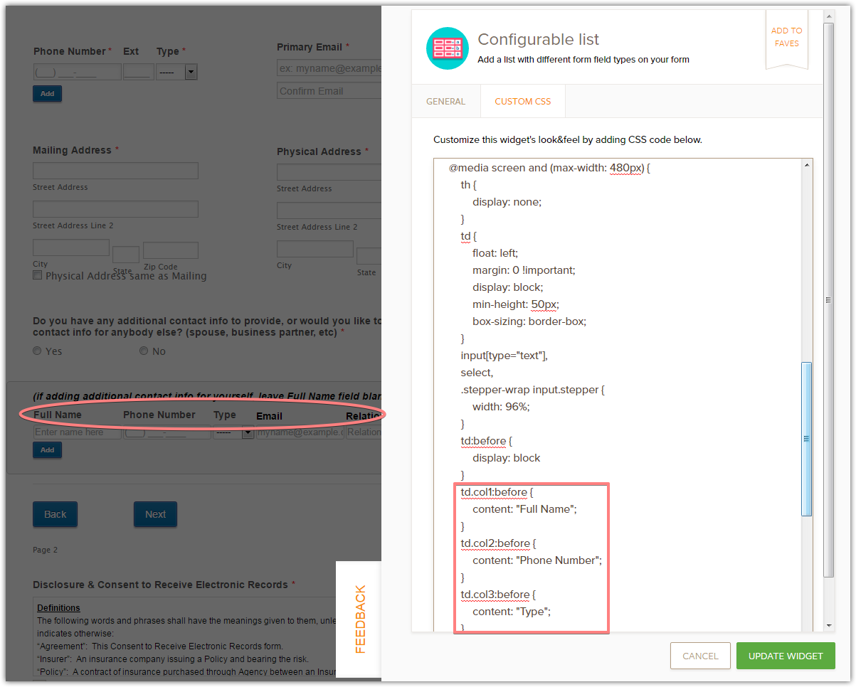
What we can try is to hide the column labels and replace them with CSS labels (based on 'before' pseudo-element) on mobile form.
Here is the CSS for configurable list:
http://pastebin.com/raw/qyD0RvTa
Thank you.
-
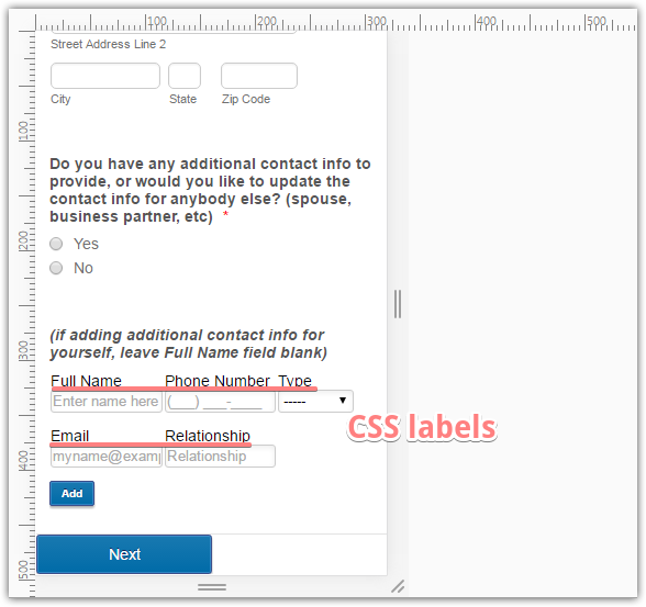
browningreagleReplied on May 25, 2016 at 4:02 PM
Thanks again Mike! I just needed to make a few tweaks to the code, but it looks much better now. However, I noticed that I'm going to have to make similar adjustments for phones using landscape orientation.
What should I change the @media max-width to in order to make these changes? And will having two groups of @media coding interfere with each other all?
UPDATE: I just checked the form using my phone, and it's perfectly fine in both portrait & landscape orientations. I was basing what I said above on the Design Mode Preview screen for phones. I think everything looks good for now, but I'll let you know if anything else pops up.
Thanks again!
-
Mike_G JotForm SupportReplied on May 25, 2016 at 5:25 PM
On behalf of my colleague, Mike, you are most welcome!
Please feel free to get back to us anytime should you encounter any issues.
Thank you.
- Templates
- Integrations
- INTEGRATIONS
- See 100+ integrations
- FEATURED INTEGRATIONS
 PayPal
- Slack
- Google Sheets
- Mailchimp
- Zoom
- Dropbox
- Google Calendar
- Hubspot
- Salesforce
- See more Integrations
- Products
- PRODUCTS
- Form Builder
- Jotform Enterprise
- Jotform Apps
- Store Builder
- Jotform Tables
- Jotform Inbox
- Jotform Mobile App
- Jotform Approvals
- Report Builder
- Smart PDF Forms
- PDF Editor
- Jotform Sign
- Jotform for Salesforce Discover Now
- Support

