


-
webcorateAsked on May 27, 2016 at 11:20 AM
-
Kevin Support Team LeadReplied on May 27, 2016 at 11:44 AM
Unfortunately, this embed option does not load responsively at the moment, it has a fixed width and it is the same does not matter the device where it is being loaded.
However, there are some methods that you may follow in order to achieve this, the first method is a Javascript code that needs to be added to the webpage where the form is being embedded on, here is a thread where one of our colleagues posted a great workaround to achieve it: https://www.jotform.com/answers/755277
I have also tested with CSS and found that this is working as well, you only need to paste this code between the <head> tags in your webpage:
<style type="text/css">
@media screen and (max-width: 480px), screen and (max-device-width: 768px) and (orientation: portrait), screen and (max-device-width: 415px) and (orientation: landscape){
.jt-title, .jt-content{
width: auto !important;
}
.jt-feedback.u-responsive-lightbox.ui-draggable div {
width: auto !important;
}
}
</style>
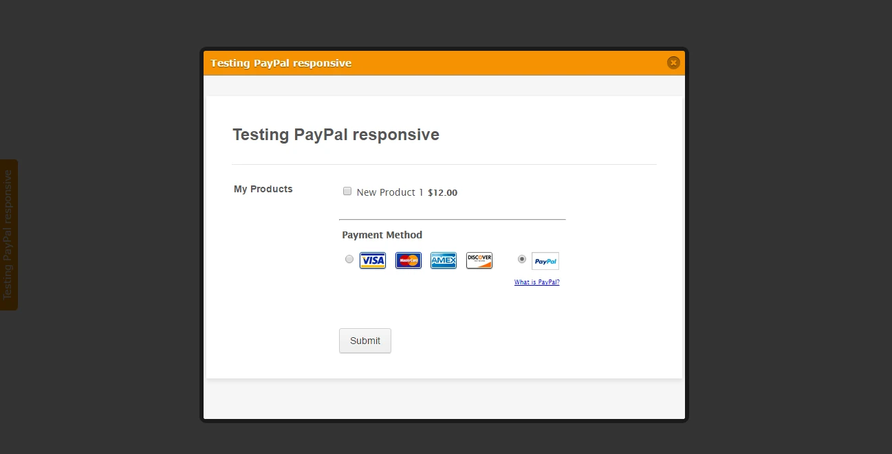
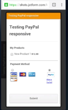
This will change the width of the light-box form displaying it correctly in mobile devices as well as in desktop devices, here are some screenshots of what the result should be once you add this code to the webpage.
Desktop:
Mobile:
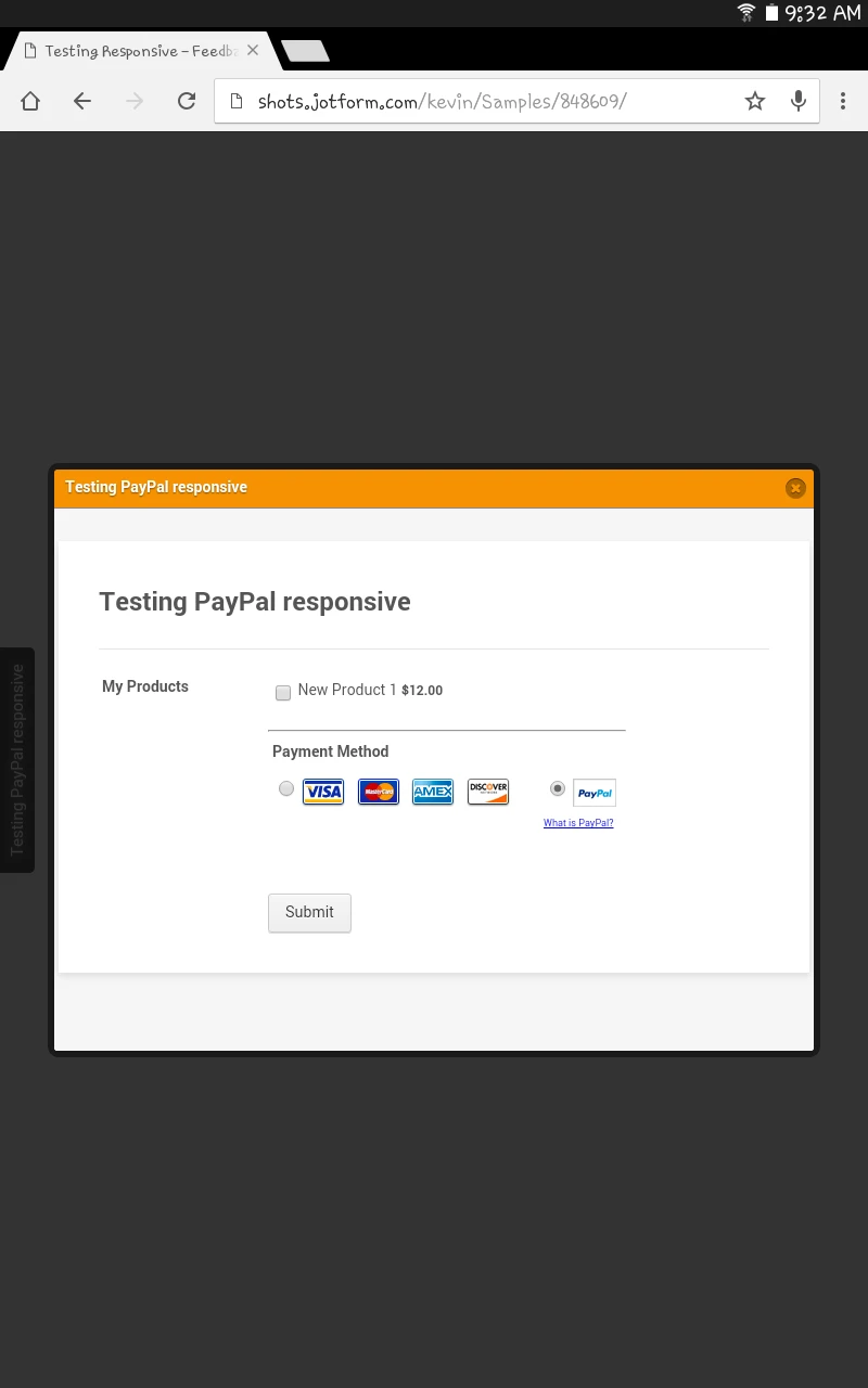
Here is the link to my form, you can test it on your end as well: https://shots.jotform.com/kevin/Samples/848609/
Here is another example about when I tested this:

I will also forward this thread to our second level, so this can be implemented and there is no need to add any code to make this mobile responsive.
Although we cannot provide an ETA about when this may be available, we will make sure to let you know as soon as this is available.
-
FrattireReplied on September 18, 2016 at 11:24 PM
This worked for me! Do you have additional CSS I can paste into the <head> tags that will alight the button to the middle left on a mobile device? I want to keep it at the top left for desktop.
-
Chriistian Jotform SupportReplied on September 19, 2016 at 1:27 AM
Hello @Frattire. I noticed that you have a currently active thread regarding your concern. So to avoid any confusion, we shall assist you with your issue on that thread. Please follow this link to view your thread: https://www.jotform.com/answers/935426. Regards.
- Templates
- Integrations
- INTEGRATIONS
- See 100+ integrations
- FEATURED INTEGRATIONS
 PayPal
- Slack
- Google Sheets
- Mailchimp
- Zoom
- Dropbox
- Google Calendar
- Hubspot
- Salesforce
- See more Integrations
- Products
- PRODUCTS
- Form Builder
- Jotform Enterprise
- Jotform Apps
- Store Builder
- Jotform Tables
- Jotform Inbox
- Jotform Mobile App
- Jotform Approvals
- Report Builder
- Smart PDF Forms
- PDF Editor
- Jotform Sign
- Jotform for Salesforce Discover Now
- Support


