


-
TriYogaAsked on June 10, 2016 at 11:00 PM
Hi great team!
We came across the issue of the logo on the forms looking huge on some of the computers. See attachment to show logo huge. Here is link to the form. I see logo in small size. http://triyoga.com/nondisclosure-agreement/ Both users are on mac, using chrome (tried other browsers too).
Logo also looks huge on iphone.
Any advice on fixing this?
thank you tons!

-
BorisReplied on June 11, 2016 at 8:14 AM
The problem with the logo seems to be caused by the Mobile Responsive widget on your form. The widget normally makes all your fields and images display in a mobile responsive manner, but on your specific form it is also causing the logo image to display over the full available width on mobile devices.
There are several ways to resolve the issue.
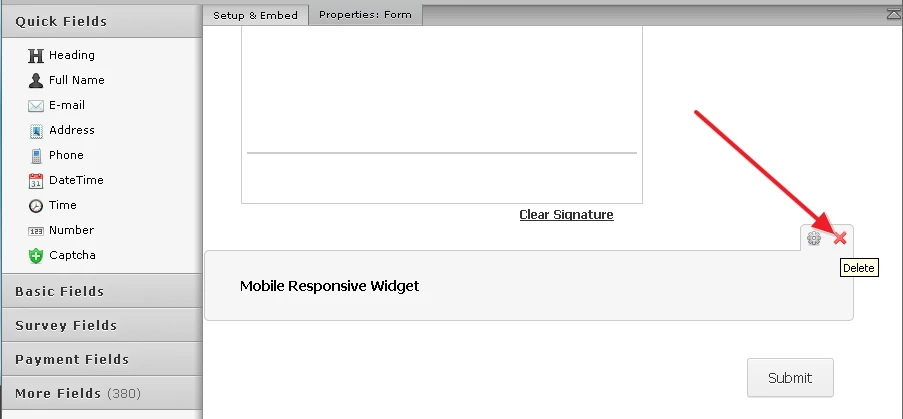
1. You can simply remove the Mobile Responsive widget from your form:
2. If you want to keep the Mobile Responsive widget, we can apply a bit of custom CSS to your form to fix the size of the logo on mobile screens:
@media only screen and (max-width: 640px) {
#id_8 .form-image { width: 62px; height: 67px; }
#cid_8 { margin: 0 5%; }
}You can add CSS codes to your form by following this guide:
https://www.jotform.com/help/117-How-to-Inject-Custom-CSS-Codes
Please let us know how it goes with any of the two recommended methods. Thank you.
- Templates
- Integrations
- INTEGRATIONS
- See 100+ integrations
- FEATURED INTEGRATIONS
 PayPal
- Slack
- Google Sheets
- Mailchimp
- Zoom
- Dropbox
- Google Calendar
- Hubspot
- Salesforce
- See more Integrations
- Products
- PRODUCTS
- Form Builder
- Jotform Enterprise
- Jotform Apps
- Store Builder
- Jotform Tables
- Jotform Inbox
- Jotform Mobile App
- Jotform Approvals
- Report Builder
- Smart PDF Forms
- PDF Editor
- Jotform Sign
- Jotform for Salesforce Discover Now
- Support