


-
swifpygalAsked on June 15, 2016 at 6:31 AM
They are so tiny on the ipad that my customers had a hard time filling them up.
And on the iphone it is the opposite, super zoomed out and totally not scrollable.
https://form.jotform.com/51510814436146
Page URL: http://www.juzplaykids.com/#!waiver/cue5 -
beril JotForm UI DeveloperReplied on June 15, 2016 at 8:12 AM
If you want to make your form responsive it is also possible by clicking the "Make the form Responsive" option from designer,
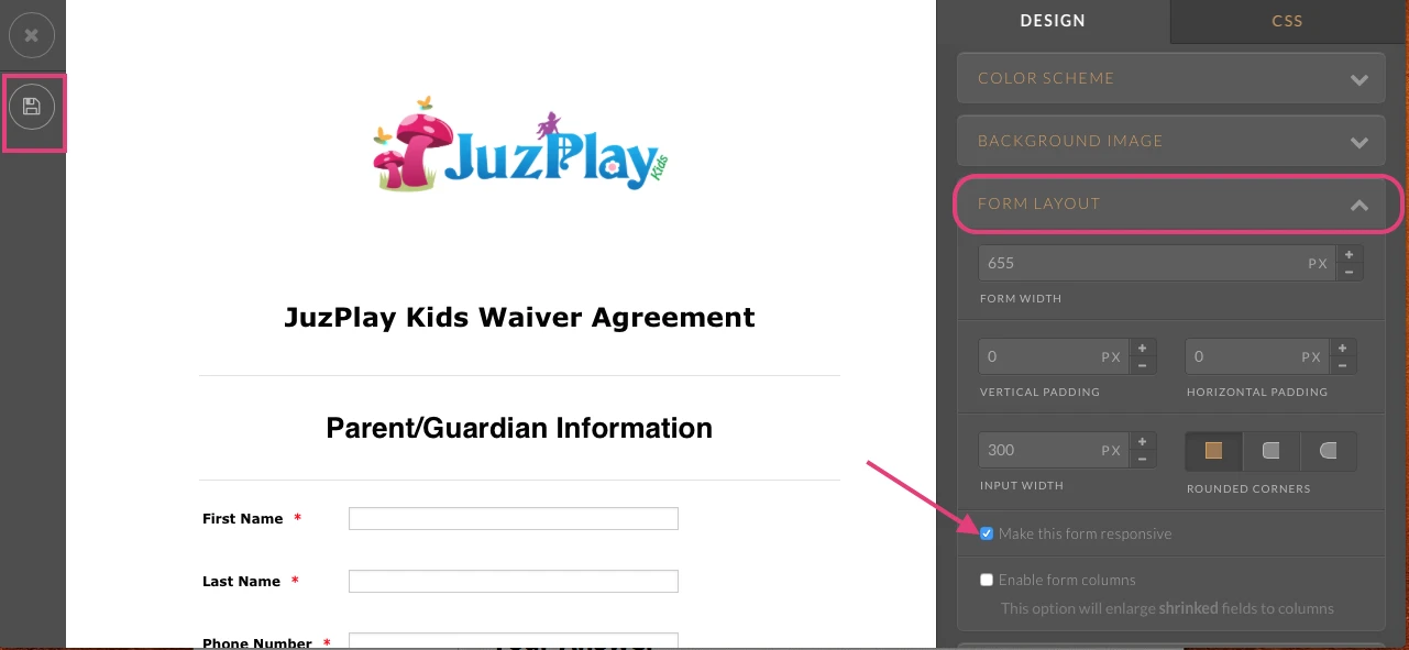
If this does not resolve the issue, please let us know and we will be glad to take another look.
-
swifpygalReplied on June 16, 2016 at 9:42 AM
Hello,
it does not resolve the issue.
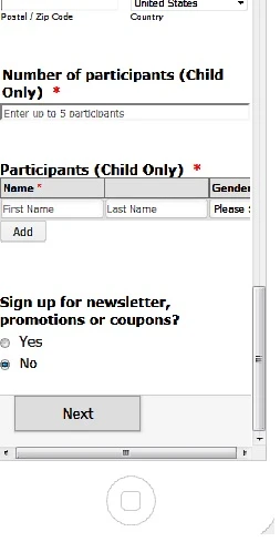
After switching to responsive form, even jotform preview screen of a iphone has error. The Form cannot be scrolled horizontally fully and so customer is not able to fill in details of Participants which include date of birth at the end of the table.
Furthermore, it looked totally different on my actual iphone ( see below). Please help.

Thank you.
-
CharlieReplied on June 16, 2016 at 12:25 PM
I presume your website is created using Wix.com? It seems like the parent element that holds the form is not mobile responsive when viewed on an iOS device, you should check the mobile responsive options in your Wix editor and see if you have missed something. Or you can also contact Wix support about that.
For the meantime, try re-embedding the form using the iFrame embed code as mentioned in this link: https://www.jotform.com/help/148-Getting-the-form-iFrame-code
Or you can also follow the steps on this guide link: https://www.jotform.com/help/70-Adding-a-Form-to-Your-Wix-Site
Unfortunately, if you would like to make the Configurable list widget "Participants (Child Only)" to be responsive, it is not possible, the length of the total widget is already short, if we can it shorter, it would be impossible for the user to read it and fill it out. But, we can display it differently on a mobile device, here's a cloned form I made: https://form.jotform.com/61674396535971
This is how it looks like in mobile view:

This is the custom CSS code that I made:
@media screen and (max-width: 480px), screen and (max-device-width: 768px) and (orientation: portrait), screen and (max-device-width: 415px) and (orientation: landscape) {
/* Force table to not be like tables anymore */
table, thead, tbody, th, td, tr {
display: block;
}
/* Hide table headers (but not display: none;, for accessibility) */
thead tr {
position: absolute;
top: -9999px;
left: -9999px;
}
tr { border: 1px solid #ccc; }
td {
/* Behave like a "row" */
border: none;
border-bottom: 1px solid #eee;
position: relative;
}
td:before {
/* Now like a table header */
display: inline-block !important;
/* Top/left values mimic padding */
top: 6px !important;
left: 6px !important;
width: 40% !important;
}
/* Label the data */
td:nth-of-type(1):before { content: "First Name"; }
td:nth-of-type(2):before { content: "Last Name"; }
td:nth-of-type(3):before { content: "Gender";}
td:nth-of-type(4):before { content: "Birth date"; }
/*Make the width of the date field 50%*/
.dateContainer {
width: 50% !important;
display: inline-block !important;
}
/*Hide the original thead*/
th.col1, th.col2, th.col3, th.col4 {
display: none !important;
}
}
You need to add it inside the widget settings:

Let us know if that works.
-
swifpygalReplied on June 16, 2016 at 1:47 PM
I pasted the css code in but nothing change on my form
-
jonathanReplied on June 16, 2016 at 3:47 PM
I checked your form https://www.jotform.us/form/51510814436146 and I see you had applied the CSS code for the configurable list as suggested by Charlie.
I test it on mobile browser, and it was working as intended. The configurable list have responsive behavior in mobile browser.

Can you tyr re-embedding the form on your website using its iframe publish code.
User guide: https://www.jotform.com/help/148-Getting-the-form-iFrame-code
This is just to make sure the published form is refresh with the latest version of the form.
Let us know if still not resolve.
-
swifpygalReplied on June 16, 2016 at 4:32 PM
But it is still not responsive as per your preview mobile view.
Also why does the form on the mobile phone keep jumping back to the top after clicking on the next field to fill in?
For example when filling in the Address:
After typing in the Street Name, I click on the textbox for City and it jump straight to the top for First Name. It is the same for every field after that. It is pretty annoying for anybody trying to fill up the form.
Please help
-
swifpygalReplied on June 16, 2016 at 5:43 PM
Hello,
Also, is it possible to make the spaces between the label and the text box for Participants shorter? So as to reduce the need to scroll to the right?
Thank you
-
David JotForm Support ManagerReplied on June 16, 2016 at 7:38 PM
I would recommend you to clone Charlie's form version, since the configurable list widget is optimized already to be responsive: http://www.jotform.com/help/42-How-to-Clone-an-Existing-Form-from-a-URL
URL: https://form.jotform.com/61674396535971

On regards of reducing the vertical space between fields, here is how to do it:
1) Click on Designer
2) Click on Line Layout tab
3) Reduce the vertical padding and line spacing properties:

Let us know if you need more help.
-
swifpygalReplied on June 17, 2016 at 4:12 AM
OK, now it is responsive but i have another problem.
When trying to fill up the form on the mobile phone, Every text box field starting from Address will keep jumping back to the top. For example, after typing in the Street Address, upon clicking on the next text field for city, it will jump to the top where my Logo is, and for every other field after that, it does the same.
Why is this happening? It will be super annoying to fill up the form if this keep happening.
-
swifpygalReplied on June 17, 2016 at 4:14 AM
if you go to my http://www.juzplaykids.com/#!waiver/cue5
on a iphone and test out the waiver form, you will see what I mean
-
Ashwin JotForm SupportReplied on June 17, 2016 at 5:31 AM
Hello,
I did test your form in iPhone 4S and I am able to replicate the issue you are having. Form scroll to top automatically. I would suggest you to please remove the script part of the iFrame embed code you have added and just use the following iFrame embed code:
<iframe id="JotFormIFrame" onDISABLEDload="window.parent.scrollTo(0,0)" allowtransparency="true" src="https://form.jotform.com/51510814436146" frameborder="0" style="width:100%; height:539px; border:none;" scrolling="no"> </iframe>
You need to exclude the following script code:
<script type="text/javascript"> window.handleIFrameMessage = function(e) { var args = e.data.split(":"); var iframe = document.getElementById("JotFormIFrame"); if (!iframe) return; switch (args[0]) { case "scrollIntoView": iframe.scrollIntoView(); break; case "setHeight": iframe.style.height = args[1] + "px"; break; case "collapseErrorPage": if (iframe.clientHeight > window.innerHeight) { iframe.style.height = window.innerHeight + "px"; } break; case "reloadPage": window.location.reload(); break; } var isJotForm = (e.origin.indexOf("jotform") > -1) ? true : false; if(isJotForm && "contentWindow" in iframe && "postMessage" in iframe.contentWindow) { var urls = {"docurl":encodeURIComponent(document.URL),"referrer":encodeURIComponent(document.referrer)}; iframe.contentWindow.postMessage(JSON.stringify({"type":"urls","value":urls}), "*"); } }; if (window.addEventListener) { window.addEventListener("message", handleIFrameMessage, false); } else if (window.attachEvent) { window.attachEvent("onmessage", handleIFrameMessage); } if(window.location.href && window.location.href.indexOf("?") > -1) { var ifr = document.getElementById("JotFormIFrame"); var get = window.location.href.substr(window.location.href.indexOf("?") + 1); if(ifr && get.length > 0) { var src = ifr.src; src = src.indexOf("?") > -1 ? src + "&" + get : src + "?" + get; ifr.src = src; } } </script>
Hope this helps.
Do get back to us if you have any questions.
Thank you!
-
swifpygalReplied on August 7, 2016 at 5:38 AM
Hello,
if I remove the script part, my whole form doesn't work at all and I cannot even scroll down to fill it in.
??? Somebody else HELP PLEASE??
I need it to be responsive which it is but it has to stop scrolling up automatically while I am trying to fill in the form on a mobile phone.
-
Welvin Support Team LeadReplied on August 7, 2016 at 7:00 AM
You have to adjust the height from 539px to a bigger value, say 1500px. Simply adjust the value until you'll see the whole form.
The webpage doesn't exist anymore so I can't view the form. Can you link it again here?
- Templates
- Integrations
- INTEGRATIONS
- See 100+ integrations
- FEATURED INTEGRATIONS
 PayPal
- Slack
- Google Sheets
- Mailchimp
- Zoom
- Dropbox
- Google Calendar
- Hubspot
- Salesforce
- See more Integrations
- Products
- PRODUCTS
- Form Builder
- Jotform Enterprise
- Jotform Apps
- Store Builder
- Jotform Tables
- Jotform Inbox
- Jotform Mobile App
- Jotform Approvals
- Report Builder
- Smart PDF Forms
- PDF Editor
- Jotform Sign
- Jotform for Salesforce Discover Now
- Support


