


-
mwheatAsked on June 17, 2016 at 6:47 AM
Afternoon
I've created a form from the default template and ticked the box, but it doesn't resize for mobile. the columns become too small for input?
https://www.ukgirlthing.co.uk/activity-only/bubble-football
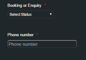
Also, I've removed the phone number and replaced it with a plain text box field called phone number, but the original is still showing on the form on the web page?
Is there anything i can do?
Thanks
Matthew
-
Elton Support Team LeadReplied on June 17, 2016 at 9:44 AM
Hello Mattew,
1. The single textbox phone number appears of be showing on your page now. Could be a delay on form update but it should be fixed now.
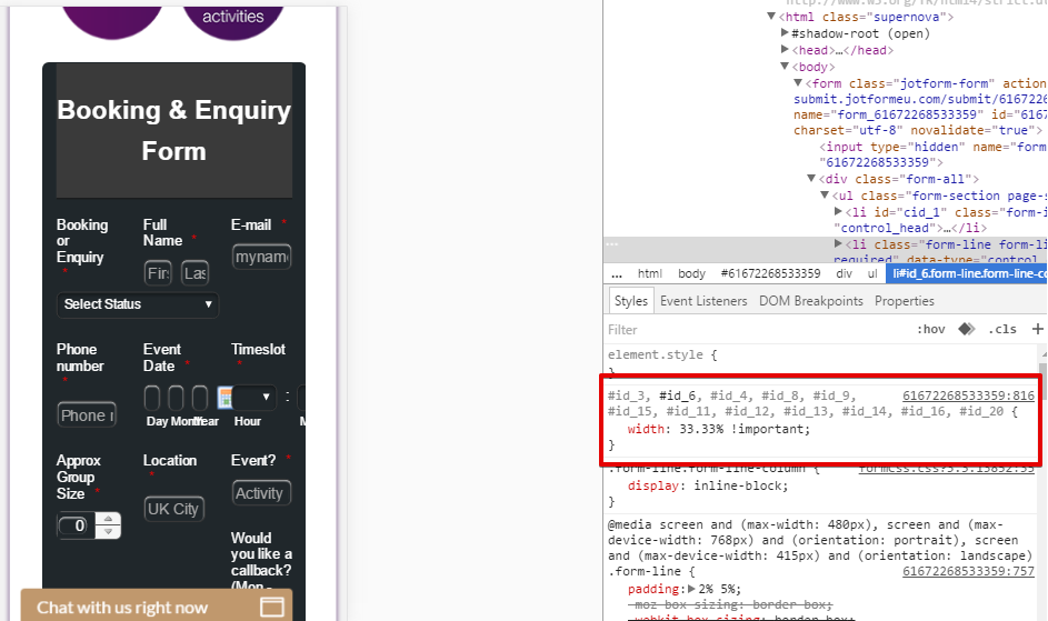
2. With regards to the responsiveness of the form, note that JotForm is responsive by default. What causes your form not to expand on mobile is the custom CSS codes injected to your form. See the following image:
So to fix this, you have to make the width 100% when form is viewed on mobile. Inject this CSS codes to your your form.
@media screen and (max-width:480px){
#id_3, #id_6, #id_4, #id_8, #id_9, #id_15, #id_11, #id_12, #id_13, #id_14, #id_16, #id_20 {
width: 100%;
}
[data-type="control_datetime"] span.form-sub-label-container {
width: 28%;
margin-right: 0;
}
[data-type="control_time"] span.form-sub-label-container {
width: 30%;
}
#id_5 {width: 100%;}
#id_21, #id_17 {
width: 100% !important;
}
}
Guide: https://www.jotform.com/help/117-How-to-Inject-Custom-CSS-Codes (paste it into the botom section)
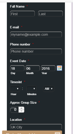
This should give you the following result:
Hope this helps!
-
mwheatReplied on June 17, 2016 at 10:35 AM
Your support team are great - even worked up the code for me, thanks!
I've added it in though, and it still performing the same?
Anything else I need to do?
thanks
-
David JotForm Support ManagerReplied on June 17, 2016 at 11:51 AM
You are correct, this can be fixed by adding the "!important" property to the code my colleague provided, so replaced it for this one:
@media screen and (max-width:480px){
#id_3, #id_6, #id_4, #id_8, #id_9, #id_15, #id_11, #id_12, #id_13, #id_14, #id_16, #id_20 {
width: 100% !important;
}
[data-type="control_datetime"] span.form-sub-label-container {
width: 28% !important;
margin-right: 0 !important;
}
[data-type="control_time"] span.form-sub-label-container {
width: 30% !important;
}
#id_5 {
width: 100% !important;
}
#id_21, #id_17 {
width: 100% !important;
}
}
Result: https://form.jotform.com/61684927481972

Let us know if you need more help.
-
mwheatReplied on June 17, 2016 at 12:38 PM
Perfect! thanks so much.
you guys have the best support team - so fast!
-
CharlieReplied on June 17, 2016 at 1:32 PM
In behalf of my colleagues, you are most welcome. We're glad that the custom CSS codes worked for you.
Should you need our assistance again, please do not hesitate to contact us here.
Thank you.
- Templates
- Integrations
- INTEGRATIONS
- See 100+ integrations
- FEATURED INTEGRATIONS
 PayPal
- Slack
- Google Sheets
- Mailchimp
- Zoom
- Dropbox
- Google Calendar
- Hubspot
- Salesforce
- See more Integrations
- Products
- PRODUCTS
- Form Builder
- Jotform Enterprise
- Jotform Apps
- Store Builder
- Jotform Tables
- Jotform Inbox
- Jotform Mobile App
- Jotform Approvals
- Report Builder
- Smart PDF Forms
- PDF Editor
- Jotform Sign
- Jotform for Salesforce Discover Now
- Support


