


-
R083RTAsked on June 18, 2016 at 6:12 PM
Hi I created a form but it doesn't look right on mobile device. Any way to get it to look right.
1) The important part is that it would fill the screen.
2) The second part, not as important, is that the header would stretch all the way to the edge, currently it looks like boxes.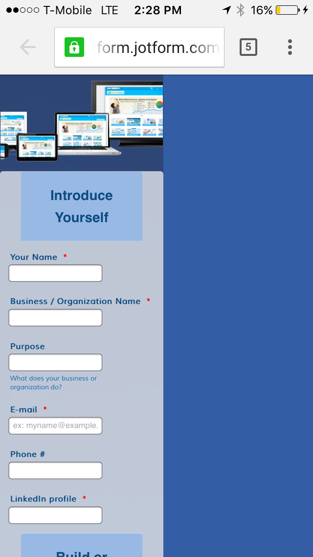 Page URL: https://form.jotform.com/61688183487168
 -
MikeReplied on June 18, 2016 at 7:53 PM
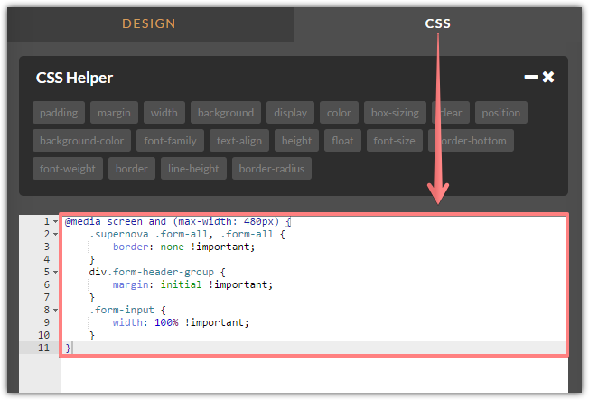
Please try adding the next CSS via form designer:
@media screen and (max-width: 480px) {
.supernova .form-all, .form-all {
border: none !important;
}
div.form-header-group {
margin: initial !important;
}
.form-input {
width: 100% !important;
}
}
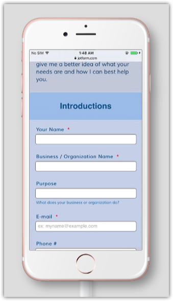
Result:
If you need any further assistance, please let us know.
-
R083RTReplied on June 18, 2016 at 8:45 PMIt worked, thanks!
... -
liyamReplied on June 18, 2016 at 10:42 PM
On behalf of Mike, you are welcome, R083RT.
If you have other questions or concerns, please do let us know. We'll be more than happy to assist.
Thanks. :)
- Templates
- Integrations
- INTEGRATIONS
- See 100+ integrations
- FEATURED INTEGRATIONS
 PayPal
- Slack
- Google Sheets
- Mailchimp
- Zoom
- Dropbox
- Google Calendar
- Hubspot
- Salesforce
- See more Integrations
- Products
- PRODUCTS
- Form Builder
- Jotform Enterprise
- Jotform Apps
- Store Builder
- Jotform Tables
- Jotform Inbox
- Jotform Mobile App
- Jotform Approvals
- Report Builder
- Smart PDF Forms
- PDF Editor
- Jotform Sign
- Jotform for Salesforce Discover Now
- Support

