


-
sindikatotakkananAsked on June 19, 2016 at 1:42 AM
I have this page http://sindikatotakkanan.com/kontak-kami/ which not shown correctly on iphone with safari browser. this is css codes I used :
@media only screen
and (min-device-width : 320px)
and (max-device-width : 480px){
.form-all {
width : 320px !important;
}
.form-line {
padding-top : 0px !important;
padding-bottom : 0px !important;
padding-left : 3px !important;
}
img.form-image {
max-width : 100% !important;
height : auto !important;
}
}
@media only screen
and (min-device-width : 375px)
and (max-device-width : 667px)
and (width : 667px)
and (height : 375px)
and (orientation : landscape)
and (color : 8)
and (device-aspect-ratio : 375/667)
and (aspect-ratio : 667/375)
and (device-pixel-ratio : 2)
and (-webkit-min-device-pixel-ratio : 2){
.form-all {
width : 667px !important;
}
.form-line {
padding-top : 0px !important;
padding-bottom : 0px !important;
padding-left : 3px !important;
}
img.form-image {
max-width : 100% !important;
height : auto !important;
}
}
@media only screen
and (min-device-width : 375px)
and (max-device-width : 667px)
and (width : 375px)
and (height : 559px)
and (orientation : portrait)
and (color : 8)
and (device-aspect-ratio : 375/667)
and (aspect-ratio : 375/559)
and (device-pixel-ratio : 2)
and (-webkit-min-device-pixel-ratio : 2){
.form-all {
width : 375px !important;
}
.form-line {
padding-top : 0px !important;
padding-bottom : 0px !important;
padding-left : 3px !important;
}
img.form-image {
max-width : 100% !important;
height : auto !important;
}
}
.form-dropdown {
width : 100% !important;
-webkit-box-sizing : border-box;
-moz-box-sizing : border-box;
box-sizing : border-box;
}
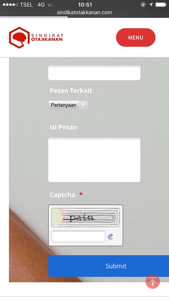
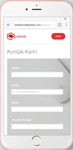
can you help me to fix it?
I attach the screenshot
-
Ashwin JotForm SupportReplied on June 19, 2016 at 2:20 AM
Hello sindikatotakkanan,
You do not have to inject custom css code to make your form mobile responsive. I did check your web page URL where you have embedded your form and found that you are using your form's script embed code. I would suggest you to make following changes to make your embedded form mobile responsive:
#1. Please ensure the "Mobile Responsive" attribute of your form is enabled. The following guide should help you: https://www.jotform.com/help/311-How-to-make-forms-mobile-responsive
#2. You should embed your form using its iFrame embed code. Please remove the existing embed code you have added in your webpage and add your form's iFrame embed code. The follwoing guide should help yo how to grab your form's iFrame embed code: https://www.jotform.com/help/148-Getting-the-form-iFrame-code
Hope this helps.
Do get back to us if you have any questions.
Thank you!
-
sindikatotakkananReplied on June 19, 2016 at 2:26 AM
Hi ashwind_d, thank you. I'll try and let you know later.
-
sindikatotakkananReplied on June 19, 2016 at 2:52 AM
Hi ashwin_d, I did what you just suggest, and got better, but not perfect yet. the form element width is still cut on Iphone with Safari.
so, what's missed?
-
Kevin Support Team LeadReplied on June 19, 2016 at 3:58 AM
I have checked your form and I can see there is a conflict with the style, although the element where the form is embedded there is some style that is setting the width of the form more than needed: however, injecting this CSS code to your form should help you to display your form fine:
@media screen and (max-width: 480px){
.supernova body {
width: 75%;
}
}
This should be the result:

.jpg)
Do note that you will need to embed your form again after doing the change, please let us know how it goes.
-
sindikatotakkananReplied on June 19, 2016 at 5:21 AM
Hi kevin_G, thank you. I'll go try first :)
-
sindikatotakkananReplied on June 19, 2016 at 6:12 AM
Hi kevin_G, so by adding width: 75% will reduce the body width. It will affect to all browsers mobile device not just safari on iphone. Actually, other browsers on some devices work fine without this. The problem is just on safari browser on iphone.
-
Chriistian Jotform SupportReplied on June 19, 2016 at 6:53 AM
Hi,
The CSS provided by my colleague will affect all devices with width less than or equal 480px regardless of the browser used to view the form. Unfortunately, there is no way to isolate CSS effect to Safari only. CSS changes will affect all browsers.
As per checking of your form using Chrome, it still looks fine. Please see below.
Here is another screenshot when your form is opened in Android phone.
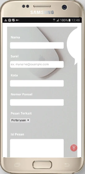
In which device and/or browser does the form have a width problem now?
-
sindikatotakkananReplied on June 19, 2016 at 5:32 PM
Hi Chriistian, I still got problem on Iphone with Safari Browser

-
jonathanReplied on June 19, 2016 at 5:58 PM
I checked and test on Iphone Safari browser using the form URL https://www.jotform.me/form/61536987510462 , but I could not produce the issue.

but on your website http://sindikatotakkanan.com/kontak-kami/ I see the problem.

Please make sure also that your website has mobile browser enabled. That should allow the form on the website respond when using mobile browser.
-
jonathanReplied on June 19, 2016 at 6:03 PM
I added the Mobile responsive widget on your form https://www.jotform.me/form/61536987510462
I think its much better now.

Let us know if there are still issue.
-
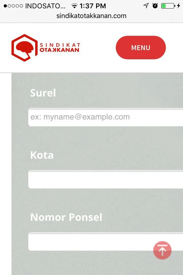
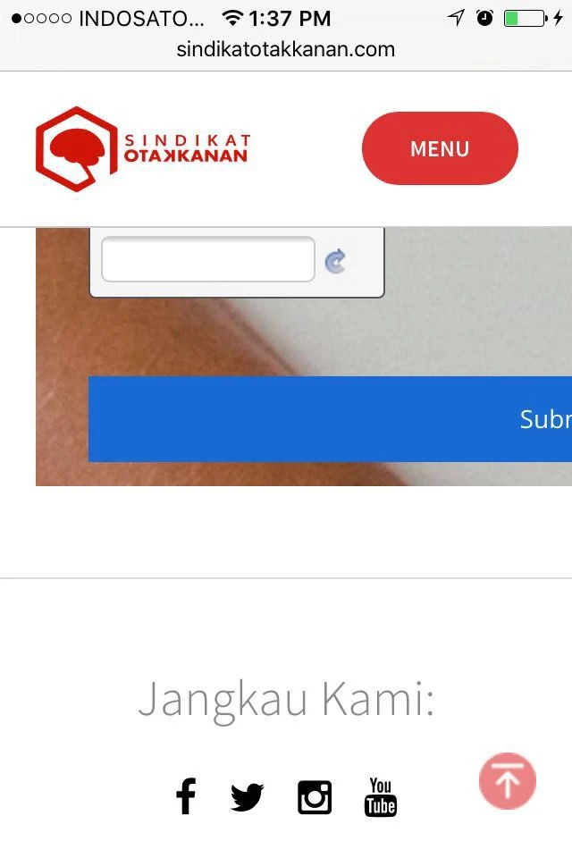
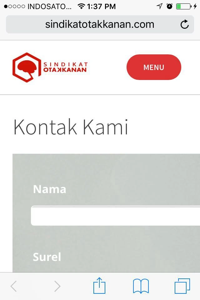
sindikatotakkananReplied on June 20, 2016 at 1:51 AM
Hi jonathan, thank you. but It still messed up (see image). so I took off the widget.

-
sindikatotakkananReplied on June 20, 2016 at 1:58 AM
I just restored to my first configurations. I removed class body supernova, responsive widget. I just checked responsive from the layout option.
-
Chriistian Jotform SupportReplied on June 20, 2016 at 2:19 AM
Checking the "Make this form responsive" option from the Form Designer will indeed make the form mobile responsive. Do you still encounter any issues with the responsiveness of the form on iOS? If you do, please let us know. Regards.
- Templates
- Integrations
- INTEGRATIONS
- See 100+ integrations
- FEATURED INTEGRATIONS
 PayPal
- Slack
- Google Sheets
- Mailchimp
- Zoom
- Dropbox
- Google Calendar
- Hubspot
- Salesforce
- See more Integrations
- Products
- PRODUCTS
- Form Builder
- Jotform Enterprise
- Jotform Apps
- Store Builder
- Jotform Tables
- Jotform Inbox
- Jotform Mobile App
- Jotform Approvals
- Report Builder
- Smart PDF Forms
- PDF Editor
- Jotform Sign
- Jotform for Salesforce Discover Now
- Support


