


-
KickUpAsked on June 23, 2016 at 12:38 AM
When the screen is smaller, matrix questions do not cleanly cut the line break at the beginning or end of a word. Instead, it breaks mid-word and becomes very hard to read (see screenshot). Is there a trick to fixing this, or is that just how it is for matrix questions?
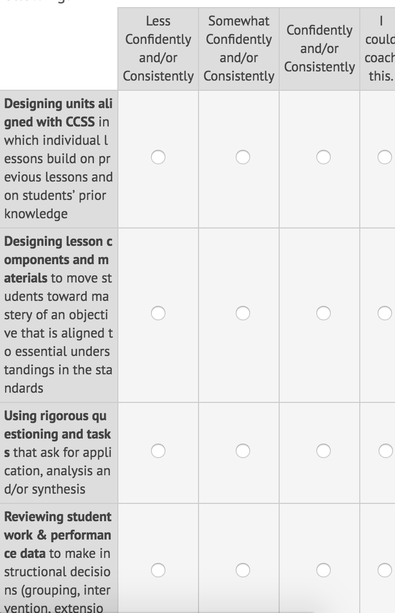 Page URL: https://form.jotform.com/61584635366161
 -
JasonBaReplied on June 23, 2016 at 2:17 AM
Hi,
You can use this code in order to fix the matrix into a smaller screen such as phone.
.form-matrix-column-headers {
word-break: break-word;
width: 35%;
}
You can follow this guide below,If you have some more questions about it, please contact us,Thank You -
beril JotForm UI DeveloperReplied on June 23, 2016 at 4:12 AM
Could you try to inject the CSS code below? At that time, it will work as expected.
@media screen and (max-width: 480px), screen and (max-device-width: 768px) and (orientation: portrait), screen and (max-device-width: 415px) and (orientation: landscape){
.form-matrix-column-headers {
word-break: break-word;
min-width: 40px !important;
}
.form-matrix-row-headers {
word-break: break-word;
min-width: 40px !important;
}
.form-matrix-table {
max-width : 620px !important;
}
}
Here is how it works on my side:
If this does not resolve the issue, please let us know and we will be glad to take another look.
-
KickUpReplied on August 18, 2016 at 1:45 PM
Hi there,
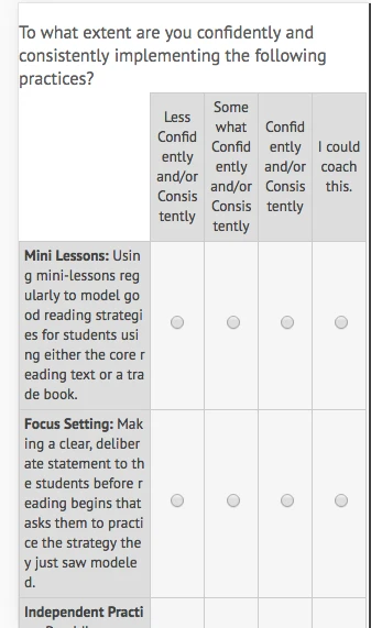
I'm sorry for waiting so long to respond, but this fix doesn't seem to do it. I used matrix questions all of the time and seem to keep seeing the issue. Just tried using the custom CSS you had shared in this form: https://form.jotform.com/62215919178159 and I see the same issue:
-
BenReplied on August 18, 2016 at 3:06 PM
Actually both replies are OK, I would only suggest changing them slightly. Specifically, you should change this:
word-break: break-word;
to:
word-break: keep-all;
That is if I understood you correctly and you want to stop the words from breaking and have the text brake only on spaces.
It is good to note however that longer matrix fields will require a scroll to happen as they can not shrink in such way that will allow you to keep unbroken words and the required width to show the matrix table properly (this is the downside of long matrix fields)
- Templates
- Integrations
- INTEGRATIONS
- See 100+ integrations
- FEATURED INTEGRATIONS
 PayPal
- Slack
- Google Sheets
- Mailchimp
- Zoom
- Dropbox
- Google Calendar
- Hubspot
- Salesforce
- See more Integrations
- Products
- PRODUCTS
- Form Builder
- Jotform Enterprise
- Jotform Apps
- Store Builder
- Jotform Tables
- Jotform Inbox
- Jotform Mobile App
- Jotform Approvals
- Report Builder
- Smart PDF Forms
- PDF Editor
- Jotform Sign
- Jotform for Salesforce Discover Now
- Support


