


-
traveldiunsaAsked on July 11, 2016 at 2:49 PM
Hello, I have this form in
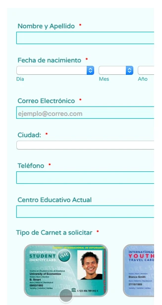
http://mundojovenhonduras.com/index.php/isic/solicitud-carnet-isicIn mobile version via browser does not display correctly, I have the "make this form responsive" selected in Designer options.
I think this is also causing the Google re.captcha images (when it requieres them) to not display correctly, onlye partialy.
¿What can I do to solve it?
Thanks for the help
-
BJoannaReplied on July 11, 2016 at 4:01 PM
I was able to replicate mentioned issue. Also when I tested your standalone form I noticed that images from Image Checkboxes widget are cut off.
Please add Mobile Responsive widget to your form to see if that will resolve your issue.
Also add this CSS code to make Image Checkboxes widget responsive on small devices:
@media screen and (min-width: 10px) and (max-width: 480px){
iframe#customFieldFrame_32 {
height: 500px!important;
}
}}
Inside of this guide you can find how to Inject Custom CSS codes to your from:
https://www.jotform.com/help/117-How-to-Inject-Custom-CSS-Codes
Here is my demo form: https://form.jotform.com/61926617951969

Feel free to clone it.
Hope this will help. Let us know if you need further assistance.
-
traveldiunsaReplied on July 12, 2016 at 12:23 AM
Thanks for the help, I applied the setups and also clone your form but it keep showing wrong on website. In url shows well, but no on website, I only insert the script
http://mundojovenhonduras.com/index.php/isic/solicitud-carnet-isic
-
Chriistian Jotform SupportReplied on July 12, 2016 at 2:14 AM
Can you please try embedding the form to your webpage using the iFrame embed code to see if that resolves the issue?
If the issue still persists, you may also try injecting the custom css code below to your form:
@media screen and (max-width: 480px){
.form-all {
width: 235px !important;
}
}
Please do let us know if you need further assistance.
Regards.
- Templates
- Integrations
- INTEGRATIONS
- See 100+ integrations
- FEATURED INTEGRATIONS
 PayPal
- Slack
- Google Sheets
- Mailchimp
- Zoom
- Dropbox
- Google Calendar
- Hubspot
- Salesforce
- See more Integrations
- Products
- PRODUCTS
- Form Builder
- Jotform Enterprise
- Jotform Apps
- Store Builder
- Jotform Tables
- Jotform Inbox
- Jotform Mobile App
- Jotform Approvals
- Report Builder
- Smart PDF Forms
- PDF Editor
- Jotform Sign
- Jotform for Salesforce Discover Now
- Support


