


-
halhawkinsAsked on July 13, 2016 at 3:39 PM
Currently, the widget doesn't resize the images on mobile devices. It continues along on one row, so that I have to swipe left to sort through them.
How do I make them move down to multiple rows, preferably just two columns wide?
https://form.jotform.com/61937155563159
Page URL: https://form.jotform.com/61937155563159 -
Welvin Support Team LeadReplied on July 13, 2016 at 4:47 PM
I've fixed it for you by doing the following:
1. Inject the following custom CSS codes in the form:
@media only screen and (max-device-width: 768px) {
.custom-field-frame {
width: 100% !important;
}
}
Guide: https://www.jotform.com/help/117-How-to-Inject-Custom-CSS-Codes.
2. Inject teh following custom CSS codes in the first widget:
@media only screen and (max-device-width: 768px) {
.imageContainer.blocks {
width: 45% !important;
}
.divimg {
width: 150px !important;
height: 150px !important;
}
}
The CSS codes are for mobile only, won't affect the normal form view in PC.
Please let us know if you need any further assistance.
-
halhawkinsReplied on July 13, 2016 at 5:45 PMIt works as far as moving them within the screen, however, on the second Image Picker, it is showing gaps between images, like only one image on a row. Any way to fix this?
... -
MikeReplied on July 13, 2016 at 7:43 PM
The gap is caused by image labels of different sizes.
In order to fix this you may try one of the following options:
1) Add a CSS to set a standard minimal height for image labels.
.imageLabel {
min-height: 40px;
}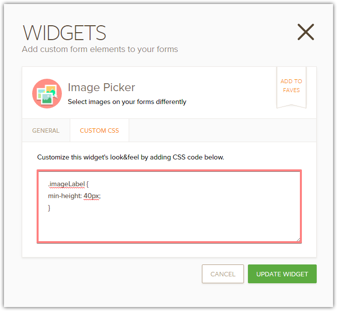
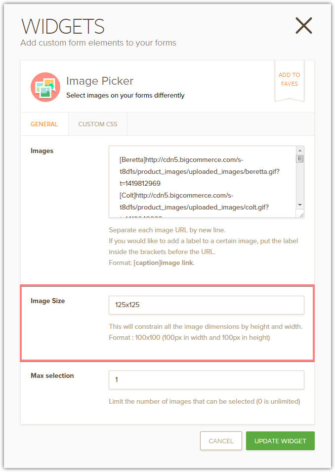
2) Increase image size to 125x125. This will also increase the image labels.
Thank you.
- Templates
- Integrations
- INTEGRATIONS
- See 100+ integrations
- FEATURED INTEGRATIONS
 PayPal
- Slack
- Google Sheets
- Mailchimp
- Zoom
- Dropbox
- Google Calendar
- Hubspot
- Salesforce
- See more Integrations
- Products
- PRODUCTS
- Form Builder
- Jotform Enterprise
- Jotform Apps
- Store Builder
- Jotform Tables
- Jotform Inbox
- Jotform Mobile App
- Jotform Approvals
- Report Builder
- Smart PDF Forms
- PDF Editor
- Jotform Sign
- Jotform for Salesforce Discover Now
- Support

