


-
BenflipsAsked on July 17, 2016 at 4:17 AM
Hi. Can I get code to resovle the following:
1) Input 110 centred.
2) Input 410 - a new config list - can I have the columns widened to make each section readable, and can I have the add button disabled
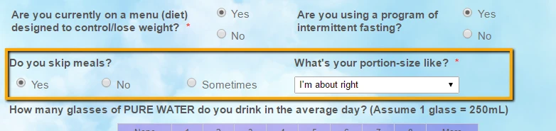
3) Input 40 / 417 and Input 41 / 418 - each next to each other on one line each. (And then a fix to my conditions so that 417 only appears when 40 has been selected and 418 only appears when 41 is selected.)
4) Inputs 139 & 315 - I've changed these to LEFT label align, but they overlap one another, can you please have them appear on the same line but next to one another.
5) Input 416 - to match the other 2 field on this line, can you wrap the label to 2 lines please.
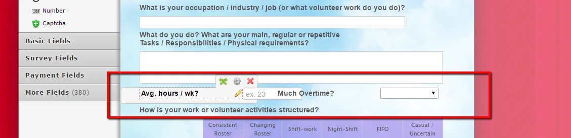
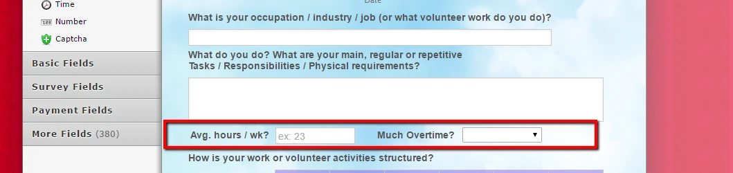
6) Input 191 - can you compress the 3 columns so that the next field (input 188) can be on the same line. Can you make sure that 188 aligns underneath with (input 192).
7) With 188 in its current position, I need a bit of space (padding?) between it and 403 below it. (Once the fix above is completed, can we see if this is still necessary?)
8) And I haven't been able to review the last couple of pages because for some reason, input 208 and 213 are overlapping one another. Can you please help fix this, so I can review my final couple of pages!
There is also an open thread about my 3rd page I haven't yet got feedback on - I'd love to have that when you get some time!
-
David JotForm Support ManagerReplied on July 17, 2016 at 1:14 PM
1) If you want to center the field labeled "Who may we thank for recommneding us to you?", inject this code: http://www.jotform.com/help/117-How-to-Inject-Custom-CSS-Codes
#id_110{
margin-left: 24% !important;
}
Result:

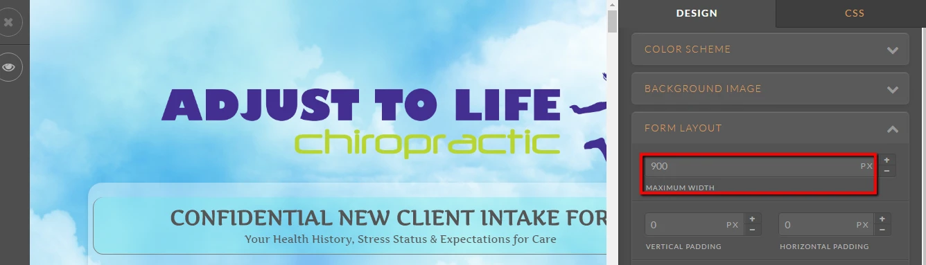
2) On regards of the configurable list widget, inject the following code inside the widgets CSS area:
#list{
width: 900px !important;
}

In order to disable the button, simply add this code in the Custom CSS area of the widget:
.add {
display: none;
}
I'll get back to you as soon as I fix the other points.
-
David JotForm Support ManagerReplied on July 17, 2016 at 1:26 PM
3) To make those field to be in the same line, increase your form with at the designer:
Result:
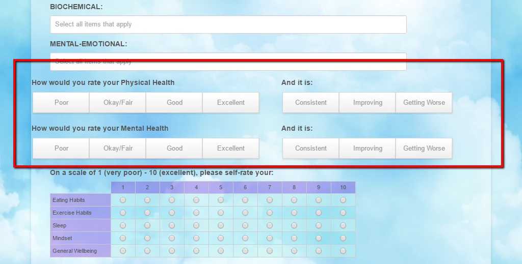
If you want to show the "And it is" fields based on a selection, you need to create a condition: https://www.jotform.com/help/316-How-to-Show-or-Hide-Fields-Base-on-User-s-Answer
Note: in this thread we will assist you with the design, if you need further help, with something else, like setting up conditions, please open a new thread.
-
David JotForm Support ManagerReplied on July 17, 2016 at 1:44 PM
4) I can see what you mean:
Inject the following CSS code: http://www.jotform.com/help/117-How-to-Inject-Custom-CSS-Codes
#label_139,#label_315{
width: 120px !important;
}
Result:
-
David JotForm Support ManagerReplied on July 17, 2016 at 1:50 PM
5) Click on the label, and add "<br>" where you want the break:

-
David JotForm Support ManagerReplied on July 17, 2016 at 2:31 PM
6) There is already injected CSS code which is affecting the field width, you need to copy all your already injected CSS code, and paste in a text editor like Sublime Text:

Once in your text editor, search for "#id_191", you will notice the widths are high:

Reduce them, and copy the whole code from your text editor and paste it back in the CSS area of your form preferences:

Finally, merge the other field to the above line(Click on the gear icon, and click on the merge option):

Result:

-
David JotForm Support ManagerReplied on July 17, 2016 at 3:29 PM
7) On regards of issue seven, I think the fix done in issue 6 fixed. But let us know what you think.
8) There is a lot of CSS code that is messing up these fields, that's why they are overlapping:

My suggestion is the following:
a) Go in to Preferences>>Form Styles>>Custom CSS, and copy/cut and paste the whole code int a text editor such as "Sublime Text".
b) Once on the text editor, search for the following ids:
#id_208
#id_209
#id_213
#id_219
And remove the code you find associated to them, this will be the code that needs to be removed:
#id_208 {
position : absolute;
width : 50%;
padding-right : 0px;
}
#id_209 {
left : 50%;
}
#id_213 {
position : relative;
width : 50%;
padding-right : 0px;
}
#id_219 {
width : 50%;
padding-right : 0px;
display : inline-block;
left : 100px;
top : -80px;
}
c) Now, copy the whole code from the text editor, and paste it back to the CSS area.
The fields located in that section should not overlap between each other:

If you need customization, let us know, so we can provide you the right solution. I would ask you to open a new thread for it.
Hope this has resolved your 8 design issues reported on this thread. If you need anything else, please open a separate thread, we will be glad to assist you.
-
BenflipsReplied on July 17, 2016 at 8:45 PMI've made the first few changes. Thank you.
The config list looks much better, but is still pretty tight. Is there a
way to add a few more pixels at the margin of each column? And is is
possible to wrap that last option I have so that the long piece of text
doesn't continue on as it currrently does?
If I change the form width as you've suggested, will this stuff all of the
many little custom alignment changes I've sought help with so far? If it
will, can I instead reduce the 'space' between the two button widgets to
have them fall on one line that way? Will this be enough to have them fit?
*Regards,*
*Dr. Ben Phillips*
Chiropractor
B.App.Sc.(Comp.Med.)(Chiro) M.Clin.Chiro.(RMIT)
... -
BenflipsReplied on July 17, 2016 at 9:25 PM
1) - Done. Thank you
2) - Done. Thanks. Is it possible to add a few extra pixels width to the columns, as it looks pretty 'tight' righ now. Also, is it possible to in some way wrap that last answer so it doesn't extend so far to the right?
3) - I did have a condition in place with the previous element, hopefully that's fixed now. As per your solution of widening the form width, though, will this alter all of the other custom alignment fixes I've had done? Would it be possible to reduce the space between the elements (would there be enough pixels here to achive the desired outcome?) rather than extend the form width?
4) - I made your change, and unlike your screenshot, the change puts the second label hard up against the input of the first field, rather than the space/gap that you have shown in your screenshot
5) - I've put in the break, thank you
6) - I'm not a coder, and your solution is REALLY difficult for me. I don't have sublime text or know how to use it... Can you please just give me what values I need to change or what code I need to overwrite? The result in your screenshot is almost what I wanted - it certainly is great for the collumns of the three radio buttons, but the other request was for input 188 to align underneath with (input 192).
7) Following on from 6. Can I just delete the portions of code you have outlined to get the effect I want, or do I have to go through this whole sublime text copy thing...
-
Chriistian Jotform SupportReplied on July 18, 2016 at 12:31 AM
2) Please inject the code below the custom css of the widget.
#list {
width: 800px !important;
}
.checkbox, .radio {
margin: 3px 0;
padding-right: 10px;
min-width: 100px!important;
}

3) Yes, depending on the css use,it will indeed affect the other custom alignment fixes that you have done. You can instead change the width of the the buttons so that the overall width of the field will also be reduced.

4) Please add this css below to your form.
#id_139 {
width: fit-content!important;
}
-
Chriistian Jotform SupportReplied on July 18, 2016 at 1:25 AM
6) You can download the sublime text here: https://www.sublimetext.com/. However, I understand if you want to simply add the css. Please inject the custom css below to fulfill your requirement.
#id_191 {
width: 50%!important;
padding-right: 0px;
}
#cid_191 {
width: 100%;
}
#id_191 .form-multiple-column {
width: 100%;
}
#id_191 .form-radio-item {
width: 30% !important;
}
#id_188 {
padding: 0px;
clear: none!important;
}
7) You can delete the code without using Sublime Text. You can do so on the Preferences CSS or on your Form Designer.
-
BenflipsReplied on July 18, 2016 at 3:30 AM
You guys (and girls!) are amazing.
I've applied these fixes.
Thanks for the config list fix Chriistian. Just one further pedantic request if i may - is there a further bit of code that can align the wrapped text on the 4 answers that wrap such that the second line starts under the first character of the first line (rather than wrapping under the checkbox icon itself?)
-
Chriistian Jotform SupportReplied on July 18, 2016 at 4:49 AM
You are most welcome. To achieve your requirement, we will need to modify the previous code we injected. Simply find and replace the value of the padding-right: 10px; in the ".checkbox, .radio" css. Change the padding from 10px to 0px.
.checkbox, .radio {
margin: 3px 0;
padding-right: 0px;
min-width: 100px!important;
}
Then after that, add the css below to the custom css of the widget.
.checkbox-container label {
margin-left: -20px;
}
#list td {
padding-left: 20px;
}
This is how it should look after.

-
BenflipsReplied on July 18, 2016 at 6:45 AMI'm hesitant to make a change in the css to the entire class of checkboxes
and radio buttons - I think maybe something like this has already occurred
given that I have asked for a similar alignment already outside of the
configuration list widgets.
Can you confirm that this first piece of code is vital, and that it will
not make profound changes to the rest of my form at this late stage in its
design?
The screenshot you've provided is pretty damn good, but there is now almost
too much space between the columns (where in the past there was not enough!)
I have not implemented this code yet, as I await your reply.
*Regards,*
*Dr. Ben Phillips*
Chiropractor
B.App.Sc.(Comp.Med.)(Chiro) M.Clin.Chiro.(RMIT)
... -
Chriistian Jotform SupportReplied on July 18, 2016 at 8:32 AM
Hi,
Yes, I confirm that the code is vital.
The screenshot you've provided is pretty damn good, but there is now almost
too much space between the columns (where in the past there was not enough!)If you think the space is too much now, you can change the last part of the CSS with padding-left: 20px to something smaller like padding-left: 15px. Please use this instead.
#list td {
padding-left: 15px;
}
-
BenflipsReplied on July 18, 2016 at 7:45 PMHi. I've applied the code - it seems good, thank you.
It appears that I've put the below code in both the form css and the widget
css...
Is that an error on my part?
*.checkbox, .radio {*
* margin: 3px 0;*
* padding-right: 0px;*
* min-width: 100px!important;*
*}*
*Regards,*
*Dr. Ben Phillips*
Chiropractor
B.App.Sc.(Comp.Med.)(Chiro) M.Clin.Chiro.(RMIT)
... -
Chriistian Jotform SupportReplied on July 18, 2016 at 9:51 PM
The code should only be applied on the Config List Widget CSS. If it is applied on the form CSS, then it will affect the rest of your radio and checkbox fields. Please remove the said code on the Form CSS to avoid any conflicts there. Regards.
.checkbox, .radio {
margin: 3px 0;
padding-right: 0px;
min-width: 100px!important;
}
-
BenflipsReplied on July 18, 2016 at 11:45 PMThank you
...
- Templates
- Integrations
- INTEGRATIONS
- See 100+ integrations
- FEATURED INTEGRATIONS
 PayPal
- Slack
- Google Sheets
- Mailchimp
- Zoom
- Dropbox
- Google Calendar
- Hubspot
- Salesforce
- See more Integrations
- Products
- PRODUCTS
- Form Builder
- Jotform Enterprise
- Jotform Apps
- Store Builder
- Jotform Tables
- Jotform Inbox
- Jotform Mobile App
- Jotform Approvals
- Report Builder
- Smart PDF Forms
- PDF Editor
- Jotform Sign
- Jotform for Salesforce Discover Now
- Support

