


-
novoformAsked on July 19, 2016 at 2:07 AM
Hi Jotform,
I have had a new form developed. It shows fine when it's on mobile by it's own url: https://form.jotform.co/novoform/ready-to-migrant . The only small issue is that some options font shows differently (bigger than others) as the photo showing below:

The main problem happens when I insert the form to one of our web page:
http://www.choosenewzealand.com/how-can-we-help/migrate-the-point-calculator/
It is fine on desktop but not on mobile.
Problems:
1. The form on the page shows wider than the other part.

2. The font is different:

3. It doesn't show the whole form:

Can someone help me on this?
Thanks!
Frank
-
beril JotForm UI DeveloperReplied on July 19, 2016 at 3:51 AM
Hello Frank,
I've tested your form on my phone and I am able to reproduce the same issue that you’re having. I think, the main problem is that you're not able to see the submit button. To solve that issue, could you please re-embed your form as you see below:
<iframe id="JotFormIFrame" onDISABLEDload="window.parent.scrollTo(0,0)" allowtransparency="true" src="https://form.jotform.co/61219237224854" frameborder="0" style="width:100%; height:539px; border:none;" scrolling="yes"> </iframe>
To solve your other issues, could you also inject the CSS code below from designer?
@media screen and (max-width: 480px), screen and (max-device-width: 768px) and (orientation: portrait), screen and (max-device-width: 415px) and (orientation: landscape) {
.form-input-wide.jf-required {
font-size: 15px !important;
}
.form-textbox, .form-textarea {
width: 250px !important;
}
}
If this does not resolve the issue, please let us know and we will be glad to take another look.
-
novoformReplied on July 19, 2016 at 10:18 PM
Hi Beril,
Thanks for your answer. The mobile version now shows the submit button. I've also put your code in the CSS through Jotform designer. But the font and width issue seems still there. The user experience looks not really good. Do you know if I did that right?
Thanks!
Frank
-
jonathanReplied on July 20, 2016 at 1:29 AM
I test the form on your website using mobile browser, and so far I did not encounter issue with form.

The Textbox and TextArea were also showing responsive width.
Can you please tell us more details on the steps to produce the problem. We will check further once we have a better undestanding of the issue.
Thank you.
-
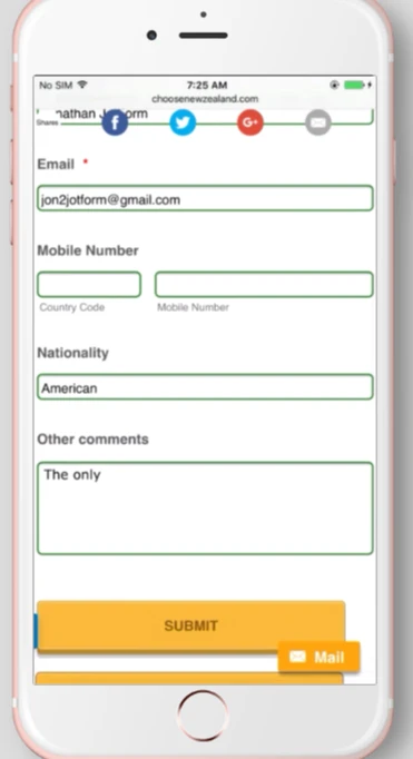
novoformReplied on July 20, 2016 at 7:11 PM
Thanks Jonathan. It looks fine on your screen. But on my mobile the form is still wider than the default page width and I have to zoom out to see the whole form. See the photos below:


Thanks!
-
jonathanReplied on July 20, 2016 at 9:07 PM
You website was not loading on the browser when I tried to test and check at this time.

Can you please check if the website is ok.
The form https://form.jotform.co/novoform/ready-to-migrant is ok, but sinde we need to test the actual embedded form we need to be able to check it on the website.
We will wait for your response.
-
novoformReplied on July 20, 2016 at 11:53 PM
It works fine in my end. http://www.choosenewzealand.com/how-can-we-help/migrate-the-point-calculator/
Do you mind to try it again?
Thanks!
-
Welvin Support Team LeadReplied on July 21, 2016 at 12:49 AM
I've added the following custom CSS codes to your form and it seems to have fixed the issue. Can you check and confirm?
@media only screen and (max-device-width: 1024px) {
.form-all {
-webkit-box-sizing: border-box !important;
-moz-box-sizing: border-box !important;
box-sizing: border-box !important;
}
}
-
novoformReplied on July 24, 2016 at 10:56 PM
Hi Weivin,
Thanks! But on my mobile (iPhone 6, Chrome) it looks still as the last two screenshots I sent to you. Some of the font looks too big for the mobile screen.
Thanks!
-
beril JotForm UI DeveloperReplied on July 25, 2016 at 3:45 AM
Could you try to inject the CSS code below:
@media screen and (max-width: 480px), screen and (max-device-width: 768px) and (orientation: portrait), screen and (max-device-width: 415px) and (orientation: landscape) {
.form-radio-item label {
font-size : 15px !important;
}
#cid_59 span.form-radio-item {
font-size : 15px !important;
}
.div.form-radio-item hoverSticky label {
font-size : 15px !important;
}
.div#label_input_60_2 , #label_input_60_0 , #label_input_60_1 {
font-size : 15px !important;
}
.div#label_input_59_2 , #label_input_59_0 , #label_input_59_1 {
font-size : 15px !important;
font-family:'Helvetica' !important;
}
.form-all {
font-size : 15px !important;
}
.form-radio-item:not(#foo) label:after {
font-size : 15px !important;
}
}
We would appreciate it if you could also test it on your side and let us know the result.
- Templates
- Integrations
- INTEGRATIONS
- See 100+ integrations
- FEATURED INTEGRATIONS
 PayPal
- Slack
- Google Sheets
- Mailchimp
- Zoom
- Dropbox
- Google Calendar
- Hubspot
- Salesforce
- See more Integrations
- Products
- PRODUCTS
- Form Builder
- Jotform Enterprise
- Jotform Apps
- Store Builder
- Jotform Tables
- Jotform Inbox
- Jotform Mobile App
- Jotform Approvals
- Report Builder
- Smart PDF Forms
- PDF Editor
- Jotform Sign
- Jotform for Salesforce Discover Now
- Support


