


-
iranscamAsked on August 1, 2016 at 12:15 PM
The mobile responsiveness widget works wonderfully for the most part. However, I was wondering if there was a way to edit certain properties when it breaks after a certain point?
For example, after a certain point, the input boxes switch to 100% width when I'd like them to be constrained with a max-width of 80%. Also, I have the labels aligned to auto, which looks great in the desktop view as they float out to the left of the text boxes. But when I break into the smaller views, these labels float above the boxes, which is fine, but they're aligned left-of-center when I'd like them to be centered above the text fields.
Furthermore, I'm using IFrame to get the form to function within my site's framework. Is there a way to achieve these things without having to screw around with the source code? If I plug the source code into my html, a million issues pop up.
Thanks!
-
BJoannaReplied on August 1, 2016 at 1:55 PM
You can achieve that by Injecting Custom CSS code to your form. Add this CSS code to your form:
@media screen and (max-width: 480px), screen and (max-device-width: 768px) and (orientation: portrait), screen and (max-device-width: 415px) and (orientation: landscape){
.form-all .form-textbox, .form-textarea {
max-width : 80%!important;
}
.form-label.form-label-left {
font-family : Roboto;
text-align : center!important;
position : relative;
left:0!important;
}
}
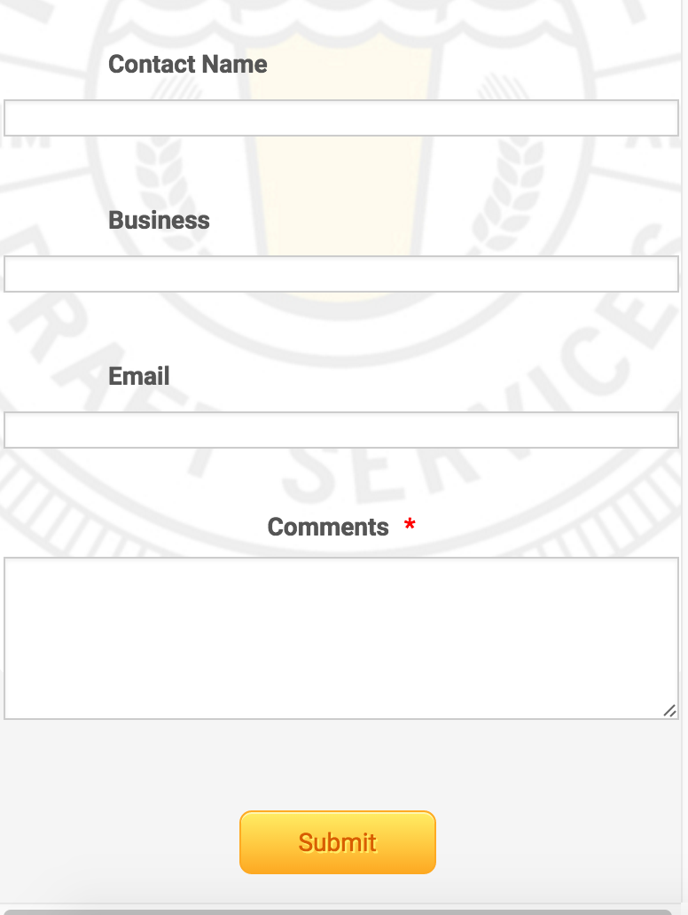
How to Inject Custom CSS Codes
After you add mentioned CSS code you form should look like this on mobile devices.

Here is my form where I added mentioned code: https://form.jotform.com/62135802609958
Feel free to clone it.
Hope this will help. Let us know if you need further assistance.
- Templates
- Integrations
- INTEGRATIONS
- See 100+ integrations
- FEATURED INTEGRATIONS
 PayPal
- Slack
- Google Sheets
- Mailchimp
- Zoom
- Dropbox
- Google Calendar
- Hubspot
- Salesforce
- See more Integrations
- Products
- PRODUCTS
- Form Builder
- Jotform Enterprise
- Jotform Apps
- Store Builder
- Jotform Tables
- Jotform Inbox
- Jotform Mobile App
- Jotform Approvals
- Report Builder
- Smart PDF Forms
- PDF Editor
- Jotform Sign
- Jotform for Salesforce Discover Now
- Support
