


-
snapstormAsked on August 1, 2016 at 6:03 PM
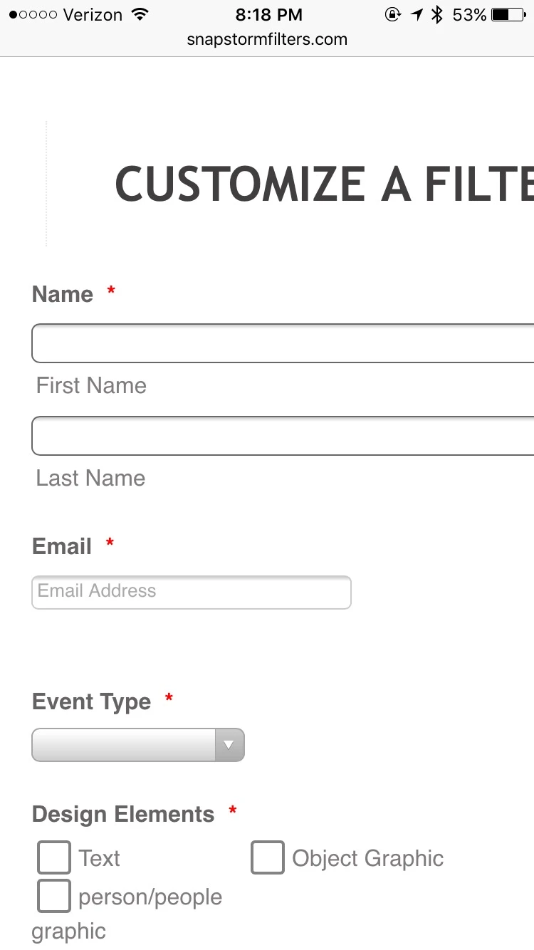
My form looks great on laptop, but doesn't work so well on my iphone. The text ("Customize a filter") and text boxes extend too far to the right, so they do not appear in the frame.
Additionally, I have "color selection" widgets that do not work (users cannot even select a color with them) on mobile.I love the form I made but I am really sad that it won't work out for mobile.
-
Support_Management Jotform SupportReplied on August 1, 2016 at 10:53 PM
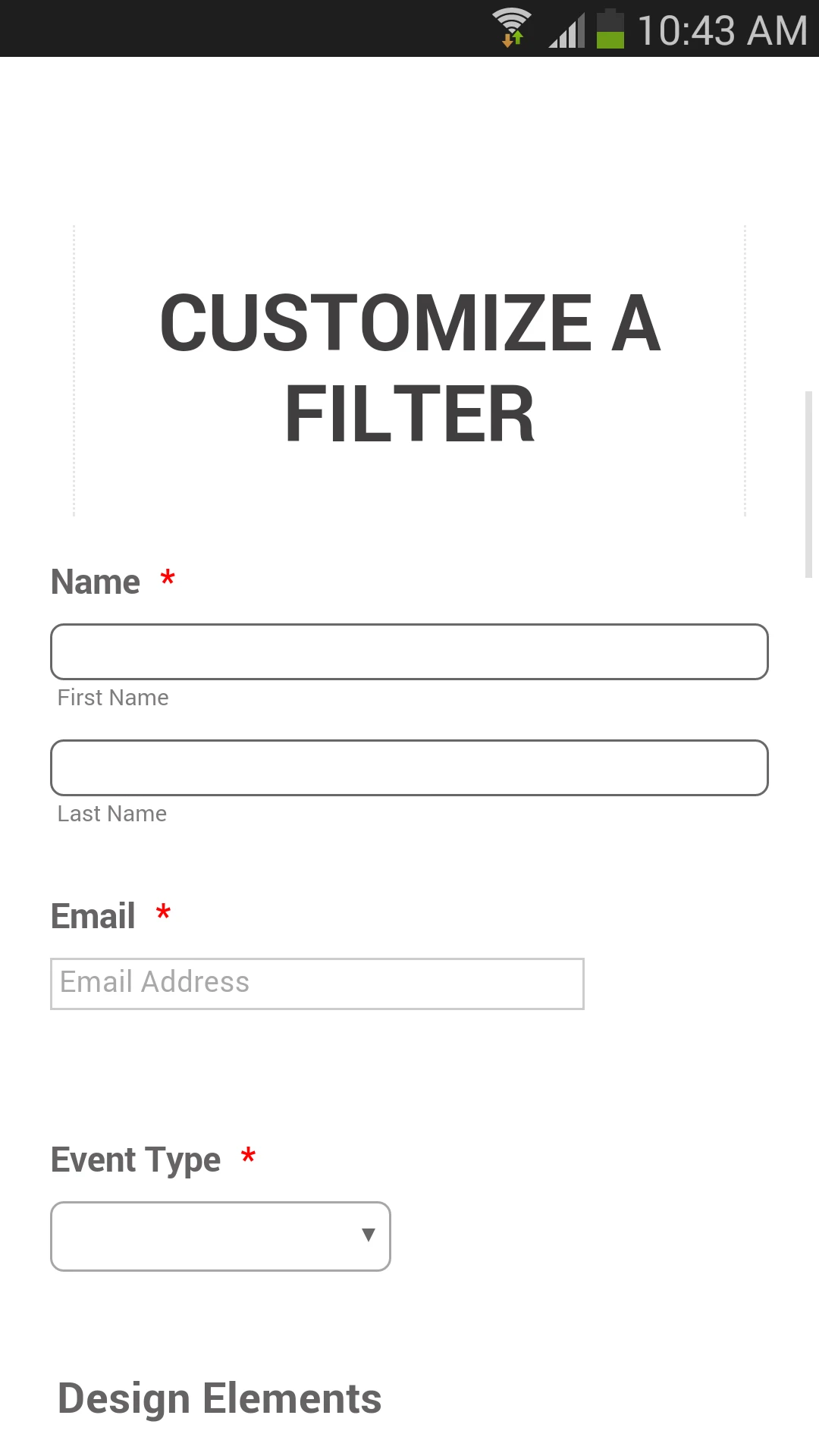
I checked the embedded form on your website using an accurate iPhone emulator and it rendered the form in a mobile responsive way.

The text ("Customize a filter") and text boxes extend too far to the right, so they do not appear in the frame.
They are aligned perfectly, they show within the frame and looks good on mobile overall. I'm seeing you have the "Mobile Responsive Widget" added to your form so I'm assuming we're all set on this one. But if you still have issues with how the form is rendered on your phone, please give us more info or share a screenshot with us so we can have another look.
Additionally, I have "color selection" widgets that do not work (users cannot even select a color with them) on mobile.
And for this other issue you reported about the color picker widget, I've moved it on a separate thread https://www.jotform.com/answers/895654 to keep this one focused on a single topic. We'll have it addressed there shortly.
-
snapstormReplied on August 2, 2016 at 1:31 AM
Thanks for getting back to me. Hmm, it seems that on your gadget it worked out fine, but I'm still having trouble when using it from my iphone. Here's a snapshot:
-
BJoannaReplied on August 2, 2016 at 4:46 AM
I do not have iPhone to test your form, but I made some tests on my Samsung Galaxy S4 and on iPhone simulator, but I was not able to replicate mentioned issue. You form is responsive on my end.
When I inspected your form I saw that you have embedded your form with script code. We recommend using of iFrame code. Please try to replace script code with iFrame code to see if that will resolve your issue. Inside of this guide you can find how to get iFrame code of your form:
https://www.jotform.com/help/148-Getting-the-form-iFrame-code
Hope this will help. Let us know if you need further assistance.
- Templates
- Integrations
- INTEGRATIONS
- See 100+ integrations
- FEATURED INTEGRATIONS
 PayPal
- Slack
- Google Sheets
- Mailchimp
- Zoom
- Dropbox
- Google Calendar
- Hubspot
- Salesforce
- See more Integrations
- Products
- PRODUCTS
- Form Builder
- Jotform Enterprise
- Jotform Apps
- Store Builder
- Jotform Tables
- Jotform Inbox
- Jotform Mobile App
- Jotform Approvals
- Report Builder
- Smart PDF Forms
- PDF Editor
- Jotform Sign
- Jotform for Salesforce Discover Now
- Support

