


-
learningrootsAsked on August 11, 2016 at 10:56 AMI have 2 more questions, I have placed a box of last name - applied CSS and brought it in authorize.net widget field. But I'm afraid only that box is not mobile responsive.
I tried to apply media query on it but nothing helped. Please suggest some thing.
-
BJoannaReplied on August 11, 2016 at 12:57 PM
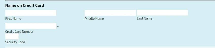
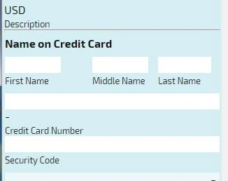
I have tested your form and middle name and last name fields are over lapping on my end.

To resolve this increase left margin of that last name field to 520px.
I also noticed that you have added iFrame code of your form to your CSS. I would suggest you to remove it.
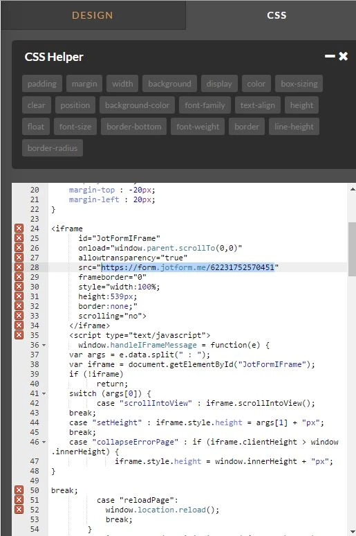
I also noticed that you have added lot of CSS code to your form for positioning on you payment fields.
To make all name fields to be responsive and to position them, so they are not overlapping on mobile devices, please add this CSS code to your form:
@media screen and (min-width: 250px) and (max-width:420px){
input#input_47_cc_firstName{width:80px!important}
input#input_47_cc_lastName{width:80px!important}
#sublabel_cc_lastName {
margin-left : -30px!important;
width : 80px!important;
position: relative!important;
}
#id_51{
width:80px!important;
margin-left:220px!important;
margin-top : -557px!important;
}
}
#id_51 {
margin-top : -531px;
margin-left : 520px;
}
@media screen and (max-width: 420px) and (min-width: 250px){
input#input_47_cc_lastName {
width: 80px!important;
position: relative;
margin-left: -30px;
}}
After you add this code you fields should look like this on mobile devices.
Here is my demo form: https://www.jotformpro.com/form/62234840452956?
Feel free to test it and clone it.
Hope this will help. Let us know if you need further assistance.
-
loriovertonReplied on August 11, 2016 at 2:50 PM
Hi, thanks alot for the help. It's mobile responsive now.
-
BJoannaReplied on August 11, 2016 at 2:51 PM
You're welcome. I am glad to hear that it's mobile responsive now.
Feel free to contact us if you have any other questions.
- Templates
- Integrations
- INTEGRATIONS
- See 100+ integrations
- FEATURED INTEGRATIONS
 PayPal
- Slack
- Google Sheets
- Mailchimp
- Zoom
- Dropbox
- Google Calendar
- Hubspot
- Salesforce
- See more Integrations
- Products
- PRODUCTS
- Form Builder
- Jotform Enterprise
- Jotform Apps
- Store Builder
- Jotform Tables
- Jotform Inbox
- Jotform Mobile App
- Jotform Approvals
- Report Builder
- Smart PDF Forms
- PDF Editor
- Jotform Sign
- Jotform for Salesforce Discover Now
- Support

