


-
mhewAsked on August 24, 2016 at 9:34 AM
I'm using jotforms to make a popup lightbox for users to read my policies. Unfortunately, when I view it mobile (using the lightbox embed code) it is not adapting the lightbox window size in mobile. If a user clicks on this embed link on a mobile device, they will get stuck on it and can't "X" out from the popup. Nor can they even read the pop-up because it goes beyond the screen constraints and gets cut off. It works beautifully on desktop, but more and more people are viewing sites on mobile, so I really need this feature. Is there some way for me to get this working?
My website is http://paintlifegrandparties.weebly.com/parties.html and the link is at the bottom of the page and reads "Policies & Cancellation".
Thanks!
-
Nik_CReplied on August 24, 2016 at 10:45 AM
I checked your website and I see what you're describing. For me it is opening fine on my phone, I can read and everything, but the x is not visible on the screen. Could you please try to shrink the width of your lightbox:
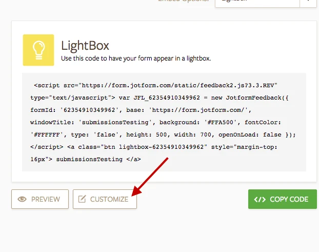
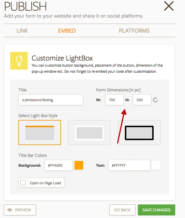
Then re-embed your form and see if it works normally.
If your issue still persists, please let us know so we can investigate further.
Thank you!
-
mhewReplied on August 24, 2016 at 2:00 PM
Hi thanks for your reply. It probably worked for you because I actually figured it out sometime after submitting this question, and I did it just how you described. Thank you, either way. Perhaps this thread will help someone else with the same issue.
-
Nik_CReplied on August 24, 2016 at 2:03 PM
I'm glad it that you were able to figure it out.
Well yes, we always tend to write this solutions so they can be re-used by other users.
Thank you for your feedback.
-
ChrisReplied on November 11, 2016 at 5:19 PM
-
jonathanReplied on November 11, 2016 at 8:23 PM
- Templates
- Integrations
- INTEGRATIONS
- See 100+ integrations
- FEATURED INTEGRATIONS
 PayPal
- Slack
- Google Sheets
- Mailchimp
- Zoom
- Dropbox
- Google Calendar
- Hubspot
- Salesforce
- See more Integrations
- Products
- PRODUCTS
- Form Builder
- Jotform Enterprise
- Jotform Apps
- Store Builder
- Jotform Tables
- Jotform Inbox
- Jotform Mobile App
- Jotform Approvals
- Report Builder
- Smart PDF Forms
- PDF Editor
- Jotform Sign
- Jotform for Salesforce Discover Now
- Support


