


-
thatartguyAsked on August 28, 2016 at 7:38 PM
-
liyamReplied on August 29, 2016 at 1:15 AM
Hello,
You can add a mobile responsive widget on your form to make your form instantly responsive and friendly for mobile devices. Here is the link to the widget: https://widgets.jotform.com/widget/mobile_responsive
You can also learn more from this guide to know how to make forms mobile responsive:
https://www.jotform.com/help/322-How-to-make-mobile-friendly-forms-on-JotFormIf you have questions, please let us know.
Thanks.
-
thatartguyReplied on August 30, 2016 at 2:45 AM
Hello,
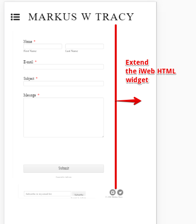
I added the widget that your staff had suggested concerning my interest in making my "CONTACT" page on my website mobile responsive. Can you please review my CONTACT page to see how it looks. It looks o.k. but I really thought that the text and the boxes would be bolder or larger like most mobile response websites. I also noticed how the the boxes are not aligned on the right side. Is there a way to correct that?
Thank you,
Markus Tracy
... -
thatartguyReplied on August 30, 2016 at 2:45 AMHello,
I added the widget that your staff had suggested concerning my interest in making my "CONTACT" page on my website mobile responsive. Can you please review my "CONTACT" page to see how it looks. It looks o.k. but I really thought that the text and the boxes would be bolder or larger like most mobile response websites. I also noticed how the the boxes are not aligned on the right side. Is there a way to correct that?
Thank you,
Markus Tracy
... -
thatartguyReplied on August 30, 2016 at 2:45 AM
Begin forwarded message:
... -
liyamReplied on August 30, 2016 at 6:37 AM
Hello,
What the widget does is insert in an instant the CSS codes which makes the fields become compatible with mobile devices.
Another method to make your form mobile responsive is using the feature on the Advanced Form Designer. This guide will tell you how: https://www.jotform.com/help/311-How-to-make-forms-mobile-responsive
You can try removing the mobile responsive widget and use the one on the form designer.
In addition, you can try inserting this code via CSS injection for the textarea that is not automatically adjusting its width on mobile devices:
@media screen and (max-width: 480px), @media screen and (min-width: 480px) and (max-width: 768px),@media screen and (min-width: 480px) and (max-width: 689px), @media screen and (max-width: 689px), @media screen and (max-width: 768px), @media only screen and (min-device-width : 768px) and (max-device-width : 1024px) {
#input_6 { width: 100% !important; }
}This guide explains how to inject CSS codes in your form: https://www.jotform.com/help/117-How-to-Inject-Custom-CSS-Codes
If you have questions, please let us know.
Thanks.
-
thatartguyReplied on August 30, 2016 at 5:45 PMHello,
My mobile response concerning my "contact" form on my website seems really small. Is there a way that you could increase the text box and the text so that is covers more of the mobile space? Please view my website at: markuswtracy.com on your mobile device. You will agree with me that it's so small. However the size on my PC is fine.
Thank you, Markus Tracy
... -
Elton Support Team LeadReplied on August 30, 2016 at 10:32 PM
If you are referring to the contact form width in its entirety, I suggest you expand the HTML container where you have embedded the form. It is the container that limits the form width. That should fix it.
If it's the labels and the textboxes you want to resize, inject this CSS codes to your form.
@media screen and (max-width: 768px){
.form-label, .form-dropdown, .form-textarea, .form-textbox{
font-size: 34px;
}}
Result:
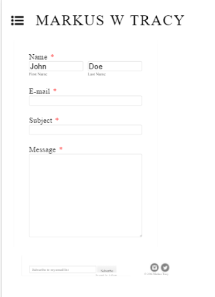
Feel free to play around with the 34px value if you want to increase it further.
--
If you also want to zoom the form like this, then you have to add the following meta code between the head tags on your contact page.
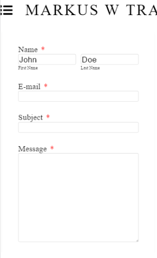
This is generally used to control the layout on mobile browsers. Most mobile responsive sites have this, it seems this code isn't present in your contact page so perhaps this would help. The standalone form has this code by the way so the problem isn't actually with the form but the page where it is embedded.
Hope this helps!
-
thatartguyReplied on August 30, 2016 at 11:45 PMHello,
Great idea! I'll expand the form but when I do that the submit button is so far below the message board. Is there a way to move that up a little closer?
Sent from my iPhone
... -
Elton Support Team LeadReplied on August 31, 2016 at 1:11 AM
Form height will automatically adjust depending on its content.
The cut off might be due to the limit of the container where the form is embedded. So, you just have to increase the height of the HTML widget where the form is embedded. It is similar to the above solution. I think you can do that in your iWeb App.
Hope this helps!
-
thatartguyReplied on August 31, 2016 at 1:45 AMThanks!
... -
thatartguyReplied on August 31, 2016 at 3:45 PMThank you!!!!!
... -
liyamReplied on August 31, 2016 at 7:00 PM
You are very much welcome, Markus.
Should you have further questions, please do not hesitate to let us know.
Thanks.
- Templates
- Integrations
- INTEGRATIONS
- See 100+ integrations
- FEATURED INTEGRATIONS
 PayPal
- Slack
- Google Sheets
- Mailchimp
- Zoom
- Dropbox
- Google Calendar
- Hubspot
- Salesforce
- See more Integrations
- Products
- PRODUCTS
- Form Builder
- Jotform Enterprise
- Jotform Apps
- Store Builder
- Jotform Tables
- Jotform Inbox
- Jotform Mobile App
- Jotform Approvals
- Report Builder
- Smart PDF Forms
- PDF Editor
- Jotform Sign
- Jotform for Salesforce Discover Now
- Support


