
-
jbefootyAsked on August 29, 2016 at 6:57 AM
-
JanReplied on August 29, 2016 at 11:02 AM
I've checked your form and I can verify that it is not responsive. It is because you specified the fields in pixels using CSS. Please give me more time about this issue. I will contact you once I have a solution. Thank you for your patience.
-
jbefootyReplied on August 29, 2016 at 11:47 AM
Thank you Jan I am very new to this and appreciate your help
Regards
John
-
JanReplied on August 29, 2016 at 3:29 PM
Thank you for patiently waiting. I cloned your form and delete all the CSS on it. After that, I removed the 50000px width of the 3rd matrix table (Group C) and then resize TextArea Autosize widget. Here's the link of the cloned form: https://form.jotform.com/62415351286959. You can clone it if you like.
Here's a guide on how to fix the form:
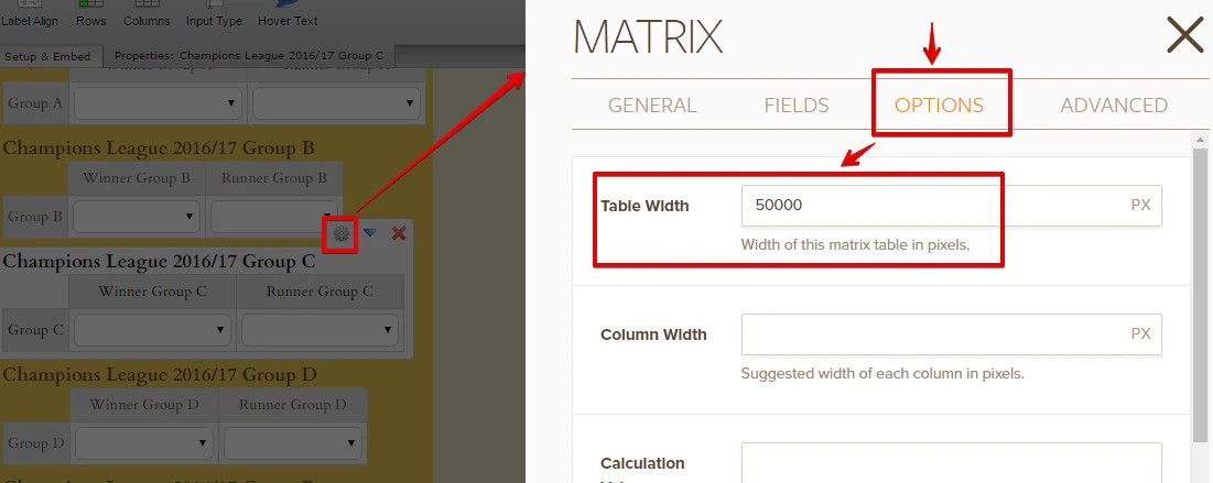
1. I removed the Table Width of the 3rd Matrix table (Group C). Select the field and then click the properties icon. Go to the Options tab and remove the value 50000px. After that, click the Save Changes button.
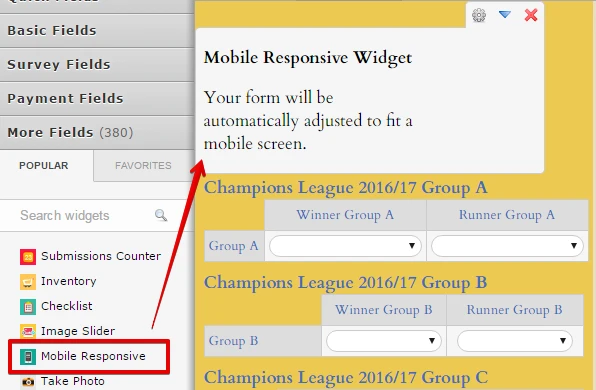
2. Insert the Mobile Responsive Widget on the form.
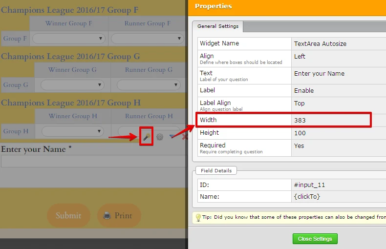
3. Change the width of TextArea Autosize widget to 383px. Select the widget and then click the gear or properties icon. Change the width to 383.
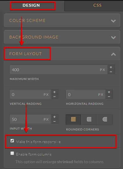
4. Go to the Form Designer.
5. Under the Design tab, go to the Form Layout section. After that, please enable the "Make this form responsive" option.
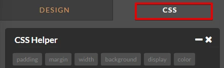
6. In the Form Designer, go to the CSS tab and delete all the CSS code.
7. Please paste the custom CSS code below in the CSS editor.
li#id_1, li#id_3, li#id_4, li#id_5, li#id_6, li#id_7, li#id_8, li#id_9, li#id_11 {
width : 100% !important;
}.form-input-wide.jf-required {
width : 100% !important;
}.form-matrix-table {
max-width : none !important;
}.form-line {
width : 100% !important;
}.form-section.page-section {
width : 100% !important;
}@media screen and (max-width: 768px) and (min-width: 480px){
.form-all .qq-upload-button, .form-all .form-submit-button, .form-all .form-submit-reset, .form-all .form-submit-print {
width : 100px !important;
}
}@media screen and (max-width: 480px), screen and (max-device-width: 768px) and (orientation: portrait), screen and (max-device-width: 415px) and (orientation: landscape){
.form-all .qq-upload-button, .form-all .form-submit-button, .form-all .form-submit-reset, .form-all .form-submit-print {
width : 100px !important;
}
}iframe#customFieldFrame_11 {
width : 100% !important;
}.span_print {
color : #353839;
}#input_2 {
color : #353839;
}.form-label.form-label-top {
color : #436CB9;
text-align : left;
}.form-dropdown {
width : center;
border-radius : 12px;
height : 22px;
line-height : 22px;
box-sizing : 2px;
border-width : 32;
}.form-section.page-section {
text-align : left;
}.form-line {
color : #436CB9;
}.form-submit-button {
color : #436CB9;
}8. Save the changes and then preview the form.
Here's the result:

Hope that helps. Let us know if you need further assistance. Thank you.
-
jbefootyReplied on August 30, 2016 at 4:12 AM
Jan
Thank you ever so much that works perfectly and I followed your very clear instructions so as I can hopefully understand form creation a bit more.
Many thanks for all your efforts
Best wishes
John
-
JanReplied on August 30, 2016 at 11:30 AM
You're welcome. Glad to hear that the solution I provided resolved your issue. If you need any help, let us know. Thank you.
- Templates
- Integrations
- INTEGRATIONS
- See 100+ integrations
- FEATURED INTEGRATIONS
 PayPal
- Slack
- Google Sheets
- Mailchimp
- Zoom
- Dropbox
- Google Calendar
- Hubspot
- Salesforce
- See more Integrations
- Products
- PRODUCTS
- Form Builder
- Jotform Enterprise
- Jotform Apps
- Store Builder
- Jotform Tables
- Jotform Inbox
- Jotform Mobile App
- Jotform Approvals
- Report Builder
- Smart PDF Forms
- PDF Editor
- Jotform Sign
- Jotform for Salesforce Discover Now
- Support