


-
miohondaAsked on August 31, 2016 at 11:34 AM
I already have this checked but my form does not appear to be responsive when opened from my iphone.
I am guessing that this is because I customized the CSS, but I don't know how I can fix this without changing the layout of the PC version.
Can you please help me fix this?
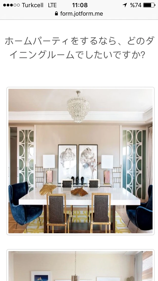
https://form.jotform.me/62418076663460
-
MikeReplied on August 31, 2016 at 1:39 PM
You may try adding a Mobile Responsive widget.
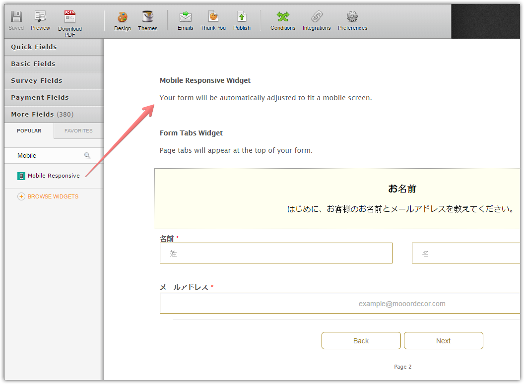
And then injecting a CSS from the following link to your form.
Thank you.
-
miohondaReplied on September 2, 2016 at 4:19 AM
Thanks.
I tried this but it doesn't change much.
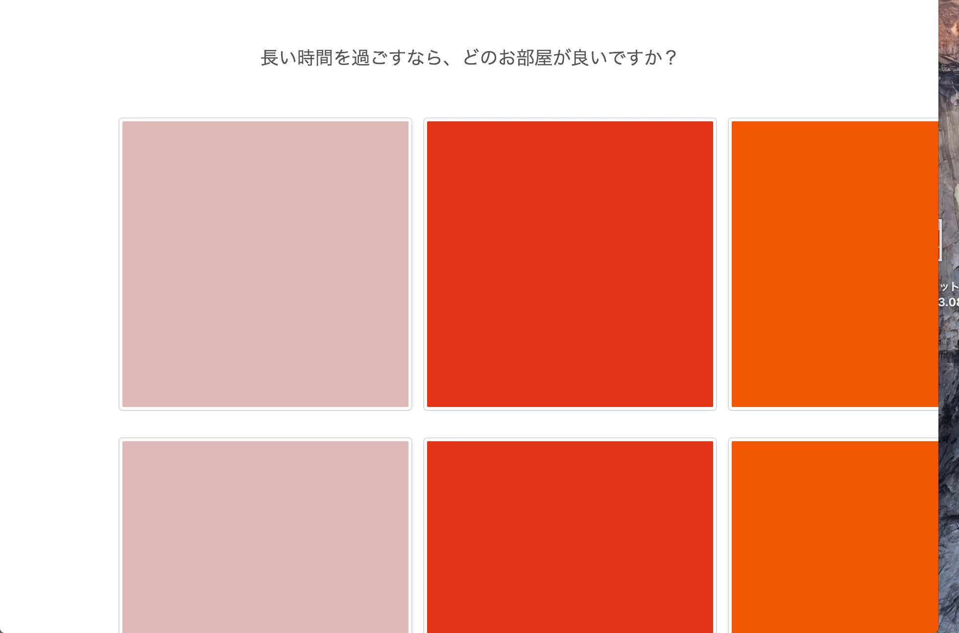
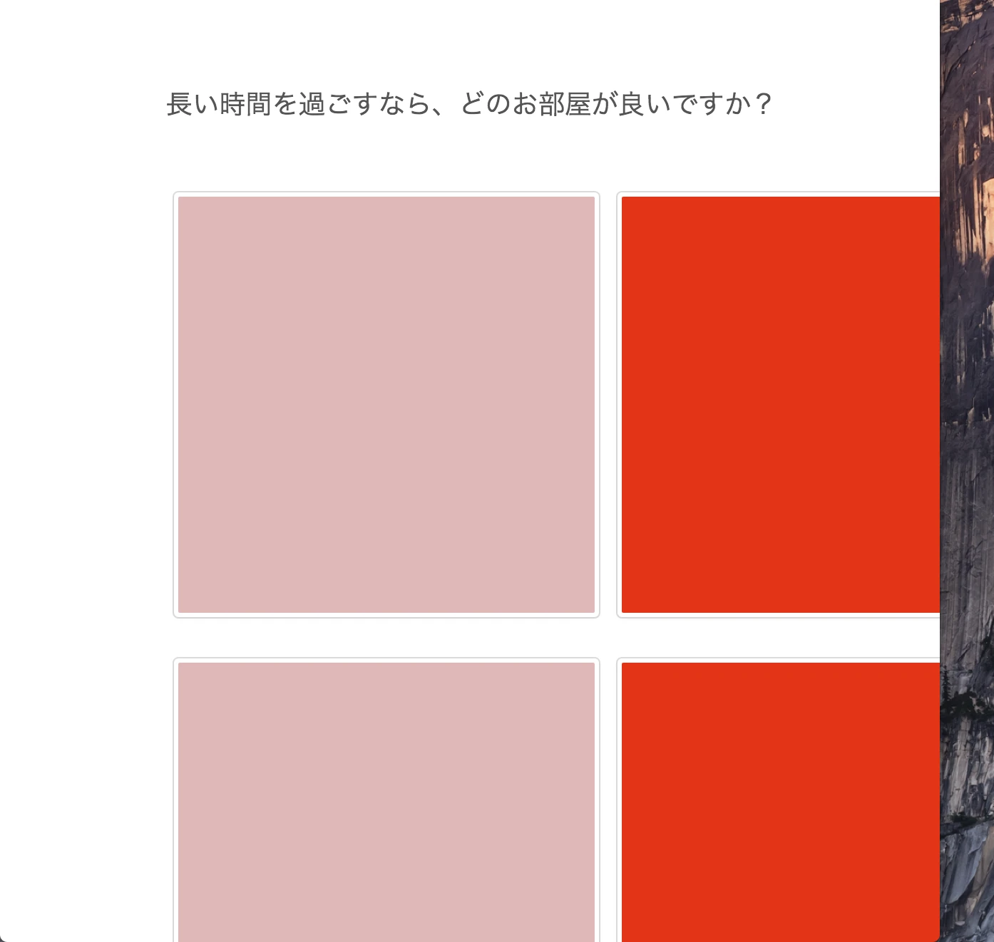
This is what happens when I shrink my browser.
And finally when the browser becomes this small, it becomes responsive.
But even so, only 2 out of 6 images appear (the other 4 are somehow hidden).
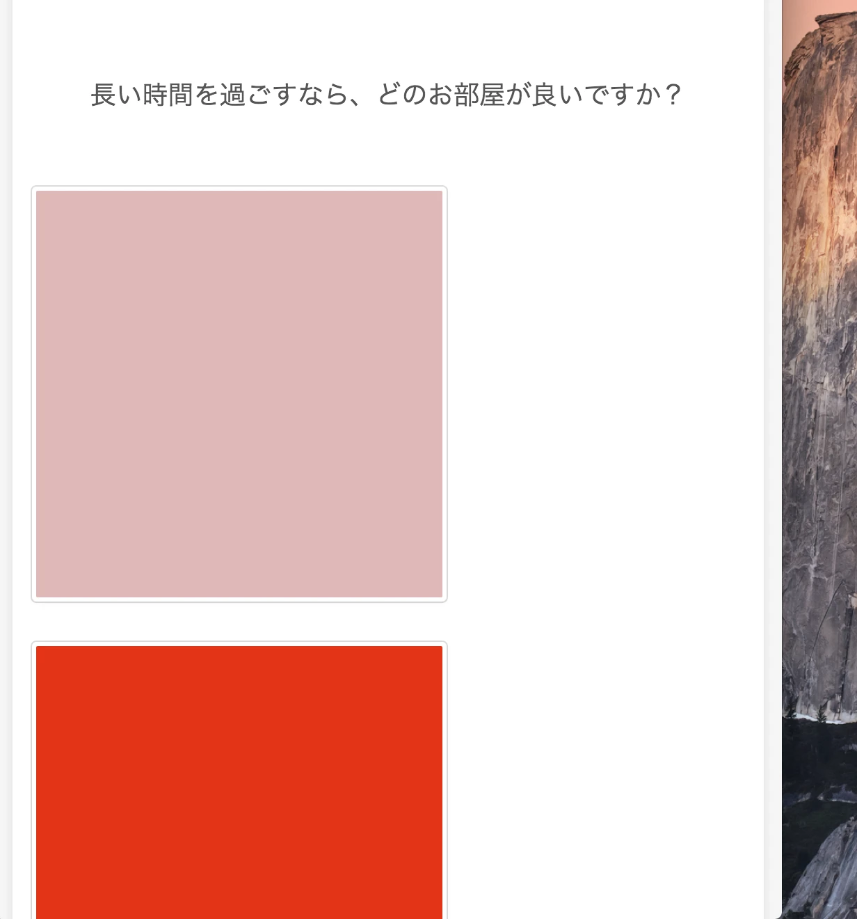
It was pretty much the same before I added this widget. Am I doing something wrong..?
-
Nik_CReplied on September 2, 2016 at 5:40 AM
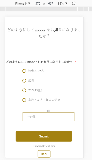
I cloned your form and checked it, but I wasn't able to find a mobile responsive widget in it. When I added and tested it was responsive as you can see below:

Could you please try to add it and test again?

Do get back to us if the issue persists.
Thank you!
-
miohondaReplied on September 5, 2016 at 2:42 AM
Sorry, I divided the form in two and was working on the other one.
Can you take a look at this form? I think you will see what I meant.
https://form.jotform.me/62449047771462
Thanks.
-
beril JotForm UI DeveloperReplied on September 5, 2016 at 4:12 AM
I've checked your form on my mobile phone. Unfortunately, I am not able to reproduce the same issue that you’re having.
It works fine on my side. Did you embed your form to your website? If it is yes, could you please indicate the URL of your page? This will help us better analyze the problem. We will wait for your response.
-
miohondaReplied on September 5, 2016 at 11:09 PM
Thats because it becomes responsive when the browser size is reduced dramatically - in this case mobile size. But until then, it is not responsive so the form will be cut off when I shrink my browser.
Please take a look at the images on my previous post at September 02, 2016 at 04:19 AM.
-
Elton Support Team LeadReplied on September 6, 2016 at 1:05 AM
Shrinking your browser manually will cut off the widgets frame height, that's because the widget frame height is calculated during the loading of the page. This is how framed widgets work.
Example, this is what I see here when I load the form on mobile. All the images appear just fine, but not when I resize the browser manually.
The last page appears to be just fine as well.
----
If you want all the image picker widgets width to be mobile responsive, inject this CSS codes to your form.
iframe[src*="image"] {
width: 100% !important;
}
With regards to the height of the image pickers widget, like I've told you, they are only calculated automatically as soon as you reload the browser. However, with the power of CSS, they can be altered.
You can use the following.
@media screen and (max-width:1170px){
iframe[src*="image"] {height: 978px !important;}
}
@media screen and (max-width:820px){
iframe[src*="image"] {height: 1975px !important;}
}
Note that these CSS codes affects all the image pickers widget and it's good for 6 image options. So if you have more than 6 image options in your image picker widget, you have to increase the height value until you get the desired result.
Hope this helps!
- Templates
- Integrations
- INTEGRATIONS
- See 100+ integrations
- FEATURED INTEGRATIONS
 PayPal
- Slack
- Google Sheets
- Mailchimp
- Zoom
- Dropbox
- Google Calendar
- Hubspot
- Salesforce
- See more Integrations
- Products
- PRODUCTS
- Form Builder
- Jotform Enterprise
- Jotform Apps
- Store Builder
- Jotform Tables
- Jotform Inbox
- Jotform Mobile App
- Jotform Approvals
- Report Builder
- Smart PDF Forms
- PDF Editor
- Jotform Sign
- Jotform for Salesforce Discover Now
- Support


