


-
tshaverAsked on September 2, 2016 at 12:46 PM
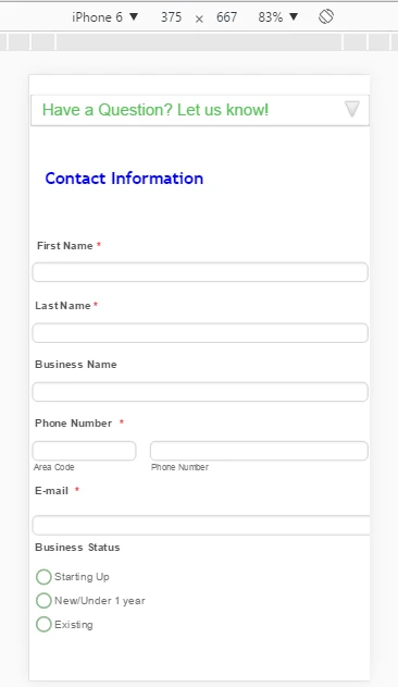
Hi I have changed the design of my form and i am happy with how it looks on a desktop - but not happy with its mobile version. I have tried the mobile responsive widget, and checking the "Mobile Responsiveness" button in design mode.
I like how my form has the labels justified right, and the fields next to them on the desktop, but when on mobile it looks like below. I have tried changing the size of the labels, and the width of the form and no change. Is there anything im missing?
https://form.jotform.com/62454525777970
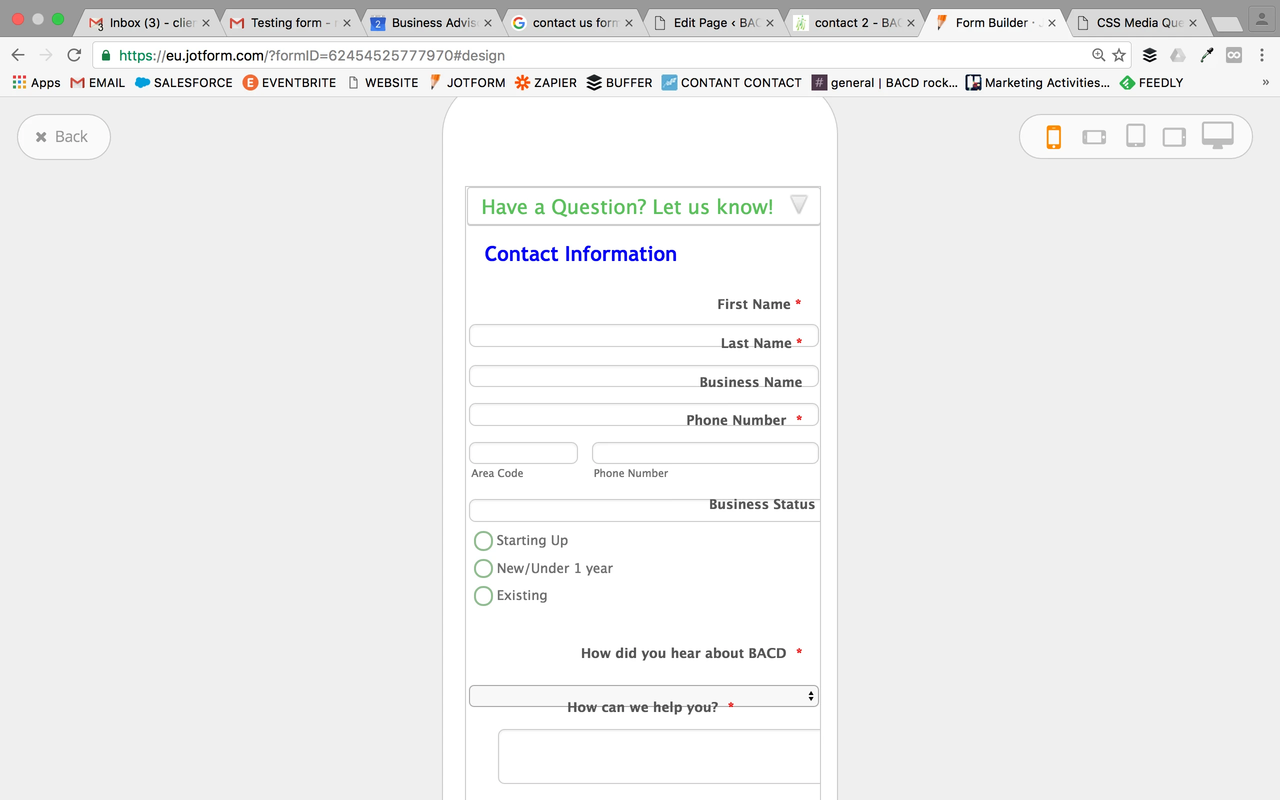 Page URL: https://form.jotform.com/62454525777970
 -
David JotForm Support ManagerReplied on September 2, 2016 at 2:34 PM
Please try injecting the following CSS code: https://www.jotform.com/help/117-How-to-Inject-Custom-CSS-Codes
@media only screen and (max-width: 480px) {
.form-label{
text-align: left !important;
}
.form-line {
margin-top: 30px !important;
}
#label_24{
margin-top: 30px !important;
}
}
Result: https://form.jotform.com/62455209635963
Let us know if you need more help.
-
tshaverReplied on September 2, 2016 at 2:51 PM
IS there way to add this same code to make it so it works on a horizontal view on a mobile? this works for vertical. thanks so much!
-
Mike_G JotForm SupportReplied on September 2, 2016 at 7:10 PM
Please try adding the CSS codes below to your form:
@media only screen and (max-width: 667px) {
.form-section-closed {
height: 36px !important;
}
.form-line{
width: 100% !important;
}
.form-label{
width:25% !important;
}
.form-input.jf-required {
width: 75% !important;
}
#input_6_area, #input_6_phone {
width: 100% !important;
}
.form-textbox, #input_14{
width: 85% !important;
max-width: none !important;
}
#label_49{
padding-right: 15px !important;
}
.form-sub-label-container{
width:42% !important;
}
#cid_24 {
text-align: left !important;
}
#input_24 {
width: 88% !important;
}
#cid_2 div.form-buttons-wrapper {
width: 100% !important;
}
.form-submit-button{
width:50%
}
}
I hope this helps. Please feel free to get back to us if you need any further assistance. Thank you.
-
tshaverReplied on September 6, 2016 at 9:51 AM
It helped for the tablet sideways but not the phone sideways.
Another question - when I embed on my website - the jotform is always in the centre of the page. Is there a way from the jotform coding end so that it will appear on the left side instead of centre - or would i have to do the coding on my side via wordpress? i'd like it to be right under the email line on the left side.
image of what I mean:

-
Nik_CReplied on September 6, 2016 at 11:09 AM
Regarding the alignment, could you please try Injecting this Custom CSS in your form:
.form-all
{
float:left !important;
}
Is this rotating issue ongoing on a form or in your website? If it is the website, can you provide your URL please so we can investigate further.
Thank you!
-
tshaverReplied on September 6, 2016 at 11:26 AM
Thank you for the coding, however when I added it, I face a problem. When I re-embedded to our website, the form is aligned to the left, however when I click the collapse button (in order to see more of the form), the form doesn't open all the way .. like it cuts off (see images: 1st is when Its not expanded, 2nd is when expanded). This wasn't happening before the previous code. Is there code I should be looking for in design that is causing this issue? As afar as sharing the website page - it is not currently published - so i don't see how to share
Form: https://form.jotform.com/62454525777970
Image1

Image 2

How my jotform preview suggests it should look:

-
Nik_CReplied on September 6, 2016 at 11:51 AM
I understand, thank you for more information provided. Is it possible we can have your website's URL so we can investigate this further. I checked the form and I see the same, form is showing normally?
Since I'm not able to test when it is embedded.
Thank you!
-
tshaverReplied on September 6, 2016 at 11:57 AM
-
David JotForm Support ManagerReplied on September 6, 2016 at 12:26 PM
It looks like the problem is related to the dimensions set in the frame of your site where you have embedded the form.
Remove the embedded code, and try embedding your form again with the Iframe code instead:
https://www.jotform.com/help/148-Getting-the-form-iFrame-code
Let us know if you need more help.
-
tshaverReplied on September 6, 2016 at 12:34 PM
do i add any coding so it still aligns left? I tried the iFrame route before and it was still centred. What code should I be looking for? thanks!
-
David JotForm Support ManagerReplied on September 6, 2016 at 12:36 PM
If you already entered the code my colleague previously provided you, the form will still be aligned to the left. Please try the Iframe method, and update us if it makes any difference, we will be glad to assist you.
-
tshaverReplied on September 6, 2016 at 12:45 PM
Sorry - it wasn't clear if you wanted me to take it out and just embed without the new code.
And i did this method and there was no change.
any other options?
-
David JotForm Support ManagerReplied on September 6, 2016 at 12:48 PM
I apologize, these are the steps:
1) Remove your form, meaning that you need to remove any embedded code related to your form from your site.
2) Get a new code, which would be the Iframe code: https://www.jotform.com/help/148-Getting-the-form-iFrame-code
3) Embed the Iframe code in your page.
-
tshaverReplied on September 6, 2016 at 2:19 PM
Did not fix the issue. It is still doing the same problem. Another thing I noticed, it kind of lags a bit - in that I click the collapse button and instead of just opening up the below contents smoothly, it kind if does a jump/jerk so that the fillable fields are on the middle of the screen. Could this be because of the coding from improving the mobile responsiveness? I will make the form live again on this page - but I really just need it to be justified left and the form is collapsable and useable.
thanks.
http://bacd.ca/contact
-
David JotForm Support ManagerReplied on September 6, 2016 at 2:58 PM
I see you re-embedded your form using the Iframe code, and it display all. I have injected the following CSS code to make it to the left:
.form-all{
margin-left: 0px !important;
}
See the result:

Let us know if you need more help, we will be glad to assist you.
-
tshaverReplied on September 6, 2016 at 3:03 PM
Thank you. Is there a way to fix when you click the collapse button- so that it smoothly expands? and does not just like it does on my website, and in your above example?
And to remove all the extra space above the form? its empty on my wordpress and i thought I had decreased the padding.
-
Nik_CReplied on September 6, 2016 at 4:56 PM
Regarding the collapsing of collapse field, I'm not sure you can adjust smoothness of collapsing, but please try this CSS if it works for you:
#collapse_58 {
-o-transition: all 2s;
-moz-transition: all 2s;
-webkit-transition: all 2s;
transition: all 2;
}
And regarding the adjustment of padding of the form, please try this:
.jotform-form {padding:0px!important;}Let us know how that worked for you and if you have any additional questions.Thank you! -
tshaverReplied on September 7, 2016 at 9:08 AM
Its almost as if it is coded to jump to "First Name" once its un-collapsed. How can I see if this is the case?
-
Welvin Support Team LeadReplied on September 7, 2016 at 10:51 AM
I think this is because of the static header on your website. The form displays the collapse at the top but your header overlaps this. Can you try using our iframe embed codes?
https://www.jotform.com/help/148-Getting-the-Form-iFrame-Code
Make sure to keep the scripts in the iframe codes. Get back to us after so we can inspect and try to manipulate the script to adjust the top margin when the collapse is open.
-
tshaverReplied on September 7, 2016 at 2:34 PM
I re-embedded with iFrame. It is even worse now - the jump is like a strong twitch; it no longer un-collapses smoothly.
If you could kindly investigate in so that the coding makes a smooth cascade, simply expands the form but does not allow a jump, and if the collapse button could be closer to the phone number/email section above. (i understand if only some of those things can happen on your end - ie not all may be possible).
Thank you!
page: http://bacd.ca/contact/
-
Welvin Support Team LeadReplied on September 7, 2016 at 3:50 PM
Yes, the animation is not working in the iframe. I tried fixing it to no avail. You can bring back the default embed codes now.
Try injecting the following custom CSS codes after:
#section_58 {
margin-top: 50px;
}
.form-section-closed {
margin-top: 0 !important;
}
I hope this method is acceptable for you.
- Templates
- Integrations
- INTEGRATIONS
- See 100+ integrations
- FEATURED INTEGRATIONS
 PayPal
- Slack
- Google Sheets
- Mailchimp
- Zoom
- Dropbox
- Google Calendar
- Hubspot
- Salesforce
- See more Integrations
- Products
- PRODUCTS
- Form Builder
- Jotform Enterprise
- Jotform Apps
- Store Builder
- Jotform Tables
- Jotform Inbox
- Jotform Mobile App
- Jotform Approvals
- Report Builder
- Smart PDF Forms
- PDF Editor
- Jotform Sign
- Jotform for Salesforce Discover Now
- Support


