


-
MarkAsked on September 6, 2016 at 12:26 PM
The form looks ok when viewed in simulator/previewer but when tested on iphone 6 the form is sitting to the right.
Direct link to form: https://form.jotformeu.com/62492902063353
Screenshots from iphone 6:


-
CharlieReplied on September 6, 2016 at 12:39 PM
Hi,
Could you please try enabling the option "Make this form responsive" in your Form Designer Tool? It is mentioned in this guide: https://www.jotform.com/help/322-How-to-make-mobile-friendly-forms-on-JotForm.
After that, if it still does not work, try adding the mobile responsive widget in your form.
Let us know if that works.
-
Kevin Support Team LeadReplied on September 6, 2016 at 1:45 PM
I have checked the web page where your form is embedded on and I can see it is displaying fine on my end, I have tested with an iPhone 6 emulator, with the developer tools in Google Chrome and with a real Android device running Android 5, here is what I can see in all my tests:
.jpg)

What I would suggest you is to inject some CSS code to your form, as you report that only some fields are not responsive.
This CSS code will help you to reduce the fields width:
@media only screen and (max-width:375px){
#fieldID{
width: 90%;
}
}
Replace the "fieldID" with the field ID that does not display responsively, this guide will help you to get it: How-to-find-field-IDs-and-names
This guide will help you to inject the code to your form: How-to-Inject-Custom-CSS-Codes
Hope this helps.
-
Mark KeaneReplied on September 19, 2016 at 11:58 AM
I've made a few updates to my form since I posted this issue with the form, I'm still having the issue with this form after updates. I have two forms embedded on my the same page on my website and this form is the only one that is not fitting to mobile phone screens. The other form responds to mobile screens perfectly. I tested this on iPhone 4, 5 and 6 and the same issue is in all devices. Both forms have the same form width, make form mobile responsive is checked and mobile responsive widget is add to them. I want both forms to fit on mobile screens. Both form look fine in the emulator but when tested on actual devices it does not fit.
Direct link to form that DOES NOT fit mobile screens:
https://form.jotformeu.com/62522384130346
Direct link to form that DOES fit mobile screens:
https://form.jotformeu.com/62513328708355
-
David JotForm Support ManagerReplied on September 19, 2016 at 1:55 PM
I checked your form, and it appears to fit on mobile devices just fine:

Have you tried clearing your browsers cache? Also, if the form fits well through the direct link: https://form.jotformeu.com/62522384130346, but does not fit well on the embedded page, please share the URL of the page where you have embedded it, so we can test further.
-
markkeaneReplied on September 20, 2016 at 3:17 AM
I have two forms on our online booking page of our website, the booking form and enquiry form when you access the the page via mobile device. The booking form seems to be the issue when embedded.
Here is the direct link to the page where the forms are embedded using iframe.
http://smt.ie/online-bookings/
-
Chriistian Jotform SupportReplied on September 20, 2016 at 4:51 AM
Can you please try embedding the Bookings form to your page using the iFrame code but without the <script></script> part?
Like in the example below, only use the yellow highlighted part of the iFrame code.
<iframe id="JotFormIFrame-62522384130346" onDISABLEDload="window.parent.scrollTo(0,0)" allowtransparency="true" src="https://form.jotform.com/62522384130346" frameborder="0" style="width:100%; height:539px; border:none;" scrolling="no"> </iframe> <script type="text/javascript"> window.handleIFrameMessage = function(e) { var args = e.data.split(":"); var iframe = false; if (args.length > 2) { iframe = document.getElementById("JotFormIFrame-" + args[2]); } else { iframe = document.getElementById("JotFormIFrame"); } if (!iframe) return; switch (args[0]) { case "scrollIntoView": iframe.scrollIntoView(); break; case "setHeight": iframe.style.height = args[1] + "px"; break; case "collapseErrorPage": if (iframe.clientHeight > window.innerHeight) { iframe.style.height = window.innerHeight + "px"; } break; case "reloadPage": window.location.reload(); break; } var isJotForm = (e.origin.indexOf("jotform") > -1) ? true : false; if(isJotForm && "contentWindow" in iframe && "postMessage" in iframe.contentWindow) { var urls = {"docurl":encodeURIComponent(document.URL),"referrer":encodeURIComponent(document.referrer)}; iframe.contentWindow.postMessage(JSON.stringify({"type":"urls","value":urls}), "*"); } }; if (window.addEventListener) { window.addEventListener("message", handleIFrameMessage, false); } else if (window.attachEvent) { window.attachEvent("onmessage", handleIFrameMessage); } if(window.location.href && window.location.href.indexOf("?") > -1) { var ifr = false; if (args.length > 2) { ifr = document.getElementById("JotFormIFrame-" + args[2]); } else { ifr = document.getElementById("JotFormIFrame"); } var get = window.location.href.substr(window.location.href.indexOf("?") + 1); if(ifr && get.length > 0) { var src = ifr.src; src = src.indexOf("?") > -1 ? src + "&" + get : src + "?" + get; ifr.src = src; } } </script>
If the issue still persists, please let us know.
Regards. -
markkeaneReplied on September 20, 2016 at 5:21 AM
Hi I added the above iframe code for the booking form to the page and the issue is still persisting.
-
Chriistian Jotform SupportReplied on September 20, 2016 at 8:30 AM
Hi,
Can you please change the 539px height to 1979px?
<iframe id="JotFormIFrame-62522384130346" onDISABLEDload="window.parent.scrollTo(0,0)" allowtransparency="true" src="https://form.jotform.com/62522384130346" frameborder="0" style="width:100%; height:1979px; border:none;" scrolling="no"> </iframe>
Do let us know how it goes.
Regards.
-
markkeaneReplied on September 21, 2016 at 7:57 AM
Ok I changed the height as requested and all that did was add more space to the end of the form. I've reverted back to all the iframe code now. I'm still having this issue on with mobile devices in portrait view only, landscape is not an issue.
Is there some bit of code that can resolve this?
-
Chriistian Jotform SupportReplied on September 21, 2016 at 9:19 AM
Hi there,
I have viewed your website in iPhone 6 and the form seems to be responsive. Please see below GIF.
Can you please share with us the screenshot in your device? If you need widths of specific controls to be change, do let us know.
Regards.
-
markkeaneReplied on September 21, 2016 at 10:35 AM
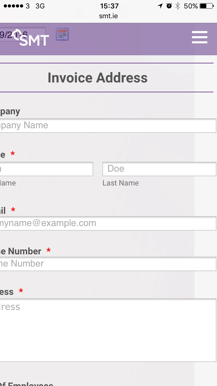
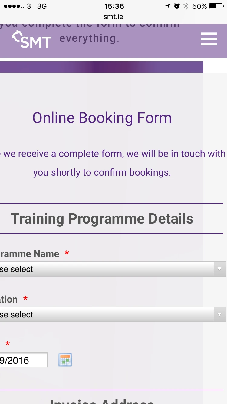
Ok so from the GIF above you can see the exact issue I'm having. The form isn't fitting on the screen for example if you look at the text under the heading "Online Bookings Form" at the top of the form the text is meant to read "Once we receive a complete form, we will be in touch with you shortly to confirm bookings." The word "Touch" is been cut off and the word "with" is not in the screen. When your on the webpage with the forms http://smt.ie/online-bookings/ you can pan to the left and you will see the all the text and all the fields are overflowing off the page.
The form is not as responsive as my enquiry form on the same page, so there must be an issue with the form itself.
I need to get this sorted asap as I have a lot of time spent on resolving this already.
-
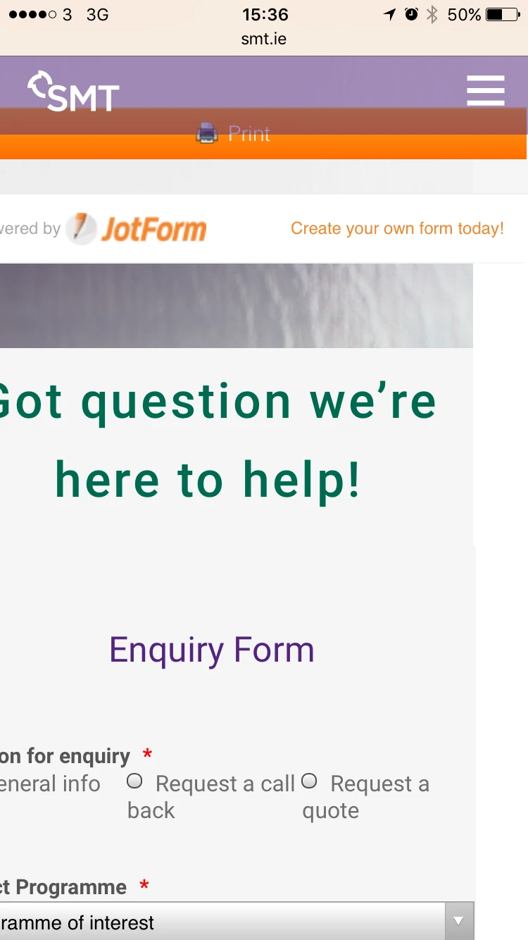
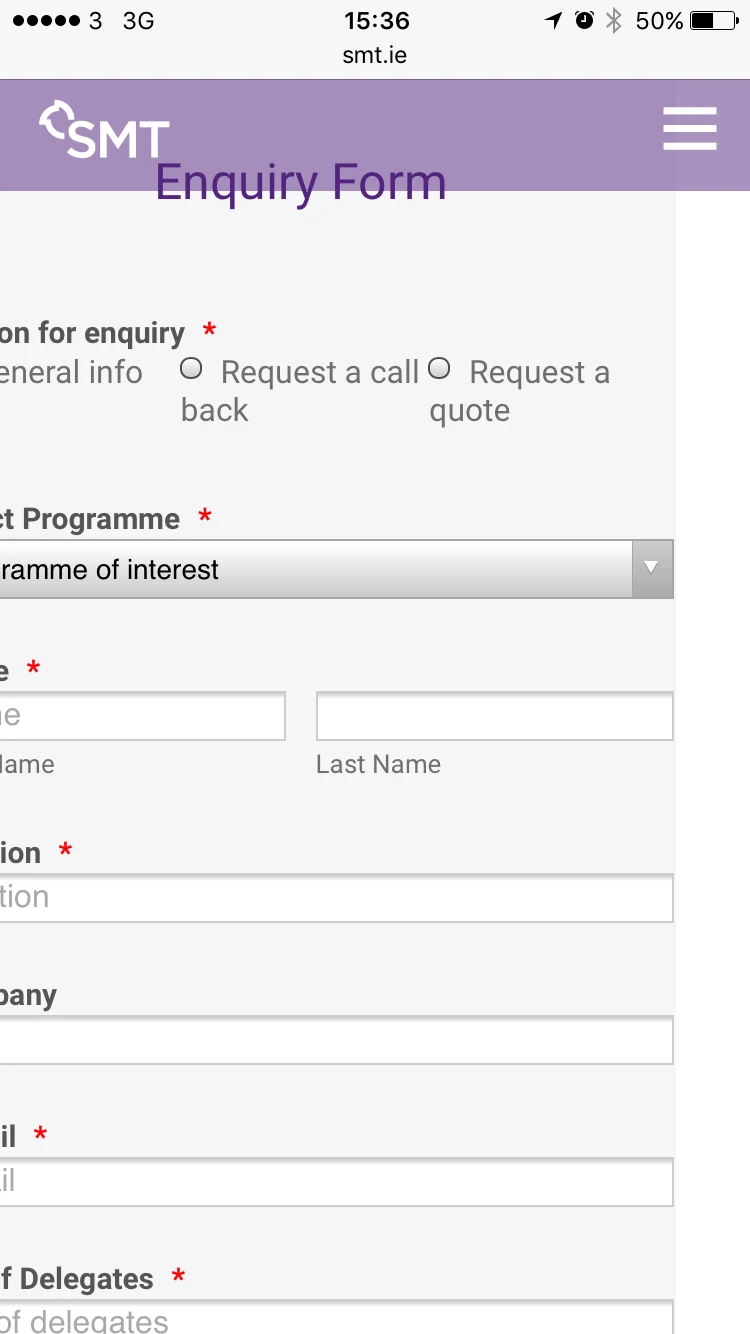
markkeaneReplied on September 21, 2016 at 10:48 AM
Please see screenshots from my iphone 6. As you can see the enquiry form isnt an issue its the booking form.
-
Chriistian Jotform SupportReplied on September 21, 2016 at 12:23 PM
I checked again your form and I was able to see what you are reporting. It seems that the width of the iFrame of the form exceeds the width of the screen which causes the text to be cut off.

When checking the direct link of the form (http://www.jotformeu.com/form/62522384130346) the text seems to be displayed properly.

I am further investigating the issue. Please give me sometime to further investigate the issue. Will get back to you as soon as I have found a solution to the issue. Regards.
-
Chriistian Jotform SupportReplied on September 21, 2016 at 12:37 PM
Can you try to inject this custom CSS code in your Booking Form and see if this will fix the issue?
@media (max-width:375px){
.jotform-form{
max-width:375px !important;
}
}
To inject custom CSS code in your form, just check the instructions provided in this article: How to Inject Custom CSS Codes.
-
markkeaneReplied on September 21, 2016 at 12:39 PM
No problem I'll do this right now and I'll let you know if it works.
-
markkeaneReplied on September 21, 2016 at 12:43 PM
No it didn't resolve the issue. I cleared the history and website data on iPhone as well.
-
David JotForm Support ManagerReplied on September 21, 2016 at 2:20 PM
I have added the following code to your booking form:
@media only screen and (max-width: 480px) {
.form-all{
width: 85% !important;
margin-left: 10px !important;
}
}
And tested it in a real iPhone 6 device, this is how it looks now:

Please check it in your end, and let us know how it shows now, we will be glad to assist you.
-
markkeaneReplied on September 23, 2016 at 12:35 PM
This worked as it fits just fine now, I still have space extra space to the right side of the screen and the user can pan over when on a mobile is there anyway this can be removed so it does allow the user to pan. I only happens on this page with the forms.
Thanks for the support to date.
-
CharlieReplied on September 23, 2016 at 1:59 PM
Unfortunately, I believe the problem is because you have two forms embedded on the same website page.
Your two iFrame embed code have their own <script> code, I presume you are already familiar with it. Those script code makes the form mobile responsive on a web page. However, the problem is that the same script code is pasted on the same web page. The two script codes are conflicting one another, which results to your form having different widths, the other is fitting, while the other exceeds.
Now this should easily be fixed by simply removing one of the duplicate <script> code, meaning leave one of the script codes intact, I suggest removing the one in the booking form. After that, you should only have one <script> code for the same page, the one in the inquiry form.
What should happen now is that the <script> code for the inquiry should handle both the responsiveness of the two forms. Although even this I could not guarantee a full responsiveness, it is recommended to have the forms on their own separate pages.
Here are my recommendations:
Option 1: Use the iFrame embed code but remove one of the duplicate script codes, leave only one. Try removing the CSS code shared by my colleagues when testing to avoid conflicting results.
Option 2: I see your website is powered by Wordpress.org, is that correct? Have you tried using the following plugins:
https://wordpress.org/plugins/embed-form/
https://wordpress.org/plugins/jotform-oembed/
Try testing the plugins one at a time to avoid conflicting results. See if they give a more promising result.
Let us know if any of the suggestions above helped.
- Templates
- Integrations
- INTEGRATIONS
- See 100+ integrations
- FEATURED INTEGRATIONS
 PayPal
- Slack
- Google Sheets
- Mailchimp
- Zoom
- Dropbox
- Google Calendar
- Hubspot
- Salesforce
- See more Integrations
- Products
- PRODUCTS
- Form Builder
- Jotform Enterprise
- Jotform Apps
- Store Builder
- Jotform Tables
- Jotform Inbox
- Jotform Mobile App
- Jotform Approvals
- Report Builder
- Smart PDF Forms
- PDF Editor
- Jotform Sign
- Jotform for Salesforce Discover Now
- Support


