


-
jonsan32Asked on September 6, 2016 at 2:32 PM
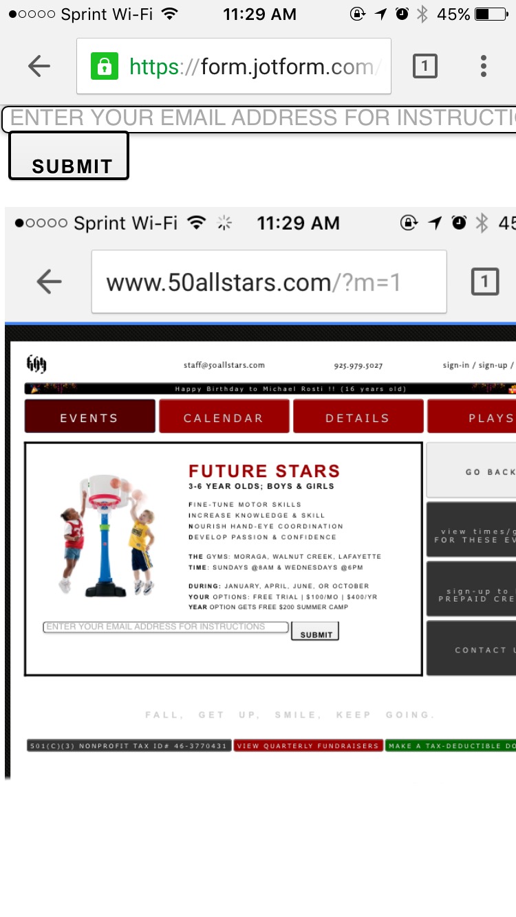
The submit button shows perfect on desktop, but looks funky on mobile. The challenge I'm having is trying to fit the entire form within a specific parameter with a bunch of css that is obviously taking its toll.
form is here: https://form.jotform.com/62146752205956
The page is here: http://www.50allstars.com/ (EVENTS > FUTURE STARS)
Any help would be great. Thx!
 Page URL: http://www.50allstars.com/
 -
JanReplied on September 6, 2016 at 3:17 PM
You are right, the submit button is showing properly in desktop. Please try to re-embed the form using the iFrame method. Here's a guide: Getting-the-form-iFrame-code
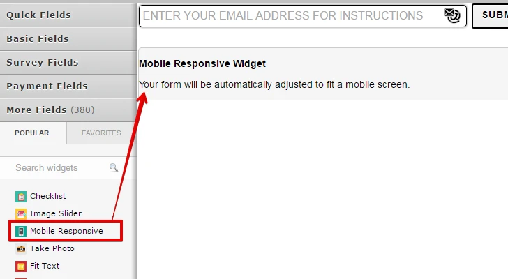
You may also want to insert the Mobile Responsive widget to your form.
Please enable the "Make this form responsive" in the Form Designer.
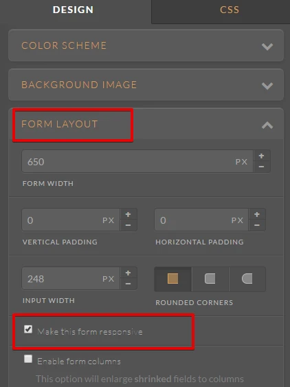
Related guide: How-to-make-forms-mobile-responsive
Hope that works. If not, let us know. Thank you.
-
jonsan32Replied on September 6, 2016 at 3:30 PM
Made complete sense. Did all 3, but none of those suggestions worked to fix the submit box. Would adjusting my padding with an !important tag work. I have no clue. Appreciate the assistance, though!
-
JanReplied on September 6, 2016 at 4:54 PM
Please try inserting this CSS code into the form:
@media screen and (max-width: 480px), screen and (max-device-width: 768px) and (orientation: portrait), screen and (max-device-width: 415px) and (orientation: landscape) {
.form-submit-button {
padding : 0px 0px !important;
margin : 0px 0px !important;
padding-bottom : 0px !important;
margin-right : 0px !important;
}}
Here's a guide on how to inject custom CSS to the form.
You can add this (margin-top: 13px !important;) inside the form-submit button if you want to have a space above the button.
Hope that helps. Thank you.
-
jonsan32Replied on September 6, 2016 at 6:29 PM
Awesome! That worked. Thx
-
jonathanReplied on September 6, 2016 at 10:04 PM
Thank you for the confirmation that it worked.
Contact us anytime should you require assistance again.
Cheers
- Templates
- Integrations
- INTEGRATIONS
- See 100+ integrations
- FEATURED INTEGRATIONS
 PayPal
- Slack
- Google Sheets
- Mailchimp
- Zoom
- Dropbox
- Google Calendar
- Hubspot
- Salesforce
- See more Integrations
- Products
- PRODUCTS
- Form Builder
- Jotform Enterprise
- Jotform Apps
- Store Builder
- Jotform Tables
- Jotform Inbox
- Jotform Mobile App
- Jotform Approvals
- Report Builder
- Smart PDF Forms
- PDF Editor
- Jotform Sign
- Jotform for Salesforce Discover Now
- Support


