


-
m7ickeyAsked on September 8, 2016 at 11:02 AM
Hi,
I screwed up a form trying to resize it for my website, i added padding, length, reduced height, changed margins and on & on. I was trying to compress the form's height and lengthen it as well. When I opened my webpage, the form took up to much space top to bottom with plenty of space on the left & right. I had some success in making it fit more to my liking BUT when I hit the preview button, the forms appearance on a mobile phone is now screwed up and I've tried a ton of adjustments with no success. If you need me to clone the form and send it to you so you can help, just tell me how. I hate asking for help and was hoping to solve it myself but I have given up. Its close. Here's some screenshots:
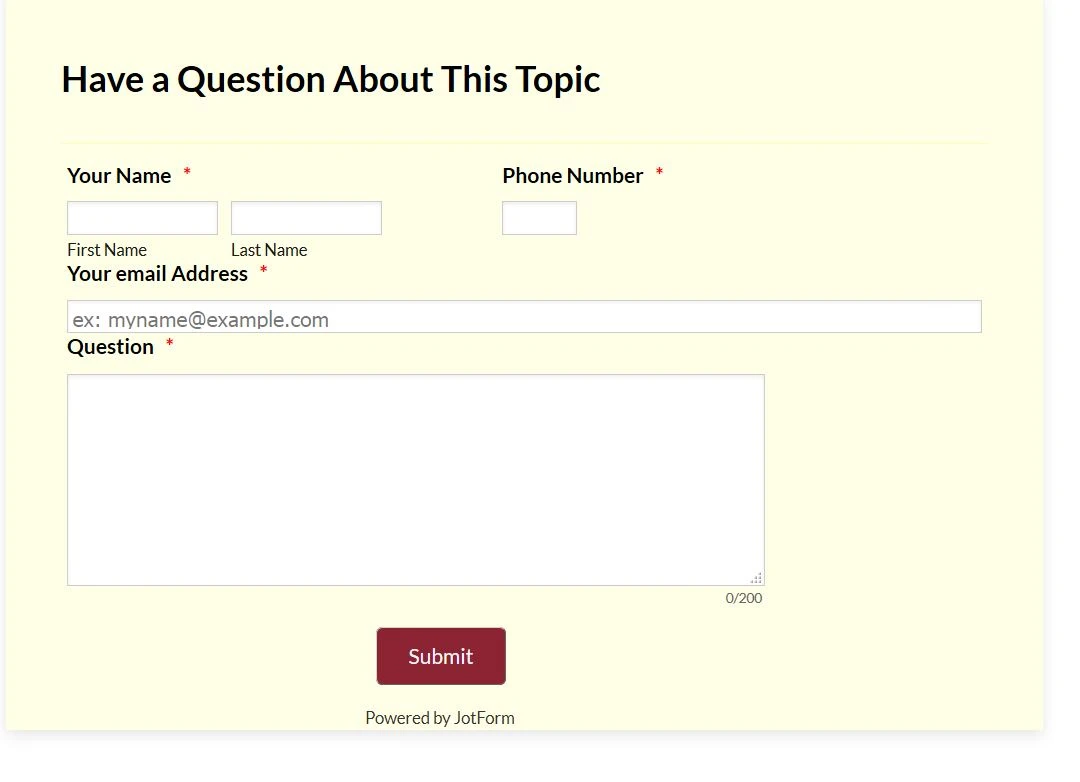
Here it is on the website, as you can see it could be much longer and possibly shorter to fill the area better plus do to my adjustments the submit button is partially outside the frame.

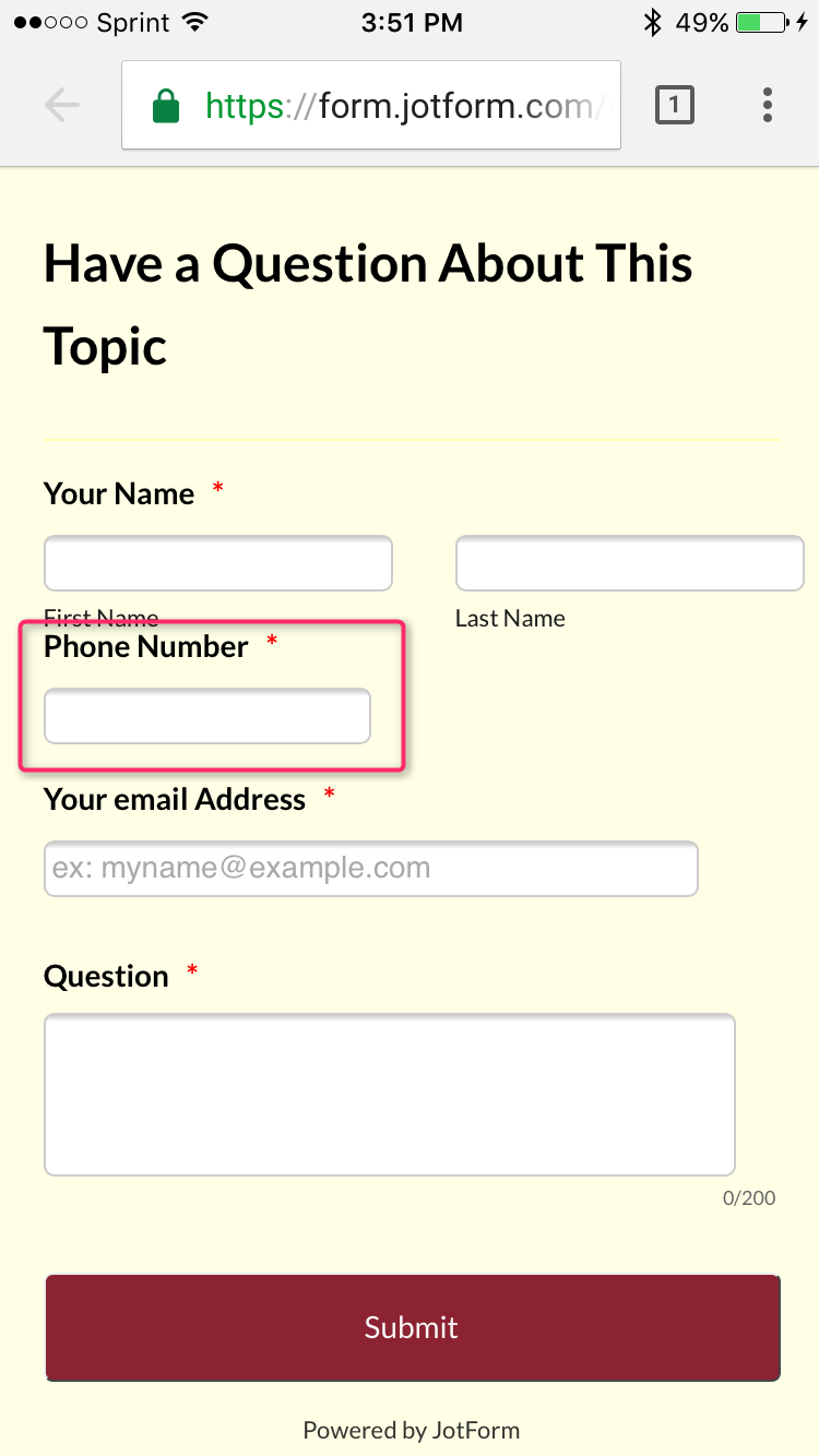
Here's the mobile phone preview problem: Notice the "phone" box gets shortened and the Header chopped off (I did have it wrapping but when it was like that, it overlapped the "name" field.)

I hope someone can help, I clearly need some coding help and quite possibly need to kill the coding I did. Our new website is ready to launch once I fix my forms problems. Thanks
-
Support_Management Jotform SupportReplied on September 8, 2016 at 12:59 PM
Sure, we can help you with the CSS codes you need to make adjustments. But the first problem I encountered while reading your post was there was no clear instruction on what exactly you wanted to happen.
As I was reading, these are the only things I found to be clear:
1. Your SUBMIT button is outside the form
2. The PHONE NUMBER field's width is too short on mobile view
3. The HEADER gets cut off
And here are the things we're not sure of due to the lack of further details:
a. What's the page/website URL where your form was embedded?
b. What's the make and model of the phone you're testing it with and which browser did you use?
c. What do you mean by "compress the form's height and lengthen it as well"? Are you trying to make the form's height as short as possible and make the width larger?
d. And for this one too, "it could be much longer and possibly shorter to fill the area better" I'm not sure what you're trying to achieve since you said you want it to be much longer and possibly shorter.
I managed to fix #1 to #3 above by modifying your injected CSS codes. Here's a cloned copy of your form https://form.jotform.com/62514866731965 Try opening that link on your phone and see if that works as intended.
If you wish to clone my test form, here's how.
Hoping to hear from you soon with more info so we can better assist you.
-
m7ickeyReplied on September 8, 2016 at 2:03 PM
Hi,
Answers
a. Here: http://www.fmgwebsites.com/5d976a0f-a2de-46a1-a5f3-d55214ec990f/p/tax-resources
b. I did not look on my actual phone, when I went into "Design" there is a preview button that shows you how the form will look on different devices, I'm on Firefox:

c. Yes, if you follow the above link & look at the page you will see the form. The yellow area is sized better now but I need to get all the info inside that area & have it re-format properly when viewed on a phone. Again, my messing around screwed that up. I started a test form and sure enough, the mobile view is fine but when I try to change sizes of fields it screws up the mobile view.
d. Think I addressed this
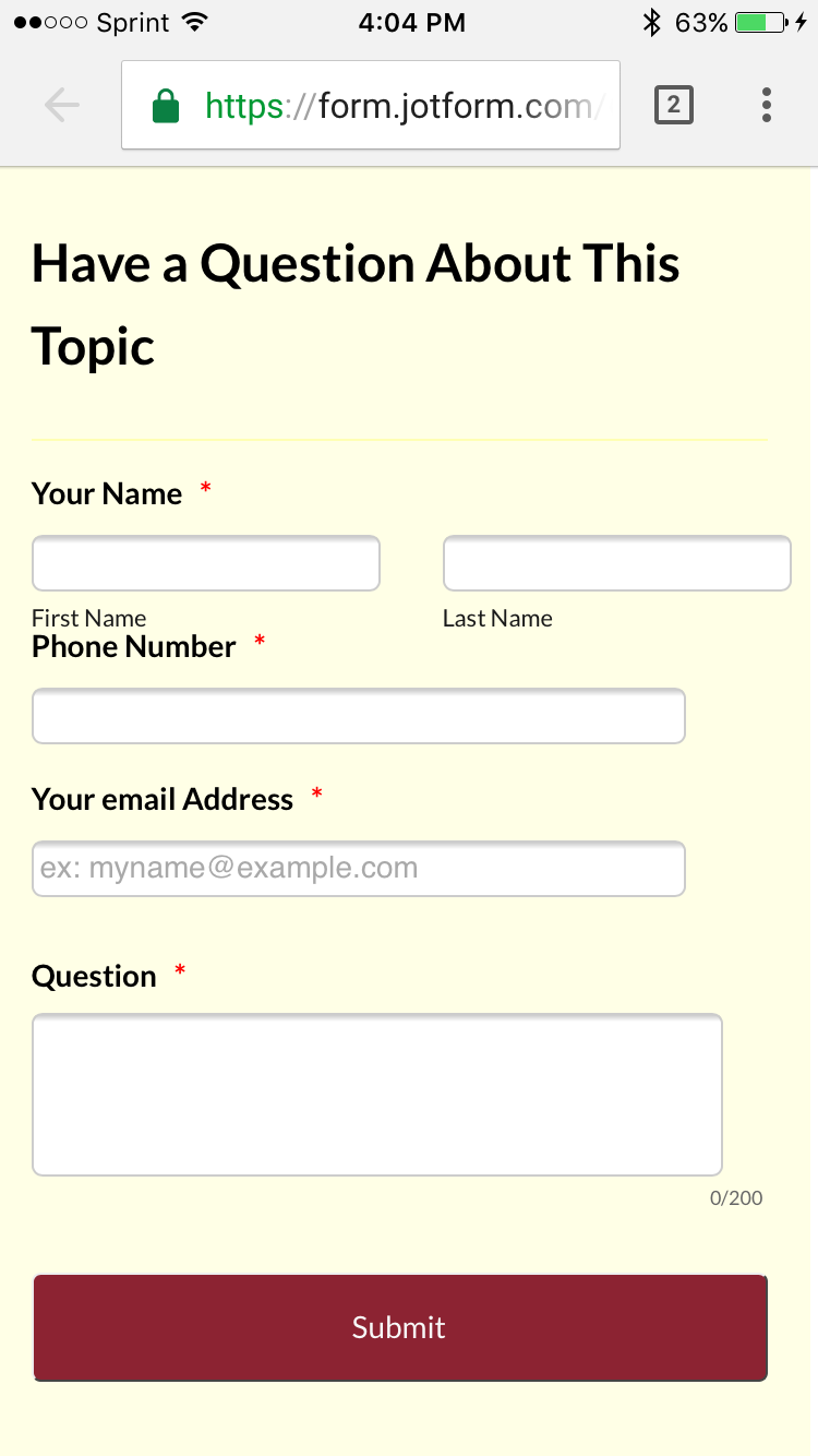
I cloned your form and its much better but still needs some tweaks. Again, in mobile view for some reason I'm losing part of the phone text box and the space between first and last names increases so last name text box goes of the screen. Lastly, I'd like to make it vertically shorter in normal view by decreasing the space between the top of the form and the header and between the header and the "your name" field. I accomplished this but when I did it screwed up the mobile view so if my choice is between good mobile view and vertically shorter, I'll choose good mobile view. Thank YOU!!! Here's a screenshot of your cloned form in mobile view.

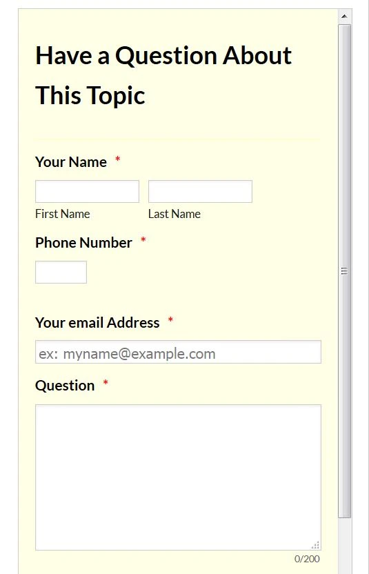
Here it is in laptop view showing where I would like to "compress" things to make it vertically shorter:

Lastly, the test form I created has different problems and all I did was resize the name boxes but the phone problem doesn't exist so if you'd rather start with that form for tweaking tell me how to send it to you.
-
m7ickeyReplied on September 8, 2016 at 2:14 PM
One more thing, The phone text box is a problem across all my forms in mobile view and the one thing I did to all of them was made the first and last name text boxes and email box longer which they need to be. So if you do figure out why this screws up mobile view please let me know so I can fix the other forms as well. Thanks
-
KadeJMReplied on September 8, 2016 at 3:55 PM
Okay, I think I see what you mean for the phone field.
You're referring to it being smaller.
That's due to how the phone field is now so it's reflecting the same size on mobile.
Were you wanting that to fit the size of the mobile screen better?
-
KadeJMReplied on September 8, 2016 at 4:14 PM
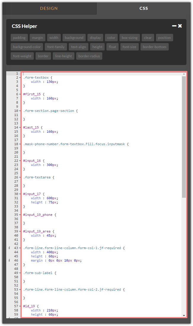
For the Phone Number field you can adjust the size of it on mobile with something like this that already exists in the example that Jim provided you I've modified it to control portrait and landscape so that it works better depending on whichever way you are using your phone:
/* Portrait */
@media only screen
and (min-device-width: 375px)
and (max-device-width: 667px)
and (-webkit-min-device-pixel-ratio: 2)
and (orientation: portrait) {#input_19_full {
width: 300px !Important;
}
/* Landscape */
@media only screen
and (min-device-width: 375px)
and (max-device-width: 667px)
and (-webkit-min-device-pixel-ratio: 2)
and (orientation: landscape) {
#input_19_full {
width: 150px !Important;
}
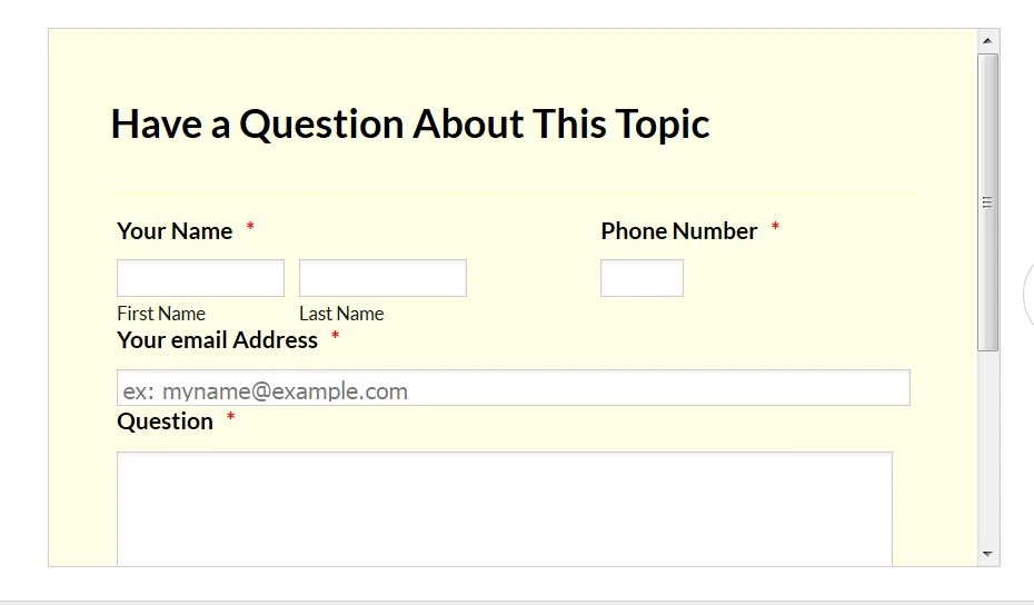
And that would produce this type of result for portrait and landscape:
-
m7ickeyReplied on September 8, 2016 at 5:01 PM
Ok, almost there. I would love if my mobile screen looked like the above screen but your code is off just a little bit. Plus, I only need the "phone" field to be big enough for a phone number. Mine is too short, yours is too long. Anyway, anything is better than mine. So your code missed the adjustment somehow and changed the email field, not the phone field. First 2 are phone views, last one is laptop view
-
MikeReplied on September 8, 2016 at 8:32 PM
There are conflicts caused by your custom CSS injections.
I would like to suggest starting from removing custom CSS styles.
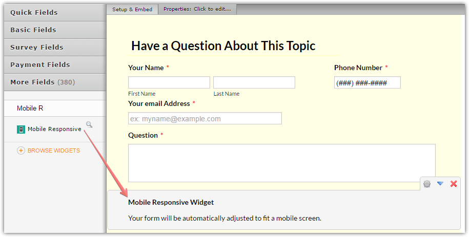
And adding a Mobile Responsive widget to the form.
-
m7ickeyReplied on September 9, 2016 at 4:52 PM
I agree that my custom stuff screwed up the form, so I'll likely start over and as I encounter trouble ask here. The basic things I have been trying to accomplish on the default layouts is to make the name fields & email fields slightly longer & in one case I have a checkbox list where I tried to make some fields longer so the text did not wrap. Anyway, I'm going to start most forms over & ask as I go along. THANKS!
-
m7ickeyReplied on September 9, 2016 at 5:55 PM
I deleted all code, didn't help. Starting over
-
MikeReplied on September 9, 2016 at 7:17 PM
We will get back to you with an update to your new thread:
https://www.jotform.com/answers/928700
Thank you.
- Templates
- Integrations
- INTEGRATIONS
- See 100+ integrations
- FEATURED INTEGRATIONS
 PayPal
- Slack
- Google Sheets
- Mailchimp
- Zoom
- Dropbox
- Google Calendar
- Hubspot
- Salesforce
- See more Integrations
- Products
- PRODUCTS
- Form Builder
- Jotform Enterprise
- Jotform Apps
- Store Builder
- Jotform Tables
- Jotform Inbox
- Jotform Mobile App
- Jotform Approvals
- Report Builder
- Smart PDF Forms
- PDF Editor
- Jotform Sign
- Jotform for Salesforce Discover Now
- Support


