


-
coptsbookAsked on September 8, 2016 at 10:42 PM
The application doesn't look good on mobile devices, how can I determine size adjustment and changes to make it fit mobile screen a.d not effect the web destop view thanks
Page URL: Http://copticangels.com -
Kiran Support Team LeadReplied on September 9, 2016 at 12:31 AM
I understand that you want to make your form mobile responsive. Please refer to the guides below that can help you with making your JotForms mobile responsive.
https://www.jotform.com/help/311-How-to-make-forms-mobile-responsive
https://www.jotform.com/help/322-How-to-make-mobile-friendly-forms-on-JotForm
Thank you!
-
coptsbookReplied on September 9, 2016 at 12:41 AM
Thank you for that but not exactly what I had in mind if you go to http://copticangels.com you will see what I mean the picture and signatures and everything need a bit of adjusting
-
CharlieReplied on September 9, 2016 at 2:34 AM
May I know how you have embedded your form to your website page? Are you redirecting or you embedded it there? The website itself is not mobile responsive which makes the form in desktop mode even on mobile view.
Here's how you can solve this.
1. First, if it is possible, you need to set a viewport on your website page. Here's how: https://developers.google.com/speed/docs/insights/ConfigureViewport
2. Add the Mobile Responsive widget in your form. Here's how to add a widget on your form: https://www.jotform.com/help/252-How-to-Add-a-Widget-to-your-Form
3. After that, setup the cover photo option like this:
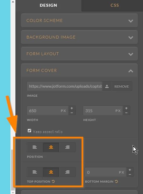
4. Now add this custom CSS code in your Form Designer Tool:
.form-all:before {
content : "" !important;
background-image : url("https://www.jotform.com/uploads/coptsbook/form_files/StMarkFestivalapp.png") !important;
display : inline-block !important;
height : 300px !important;
position : absolute !important;
background-size : 100% 100% !important;
background-repeat : no-repeat !important;
width : 100% !important;
}
#input_2 img {
display : inline-block !important;
height : 100px !important;
background-size : 100% 100% !important;
background-repeat : no-repeat !important;
width : 100% !important;
}
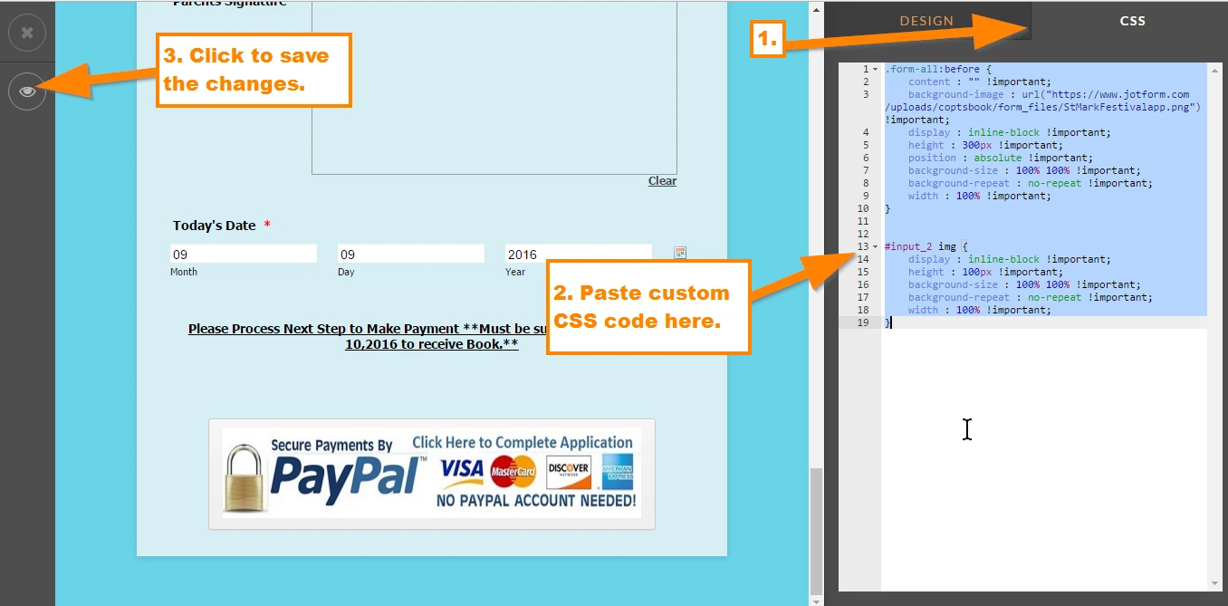
I hope that helps.
- Templates
- Integrations
- INTEGRATIONS
- See 100+ integrations
- FEATURED INTEGRATIONS
 PayPal
- Slack
- Google Sheets
- Mailchimp
- Zoom
- Dropbox
- Google Calendar
- Hubspot
- Salesforce
- See more Integrations
- Products
- PRODUCTS
- Form Builder
- Jotform Enterprise
- Jotform Apps
- Store Builder
- Jotform Tables
- Jotform Inbox
- Jotform Mobile App
- Jotform Approvals
- Report Builder
- Smart PDF Forms
- PDF Editor
- Jotform Sign
- Jotform for Salesforce Discover Now
- Support

