
-
lumiartsAsked on September 21, 2016 at 7:30 AM
The form displays correctly on a full screen pc, but on any smartphone, it has errors.
So how do I fix the items below highlighted in red, using CSS? Thanks! Page URL: https://form.jotformz.com/62616721002646
 -
JanReplied on September 21, 2016 at 11:29 AM
You need to use the Mobile Responsive widget and insert some custom CSS in order to fix this issue.
1. Add the Mobile Responsive widget to your form.
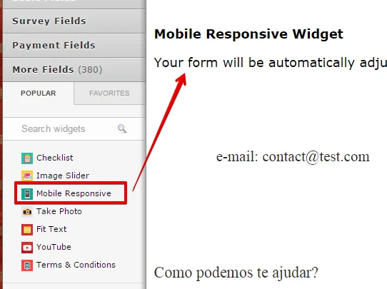
2. Please insert this custom CSS code:
@media screen and (max-width: 480px), screen and (max-device-width: 768px) and (orientation: portrait), screen and (max-device-width: 415px) and (orientation: landscape) {
li#id_4 {
margin-bottom: 0px !important;
padding-bottom: 0px !important;
}li#id_6 {
margin-top: 0px !important;
padding-top: 0px !important;
}label#label_6 {
margin-top: 0px !important;
padding-top: 0px !important;
margin-bottom: 0px !important;
padding-bottom: 0px !important;
}}
Here's a guide on How-to-Inject-Custom-CSS-Codes. Here's the result:
Related guide: How-to-make-forms-mobile-responsive
Hope that helps. Thank you.
-
lumiartsReplied on September 21, 2016 at 1:56 PM
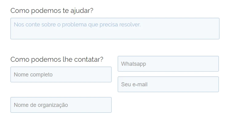
In you image, there is still an error. There is a small gap between the second and third field, different than the others.
I did exactly as instructed and the same problem appears, and also, it is worse when viewed on the lying down smartphone.
-
JanReplied on September 21, 2016 at 3:26 PM
It seems that you haven't inserted the CSS code I provided above. Please insert the CSS code below to fix the landscape mode and portrait mode:
@media screen and (max-width: 480px), screen and (max-device-width: 768px) and (orientation: portrait), screen and (max-device-width: 415px) and (orientation: landscape) {
li#id_4 {
margin-bottom: 0px !important;
padding-bottom: 0px !important;
}li#id_6 {
margin-top: 0px !important;
padding-top: 0px !important;
}label#label_6 {
margin-top: 0px !important;
padding-top: 0px !important;
margin-bottom: 0px !important;
padding-bottom: 0px !important;
}
}@media screen and (max-width: 699px) {
li#id_4 {
margin-bottom: 0px !important;
padding-bottom: 0px !important;
}li#id_6 {
margin-top: 0px !important;
padding-top: 0px !important;
}label#label_6 {
margin-top: 0px !important;
padding-top: 0px !important;
margin-bottom: 0px !important;
padding-bottom: 0px !important;
}}
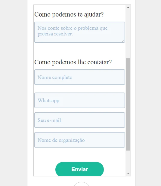
Please check the screen capture below:

In the screen capture above, I showed you the distance problem in portrait mode and landscape mode. After inserting the CSS code I provided, the distance problem was fixed in both modes.
Hope that helps. Thank you.
-
lumiartsReplied on October 3, 2016 at 3:25 PM
-
JanReplied on October 3, 2016 at 4:59 PM
The solution I provided above is only for this form (https://form.jotformz.com/62616721002646). I need to create a separate thread since the original issue is already resolved.
Please refer to this thread: https://www.jotform.com/answers/949770.
We'll attend to that thread shortly. Thank you.
-
lumiartsReplied on October 4, 2016 at 1:37 PM
Thanks it did work. I checked the form again and the same problem is back.
I don't understand why, since the only changes I made was changing the font type and removing the border around fields.
Thank you for your patients -
IrshadReplied on October 4, 2016 at 3:28 PM
If earlier it was working, and by mistake something wrong happened, then I would suggest you to use "Form revision history" tool, and you can review the older version of your form.
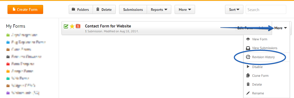
Please check the below guide, which explains, how to view form revision history:
https://www.jotform.com/help/294-How-to-view-form-revision-history
If you face any issue, or need further assistance, feel free to revert back.
Thanks.
-
lumiartsReplied on October 5, 2016 at 8:17 AM
This isn't the case. I didn't make one change, but probably hundreds of changes over the last two weeks. My form now has little to do with what it was a long time ago, so this does not apply. But thanks anyway for the help.
Could you please offer me another solution to the unwanted gap between the fields? Thanks! It's the last thing I need to fix before a finish my form :)
-
John_BensonReplied on October 5, 2016 at 9:41 AM
I believe you are referring to this form (https://form.jotformz.com/62736129927667). Is that correct?
I've checked this form and I found out that you did not paste the CSS code provided by Jan. Please follow the steps below:
1. Remove this CSS code in your form.

2. Please insert the CSS code below:
@media screen and (max-width: 480px), screen and (max-device-width: 768px) and (orientation: portrait), screen and (max-device-width: 415px) and (orientation: landscape) {
li#id_4 {
margin-bottom: 0px !important;
padding-bottom: 0px !important;
}li#id_6 {
margin-top: 0px !important;
padding-top: 0px !important;
}label#label_6 {
margin-top: 0px !important;
padding-top: 0px !important;
margin-bottom: 0px !important;
padding-bottom: 0px !important;
}}
@media screen and (max-width: 699px) {
li#id_4 {
margin-bottom: 0px !important;
padding-bottom: 0px !important;
}li#id_6 {
margin-top: 0px !important;
padding-top: 0px !important;
}label#label_6 {
margin-top: 0px !important;
padding-top: 0px !important;
margin-bottom: 0px !important;
padding-bottom: 0px !important;
}}
Here's a guide on how to insert CSS code to the form.
If you have any questions, let us know. Thank you.
-
lumiartsReplied on October 5, 2016 at 2:30 PM
Actually I did paste the provided CSS code, but it messed everything up and I removed it. Well I put it back so you can see it's messed up. You can also see the problem on the image below.
Did you test the provided code? So, only need to fix this to finish, please help! :)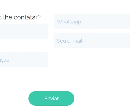
-
JanReplied on October 5, 2016 at 4:22 PM
I have checked your form and I can see that there is an error in your CSS code. You also did not remove the other CSS media queries. Here's a screenshot of the error:

I logged in to your account and edit the CSS code. It should be working properly now. Please do check and let us know if you're still having issues. Thanks!
- Templates
- Integrations
- INTEGRATIONS
- See 100+ integrations
- FEATURED INTEGRATIONS
 PayPal
- Slack
- Google Sheets
- Mailchimp
- Zoom
- Dropbox
- Google Calendar
- Hubspot
- Salesforce
- See more Integrations
- Products
- PRODUCTS
- Form Builder
- Jotform Enterprise
- Jotform Apps
- Store Builder
- Jotform Tables
- Jotform Inbox
- Jotform Mobile App
- Jotform Approvals
- Report Builder
- Smart PDF Forms
- PDF Editor
- Jotform Sign
- Jotform for Salesforce Discover Now
- Support