


-
adam16sterAsked on October 11, 2016 at 12:47 PM
I've scoured and tried solutions found in forum but no luck. If I view the form through direct jotform link it works perfectly fine. It's when I embed or iframe on my webpage that responsive doesn't work.
jotform:
https://form.jotform.com/61794911587974
my webpage:
embed:
http://prospectwire.com/forms/embed.html
iframe:
http://prospectwire.com/forms/iframe.html
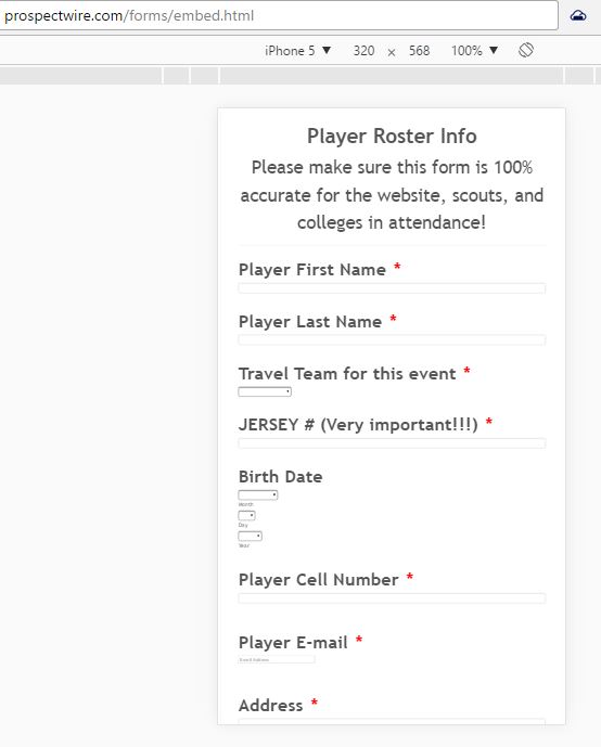 Page URL: http://prospectwire.com/forms/embed.html
 -
David JotForm Support ManagerReplied on October 11, 2016 at 4:01 PM
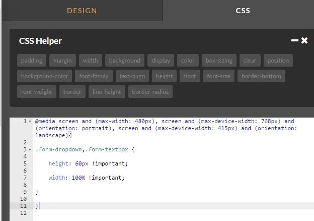
Please try injecting the following CSS code in your form:
@media screen and (max-width: 480px), screen and (max-device-width: 768px) and (orientation: portrait), screen and (max-device-width: 415px) and (orientation: landscape){
.form-dropdown,.form-textbox {
height: 60px !important;
width: 100% !important;
}
}
This should be the result:

Let us know if you need more help, we will be glad to assist you.
-
adam16sterReplied on October 11, 2016 at 4:16 PM
I added the CSS into the CSS box in the designer area but it didn't fix the issue. I tried embedding and iframe as well. Not sure what I'm doing wrong. Should I add the CSS in my HTML file?
-
David JotForm Support ManagerReplied on October 11, 2016 at 5:57 PM
I have cloned your form, and tried the following:
1) Removing any code related to mobile view.
2) Disabling the mobile responsive feature at the designer.
3) Adding custom code(the one on previous reply).
3) And then adding the mobile responsive widget.
The forms looks good through the direct link: https://form.jotform.co/62846220267860

However, when I view the embedded version: http://shots.jotform.com/david/newform.html, it is totally different:

I have forwarded this to our second level to get further help. You will be updated via this thread when this gets fixed.
- Templates
- Integrations
- INTEGRATIONS
- See 100+ integrations
- FEATURED INTEGRATIONS
 PayPal
- Slack
- Google Sheets
- Mailchimp
- Zoom
- Dropbox
- Google Calendar
- Hubspot
- Salesforce
- See more Integrations
- Products
- PRODUCTS
- Form Builder
- Jotform Enterprise
- Jotform Apps
- Store Builder
- Jotform Tables
- Jotform Inbox
- Jotform Mobile App
- Jotform Approvals
- Report Builder
- Smart PDF Forms
- PDF Editor
- Jotform Sign
- Jotform for Salesforce Discover Now
- Support

