


-
cszopfAsked on October 20, 2016 at 12:18 PM
The mobile responsiveness of this form is extending out all of my input boxes. Including the submit button. I want to be able to allow for custom sizing of the input spaces/widths. Any suggestions?

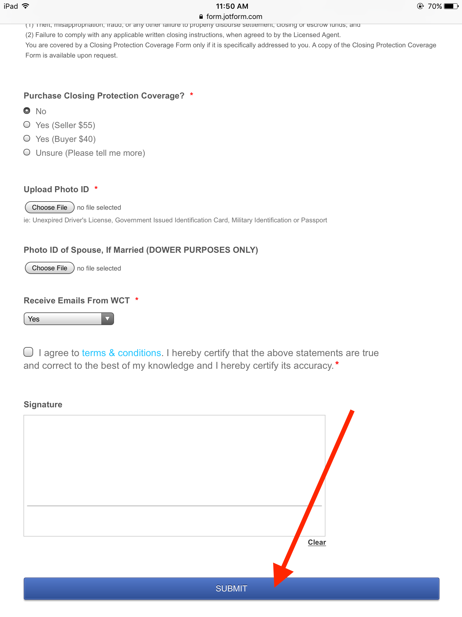 Page URL: https://form.jotform.com/62756362865164
 -
Elton Support Team LeadReplied on October 20, 2016 at 2:40 PM
That is how the form reacts when viewed on iPad specifically in portrait orientation when the mobile responsive option is enabled in your form.
If you don't want it to be in full width, you can change it by injecting this CSS codes to your form.
@media screen and (max-device-width: 768px) and (orientation: portrait), screen and (max-device-width: 415px) and (orientation: landscape){
input[type=text], input[type=email], input[type=tel], textarea{
width: 50%;
}
.form-buttons-wrapper button {
width: auto;
}
}
Feel free to change the width value (text in bold) to your preference.
Guide: http://www.jotform.com/help/117-How-to-Inject-Custom-CSS-Codes (paste it into the bottom section if you have existing CSS codes in your form)
If you need further assistance, let us know.
- Templates
- Integrations
- INTEGRATIONS
- See 100+ integrations
- FEATURED INTEGRATIONS
 PayPal
- Slack
- Google Sheets
- Mailchimp
- Zoom
- Dropbox
- Google Calendar
- Hubspot
- Salesforce
- See more Integrations
- Products
- PRODUCTS
- Form Builder
- Jotform Enterprise
- Jotform Apps
- Store Builder
- Jotform Tables
- Jotform Inbox
- Jotform Mobile App
- Jotform Approvals
- Report Builder
- Smart PDF Forms
- PDF Editor
- Jotform Sign
- Jotform for Salesforce Discover Now
- Support

