


-
dweinappleAsked on October 25, 2016 at 12:57 PM
How can I analyze input data from approximately 300 submitted evaluation forms? These forms contain a number of likert rating scales, matrix input, and objective written responses. An example of the types of data are as follows:
1)

2)

3)
 Page URL: https://form.jotform.com/62660881948974
 -
KadeJMReplied on October 25, 2016 at 3:11 PM
If I understand you correctly it seems to me that you mainly want to be able to evaluate fields such as your above examples for analytical and statistical usage.
What you could do is use on of our reporting options such as Visual Reports that will work to combine and analyze it in a graphical way such as charting for that.
Also, we have a couple of Analytics and Reporting Apps that might be of interest.
-
Devora WeinappleReplied on October 25, 2016 at 6:31 PM
Yes - we need to be able to analyze and compile summary information from each of the attendees evaluations for the course presenters. I looked at the analytics and reporting apps and thought Combine Submissions would work, but it doesn't do analytics. Actually none of those apps looks helpful. I'm looking into a conference mgmt custom software package that will cost us $$ but does what we need. I'm just stuck now because we used jotform and have no way to analyze and compile our data.. Even the visual reports seem to just use 2 or 3 of the questions, and ignore the rest of the form. What is that about.
It would be really helpful if there were a way that our evaluation data could be analyzed, even as much as survey monkey does. Can Jotform do any of that?
-
BorisReplied on October 26, 2016 at 12:48 AM
The Visual Report can depict graphs for any number of form fields. The initial two fields are added to get you started, but you must add charts / graphs for any other fields of your form, by using the Chart button at the top of the Visual Report builder:
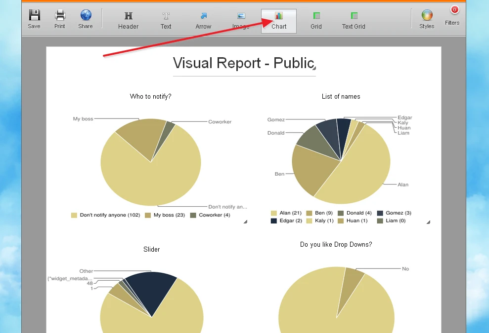
Please try using the Chart button in a Visual Report to add charts for as many fields as you need, and let us know how it goes.
Other than that, our system doesn't provide with other advanced evaluation methods for your form responses, but another thing that is helpful is that you can export your submission data into an Excel file:
https://www.jotform.com/help/44-How-to-Export-Form-Data-to-Excel
Once in Excel, you can also use any such functions of Excel to analyze your data.
-
dweinappleReplied on October 26, 2016 at 1:33 AM
When I clicked on the chart button, it just popped in another pie. How do I get it to chart ALL of the form field data? Sorry, I don't understand how this works. There are still only the top couple fields that it visually charts. How do I add the field data to chart it? We already have the data in spreadsheet form, unanalyzed. I don't know how to use excel to analyze and consolidate data from multiple sheets. That is something I was hoping that Jotform could do.
-
BorisReplied on October 26, 2016 at 5:39 AM
In the Visual Report, you will need to add a chart for each form field on your form. In other words, you will have to add a chart (click on the Chart button) as many times as the number of fields you would like to graphically represent.
If you add 8 charts, they can depict data from 8 form fields.
When you add a chart, you can use its gear-shaped icon to control from which form field it will take its data, and also how the graph should be displayed:

There, you can select whether to display it as a pie graph, or bars, and which form field the graph should be about:

The following guide provides more information on how to use the Visual Reports:
https://www.jotform.com/help/187-How-to-Create-a-Visual-Report-with-Your-Form-Submissions
Now, Visual Reports work on individual form basis. Visual Reports have to be created separately for each form.
If you want to have the information combined in one place, then the only way is to use an app such as Combine Submissions app to get all your desired submissions into one file, and then perform your own analysis on that file in Excel or similar software.
If you want to use JotForm to do the analyzing of your data, then you would have to use the Visual Reports function that we have, as explained above. I hope this helps.
-
dweinappleReplied on October 26, 2016 at 9:29 PM
What are "the correct chartable question types" ?
5. Start creating and customizing your visual report.
When you create a new visual report, we will automatically create up to two example charts for you, from your submission data (provided you have the correct chartable question types on your form).
-
dweinappleReplied on October 27, 2016 at 2:17 AM
I think I've got it! The visual charting is very useful!! Thanks so much for that last explanatory link.. One additional question: What is entry limit?

I understand now about acceptable field types. As far as the text box responses, I'm thinking they will just need to be added in a separate report, as there's no real way to do a visual chart on those.
This has been helpful - thanks so much!
-
dweinappleReplied on October 27, 2016 at 2:33 AM
OK - I'm seeing some weirdness I don't understand. Most of the responses are rating scales (1-5), but only 3 of the 5 are charted. When I look back at the submission data, there were responses that included 1-5. Also, in the field dropdown, not all of the fields is listed - and they are all acceptable field types. It seems arbitrary - can you please explain why that is, or what I may be doing wrong? I did figure out how to change colors - which is very cool. Also, still don't understand what "entry limit" means. Thanks.

-
sethReplied on October 27, 2016 at 4:14 AM
Hello,
Entry limit is the number of different categorizations that will be handled on the chart or graph. In other words, it will be the number of bars in a bar chart or number of slices on a pie chart. You can test this by entering 1 as entry limit. You will see that the most selected choice will be reported on the graphs.
You said some of the responses were not charted on the bar graph. I checked your submission data and saw that your submission data does not have values below 4. Here is the report of your submissions as excel with respect to the specified form question:
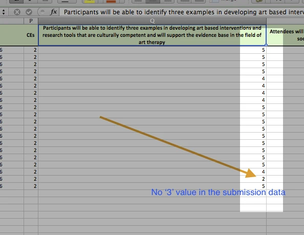
I think you are confused that you mixed up the two different questions which both starts with 'Participants ....'. Please check again the questions and their submission values.
I hope this helps. If you have further questions, we would be very happy to help.
Good Luck!
PS: Please share which form you are referring in support forum questions. (Form ID is 62660881948974 for this question)
-
dweinappleReplied on October 27, 2016 at 3:47 PM
-
Kevin Support Team LeadReplied on October 27, 2016 at 7:39 PM
OK, I have checked the form you've provided us and I can see the submitted info is being shown in the visual report you've created, for example, the field "Describe how to facilitate creation of joint intention" shows 4 options and their entries, I could not find any entry with the value "1", please do note that if an option has not being submitted it will simply not appear in the report.
What I would suggest you is to submit your form with an option that currently does not appear in the visual report and you will notice it appears then.
For example, I have added a Scale Rating field and it shows like this when it has not data:

Then in my testing form I submitted one option only and only that option is showing on the chart.
Submission:

Then this is how it shows in the visual report:

If the option "1" would be submitted again then the chart will increase, but if the "2" options is submitted then another bar will appear and you will have two now since two different options have been submitted in your form.
However, please give it a try and let us know how it goes on your end.
- Templates
- Integrations
- INTEGRATIONS
- See 100+ integrations
- FEATURED INTEGRATIONS
 PayPal
- Slack
- Google Sheets
- Mailchimp
- Zoom
- Dropbox
- Google Calendar
- Hubspot
- Salesforce
- See more Integrations
- Products
- PRODUCTS
- Form Builder
- Jotform Enterprise
- Jotform Apps
- Store Builder
- Jotform Tables
- Jotform Inbox
- Jotform Mobile App
- Jotform Approvals
- Report Builder
- Smart PDF Forms
- PDF Editor
- Jotform Sign
- Jotform for Salesforce Discover Now
- Support


