


-
supplyshieldAsked on October 27, 2016 at 2:40 PM
I have an infinite list widget that has 7 columns. I am trying to figure out how to make all the columns and added rows show up properly on mobile-width screens. I tried a few support threads about a week ago, but since then have removed any custom coding related to the widget in order to try and work with it from scratch
Here are screenshots of what it looks like on desktop vs mobile width (with each field set to 100 pixels from within the widget)

Smaller width screenshot

-
Kiran Support Team LeadReplied on October 27, 2016 at 6:33 PM
Please try injecting the following CSS code to the Custom CSS code section of the widget.
td {
display:inline-block;
float: left;
}
input {
width: 100% !important;
}

Now, inject the following CSS code to the form by following the guide How-to-Inject-Custom-CSS-Codes
iframe[src*="//widgets.jotform.io/list/"] { width: 100% !important; height: auto; }
After add the CSS code to the form, the widget should be displaying as shown below on a mobile device.

Hope this information helps!
-
supplyshieldReplied on October 27, 2016 at 11:41 PM
Hi thank you for the response. I inserted the code, and while it stacks the cells, this is what I see when on smaller screen widths - the iframe is a specific height and in this case is cutoff to the first 3 fields

-
sethReplied on October 28, 2016 at 3:32 AM
Hello,
Please add this css code to your form. Please follow this guide:
How-to-Inject-Custom-CSS-Codes
#form{
height: inherit;
}
Your page will look like this:

There is a problem after adding product order. The data does not align properly. I will work on this issue and will let you know the improvements about it.
Regards.
-
supplyshieldReplied on October 28, 2016 at 10:14 AM
Hi thank you - unfortunately I have encountered the same problem I did using this code solution previously - once you add rows (either on desktop or mobile) the entire section is unreadable for the user.


-
Kiran Support Team LeadReplied on October 28, 2016 at 11:45 AM
Please replace the custom CSS code injected to the widget with the following code:
table#form td {
display:table-cell;
float: left;
}
input {
width: 100% !important;
}
table#list tr {
display: table-row;
}
table#list td, th {
display: table-cell;
}
It should be displaying as shown in the screenshot below on a mobile device.

Let us know if you need any further assistance. We will be happy to assist.
-
supplyshieldReplied on October 28, 2016 at 12:56 PM
Thank you - getting much much closer - it works great on desktop - but on mobile width, its cuts off the columns based on screen width... Here is a screenshot
Thank you for helping me work this out.

-
Kiran Support Team LeadReplied on October 28, 2016 at 2:57 PM
I have made added some CSS code to the widget on your form to display it as below:
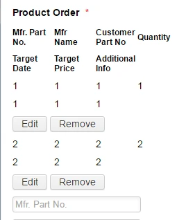
The change in the CSS code is to the last section of the earlier injected code i.e., changed the display from table-cell to inline-block. Additionally added few more lines as provided below:
table#list td, th {
display: inline-block;
}
table#list th {
max-width: 50px !important;
font-size: 12px;
}
Please check your form and let us know if that works for you. Thanks!
-
supplyshieldReplied on October 28, 2016 at 4:19 PM
Thank you! That is working great.
One last request - When on deskop size, is it possible to have the fields stack on top of each other (like they do on mobile), and then still display the added rows horizontally like they currently do?
-
Kiran Support Team LeadReplied on October 28, 2016 at 6:35 PM
If you mean to display the widget as shown below on the desktop, you may add the following CSS code to the widget in addition to the existing CSS code.
@media screen
and (min-device-width: 1200px)
and (max-device-width: 1600px)
and (-webkit-min-device-pixel-ratio: 1) {
table#list {
width: 33%;
}
table#list th {
max-width: 50px !important;
}
table#form {
width: 33%;
}
}
Hope this information helps!
-
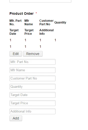
supplyshieldReplied on October 28, 2016 at 7:01 PM
To clarify, I would like to be able to display it as shown in the composite image I made below, a combination of how it looks on the desktop and the mobile right now. Is this possible for desktop display?

-
CharlieReplied on October 29, 2016 at 10:49 AM
I'm not sure how you want to fit the 7 column widget on a mobile device width, especially the inputs there are not 1 character length. Perhaps this kind of formatting would work for you.
Here's my form: https://form.jotform.com/63023654620953
This is how it looks like on smaller screen or smaller device width:
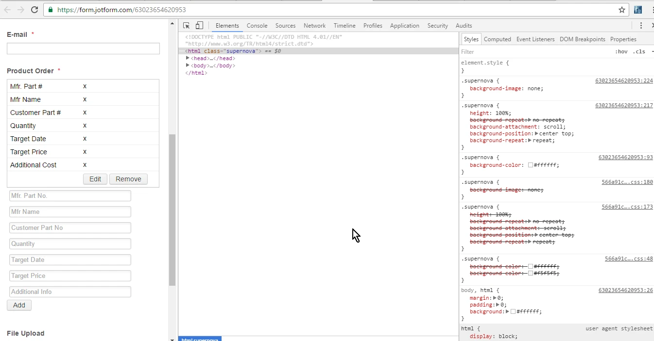
In a mobile emulator, here's how it looks like in action:

If that's something that will work for you. You can clone my form by following this guide: https://www.jotform.com/help/42-How-to-Clone-an-Existing-Form-from-a-URL. From there, you can check out how my form was setup and how the CSS code are added. If you want further assistance on that, let me know and we'll walk you through.
Thank you.
PS: The trick was based on this link https://css-tricks.com/responsive-data-tables/. Just need to tweak it to fit your form.
-
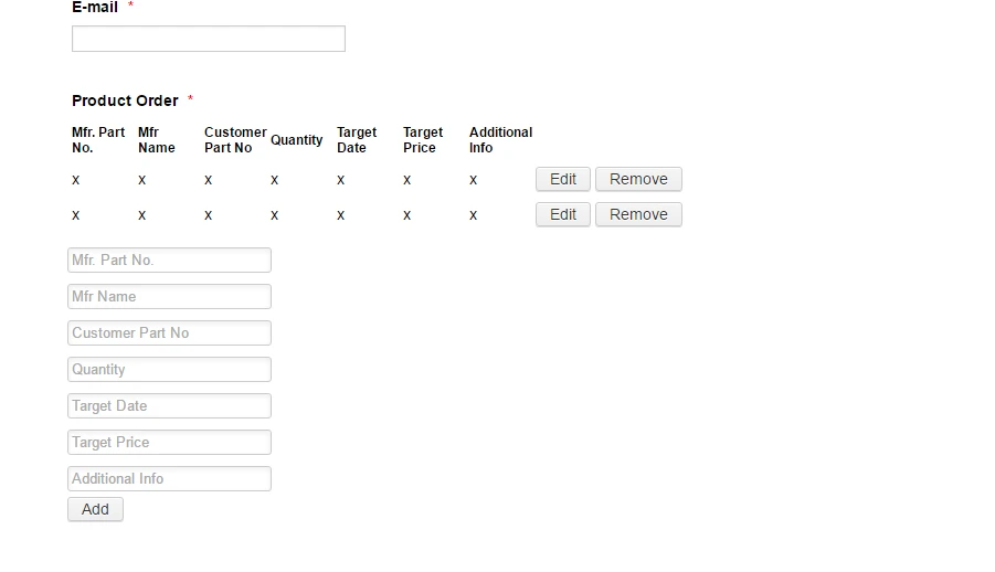
supplyshieldReplied on October 30, 2016 at 7:36 PM
To correct your assumption in this case I am not trying to make create this 7-column display on a mobile, I am trying to create this display on the desktop version. Your resource is super useful though. Can you or anyone help me modify the display on desktop sizes to resemble the image below? Where the added rows are in columns but the input fields are stacked?

-
sethReplied on October 31, 2016 at 1:53 AM
Hello,
To clarify things, could you please list the requirements of your design once again. This thread started with changing the view of the infinite list widget with reference to mobile view. However, I see that you want a specified view on desktop. So here is what I understood from the dialogue here:
1) You want a 7 column display of the infinite list widget's product entry fields on both desktop and mobile.
2) You want 7 column display of the entered product details on mobile, but 7 row display of the entered product details on desktop.
If this is the case, please confirm the design.
We are awaiting your response.
-
supplyshieldReplied on October 31, 2016 at 10:29 AM
Hi Seth, sorry for the confusion.
1. The display on mobile right now is perfect, we don't want to change that.
2. The display on desktop: We wanted to know if this look is possible: (7 column horizontal display for added rows, stacked single column of input fields)
-
Kiran Support Team LeadReplied on October 31, 2016 at 12:13 PM
Please add the following CSS code the custom CSS code section of the widget.
@media screen
and (min-device-width: 1200px)
and (max-device-width: 1600px)
and (-webkit-min-device-pixel-ratio: 1) {
table#form {
width: 33%;
}
}
This should be displaying the list input fields in stack in desktop as well.
Please let us know if we can be of any further assistance. Thank you!
-
supplyshieldReplied on October 31, 2016 at 1:37 PM
That works thank you. I started testing the form and realized that row labels dont necessarily line up with the columns on the added rows (depending on whats been entered) ...
It seems like the easiest solution would be to add labels above each added row since the amount of text the user enters will always vary.
So is it possible to add labels above each new added row? I know a support member gave me a version of the solution here https://www.jotform.com/answers/964475-Adding-labels-to-infinite-list-widget#9 but it conflicted with other code I was receiving from other support threads at the time, all of that was cleared out so that I could restart with a single thread.
(Let me know if I should start a new thread for this)
-
Kiran Support Team LeadReplied on October 31, 2016 at 3:05 PM
Since we already have a thread with this issue, let me check the code and get back to you on the other thread. Please allow us some time to check this up since we having some extra traffic to our support forum. We will get back to you as we find any solution for the issue on the other thread.
Thank you!
-
supplyshieldReplied on October 31, 2016 at 3:39 PM
K I will await your response - thank you for your continued support.
-
supplyshieldReplied on November 1, 2016 at 10:14 AM
Checking in on the labeling issue
-
Kiran Support Team LeadReplied on November 1, 2016 at 11:50 AM
I am sorry for the delay. We were extremely busy yesterday with extra traffic to the support forum. I'll send you a response on the other thread in few minutes.
Thank you!
- Templates
- Integrations
- INTEGRATIONS
- See 100+ integrations
- FEATURED INTEGRATIONS
 PayPal
- Slack
- Google Sheets
- Mailchimp
- Zoom
- Dropbox
- Google Calendar
- Hubspot
- Salesforce
- See more Integrations
- Products
- PRODUCTS
- Form Builder
- Jotform Enterprise
- Jotform Apps
- Store Builder
- Jotform Tables
- Jotform Inbox
- Jotform Mobile App
- Jotform Approvals
- Report Builder
- Smart PDF Forms
- PDF Editor
- Jotform Sign
- Jotform for Salesforce Discover Now
- Support


