


-
supplyshieldAsked on November 1, 2016 at 12:58 PM
I am trying to apply the same logic to another form that employs the Infinite List Widget. I copied CSS from the form on this page http://supplyshield.com/request-a-quote-2/ which was the result of support help from these 2 threads
(sizing and layout issues)
(labeling issue)
https://www.jotform.com/answers/964475-Adding-labels-to-infinite-list-widget
This main problem is that the form width is set to 33%, if it could fill the space that its in (without cutting off on desktop or mobile) then it would be fine. I tried changing the width, but this cut off the height of the form the viewable fields

-
BorisReplied on November 1, 2016 at 3:33 PM
Please first remove this part of the existing custom CSS from your second Infinite List widget:
@media screen
and (min-device-width: 1200px)
and (max-device-width: 1600px)
and (-webkit-min-device-pixel-ratio: 1) {
table#form {
width: 33%;
}
}As the remaining CSS of the widget itself is mobile responsive, please only add the following line of CSS into your second form (not inside the widget, but the form itself):
iframe[src*="//widgets.jotform.io/list/"] { width: 100% !important; }
#cid_17 { width: 100%; }https://www.jotform.com/help/117-How-to-Inject-Custom-CSS-Codes
Now, I see that you've already tried adding this code into the form, but you have accidentally omitted one last } brace in your second form's custom CSS, so it currently has an error:

Please add a closing } brace on the @media query, and paste the above code, so that your form's custom CSS is modified from this:
@media screen and (max-width: 768px) and (min-width: 480px) {
.jotform-form {
padding-top: 0;
}
iframe[src*="//widgets.jotform.io/list/"] { width: 100% !important; height: auto; }
#form{
height: inherit;
}Into this:
@media screen and (max-width: 768px) and (min-width: 480px) {
.jotform-form {
padding-top: 0;
}
#cid_17 { width: 100%; }
}
iframe[src*="//widgets.jotform.io/list/"] { width: 100% !important; height: auto; }
#form{
height: inherit;
}Please try it out and let us know how it goes.
-
supplyshieldReplied on November 1, 2016 at 9:37 PM
Hi, this solution is working for some pixel ranges but not all, mostly desktop size
Above 980px (which appears to be the same form width as mobile right now):
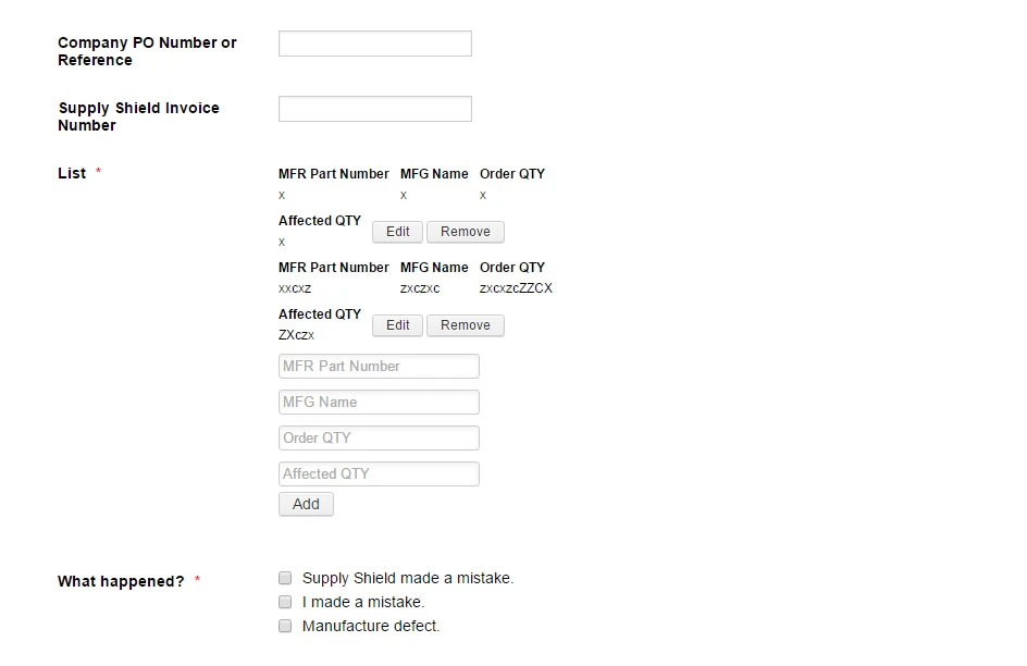
768px - 980px (lists added rows nicely, but the input fields aren't stacked)
-
Ashwin JotForm SupportReplied on November 2, 2016 at 5:04 AM
Hello supplyshield,
I did check your webpage where you have embedded your form and found that you have used yoru form's script embed code. Please note that for your form to be mobile responsive, we recommend to embed form using its iFrame embed code.
Before we further work on the custom css code, I would suggest you to please embed your form using its iFrame embed code and see how your form appears. Based on that we will help you further with custom css code. The following guide should help you how to grab your form's iFrame embed code: https://www.jotform.com/help/148-Getting-the-form-iFrame-code
We will wait for your response.
Thank you!
-
supplyshieldReplied on November 2, 2016 at 9:08 AM
Ok Thanks - I have switched it to the iframe embed code.
-
BorisReplied on November 2, 2016 at 11:57 AM
I see that your form is now correctly embedded with the iFrame embed method.
If you are still having issues with the width of the form in a specific range of screen width, it is most likely because your form is set to have a width of 1080 pixels:

The mobile responsiveness of the form will only "kick in" when screen width is the one that mobile devices have, and in between that and 1080 pixels, there may be problems with the re-sizing of some fields.
If you are indeed still having issues, please try injecting the following line of custom CSS into your form as well:
.form-all { max-width: 1080px; width: 100% !important; }
Please let us know if you need further assistance after that.
-
supplyshieldReplied on November 2, 2016 at 12:03 PM
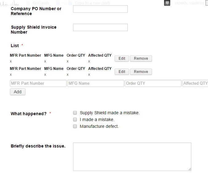
Hi Thank you, that resolved the issue for 768px - 980px but above 980px this is still what it does to the added rows, they should easily fit on one line as they do for the 768-980 pixel range
Above 980px:

-
Ashwin JotForm SupportReplied on November 2, 2016 at 1:42 PM
Hello supplyshield,
I did make few changes to the injected custom css code of your form. I would suggest you to please test your form and see if it is being displayed correctly in mobile devices.
Do get back to us if the issue persists.
Thank you!
-
supplyshieldReplied on November 2, 2016 at 3:45 PM
Hi thank you - the display is fine for mobile devices - it is the desktop pixel range 980px+ that is displaying as if the screen is a super-small width.

-
supplyshieldReplied on November 3, 2016 at 12:07 PM
Hi checking in on this issue.
- Templates
- Integrations
- INTEGRATIONS
- See 100+ integrations
- FEATURED INTEGRATIONS
 PayPal
- Slack
- Google Sheets
- Mailchimp
- Zoom
- Dropbox
- Google Calendar
- Hubspot
- Salesforce
- See more Integrations
- Products
- PRODUCTS
- Form Builder
- Jotform Enterprise
- Jotform Apps
- Store Builder
- Jotform Tables
- Jotform Inbox
- Jotform Mobile App
- Jotform Approvals
- Report Builder
- Smart PDF Forms
- PDF Editor
- Jotform Sign
- Jotform for Salesforce Discover Now
- Support
