


-
SydneyShoulderSpecialistsAsked on November 15, 2016 at 7:19 PM
Hi There,
The image is huge when viewed through preview or on a mobile phone but the size I want when the form is viewed on a desktop. I've tried resizing the image then re-uploading, I've tried using the width and height in image edit in the form itself but no luck. I've not published the form as yet.
Many thanks
Jasmin
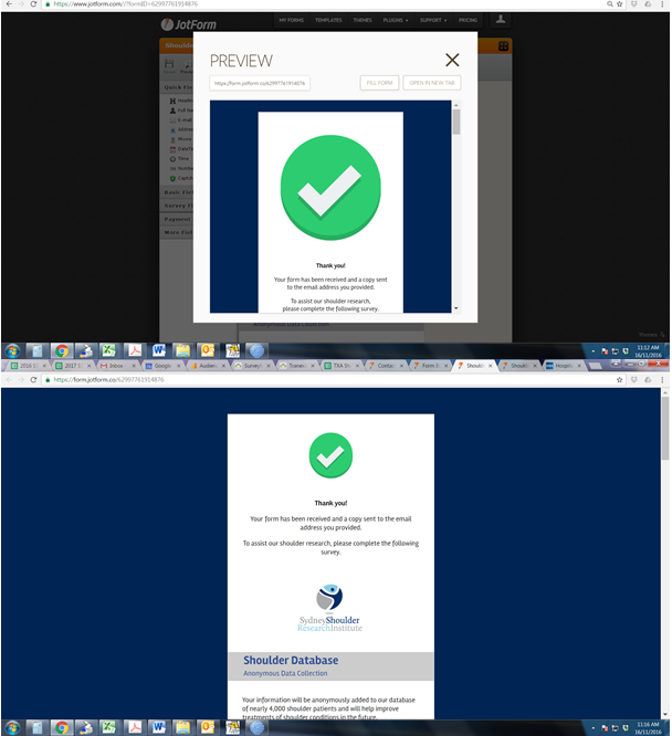 Page URL: https://form.jotform.co/62997761914876
 -
MikeReplied on November 15, 2016 at 9:36 PM
The images are being set to 100% width by Mobile Responsive widget. As a workaround, you may try to set a max image width to 150px on mobile form. To do this, add the next CSS via form designer.
@media only screen and (max-width: 40em){
img.form-image {
max-width : 150px !important;
}
}
If you need any further assistance, please let us know.
-
SydneyShoulderSpecialistsReplied on November 16, 2016 at 6:14 PM
Hi Mike
Many thanks - that worked well :-)
Kind Regards
Jasmin
- Templates
- Integrations
- INTEGRATIONS
- See 100+ integrations
- FEATURED INTEGRATIONS
 PayPal
- Slack
- Google Sheets
- Mailchimp
- Zoom
- Dropbox
- Google Calendar
- Hubspot
- Salesforce
- See more Integrations
- Products
- PRODUCTS
- Form Builder
- Jotform Enterprise
- Jotform Apps
- Store Builder
- Jotform Tables
- Jotform Inbox
- Jotform Mobile App
- Jotform Approvals
- Report Builder
- Smart PDF Forms
- PDF Editor
- Jotform Sign
- Jotform for Salesforce Discover Now
- Support
