


-
RaimundFaberAsked on November 21, 2016 at 3:08 PM
Here is the jotform link:
<iframe id="JotFormIFrame" onDISABLEDload="window.parent.scrollTo(0,0)" allowtransparency="true" src="https://form.jotformeu.com/63255178228359" frameborder="0"i style="width:100%; height:1299px; border:none;" scrolling="no"> </iframe>
it´s made with check for make this responsive
and here is the webside where it is embedded:
www.faber-beratung.com/kontakt
thanks for your help
-
JanReplied on November 21, 2016 at 5:53 PM
I checked your form and I can see that it is responsive when I opened it in my desktop computer. I also tried resizing the browser and I can say that it is responsive.
Please try to insert the Mobile Responsive widget in your form. Here's a guide on How-to-Add-a-Widget-to-your-Form.
The URL you provided is not working. Please provide the correct URL of the webpage where the form is embedded so that we can further investigate.
Let us know if you need further help. Thank you.
-
RaimundFaberReplied on November 22, 2016 at 8:52 AM
Hi Jan,
sorry, the URL is www.faber-beratung.com/kontakt.htm
it´s still not working, how can I adjust the form size and juse a form without background
-
HelenReplied on November 22, 2016 at 9:04 AM
Hi,
Thanks for contacting us.
I checked your link that you provide with us. However , I could not see any contact form on this page. As you can see below:

Please re-embed your form to your website. I must see the page for to solve this issue.
We will waiting your response.
-
RaimundFaberReplied on November 22, 2016 at 11:42 AM
Hi Helen,
sorry, now it´s updated.
Here´s the new jotform link:
<iframe id="JotFormIFrame" onDISABLEDload="window.parent.scrollTo(0,0)" allowtransparency="true" src="https://form.jotformeu.com/63264241805351" frameborder="0"i style="width:100%; height:622px; border:none;" scrolling="no"> </iframe>
I also just want to have the white formular without the gray frame - but do not know how to
Thanks
Raimund
-
JanReplied on November 22, 2016 at 1:23 PM
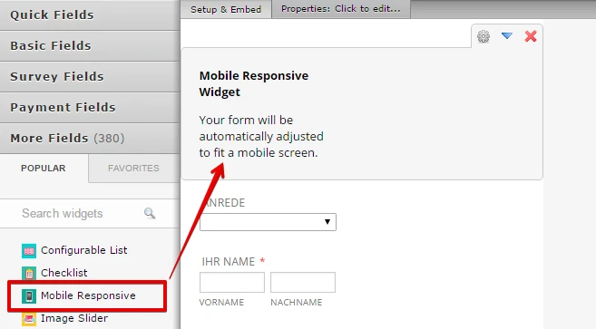
I cloned your form and I can see that you haven't inserted yet the Mobile Responsive widget. In the Form Builder, please click the "More Fields" section and then search form "Mobile Responsive". After that, please drag it to the form. Here's a screen capture:

If you want to remove the gray background or frame, please insert the CSS code below:
.supernova {
background-color: #ffffff !important;
}.supernova .form-all {
box-shadow: none !important;
-moz-box-shadow: none !important;
-webkit-box-shadow: none !important;
}Here's a guide on insert a CSS: https://www.jotform.com/help/117-How-to-Inject-Custom-CSS-Codes.
Let us know if you need further assistance. Thank you.
-
RaimundFaberReplied on November 22, 2016 at 4:38 PM
Dear jotform-team,
thank you very much for your great support - everything works very fine so far.
The only thing I´m worried about are the missing right side frames on iPad version.
Any idea about it?
Here my latest jotform link:
<script type="text/javascript" src="https://form.jotformeu.com/jsform/63266123534351"></script>
Once again thank you so much - great support
Raimund
-
RaimundFaberReplied on November 22, 2016 at 4:47 PM
Dear jotform-team,
additional information:
drop down menue also missing lower frame??
please help!
thanks in advace
Raimund
-
RaimundFaberReplied on November 22, 2016 at 5:16 PM
it looks like safari is the problem - android works
-
RaimundFaberReplied on November 22, 2016 at 5:29 PM
Sorry,
it´s not safari related, it´s IOS related - same problem with different browsers like opera or chrom on IOS devices iPad 2, iPad mini, or any iPhone
IOS version on all devices is 10.1.1
Thanks for your support
Raimund
-
Kevin Support Team LeadReplied on November 22, 2016 at 9:38 PM
I'm currently testing your form, but unfortunately I do not have a real device with IOS and using emulators I do not seem to replicate the problem you're mentioning.
So far, the drop downs you have in your form are showing up on my end, what I have noticed is that the form is getting cut off on the right side, what I would suggest you is to inject this code to your form so you reduce the form's width and display completely the fields in mobile devices:
@media screen and (min-width: 480px){
.supernova{
width: 90%;
}
}
Please give it a try and let us know how it goes.
-
RaimundFaberReplied on November 23, 2016 at 1:56 PM
HI Kevin,
Hi jotform-team
thank you so much for your greater support - now everything works properly
Raimund
-
Kevin Support Team LeadReplied on November 23, 2016 at 3:12 PM
You're most welcome Raimund.
Please if there is anything else that we can assist you with, do not hesitate to contact us, we will be more than happy to help you.
- Templates
- Integrations
- INTEGRATIONS
- See 100+ integrations
- FEATURED INTEGRATIONS
 PayPal
- Slack
- Google Sheets
- Mailchimp
- Zoom
- Dropbox
- Google Calendar
- Hubspot
- Salesforce
- See more Integrations
- Products
- PRODUCTS
- Form Builder
- Jotform Enterprise
- Jotform Apps
- Store Builder
- Jotform Tables
- Jotform Inbox
- Jotform Mobile App
- Jotform Approvals
- Report Builder
- Smart PDF Forms
- PDF Editor
- Jotform Sign
- Jotform for Salesforce Discover Now
- Support


