


-
David SlovesAsked on November 21, 2016 at 3:20 PM
HI - in my form I have a Matrix that is not readable when a tablet/ipad is in vertical mode.
The Matrix is called "Service(s)"
The form is at https://form.jotform.com/63067426136152
and embedded here:http://www.cleangreenmobile.com/customer-form/
This is a customer is mine, and the form is in his account which has his email address listed, so I'm contacting you from outside.
His account is:
cleangreenmobile
Thank you!
David
-
Kevin Support Team LeadReplied on November 21, 2016 at 6:53 PM
I have tested your form in an emulator since I do not have a real device, I could not replicate the problem neither using the direct link to your form or the embedded form in the webpage you have shared us.
Here're some screenshots about my test:
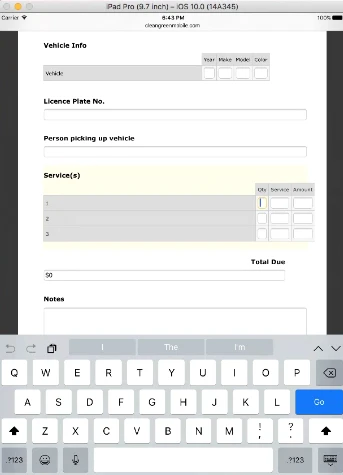
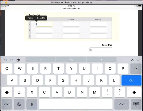
I have also tested the form in other devices and I can fill our the fields in the matrix area.
Could you please provide us more details about the device where you replicated this problem?
May be this is in an specific IOS version or device, with the details we will be able to test in the same device than you and try to replicate the problem.
Also, is the problem happening in the embedded version only or is it happening when using the direct link as well?
Please do let us know, we will be glad to take another look to the form.
-
DavidReplied on November 21, 2016 at 7:09 PM
Oh it looks like the problem my client described is that in the vertical position, the column containing the title of each row in the matrix is way too wide so the rest gets smushed at the right. Same with Vehicle Info matrix. I can see this in your screenshots.
It looks perfect on the desktop and horizontal tablet devices, so I don't want that to change. Just for mobile vertical. How can I fix the matrixes just that - for tablet vertical position?
Thank you!
-
Kevin Support Team LeadReplied on November 21, 2016 at 9:08 PM
I have checked your form again on different devices and could not replicate the problem, but since you're mentioning that the matrix headers are wider than the fields, I think the code to decrease the fields size should help to display properly the matrix field in your form.
This is the code that I used to reduce the field's size in the matrix field on my end:
@media screen and (max-width: 480px){
li#id_23 .form-matrix-table tr:not(:nth-child(1)) th {
min-width: none;
width: 5px;
}
li#id_23 .form-matrix-table tr:nth-child(1) th, .form-matrix-values {
width: 5px !important;
min-width: none;
}
}
This code will help you to inject the code to your form: How-to-Inject-Custom-CSS-Codes
Here's also the form I cloned of yours and where I have applied the given CSS code, please take a look to the result: https://form.jotform.com/63257665083967
I can also see you have injected some CSS code to your form, please check also that code since it may also be affecting the matrix field, if the problem still persists, please try removing temporary the CSS code of your form and test it, do let us know if the problem is there even with no CSS code injected.
-
cleangreenmobileReplied on November 22, 2016 at 12:10 AM
Actually it appears the problem was due to the form's interaction with the website it is embedded on. It works fine on its own url outside the site. In this instance we don't need the form on the site itself, so we'll just use it at its form.jotform.com/..... location instead.
Thanks!
David
- Templates
- Integrations
- INTEGRATIONS
- See 100+ integrations
- FEATURED INTEGRATIONS
 PayPal
- Slack
- Google Sheets
- Mailchimp
- Zoom
- Dropbox
- Google Calendar
- Hubspot
- Salesforce
- See more Integrations
- Products
- PRODUCTS
- Form Builder
- Jotform Enterprise
- Jotform Apps
- Store Builder
- Jotform Tables
- Jotform Inbox
- Jotform Mobile App
- Jotform Approvals
- Report Builder
- Smart PDF Forms
- PDF Editor
- Jotform Sign
- Jotform for Salesforce Discover Now
- Support

