


-
naggarAsked on November 28, 2016 at 4:48 AM
Dear Support,
Everytime I do some edits to my form, a lot of the text alignment gets messed up so can you please support.
http://www.peax.com/rental-enquiries/

In addition all the length of fields in addition to the length of the form itself seem to have gotten messed up as well.

I would like to restore to the same length for all fields and same style, please help. Thanks again.
Kind Regards,
Page URL: http://www.peax.com/rental-enquiries/ -
naggarReplied on November 28, 2016 at 4:50 AM
Also please do note that I just checked the form on a mobile device, and the alignment is even more messed up. So please support thank you.
-
candyReplied on November 28, 2016 at 5:46 AM
Hello,
I have checked your form and cloned on my side in order to test it.
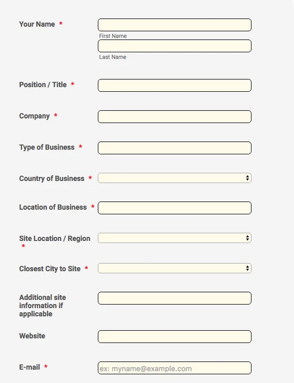
First of all, my recommendation would be to use a theme. Please find the cloned version of your form with the theme named "Float": https://form.jotform.com/63322704667962
Also, please find the related screenshot below:

Secondly, if you do not prefer using a theme, you can inject CSS codes to your form in order to align the fields.
I have cloned your form and injected the following CSS codes:
.form-textbox{
width: 300px !important;
}
.form-line{
width: 400px !important;
}
.form-all{
font-size:12px;
}
.form-checkbox-item{
width:400px !important;
}
.form-checkbox-other-input{
width:100px !important;
}
I have created the cloned version of your form at the following link: https://form.jotform.com/63322103560947
Also, please find the related screenshots below:


If you prefer, you can use both theme and inject CSS codes to your form in order to make it prettier.
To make your form mobile friendly, I recommend you to use "Mobile Responsive widget". Please check the following link in order to add it to your form: https://widgets.jotform.com/widget/mobile_responsive
If you need more clarification or assistance, do not hesitate to contact us.
Thanks in advance.
-
naggarReplied on November 28, 2016 at 5:50 AM
Thank you very much. The overall size of the form looks very big though, how can this be reduced?

-
naggarReplied on November 28, 2016 at 5:53 AM
Also please do note that this does not solve the problem with alignment for the check boxes, as you have changed the form to display the choices in one row, while we want them to be displayed in 3 rows and not just one.
Hope this clarifies, thanks in advance
Kind Regards,
-
omerorkun JotForm Data ScientistReplied on November 28, 2016 at 6:26 AM
Hi,
I have injected the following CSS code to the cloned version of your form:
.form-textbox {
width : 300px;
}
#input_24 {
width : 140px;
}
.form-dropdown {
width : 300px!important;
}
It looks like this after the customization:
Added the mobile responsive widget, here is how it looks like:
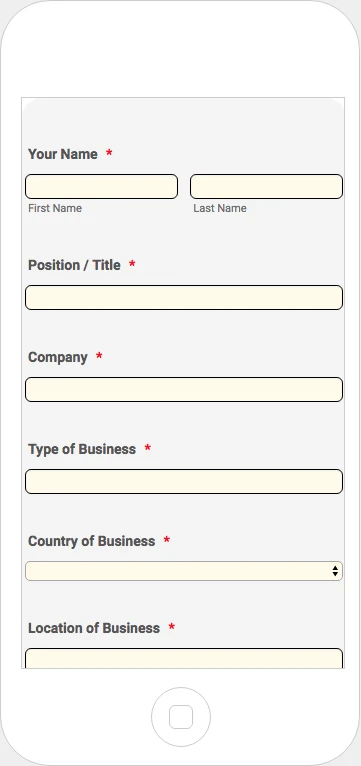
I also suggest you to change the dropdown style after CSS injection. When you increase the width of them with CSS the arrow positions itself in the middle of the dropdown. However, when you change it, it gets fixed. Here is how you can do it:

If you want to change the overall width of your form please use the following selector in custom CSS:
.form-all {
width:specify the width with px;
}
Specify any width you'd like between ":" and ";". I guess it looks good enough like this. Please let us know if there should be any further changes to be made.
Regards
-
candyReplied on November 28, 2016 at 6:34 AM
Hello again,
You have indicated that "you want the checkboxes to be displayed in 3 rows and not just one." in your previous comment.
Do you want the checkboxes as the following screenshot?

If not, could you please give us further detail related your question?
Waiting for your answer.
Thank in advance.
-
naggarReplied on November 28, 2016 at 6:38 AM
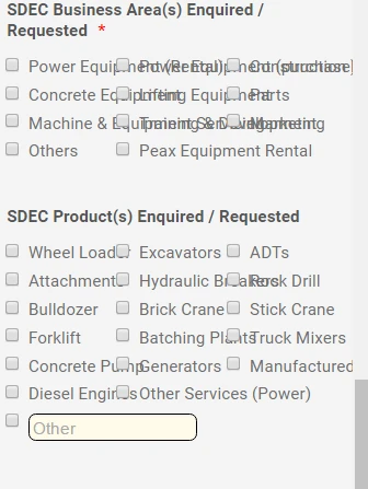
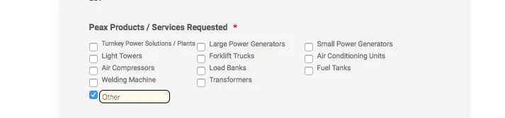
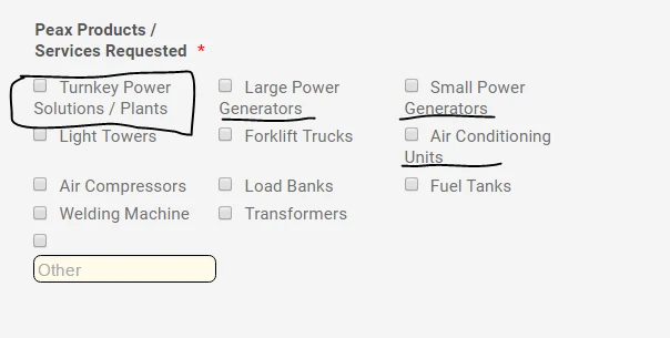
no sorry that wasn't very clear. I meant the checkboxes for the products. As you can see the alignment is not correct for the choices for the ones with longer names like Small Power Generators and Air Conditioning Units, and needs to be fixed. I want it to be displayed over 3 rows as you see not just one. Thank you.

-
naggarReplied on November 28, 2016 at 6:51 AM
.form-checkbox-item label {
display : block !important;
margin-left : 19px;
margin-top : -17px;
This code I had from before fixed it, but it's still corrupt on the mobile view in addition I think the name boxes have not been fixed on the mobile view still.
-
naggarReplied on November 28, 2016 at 6:55 AM
I used the same codes for my other form as well, now it's completely distorted on the mobile view.
http://www.saudidiesel.com/rental-enquiries
-
candyReplied on November 28, 2016 at 6:58 AM
Hello again,
I have injected the following CSS codes in order to get the following screenshot of your checkboxes:
.form-textbox {
width : 300px;
}
#input_24 {
width : 140px;
}
.form-dropdown {
width : 300px!important;
}
.form-all {
width:1000px !important;
font-size:12px;
}
.form-checkbox-item{
width:150px !important;
font-size:10px;
}
.form-checkbox-other-input{
width:100px !important;
}
#label_input_24_0{
font-size:9px;
width:200px !important;
}
#label_24{
width:300px !important;
}
To fix your form on the mobile devices you must inject the following CSS codes into your form:
@media only screen and (max-device-width: 768px){ /*tablet*/
.form-textbox {
width : 300px;
}
#input_24 {
width : 140px;
}
.form-dropdown {
width : 300px!important;
}
.form-all {
width:1000px !important;
font-size:12px;
}
.form-checkbox-item{
width:150px !important;
font-size:10px;
}
.form-checkbox-other-input{
width:100px !important;
}
#label_input_24_0{
font-size:9px;
width:200px !important;
}
#label_24{
width:300px !important;
}
}
@media only screen and (max-device-width: 500px){ /*mobile*/
.form-textbox {
width : 300px;
}
#input_24 {
width : 140px;
}
.form-dropdown {
width : 300px!important;
}
.form-all {
width:1000px !important;
font-size:12px;
}
.form-checkbox-item{
width:150px !important;
font-size:10px;
}
.form-checkbox-other-input{
width:100px !important;
}
#label_input_24_0{
font-size:9px;
width:200px !important;
}
#label_24{
width:300px !important;
}
}
Please be aware of that, you can not use the same codes in your other forms. You should check first. We are writing the codes according to the specific form.
Please try, if you need more assistance, let us know.
Thanks.
-
naggarReplied on November 28, 2016 at 7:09 AM
Thank you that did solve most of it. Only the name section is still not fixed on mobile device. And apologizes about using the same code, was not aware of that.

-
naggarReplied on November 28, 2016 at 7:11 AM
I have also removed all the injected codes in my other form, c
an you please help fix it on both desktop and mobile view as well to be the same as this one after it was fixed.https://form.jotform.me/naggar/sdec-enquiry-form
http://www.saudidiesel.com/rental-enquiries
-
candyReplied on November 28, 2016 at 8:08 AM
Hello again,
In order to arrange Full Name field in mobile devices, please inject the following CSS codes into your form:
@media screen and (max-width: 480px), screen and (max-device-width: 768px) and (orientation: portrait), screen and (max-device-width: 415px) and (orientation: landscape) {
[data-type="control_fullname"] .form-sub-label-container:first-child {
margin-right: 2%;
}
}
We will study your forms and you are going to be informed via this thread.
Thanks.
-
naggarReplied on November 28, 2016 at 8:18 AM
Hi Candy,
Thank you, please do so. Please do note that this did not fix the "Full Name" issue and it still persists on mobile devices. Thanks again.
Kind Regards,
-
candyReplied on November 28, 2016 at 9:14 AM
Hello again,
I have checked your form named "Peax Enquiry Form" in your account, I have found the reason why the code did not work. Because one bracket was missing in your code.
Please delete all of the codes that you have injected to your form, and inject the following CSS codes into your form named "Peax Enquiry Form" in order to solve the mistake:
.form-textbox {
width : 300px;
}
.form-dropdown {
width : 300px!important;
}
.form-all {
width:1000px !important;
font-size:12px;
}
.form-checkbox-item{
width:150px !important;
font-size:10px;
}
.form-checkbox-other-input{
width:100px !important;
}
#label_input_24_0{
font-size:8px;
width:300px !important;
}
#label_24{
width:300px !important;
}
@media screen and (max-width: 480px), screen and (max-device-width: 768px) and (orientation: portrait), screen and (max-device-width: 415px) and (orientation: landscape) {
[data-type="control_fullname"] .form-sub-label-container:first-child {
margin-right: 2%;
}
}
Please try this and let us know the solution.
Thanks.
-
candyReplied on November 28, 2016 at 9:29 AM
I have split the thread in order to assist better by our support team as the following link: https://www.jotform.com/answers/998833
We are going to answer there.
-
naggarReplied on November 28, 2016 at 11:55 PM
Dear Candy thank you for all the help,
Please do note that the above code has fixed the regular view, but completely corrupted the mobile view.
Appreciate your support.
Kind Regards,

-
naggarReplied on November 29, 2016 at 12:04 AM
Dear Candy,
Also please do note that the font for the products has decreased too much for the products list that it's barely seen anymore on a regular view, please help restore to it's regular size as well. Thanks in advance.

Kind Regards
-
naggarReplied on November 29, 2016 at 12:07 AM
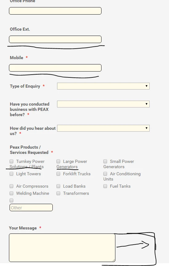
The alignment of "Your Message" box needs to be fixed as well, the box should come under "your message" text not next to.

Kind Regards,
-
Mike_G JotForm SupportReplied on November 29, 2016 at 2:16 AM
With regards to your first concern, I will further check the issue also on my end. May we just know the device are you using that shows the field being corrupted, please?
As for the font size of the text in the option of the checkbox field in your form, please try to add the CSS codes below and see if that will fix the issue.
span.form-checkbox-item label {
font-size: 12px;
}
Then, for the alignment of the label and the text area of the field "Your Message", please refer to this thread: https://www.jotform.com/answers/999534
-
naggarReplied on November 29, 2016 at 5:20 AM
Dear Mike,
I'm getting really confused and frustrated with all these codes and having to inject them, if you guys have access to my form please go ahead and edit it to make sure it works correctly, I keep trying different codes and each time something else gets distorted and I'm not a programmer so I cannot do this myself, so I would really appreciate if you guys can go through the form in details and as a whole and make sure that all the following is happening:
1-All fields including drop boxes are the same length for both Mobile and Regular view
2-Peax Product Options with 3 words are correctly aligned in both mobile and regular view and size is "not" reduced to get them to be so.
3-"Your Message" box is underneath the "Your Message" text.
I'm currently using Iphone 6 and the Jotform mobile view tester to check the mobile view and both match.
Thanks a lot in advance, I really appreciate your support.
Kind Regards,
-
omerorkun JotForm Data ScientistReplied on November 29, 2016 at 5:56 AM
Hi,
I have now made the necessary changes on your actual form per your authorization. The only flaw is that the "Peax Product" field is being shown in 2 columns on mobile. However, it is not able to be shown in 3 columns without reducing their sizes. So, for now I let it leave as it is.
The rest tough, looks exactly how you'd like it to. Please test it again both on the view tester through JotForm and on your mobile phone. Let me know if there are any flows that needs fixing.
Best Regards
-
naggarReplied on November 29, 2016 at 6:13 AM
Dear Owen,
Thank you very much for being understanding. Please do note that the form is still distorted on both the mobile and regular view. Please see below for reference. Please feel free to go over both forms, for SDEC and Peax as you may like and amend as you seem fit until this problem is solved once and for all, I'm have turned of our Google Adword Ad's routing to the form until we can figure this out completely. Appreciate all your hardwork, thanks in advance.
http://www.peax.com/rental-enquiries/
Kind Regards,
-
omerorkun JotForm Data ScientistReplied on November 29, 2016 at 7:45 AM
Hi,
The 3 column thing is not possible to be fixed without changing the font size. I have fixed it on mobile tough. Please check again and let me know if there are any changes that should be made.
Thank you
-
naggarReplied on November 30, 2016 at 12:21 AM
Hi Owen,
Thank you for your efforts. I'm not sure why that is the case, because it is working fine for me o other "SDEC" form, Boris was able to get this to work, can you please communicate with him and get the same solution implemented for this one as well? Really appreciate it. Thanks again.
https://www.jotform.com/answers/998833/?entrymessage=10732640770
Kind Regards,
-
Mike_G JotForm SupportReplied on November 30, 2016 at 2:31 AM
Unfortunately, Boris is not around, however, I have checked the form, Peax Enquiry Form, and I see that you've also added the codes Boris have asked you to add to your other form (https://form.jotform.me/naggar/sdec-enquiry-form) on this thread: https://www.jotform.com/answers/998833.
I see that took care of the issue you have regarding the fields in the Peax Enquiry Form form that does not have the same width but that does not fix the issue with the options in the "Peax Products / Services Requested" checkbox field.
You can try to add the codes below to fix the issue with the checkbox options.
@media screen and (max-width: 480px)
{
span.form-checkbox-item {
width: 100% !important;
}
}
Here's how it should look like on an iPhone 6.

And on Preview:

Below is a clone version of your form where I have applied the changes above:
https://form.jotform.com/63341335792962
I hope this helps. Otherwise, please feel free to contact us again anytime. Thank you.
-
Mike_G JotForm SupportReplied on November 30, 2016 at 2:37 AM
Just letting you know that I have added the codes I have mentioned above to your form since you've mentioned in your previous replies that we can just do that to save you time in understanding which code should be added and which are not.
Thank you.
-
naggarReplied on November 30, 2016 at 2:41 AM
Dear Mike thank you,
This did fix indeed for the mobile view, but the problem with the Desktop view product alignment still persisting, this problem does not exist in the other form any longer, why hasn't it been fixed in this one?
Thanks again for all the help!
-
Mike_G JotForm SupportReplied on November 30, 2016 at 3:22 AM
To my understanding, you would like to have the second line of options with longer labels to be indented like the ones in the https://form.jotform.me/naggar/sdec-enquiry-form, is that correct?

I have added the codes below to make the options in the checkbox field of the form embedded in your website, http://www.peax.com/rental-enquiries/,
span.form-checkbox-item label {
display: block !important;
margin-top: -17px !important;
margin-left: 19px !important;
}
Also, if you want to have the "Other" textbox field aligned with the checkbox input box, you can use the codes below:
.form-checkbox-item:last-child {
width: 100% !important;
}
.form-checkbox-item:last-child input:nth-child(2) {
width: 33% !important;
}
It should look like this after.
Mobile:

Desktop:

Hope this help fix the issue in your form in both mobile and desktop view.
-
naggarReplied on November 30, 2016 at 3:26 AM
Yes thank you!!! Finally solved :) appreciate all the help.
- Templates
- Integrations
- INTEGRATIONS
- See 100+ integrations
- FEATURED INTEGRATIONS
 PayPal
- Slack
- Google Sheets
- Mailchimp
- Zoom
- Dropbox
- Google Calendar
- Hubspot
- Salesforce
- See more Integrations
- Products
- PRODUCTS
- Form Builder
- Jotform Enterprise
- Jotform Apps
- Store Builder
- Jotform Tables
- Jotform Inbox
- Jotform Mobile App
- Jotform Approvals
- Report Builder
- Smart PDF Forms
- PDF Editor
- Jotform Sign
- Jotform for Salesforce Discover Now
- Support


