


In 2021, you can visit a number of websites that will automatically generate a logo for you in a matter of minutes. That, of course, isn’t how we do things at Jotform.
We wanted to create a new identity for ourselves, using our own internal design team, based on how our product and users have evolved over the past 15 years. The process of creating a new brand for Jotform took dozens of team members within the company an entire year to complete.
With that, we’re excited to show you what we’ve been working on.
What’s changed?
Logo
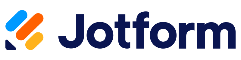
We didn’t just update our logo, we overhauled it completely. First we created our own font to draw the logo, and then we introduced a completely new color scheme.
One of the first things you might notice is that we’ve lowercased the “f” in Jotform. This is now how it’ll appear not only in our branded logos but also whenever we refer to the company in writing. There were two significant reasons for this: 1) we felt the lower case “f” enhanced readability, and 2) most Jotform users already spelled our company name with a lowercase “f.”

Jotform’s pencil icon is a major part of our brand, and we felt it was important to keep it as a part of our new identity, with some needed improvements.
The icon is greatly simplified, without the fine lines and detail of the original version. The updated look is more modern and memorable. It also shows up better when shrunken for favicons and social media images, or printed on apparel.
The updated pencil is multicolored in order to demonstrate the many Jotform products and features that we’ve built in recent years. When arranged differently, the colors on the pencil can morph to represent form fields, the cells in a table, the bars on a bar graph, or the lines on a document.
One thing you’ll notice about our new design is circles, whether on our site pages or in the new logo itself. We used them because circles are flexible and expandable, just like Jotform. A circle is also a welcoming and soft shape, which gives our users a friendly experience when they’re navigating our site.
Tagline
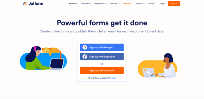
We introduced a new tagline to accompany our new design: Powerful forms get it done.
We needed a tidy way to convey what Jotform has become and what it means to our users in 2021. We didn’t want our new messaging to focus solely on how easy it is to use our Form Builder; we also wanted the tagline to speak to the advancements we’ve made to our product over the past 15 years. Jotform has the most powerful forms anywhere, and that’s the focus of our messaging going forward.
Rebranding means changing hundreds of pages, both on our own site and across the web. Here’s a look at how some of the updates appear, next to their old versions:
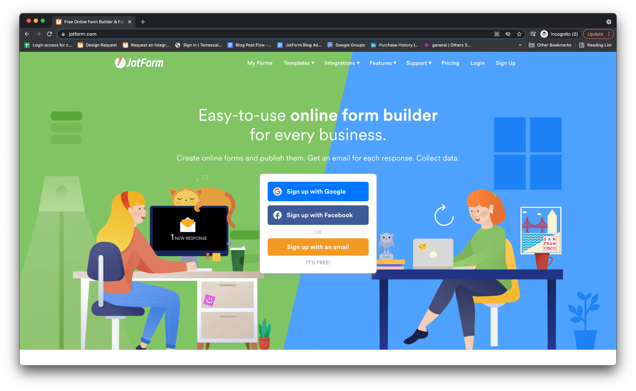
Homepage
The bones of the homepage will remain the same, but we’ve livened it up with our new tagline, color scheme, and logo.
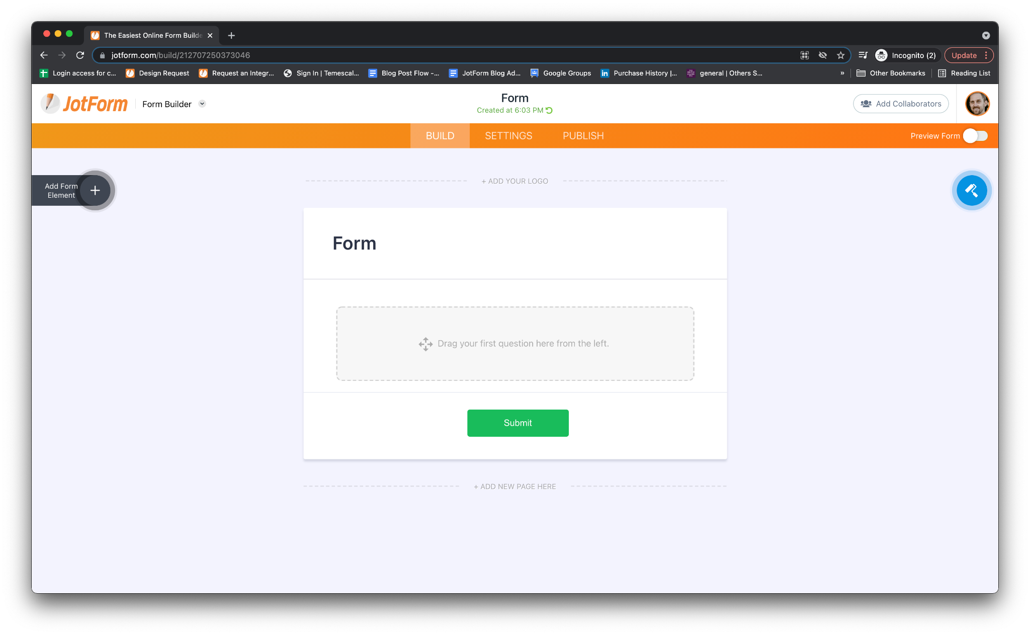
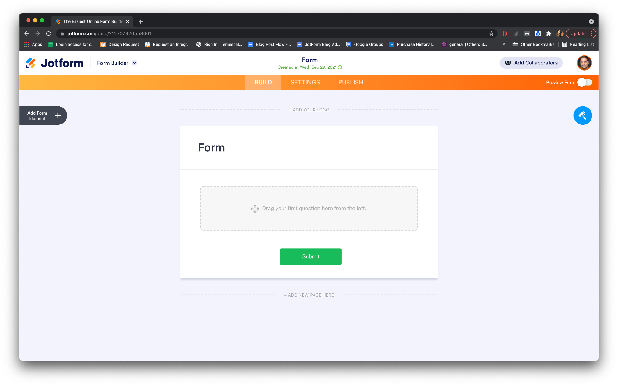
Form Builder
We’ve slightly changed the colors in our Form Builder navigation, with an emphasis on high contrast, while keeping the focus of the page on the form being created.
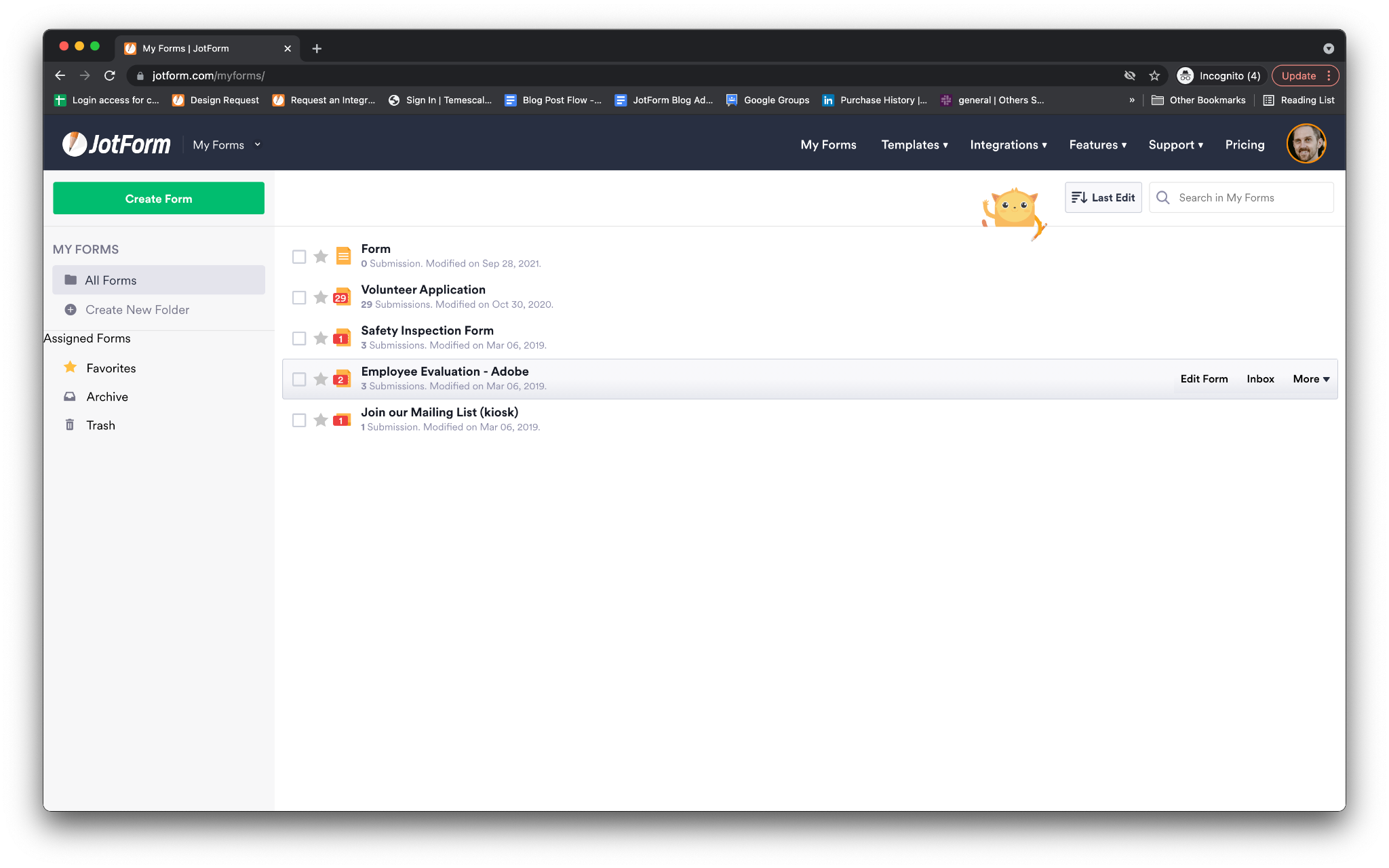
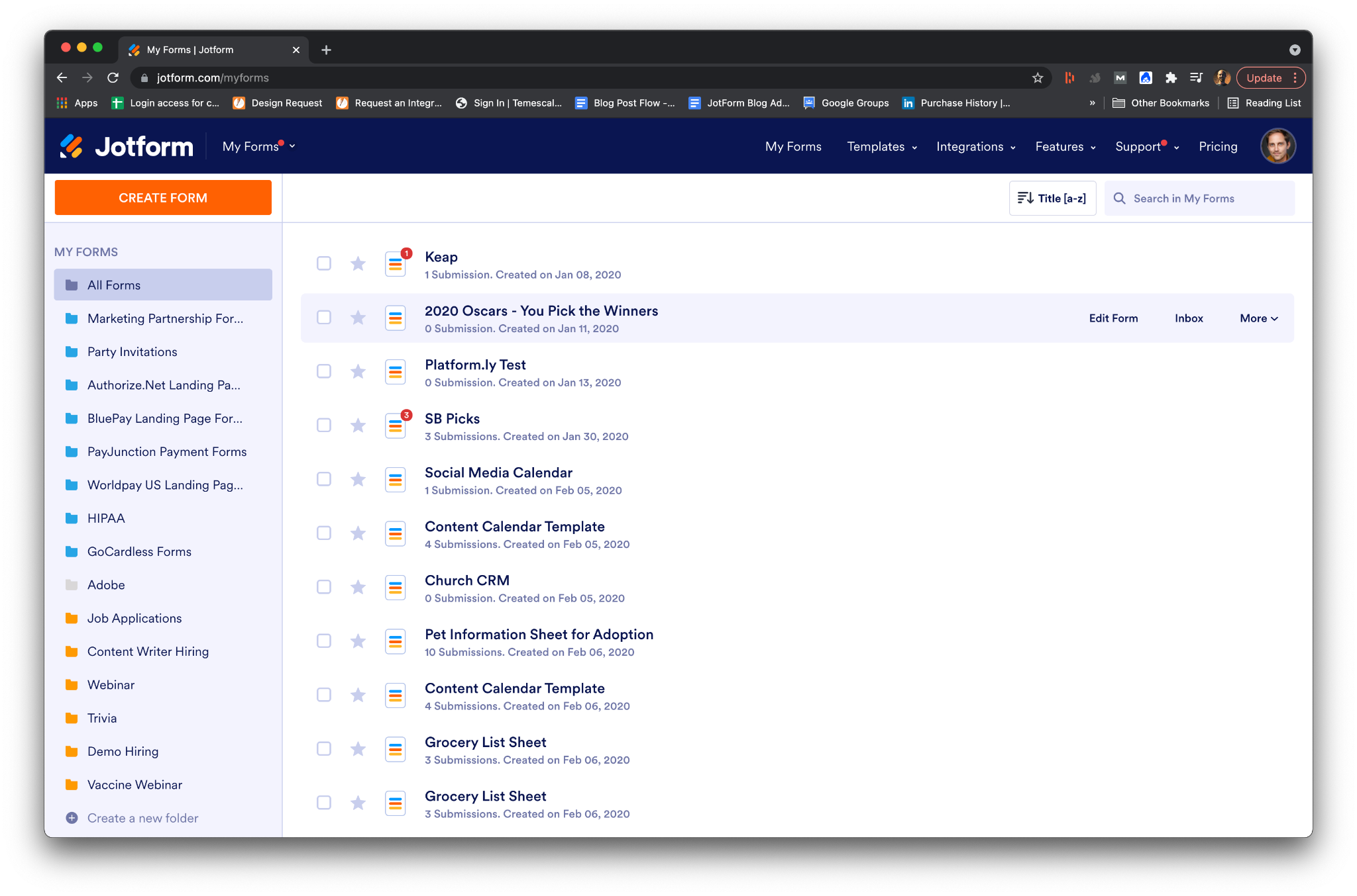
My Forms dashboard
Everything looks cleaner on the rebranded My Forms page. Jotform’s new navy blue extends across the header, and our new orange “Create Form” button really pops. The page is also easier to read and navigate.
What hasn’t changed?
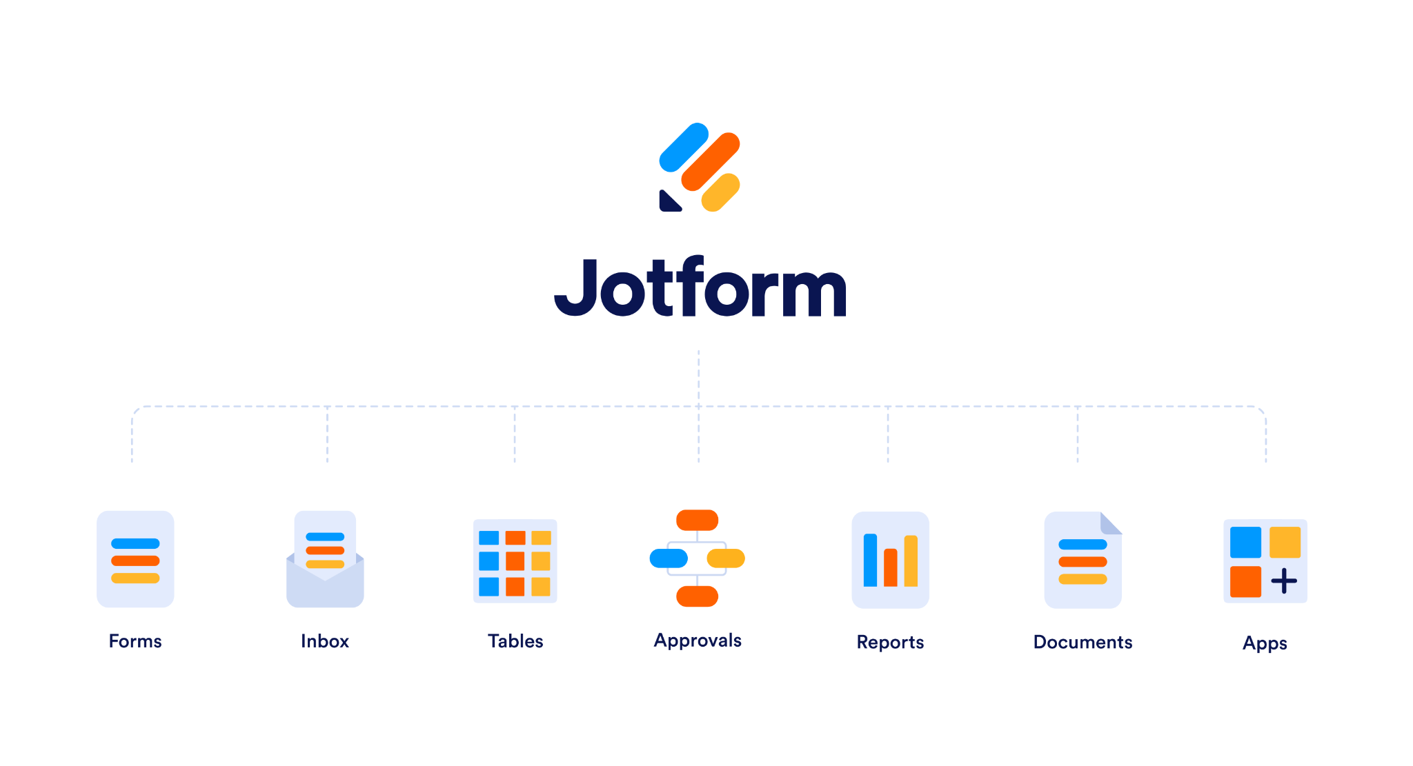
While much has changed with Jotform, it’s still the same suite of products you know and love.
Our pricing plans are exactly the same, including our free Starter plan. It’s important for us to keep Jotform accessible to every type of organization, and we still offer all of our advanced features and integrations on our Starter plan.
We’re also keeping all the same features and products you know and love, including Jotform Tables, Jotform Mobile Forms, Jotform PDF Editor, and more.
And, even though we’ve given Jotform a fresh look, we’re still keeping Podo, our friendly mascot.
Our design process
You might have heard about Jotform’s famous hack weeks before. Every so often teams within Jotform will stop everything else they’re doing to collectively focus on a single goal. It’s how we’ve conceptualized many of our products. And it’s how we tackled creating a new brand for Jotform.
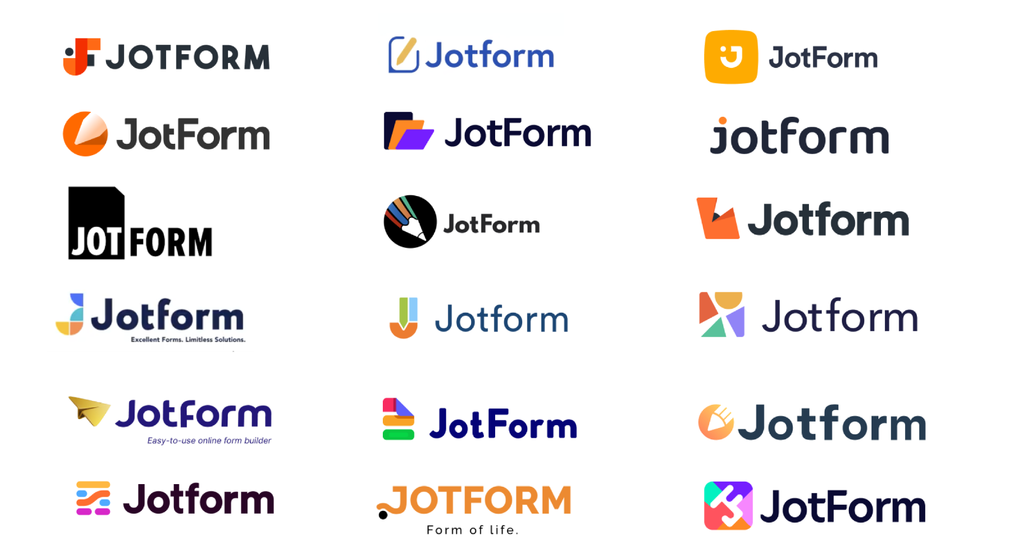
We actually developed this new brand identity over two separate hack weeks and came up with dozens of other concepts along the way. In the end, we felt like our new brand was the best representation of Jotform and its many features and users. But you can see how some of our other concepts inspired what ultimately became our new look.
Conclusion
Initiating a rebrand of Jotform meant reexamining what our company is today.
The previous version of our logo and brand was a reflection of how our users and employees saw the company at the time: easy-to-use, approachable, and friendly. It was important that we retained that in our new look, but the company has evolved over the years, and so have our users.
In the early days, Jotform served developers looking to create forms without the tedium that traditionally came with the process. As the years went by, DIY small businesses, nonprofits, and schools started using Jotform more and more because of its simplicity and the free plan.
But now we also count government entities, hospitals, Fortune 500 corporations, and major universities among those commonly using Jotform. In short, it’s a tool for everyone. This diversity of use cases needed to be reflected in the new Jotform.
We’re so excited to be able to share this new brand with you as we celebrate our 15th year in business and our 10 millionth user. We certainly couldn’t have done it without you.
For more information about the new look, visit the resources below:
What do you think about the new look? Let us know in the comments!


Send Comment:
2 Comments:
More than a year ago
Congratulations on your rebrand. Your new logo mark is lovely and so clever! And the entire identity looks like quite the visual upgrade! Great work
More than a year ago
Great job on the logo. Perfect choice lower case "f". Great logo graphic. A+ on the new logo. Webpage design still needs LOTS of work.