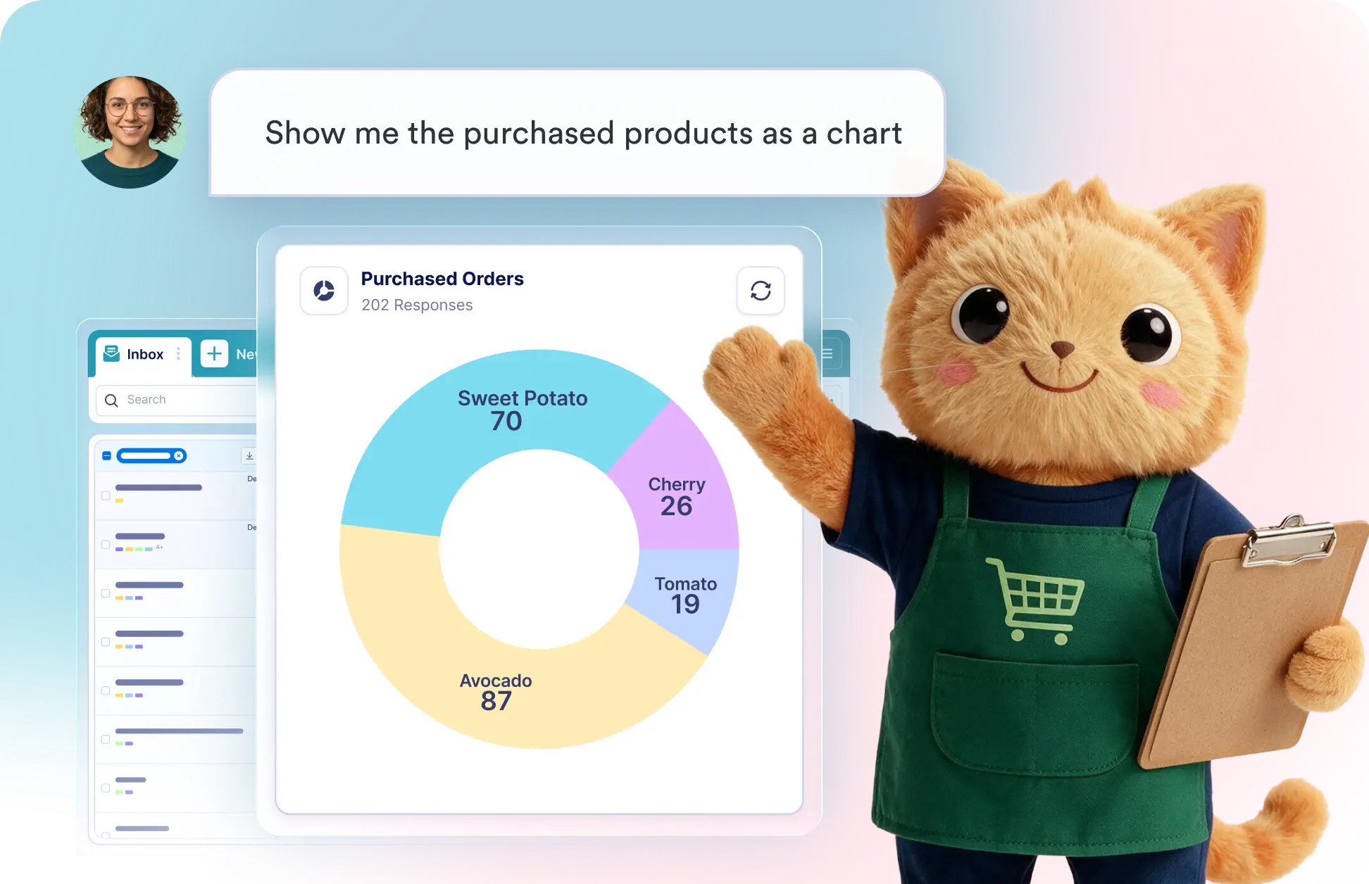
Describe the visualization you need in everyday language, and Data Assistant will turn your submissions into clear charts or data tables that highlight patterns and make comparisons easier.
Visualize Submission Data With AI
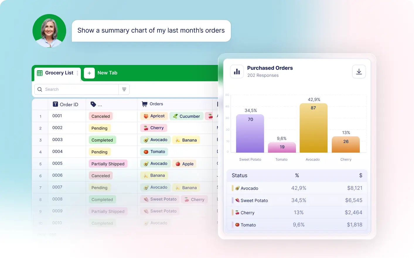
Request a visual summary of any field, category, or response set. Data Assistant creates charts and dynamic tables instantly, helping you compare values and explain findings without manual setup.
Generate Charts From Form Submissions
Ask for a bar, pie, donut, or column chart based on submission data. Data Assistant organizes the values, creates the visual, and presents key patterns alongside the chart.
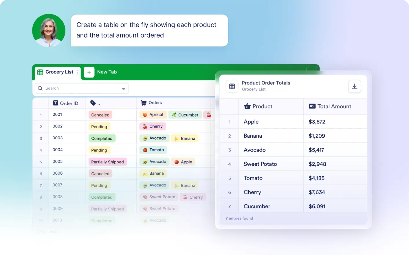
Build Tables and Text Grids Instantly
Create an on-the-fly table to organize answers in a structured format. Work with submission data, sample data, or AI-generated data to compare values and perform deeper analysis.
FAQ
Tell Jotform's Data Assistant what you want to visualize, such as recurring names or responses by category. It analyzes your submissions and creates a visual chart based on your request.
You can visualize submission data using Bar, Pie, Donut, Column, and Text Grid charts, giving you different ways to compare values, review distributions, and present results.
Yes. Describe what you want to analyze using natural language, and Jotform's Data Assistant handles the data analysis and chart creation for you.