


Do you: “Strongly Agree — Agree — Somewhat Agree — Neutral — Somewhat Disagree — Disagree — Strongly Disagree?”
Ugh. The Likert scale.
If you’ve ever filled out a form (or had to collect data) using one of these, you’ll know exactly what I mean.
My Master’s Thesis relied on a Likert scale-powered survey. Even worse, I had to collect all the data manually (for ten websites, and 40 respondents!) because my surveys were hard copies. It was a tricky, frustrating process; and the form I used makes me want to gouge my eyes out:

The table was ugly; the layout was overwhelming; and the font had to be Times New Roman.
Bad times. Maybe that’s why I feel so strongly about what forms should be like. The ride needs to be smooth and easy, so respondents feel supported and motivated to start, continue and complete the process.
This all came into play in the lead up to launching our newest product. We got to where we are today with the help of seven hack weeks.
Hack week (noun)
Five-day sprints where the product teams focus exclusively on a specific area or problem, without worrying about daily tasks or to-do lists.
At Jotform, hack weeks are responsible for our team’s most innovative and original ideas, including Jotform Cards: the biggest release in our 12-year history.
Hack weeks are intense. A hack week multiplied by seven is — well, very intense.
But hack weeks are more than just hard work: they’re a powerful exploration of creativity. They’re an opportunity for designers to think outside the box and shine, a playground for experimentation.
Developers, product specialists, UX and UI experts all join forces to form over-arching, cross-functional teams where ideas can flow back and forth.
And there are major constraints propelling things along. The design needs to be ready in one or two days, leaving enough time for the developers to implement it. This means we can’t agonize over minor details — we just have to get on with it.
As Aytekin said, there’s magic in collaboration.
Here’s a snapshot of what happened.
Hack week five
Describing all the work involved over the course of the seven hack weeks would take a book rather than a blogpost.
But I’d like to give you a flavour by zooming in on hack week five. The overall goal was to make the form-filling experience more fun, friendly and down-to-earth.
Our specific brief was to either improve an existing field for Jotform Cards, or to develop a new one. We decided to improve the existing ‘Input Table’ field.
The previous version was very content-heavy and contained a ton of rows and columns, with options such as radio button, checkbox, dropdown, text box, numeric text box and currency text box. It was hard to follow and even harder to fill out.

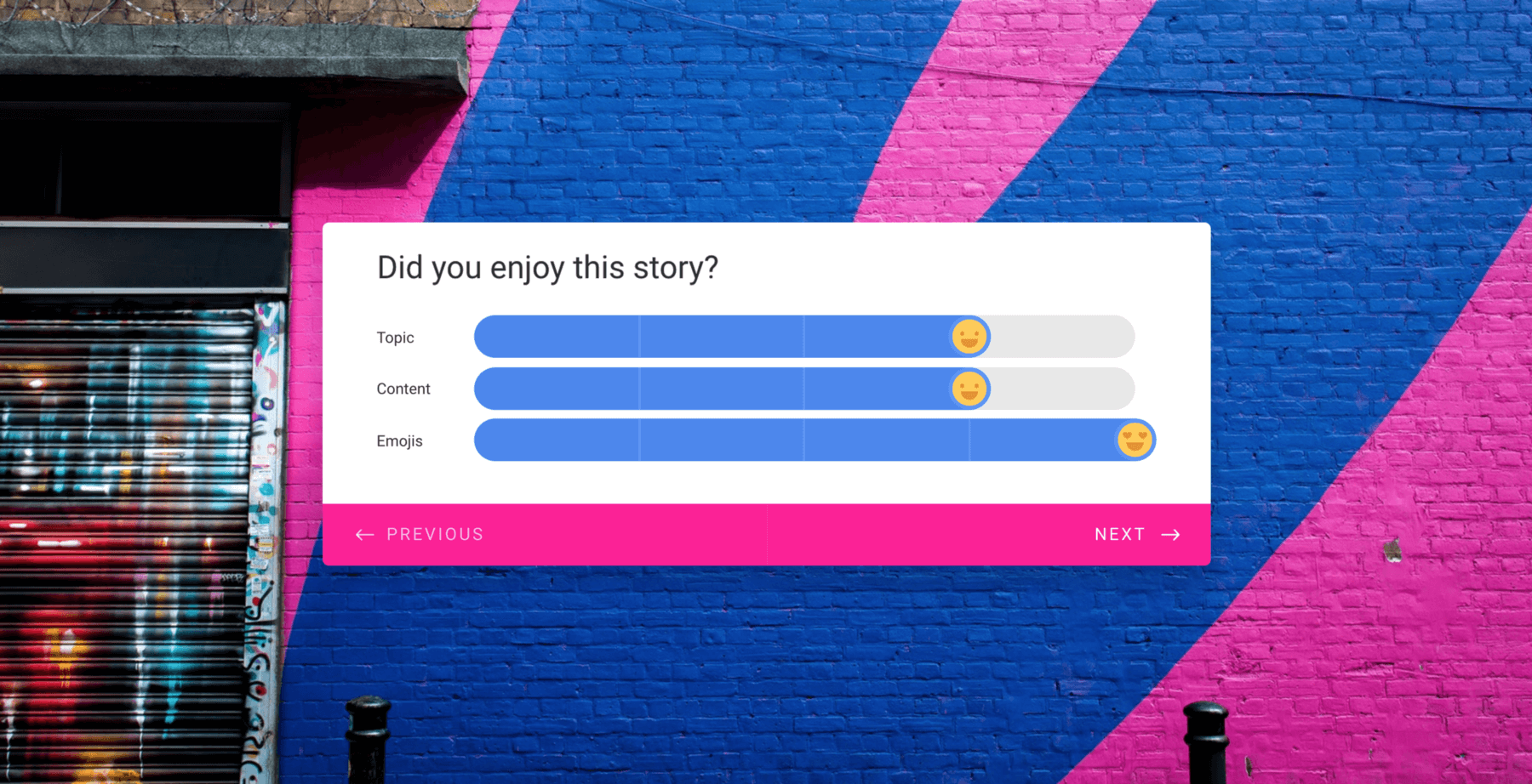
Step one: a funky evaluation slider
We wanted to develop a more expressive way for respondents to communicate with the form owner. They could already use the radio button for input, but we knew they might prefer a quicker way of responding.
So, we brought in the evaluation slider: by dragging the blue dot or clicking on the grey one, respondents could get quick feedback and see their answers change instantly.
Step two: getting emotional
After that, it was time to spice things up a little. The second input type we focused on has become one of Jotform Cards’ most unique features: the Emoji Slider!
I wanted users to be able to express their level of satisfaction/agreement without having to use words. Instead of wading through the never-ending nuances of “Strongly Agree — Strongly Disagree” statements, I developed a design that enabled them to select three, five or seven-scaled Emoji Sliders:

Emojis are a win-win, saving time for the form owner and the respondent.
Filling forms can feel like a boring, obligatory task, but when we watched the user-testing videos, it was clear that respondents enjoyed filling out the emoji slider. It encouraged a fun, gamified experience that makes people smile.
By the time we were ready send the input table field to user testing, we’d become emotionally attached to the emojis we’d created!
The crying face tore our heart out, while the heart-eyed emoji had us lovestruck. The micro animations and smooth transitions were the cherry on top, making the emojis even more attractive and engaging.
Step three: toggle to your heart’s content
We had noticed that users tended to create Yes-No questions using radio buttons. So our final mission was to make their lives easier by adding a Yes-No Toggle to the input table types.

When we finished the Input Table field at the end of the hack week, we had three new input types: the Evaluation Slider, the Emoji Slider and the Yes-No Toggle. We had also improved UIs of the existing radio button, check box, dropdown, text box, numeric text box and currency box.
Oh, and all of these features were mobile-friendly.
We were delighted with the results. In a short timespan, we’d managed to bring out a diverse field of cool new features.

I need some space
We expected that both the Emoji Slider and the Yes-No Toggle would be our users’ favourites. So, before launching, we decided to give these features independent fields, and made sure they were ready to use for single-questioned statements.
And we were right: recent data shows that the separate Emoji Slider Field is used 6X more now that it’s part of the input table field. It’s much easier to find in the editing tool and more practical if the user wants to ask a single line question.
Beyond Likert scales
The journey that took us to the launch of Jotform Cards was incredible –intense and hectic, yes, but also very productive. As Aytekin always remindsus, constraints breed creativity.
It was amazing to immerse ourselves in a series of challenges and come out the other side with a product we’re all proud of. Plus, nothing builds company culture like working toward a shared goal.
Whenever we thought:
“Is there really anything else we can do that hasn’t been done before?”
the product teams would surprise everyone with fresh new ideas. Now these ideas have been designed and implemented, and they represent part of a happier user experience.
Jotform Cards is all about taking the chore out of forms, and making the task of filling them out as inviting as possible. I think we’ve come a long way in achieving this, and we will keep pushing for improvement.
I can’t wait to see what’s in store for our team. I hope it will make you smile 🙂


Send Comment: