Ücretsiz Sütun Grafikleri Oluşturun
Jotform'un sütun grafik oluşturucusu, ham form yanıtlarınızı net veri görselleştirmesi için özelleştirilebilir sütun grafiklerine dönüştürmenize yardımcı olan bir araçtır. Yanıt verilerini seçmek, renkleri ve etiketleri ayarlamak ve yeni veriler geldikçe otomatik olarak güncellenen profesyonel grafikler oluşturmak için bu sütun grafik oluşturucuyu kullanın. Grafik sonuçları, trendleri belirlemenize, değerleri karşılaştırmanıza ve kod yazmadan veriye dayalı kararlar almanıza yardımcı olur.
Şablonlar
Sütun Grafiği Şablonlarını Keşfedin
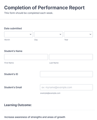
Öğrenci Performansı Değerlendirme Formu
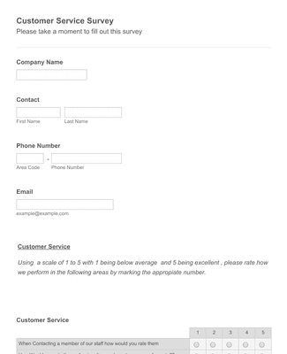
Müşteri Memnuniyeti Anket Formu Şablonu
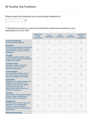
Kaliteli Kuruluş Çalışan Geribildirim Formu
Avantajlar
Anında Sütun Grafikleri Oluşturun
Zahmetsiz veri görselleştirme
Jotform'un Rapor Oluşturucusu ile kolaylıkla online form yanıtlarınızı etkileşimli sütun grafiklerine dönüştürebilirsiniz. Karışık kodlama veya tasarım becerilerine gerek yok — basitçe görmek istediğiniz gönderi verilerini seçin ve Sütun Grafikleri her yeni gönderide yenilenen profesyonel grafikleri otomatik olarak oluştursun.
Bilgilendirici görseller oluşturun
Form yanıtlarınızı sütun grafiklerine dönüştürerek karmaşık verileri net ve özlü bir şekilde çevirin. Hedef kitlenizi form yanıtlarınızın tüm hikayesini anlatan ve verilerinize hayat veren profesyonel görsellerle etkileyebilirsiniz.
Eğilimleri ve görüşleri belirleyin
Sütun grafikleriyle form yanıtlarınızdan saniyeler içinde trendleri belirleyebilir ve değerli bilgiler edinebilirsiniz. Görsel gösterim, daha iyi bir işletme oluşturmak için kalıpları hızlıca fark etmenize, değerleri karşılaştırmanıza ve veriye dayalı kararlar almanıza kolaylıkla olanak tanır.
Kolaylıkla özelleştirilebilir
Jotform'un sütun grafik oluşturucusu, grafiklerinizi dakikalar içinde özel ihtiyaçlarınıza ve markanıza uyacak şekilde özelleştirmenize olanak tanır. Sunumunuz veya rapor stilinizle mükemmel uyum sağlayan grafikler oluşturmak için renkleri, etiketleri ve sütunları ayarlayın. En iyi kısmı mı? Hiçbir kod yazmadan!
Formlarla sorunsuz entegrasyon
Sütun grafiklerine bilgi toplamak için Jotform'u kullanarak veri toplama sürecinizi kolaylaştırabilir ve grafik oluşturmayı otomatikleştirebilirsiniz. Grafikleriniz, otomatik olarak her form yanıtıyla beraber yenilendiği için her zaman günceldir.
Kullanıcı Görüşleri
Kullanıcılarımız Jotform hakkında ne diyor?
Sıkça Sorulan Sorular
Jotform ile ilgili tüm sorularınızı cevapladık. Sıkça sorulan soruların yanıtları için SSS bölümümüze göz atın veya daha fazla bilgi için destek ekibimizle iletişime geçin.
Özel bir sütun grafiğini nasıl oluşturabilirim?
Jotform ile özel sütun grafiği oluşturmak hiç bu kadar kolay olmamıştı! Rapor Oluşturucu'yu açın ve Yeni Rapor'a tıklayın. Verilerinizi çekmek için mevcut bir form seçebilir, veri içe aktarabilir veya örnek rapor kullanmayı tercih edebilirsiniz. Verileriniz daha sonra bir rapora dönüştürülecektir. Herhangi bir yanıt setinin yanındaki dişli simgesine tıklayın ve Grafik türü altından Sütun'u seçin. Verileriniz kullanışlı bir sütun grafiğine dönüşecek ve buradan istediğiniz gibi özelleştirebilirsiniz! İşiniz bittiğinde, raporunuz saniyeler içinde indirilmeye, yazdırılmaya veya paylaşılmaya hazır olacak.
Jotform'un sütun grafiği oluşturucusu ücretsiz midir?
Evet, Jotform'un sütun grafiği oluşturucusu tamamen ücretsizdir ve ileride de ücretsiz olacaktır.
However, Jotform’s free Starter plan only allows for 100 monthly form submissions. You can access higher submission limits with a paid Bronze, Silver, or Gold plan.
Sütun grafiklerini kullanarak verilerimde eğilimleri ve kalıpları görebilir miyim?
Evet. Aslında bu, verilerinizi görselleştirmek için sütun grafiğini kullanmanın ana avantajlarından biridir! Sütun grafikleri, form yanıtlarının değerlerini hızlıca karşılaştırmak için yan yana görsel karşılaştırmalar oluşturmanıza olanak tanır. Bu sayede verilerinizdeki üst düzey kalıpları ve eğilimleri kolayca tespit edebilirsiniz.
Column charts are also a great option for presenting your data to an audience because they let you demonstrate these trends with ease.
Sütun grafikleri neden kullanılır?
Sütun grafikleri, birden fazla kategori veya veri grubunun değerlerini görüntülemek ve karşılaştırmak için kullanılır. Özellikle birden fazla veri kategorisi arasındaki eğilimleri, kalıpları ve ilişkileri göstermek için kullanışlıdır ve veri sunumu ve yorumlaması, kategorik analiz ve çok daha fazlası için mükemmeldir!