Key Takeaways
- Online forms play an important role in our lives, even though we don’t always realize.
- Form design is crucial to minimize the form abandonment rate.
- Some psychological principles affect the way the people would fill out a form and these principles should be minded when preparing a form.
- The audience should be identified well since you ask questions to do them.
- Basic UX principles should not be forgetten as well.
Have you filled out an online form recently?
Chances are that the answer is yes. According to recent research, 84% of people fill out at least one web form per week.
But you may not have realized, because filling out web forms has become an almost integral part of the fabric of our lives.
In fact, almost every online interaction that takes a user from A to B is an online web form: getting in touch with a company, booking a train, buying a product, organizing a hotel stay…
Web forms first started to be used for online sales in 1994, with the first ever drag-and-drop forms popping onto our screens in 2006. Since then, forms have become the lynchpin of online interactions.
They are the gateway between a company and their customer. From small town blogs to global government portals, it’s almost impossible to imagine a website without one.
So why do online forms have such a bad rep?
Sure, very few people actually love forms. But most won’t mind filling one out as long as it’s clear, concise and well-designed.
And that’s where the rub lies. Too many online forms are overly long, confusing or invasive (and sometimes all three at the same time).
When a form baffles, frustrates or asks for more than is necessary, the risk of a respondent giving up is sky-high. Some people will abandon the form altogether. Others will unsubscribe. Either way, you’re not likely to get a second chance.
When designing a form, how can we make sure respondents will hang in till the final click?
“It’s very easy to create a form. The hard part is getting people to actually fill it out.”
After helping our 4.2 million users create online forms, the main thing we have learned at Jotform is that seemingly subtle changes make a world of difference. Often, they are what distinguishes a form that converts from one that is abandoned.
For example:
- HubSpot found that readers were 17% more likely to fill out a lead generation form of 14+ pages when it was placed on a separate landing page.
- Marketo found that a few non-essential fields were inflating their cost per lead by 25%.
Designing a form? Make it an intuitive, easy and friendly experience. This guide tells you how.
Pro Tip
It’s so easy to design beautiful forms without any technical knowledge or prior experience. Sign up now and start creating online forms for free!
Main components of a form
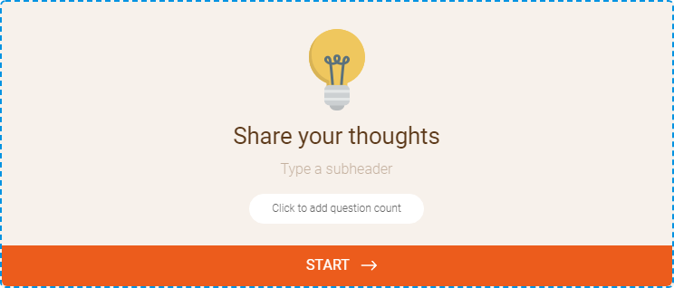
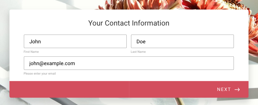
1. Greet your respondents: Title and introduction
Would you greet your friends without saying hello? We know how important good manners are, but in the online sphere, they often get lost in translation.
A title and welcome page are your chance to introduce your form (and yourself) in a clear and friendly way – and make a good first impression.
Just ask BettingExpert: they received 31.54% more signups by changing their form title to emphasize why people should sign up.
Your title is the shortest and most accurate description of what’s to come. Users tend to skim a form’s content, and hardly any will read a detailed description carefully. That’s why it’s so crucial to capture a form’s purpose in as few words as possible.
The title can be followed by a brief description of what the respondent can expect from the form. Keep this as neutral as possible: you want to make sure that your respondents answer honestly, rather than trying to meet your expectations. Even something as simple as outlining a goal may unwittingly coax your respondent into trying to achieve that goal.
Now’s also the time to list any external paperwork the respondent should gather beforehand – no one wants to be running around the house looking for their P45 or passport halfway through.
If your form is guaranteed to take a substantial amount of time to finish, alert users to this in advance. But if it’s ‘quick and easy’? Let users be pleasantly surprised (i.e., don’t risk insulting anyone’s intelligence, just in case.) They will be able to infer this themselves by looking at the progress bar or number of fields anyway.
Pro-Tip
Not sure where to begin? Explore Jotform’s 20,000+ readymade form templates to get a head start on creating custom online forms for free — with no coding required.
2. Place related headers and subheaders
Fun fact: humans form first impressions in 50 milliseconds. Spoiler: that’s just not long enough for them to read your copy carefully.
Form respondents will probably skim-read the bare minimum and ignore the rest. Chances are they’re in a hurry, distracted, or generally impatient to get the experience over and done with.
Fair enough. We can’t stop them, so we may as well guide them: with crystal-clear, succinct sign-posting. Headers are your new best friend: they clarify the text, break it down, give it structure and keep users engaged.
Users should be able to glance at a header and immediately know what’s expected of them, without having to read the rest of the text.
The best way to test this is by reading your headers in isolation – do they still make sense?
3. Break questions with dividers
Dividers matter. In the case of traditional forms, using dividers is the best way to reduce overwhelm by visually breaking questions up. There doesn’t need to be a huge amount of visual difference, and too much contrast can distract.
4. Decide whether you’ll use multi-page or single page form
It depends on the number of sections.
If there are only one or two topics, a single page form is your best bet. But if a form has multiple sections, multiple pages are required to break up the conversation. Think about first impressions: a user is likely to feel intimidated if faced with a one-page form containing (what looks like) hundreds of fields.
5. Emphasize Calls-to-Actions (CTAs)
Successful CTAs emphasize the ACTION part: by clicking this button, what will the user DO? Generic labels like “send,” “submit” or “process” won’t cut it. The more descriptive, the better.
To eliminate uncertainty, try answering the question “I want to…” from the user’s perspective. For example, if it’s an inquiry form for a service, it could be ‘Request My Free Consultation.’
Need more convincing? In this study, Unbounce found that even just changing ‘start your free trial’ to ‘start my free trial’ increased clicks of the call to action by 90%.
6. Identify your form fields
Now’s not the time to get fancy….
Radio fields, picker fields, and checkboxes work because they are plain and familiar. Standard formatting of form elements equals better usability.
Radio buttons can be used when there are several options, and only one can be chosen. Checkboxes work best when more than one option can be selected.
Where possible, use checkboxes and radio buttons rather than dropdowns, as they require less cognitive load to process. As Luke Wroblewski once remarked: “dropdowns should be the UI of last resort.”
7. Never forget “Thanks” page
Remember your respondents are humans that have given you some of their time. So don’t finish abruptly – always say thank you. You can customize your thank-you page with buttons, images, videos, and redirect options to continue the user journey after submission.
How to write so people will listen
Below are a few tips on the art of writing forms so people will fill them.
8. Speak simply
When it comes to forms, we all prefer plain language – even the academics amongst us, the geniuses, and the experts. So why do so many online conversations sound like they’ve been put through a Thesaurus backward?
“Kindly accept our sincerest apology. Nevertheless, we would care to know your opinion. Furthermore… “
Writing like your old college professor will alienate readers and make their eyes glaze over.
Simple doesn’t equal dumb – it equals readable. That means Plain English, with maximum clarity. Each word should be the shortest, most straightforward version available – that means ‘but’ instead of ‘however.’ No jargon, no complex sentences.
To check for coherence, read your text out loud. Your ears might hear what your eyes can’t see – particularly in corners where your writing stumbles into wordy territory.
9. Make it personal
A form should feel like a friendly conversation between you and the respondent. Make it personal by using pronouns like “I,” “you” and “your.”
10. Eliminate passive sentences
Writing packs more of a punch when it’s active (John wrote a letter of complaint), not passive (A letter of complaint was written by John).
Passive writing tends to be lengthier and less focused.
How can you tell if a sentence is passive? Here are two dead giveaways:
- The subject doing the action is unclear (A letter was written) or
- The sentence uses the verb ‘to be’ (has been, was…) followed by a participle (e.g. ‘written’).
Still not sure? You can check for passives with Microsoft Word’s Readability Statistics, or with Purdue’s Paramedic Method.
11. Cut as many words as possible
Many writers fall into the trap of thinking that the more words they use, the smarter they sound. Not so. When it comes to form-writing – or indeed, any kind of writing – cutting words is almost always more effective than adding them.
‘For every word you cut, you gain a reader.’
A text will emerge leaner, more coherent, more engaging and more precise after being checked carefully for unnecessary words.
Helpful areas for cutting:
Adverbs (words ending in -ly).
Meaningless qualifiers (a lot, a great deal).
Empty intensifiers (very, quite, rather, really).
The word ‘that.’
Nonessential information.
Vague words (thing, few, many).
12. Use contracted versions of words
Using contracted versions of words (e.g. can’t, isn’t) instead of their serious, full-formed alternatives (cannot, is not)) keeps writing light, friendly and conversational.
Plus, you save space. And good forms are always spacious.
What’s > what is. Simple.
13. Cleave long sentences
Lengthy, meandering sentences induce overwhelm. So do dense blocks of text.
For most readers, up to 20 words per-sentence – and up to three sentences per-paragraph – is just right. Splice anything longer in two. Short sentences aren’t inferior.
Blank space, bullet points, tables – anything else that breaks through the fog of heavy instructions – will make your reader breathe a sigh of relief.
14. Review the written content
Throughout my blogging journey, I’ve learned (the hard way) that good writing is 30% composition and 70% editing.
When you’ve perfected your questions, reduced words and tightened everything, put the form away. Let it stew for a few days. When you return to it, you’ll spot loose ends to tie that you couldn’t have spotted the first time round.
The psychology of forms
Most UX psychology principles are so built into our psyche that we don’t notice them – unless they’re not there.
But every color, font, line and button serves a purpose.
Small-scale, everyday design might not be as dramatic as billion-dollar marketing campaigns. But that doesn’t mean it should be any less thoughtful. And understanding the psychology behind what makes people tick is fascinating – and free.
Here are some key psychological principles that form the solid basis for well-designed forms.
Just so you know
Ready to build a well-designed form of your own? Sign up for our free Form Builder today to create any online form in just a few clicks.
15. Compare costs and benefits
Every decision we make – from taking out the bins to getting engaged – goes through an automatic cost-benefit analysis in our minds. Are the costs of a task worth the benefits of its completion?
It’s a designer’s job to ensure that perceived benefits always outweigh costs.
Of course, cost vs. benefit is subjective, and form-filling usually stems from obligation, rather than an activity respondents hope to gain something from. We can’t ensure benefit, unless we offer our respondents a reward. But we can minimize costs.
Some key strategies for minimizing costs for your respondents:
16. Chunk text

+1-919-555-2743 vs 19195552743.
Which telephone number sticks in your brain? The first one, of course. That’s because it’s been chunked.
Chunking is a handy memory technique: we use it for our bank PINS, social security numbers and locker codes. It refers to the process of arranging information into ‘chunks,’ making the content easier to retain, process and recall.
Research claims that three is a magic number to help people absorb and recall information. So use it when you can: for paragraphs, lists, key steps…
17. Define formatting requirements
If at all possible, avoid arbitrary formatting rules. But if they are a necessary evil, spell them out in red marker pen. When filling out a form, no one likes guessing games. Password requirements, syntax rules, numbered spacing: if a field requires a certain input, make it visible.
Hicks Law
If I’m throwing a dinner party, I’ll always opt for buying my ingredients from a small local grocer rather than a sprawling supermarket. That’s because having too many options often feels paralyzing. That’s Hicks Law: it states that, as our number of choices increases, so does our time spent trying to make a decision.
Applied to UX, Hicks Law is an ode to deliberate elimination: limiting navigation choices and giving users clear but restricted options. Because as design flexibility increases, its usability decreases.
Less really is more.
Some ways of putting Hicks Law into practice:
18. Cut ruthlessly (again)
What purpose does that link serve? Or that button on the top right? If it’s not adding, it’s taking away. Every word of copy, every picture, bell or whistle that isn’t 100% necessary will decrease your form’s conversion rate.
Neil Patel was able to increase his contact form submission rate by 26% simply by removing a single field.
As Truman Capote once said, ‘I believe more in the scissors than I do in the pencil.’
19. Reduce the need for typing
Typing is the most time-consuming and intensive aspect of online forms, and it often leads to errors – especially on mobiles. Replacing text boxes with buttons and sliders and using autocomplete will reduce effort and increase conversions.
20. Shorten your form with conditional logic
According to Marketing Insider Group, 78% of internet users say personally relevant content from brands increases their purchase intent. And marketing campaigns are 83% less effective when the experience is irrelevant to the user.
So, thank goodness for conditional logic!
Conditional logic (or ‘branch logic’) simplifies complex processes by allowing additional instructions based on a particular response – or, “if this, then that.” In the context of a form, a respondent would only see questions that apply to them on the basis of their previous answers.
Using conditional logic will reduce the time it takes to complete your form by not displaying questions that are irrelevant to a user, making them less likely to abandon the task ahead (stat about abandonment).
Yes, this sounds like common sense – but most forms parrot the same questions to every user, no matter who they are. And using conditional logic is a win-win, because by clearly defining user segments, you capture cleaner, more useful data.
Dual-Coding Theory
I say: tree.
You see: trunk, green leaves, branches.
Our brain is clever like that: it associates visuals with words.
That’s the key principle behind Dual-Coding Theory, which states that memory has two disparate but connected systems, one for verbal information (‘tree’) and one for visual information (trunk, green leaves, branches).
When something is ‘coded’ in two ways (visual and verbal) there is a higher chance of it being understood and remembered than if it is coded in only one way (visual or verbal).
In other words, pairing words with images make them easier to remember. Children’s books make the most of this. Here are two ways of putting Dual-Coding Theory into practice when designing a form.
21. Visualize the information
Our brains process visuals much faster than text. Using cues like icons, imagery, shapes – whatever helps to illustrate your point – will make the user experience more intuitive.
Form design should be consistent, but that doesn’t mean it can’t integrate little moments of surprise. By using non-standard visual UI elements – like clickable images and toggled sliders – you can make form-filling more enjoyable and intuitive.
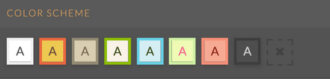
22. Consider the colors
Did you know: 90% of our initial judgement of a product is based on color alone?
In fact, according to marketing guru Neil Patel, color is “85% of the reason you purchased a specific product.” The right combination can improve readership by 40%, comprehension by 73%, and learning by 78%.
You don’t need to be a designer to figure out which color schemes and contrasts work best. Handy programs like Adobe Color CC and Paletton exist to help you choose a palette that reflects your company’s image.
23. Make your form beautiful
Shallow creatures that we are, we’re conditioned to believe that attractive design is better in other ways, too: faster, smarter, easier to use. That’s called the ‘aesthetic-usability effect.’ A beautiful interface increases our patience and loyalty and even makes us more sympathetic to design problems.
38% of people will stop engaging with a page if the content or layout is unattractive. In other words, if your web forms aren’t beautiful to look at (and easy to fill out), they’re a waste of time.
Sure, beauty is in the eye of the beholder. But a simple interface, clean font, and sleek styling will win you (form) beauty pageants.
Here’s a quick tip on how to create an attractive form with the right color scheme:


Pro Tip
When choosing the best font for forms, prioritize readability over style, clean, simple fonts help users scan questions faster and complete forms with fewer mistakes.
The Endowed Progress Effect
We are more motivated to finish a task if we can visualize the progress we’ve already made towards it. When we think we have a headstart, it reduces that amount of perceived work, making us more likely to go the extra mile.
That’s known as the ‘Endowed Progress Effect,’ summed up by American professors Joseph C. Nunes and Xavier Dreze as “a phenomenon whereby people provided with artificial advancement toward a goal exhibit greater persistence toward reaching the goal.”
Some examples of applying the Endowed Progress Effect to forms:
24. Stagger questions from easy to hard
If you can release questions from easy at the beginning of the form to hard at the end (without sacrificing logical order), users will speed through the initial stages of the form. This, in turn, will trigger the streak effect: the satisfaction generated by quick progress and a sense of momentum, that makes users reluctant to break the streak. Meaning they will continue and are more likely to hang in when the form becomes more demanding.
25. Illustrate the progress
Reflect user’s advancement at all times. The closer respondents feel to their goal, the more likely they are to push themselves towards it. If your form is multi-page, indicate how many pages they have left to complete.
A study from Clutch confirms that 90% of people prefer web forms that use progress bars to manage their expectations about completion time.
Questions, answers and grouping
26. Brainstorm the questions
All forms rely on questions. When it comes to brainstorming questions, it’s best to start with the end goal and work backward.
So your first question is: What’s the purpose of your form? Is it onboarding? Feedback? Research?
Jot down the knowledge you hope to gain from the form, as precisely as possible. Articulate this as questions (with a question mark at the end) instead of snippets from your train of thought. Give yourself enough time to erase and start again.
Then, write down some possible answers which would give you what you are looking.
And finally, brainstorm the questions that would lead you to these answers in the first place.
As a post-survey precaution, write down the %age of responses per-question you’d expect to receive. Comparing these guesstimates to your actual results will reveal blind spots to pay attention to next time round.
This pre-survey process will also guide your design and save you time.
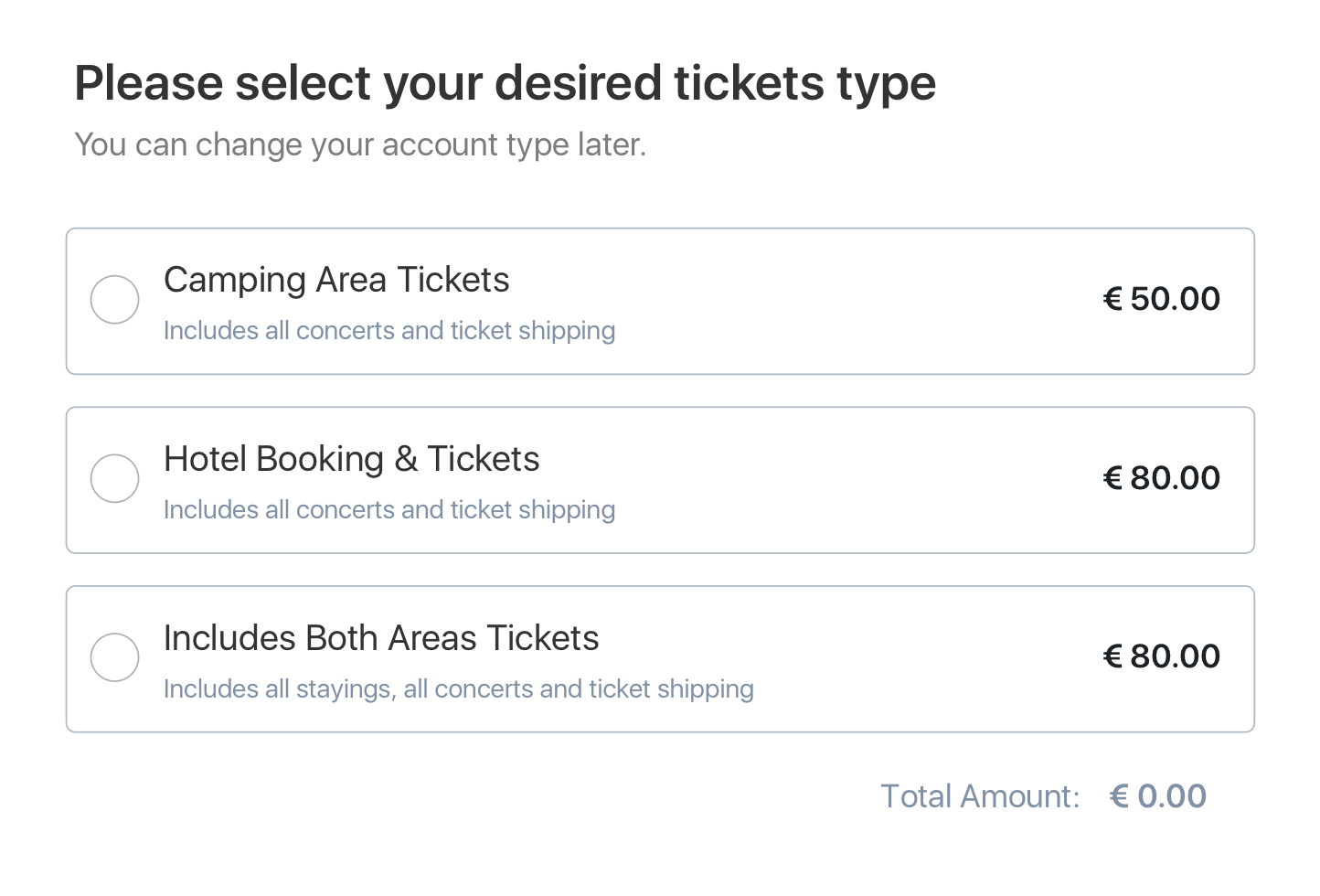
The science of fields
According to the Form Conversion Report, the type of form directly impacts the number of fields you should include. Think very carefully about how much detail you need for the context you are in.
Now, ask yourself: do you really, really, REALLY need to ask that question?
Chances are the answer is no. Even if we know the power of less, when faced with the opportunity to get a peek into our users’ brains, it’s tempting to ask for lots.
Yes, the answer to this question may be important. But is so important that it’s worth losing the form respondent over it?
You need your users’ cooperation. And every additional field makes them less likely to complete your form. So, once you’ve listed all the possible questions and answers, try and cut as many as you can. Think about other ways to collect data, and consider whether the question can be inferred, postponed or excluded altogether.
Eliminate optional questions altogether. If you must include them, list them after the form has been completed.
27. Group the questions correctly
Structuring online forms is key for success.
Once you’ve brainstormed, trimmed and refined a final list of questions, it’s time to organize them. Arrange them into groups and subgroups with a ‘theme’ header that holds them together, e.g. contact details, work experience, etc.
Once again, the user should be able to scan each section and know what they need without reading the questions.
28. Define a logical question sequence
Next on the list is question order. The rule of thumb is that the closer in topic questions are, the closer they should physically be placed together.
Each question, and section, should nudge the respondent on to the next. Big gaps or leaps forward are confusing, so think of the way a form develops step-by-step in a recognizable sequence.
Through conditioning, we can recognize some types of flow more easily than others. For instance, ‘What’s your name?’ will come before ‘Where do you live?’ which will, in turn, come before ‘What’s your work experience?’

29. Decide on “compulsory vs. optional vs. ‘nice-to-have’”
It’s best practice to limit your form to compulsory questions only. Optional questions needlessly lengthen a form and irritate the user: “Where did you hear about us?” “Would you like to receive marketing emails?”
But what about questions that aren’t compulsory, but would be very ‘nice to have’? Place them at the end of the form as an optional follow-up. This way, they will feel less invasive, and won’t affect your conversion rate.
30. Ask one thing at a time
Double-barrelled questions lead to ambiguity. And – you guessed it – ambiguous answers can’t be quantified.
Avoid the pitfall of meandering questions by scanning them for the words ‘and/’or.’ Seen one? Cleave the question in half.
The clearer the question, the clearer the answer. The clearer the answer, the clearer the data.
31. Give shortcuts
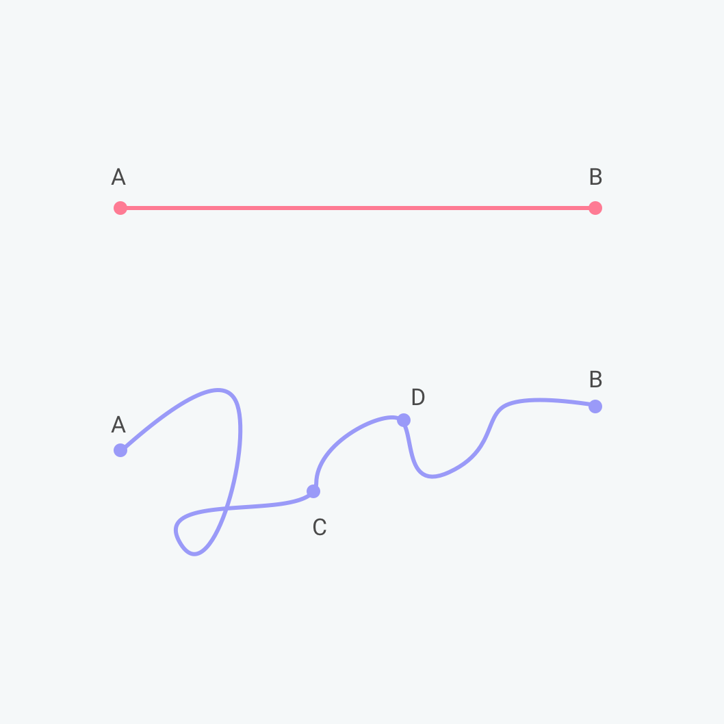
A good form carves a clear route to completion, then carefully guides users along with clues, cues and direction. The shorter that route, the higher the chance of completion. So offer shortcuts if you can.
Some examples of helpful shortcuts:
Zip code lookup
When asking users to fill out their address, it’s best practice to just ask for a house number and postcode/zip code, and then use a lookup service to suggest the full address.
Placeholder text
Placeholder text is light text that appears in a form field to describe its expected value. It should only be used if there is potential ambiguity.
Field label
A field label is the question text that sits above the field. These should always be present and shouldn’t be replaced with placeholders. It’s tempting to free up space by making placeholder text double up as a label, but this causes many usability issues (summarized here.)
In other words, you can have labels without placeholder text, but not placeholder text without a label.
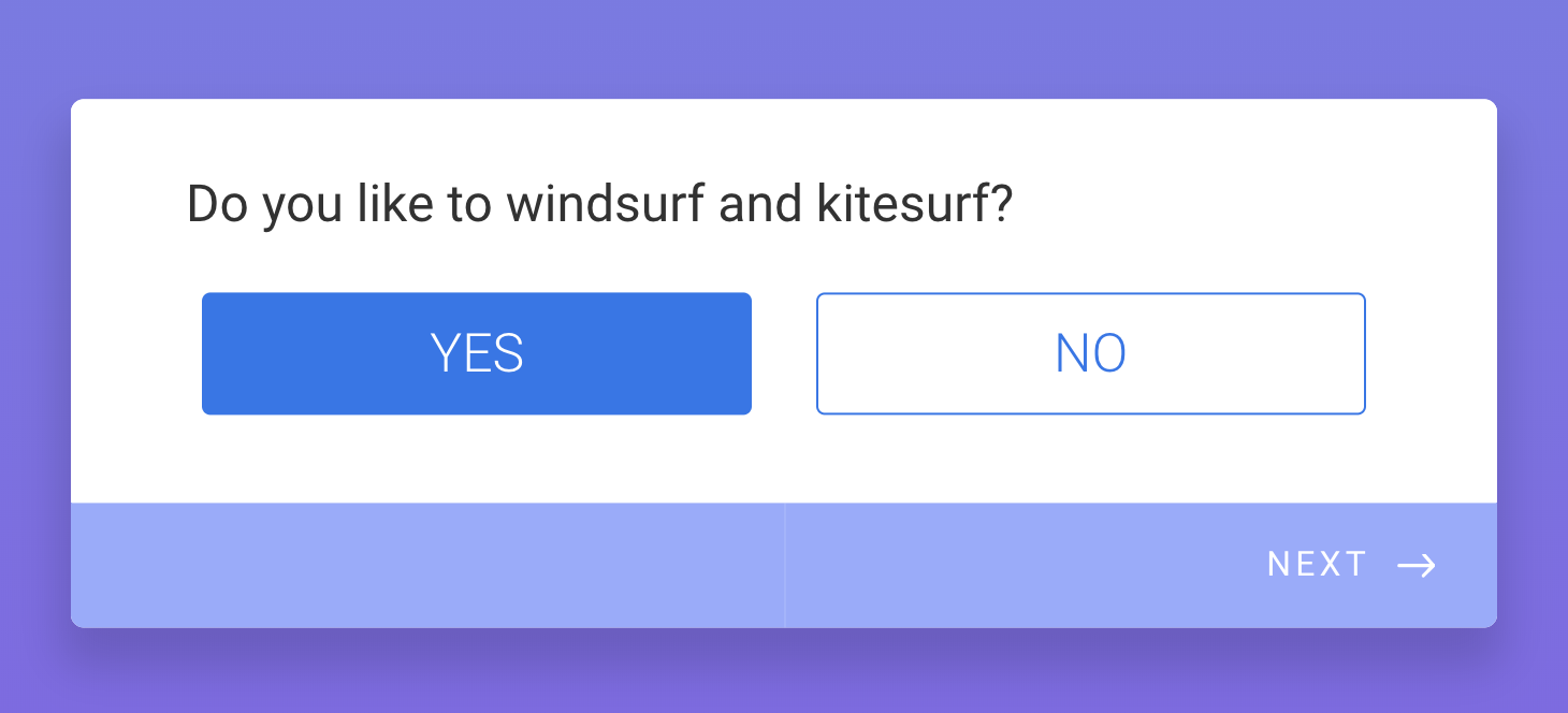
Predefined answers
Everyone loves predefined answers. They save your reader time, AND they are easy-peasy to evaluate.
You can predefine answers by making questions Yes/No, single choice (radio) or multiple choice (checkbox). In case there’s an answer you can’t predict, add an ‘Other’ textbox to let readers enter a custom response.
Predictive search
When asking users to choose their country, occupation, or something else with a large number of predefined options, it helps to provide a predictive search function to reduce the amount of typing (and cognitive load) required.
Audience, purpose and context of a form
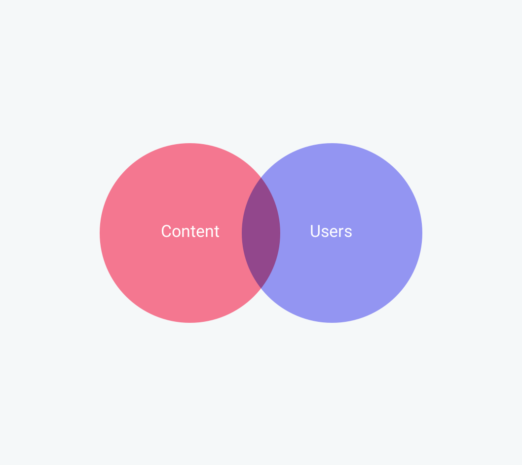
Your form is only half of the equation. It’s active, not passive. And its action relies on your respondents. They need to be embedded in the framework from the very beginning.
Forms are a vehicle for communication. There are two parties involved.
So when designing a form, you also need to think from your user’s perspective… And that starts with their purpose and context.
Why should someone fill your form? What’s their purpose? Write it down.
Purpose is embedded in context, so make context specific in your mind’s eye. Where and how are they filling out the form? At home? On a laptop? On a mobile? On the subway?
Context isn’t just the environment. It’s about your participants understanding what your form can achieve, with their help.
Just so you know
Now that you’re an expert in form design, create your own online form for free with Jotform’s drag-and-drop Form Builder.
32. Know who are you talking to

The form needs to engage the attention of the right audience – so, who is that audience comprised of?
Thinking in a broad, foggy mass of people won’t help. To focus your mind, hone on on one person – or, a ‘buyer persona.’ This will tell you more than any general group can.
Imagine a fictitious ideal customer with a job, personality, family, hopes, and dreams. Bring this person into sharp focus. Where do they live and work? What are their opinions and values? How do they relate to your business?
If you find out what is meaningful to this imagined person, you will be better-placed to gather questions that lead to meaningful data.
This is the person you need to keep referring back to. This is the person whose answers you need.
Pro Tip
One way to do that is to choose form themes that target your audience, then customize the colors, images, and layout so the form feels relevant before respondents start answering questions.
Form visuals and structure
Surprises are great on birthdays, but not when filling out forms. Users should be lulled into a sense of rhythm and repetition as they work through the questions, safe in the knowledge that the buttons, input fields and everything else will be the same from page to page.
Consistency will support a smooth form-filling experience. That means colors should be the same, visuals should be the same, TOV should be the same.
What is your company persona? What phrases and words get this across? What are your values?
At Jotform, we focus on being inclusive, friendly and down to earth – and the language we use reflects this.
When you’ve defined your brand tone of voice, maintain it throughout all of your forms – your customer should feel as if they’re interacting with the same friendly person every step of the way.
Visual consistency is equally important. Adopt a visual identity and style that you maintain throughout your form (and the rest of the forms you create in the future).
Pro-Tip
Explore 20,000+ beautiful free form templates in Jotform’s template directory — then customize your chosen template in seconds with our drag-and-drop builder.
33. Align labels top-left
Google’s UX researchers found that aligning labels above fields on the left-hand side increased form completion time, because it requires less ‘visual fixations.’
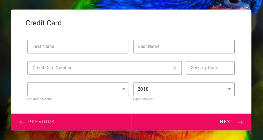
34. Avoid placing questions side-by-side.
Eye-tracking studies have shown that simple one-column layouts are better than multi-column layouts with questions positioned side-by-side.
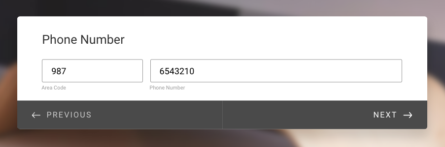
The only exception to this rule is when asking for dates (day, month, year) or time (hours and minutes), where multiple fields are expected to be on one line.
35. Try one-thing-per-page
One-thing-per-page is a psychological technique defined as:
…” splitting up a complex process into multiple smaller pieces, and placing those smaller pieces on screens of their own.”
Essentially, users only have one important thing to focus on.
- One piece of information to understand.
- One decision to make.
- One question to answer.
A chaos-free page encourages users to stay on task.
36. Use field length as an affordance
Always adjust the width of the field so it’s just long enough to contain all the characters of the input (users should be able to see their full entry) and no longer.
The size of a field should reflect how much text the user is expected to enter. Fields like zip code or house number should be shorter than the address line.
A Baymard Institute usability study found that if a field is too long or too short, users start to wonder if they have understood the label correctly. This applies especially to fields with unusual data or a technical label like CVV (Card Verification Code).
If you are new to Jotform, you can always refer to Jotform’s form design tutorial while structuring your online form. With the help of tutorial videos, you can make the best out of Jotform’s Form Designer.
Errors and the path to completion in form design
Like in life, it’s possible to get it wrong when filling out forms.
And like in life, the key issue is signaling errors and allowing quick correction.
37. Don’t rely on color alone
1 in 12 men have some degree of color blindness.
When displaying validation errors or success messages, don’t rely on using green or red text, (as red-green color blindness is relatively common). Use texts, icons or something else. Jotform Cards warns the user with a micro-animation that shakes ‘no’ when an error has been made.
38. Specify errors inline
Show the user where the error occurred and provide a reason.
If you must use validation, ensure that it’s inline (to the right of the field) and reports errors early on.
Don’t wait until a user hits submit to report validation errors. But equally, inline validation should not be real-time, as this is likely to report errors before a user has completed the field.
39. Use field validation
You ask for an email address, and you receive a response with no @ sign. You request a phone number, and half your answers don’t contain enough digits.
Typos shouldn’t be a barrier to your form’s usability.
Use “field validation” to make sure you get the answers you need, such as, “Answer must contain a ___.”
Jotform Cards recovers the email address of a user who has entered the domain name wrong; john@gnail.comshould be john@gmail.com.
40. … but don’t be too strict
If there’s a lot of variation in how users answer a field (for example, responding to ‘phone number’ with +12345678912, +44 12345678912, 012345678912), convert these to a consistent format.
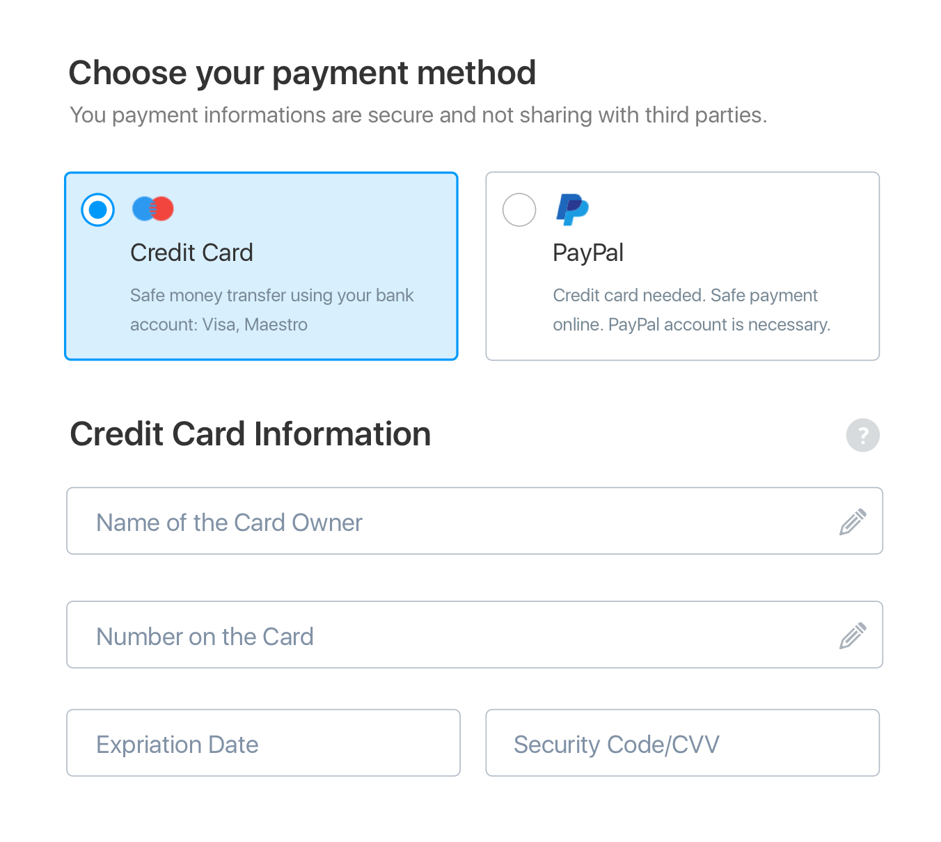
All about payment forms
What is a payment form?
A payment form is a digital version cash desk. It authorizes online payment, validates the user’s details, checks funds are available and ensure you get paid.
Payment integrations have a lot of advantages. They help you to
- sell products or services;
- apply complex calculations to these sales, such as adding taxes and shipping costs or subtracting coupons;
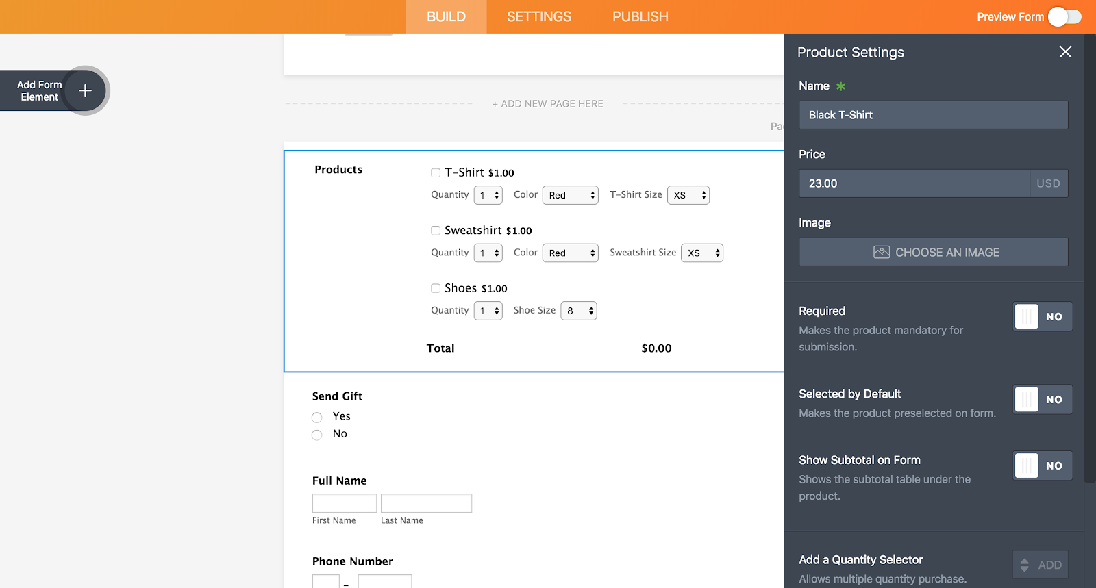
- give your products descriptions like images, quantity, color and sizing options;
- collect donations and payments of a fixed amount, or make these payments recurrent with a subscription service.
Pro Tip
When it comes to designing a payment form, it’s essential to follow best practice. Here are some key rules.
41. Limit the steps in payment
The Baymard Institute analyzed checkout forms and found that a checkout process that is too long or too complicated is one of the top reasons for abandonment during checkout. So cut fields, cut, and then cut again.
42. Use visual indicators of security
When entering sensitive details such as credit card details, users will be on high-alert to anything that seems dodgy. A recent study revealed that 17% of shoppers left a page without paying due to security concerns.
Professional payment forms put users at ease, whereas anything that looks ‘off’ will put them on edge. That’s why you should be cautious about building a payment form from scratch – even the tiniest errors or inconsistencies can scare users off.
It also helps to enable SSL on your forms to help protect data. Visitors get peace of mind knowing all interactions are encrypted. Jotform is the most secure way to transfer data: we’re Payment Card Industry Data Security Standard (PCI DSS) Level 1 compliant and SSL enabled.
43. Clearly explain why you’re asking for sensitive information
People are increasingly concerned about privacy and information security. If you must ask for sensitive information, make sure you explain why it is needed, using support text below the field.
44. Save the data
Giving users the option to save their address and payment information makes the process quicker and more streamlined – especially on fiddly devices like mobile. It also gives repeat customers a sense of reward and loyalty.
45. How to add a payment integration with Jotform
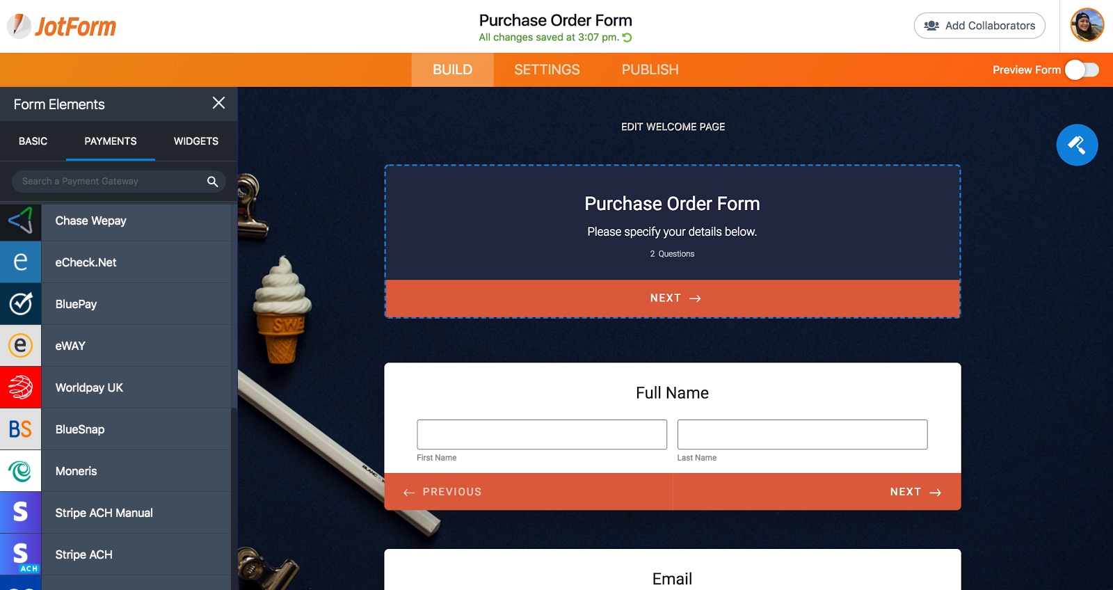
Step 1: Add your brand logo and custom styles.
Step 2: Enter integration credentials using a connect button, or enter them directly.
Step 3: Add product image, product details like quantity, color, size.
Step 4: Calculate coupons, taxes and shipping.
You can use purchase order integration to check for the details and options for a generic payment field creation (this doesn’t require any credentials because it doesn’t create a real transaction). You can check Sofort integration guide as an example to walk through an entire payment process.
Step 5: Write a personal thank you message-autoresponder emails.
All set. Now you can easily sell your products on websites, blogs or social media.
Pro Tip
Small design changes can make a big difference in payment completions. See how Jotform doubled payment form conversion rates just by simplifying the layout and reducing unnecessary fields.
When you’ve finished the form…
Hurray, done! Almost. Your form might be finished, but it’s not time to send it off just yet…
There are a few final steps to keep in mind.
46. Test your form before sharing
We all have blind-spots. And when a form’s success hangs on the quality of the data, it’s good to be cautious. So, make sure you’ve provided robust answer choices, and haven’t missed anything, by pre-testing your survey.
Send it to family/friends and ask them to keep track of how long it takes for them to respond to the survey, and how they experience the flow of questions. For higher-traffic forms, you can also A/B test your forms to compare layouts, field labels, CTAs, and completion rates. This will help you evaluate the design of the form next time round, too.


Send Comment:
10 Comments:
August 18, 2022
It’s wonderful writing, Very nice write-up. I definitely like this website. Keep it
up!
December 17, 2021
UI UX designer is crucial to just about everything. It renders the latest technology accessible to the masses, makes our favourite apps and websites a pleasure to use, and determines which brands and products we return to over and over again. To put it simply, design matters.
July 7, 2021
I am heartily impressed by your blog and learn more from your article. Thank you so much for sharing with us. I find another blog as like it. If you want to look visit here Important Forms and Templates . It’s also more informative.
March 6, 2021
Awesome. Exactly what it says on the tin, a complete reference for text-based design.
March 4, 2021
Very intelligent work and innovative. I have learnt a lot of new things from this article. Thank you very much.
September 24, 2019
I fiercely disagree! You cannot make assumptions and try to scrap all the best practices of different areas you have read about together into one single article under the headline of a currently well-discussed topic. Why would anyone prefer can’t over cannot except you design for a toy store?
May 23, 2019
I found a duplicate of your text here. It does not include the bullet points and images but it does have most of the text:
May 13, 2019
Very comprehensive list. Thanks!
Only comment is that placeholder text is now considered to be inappropriate because of accessibility. Placeholder text disappears when the field is entered. Screen readers have a hard time with disappearing text so users with visual impairments loose the context or instructions.
May 2, 2019
Thank you for putting this together! I've never see such a comprehensive article on form creation. Some wonderful insights into the mind of form designers. Particularly enjoyed the section on the psychology of forms. One of my favorite parts of designing a new form is considering the audience and how to motivate them. I'll be referring back to this as a reminder each time I create a new client form.
May 2, 2019
Very insightful piece. I guess creating an online form is like creating an artwork. As a specialist in human resources, I need to fill dreary, long-winded form/survey every single day. I immensely liked the tips you gave about creating visually consistent forms. And I’ll surely benefit from these tips.