-
 chemast
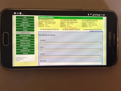
Los campos existentes en una misma linea de un formulario se presentan en lineas diferentes, expandidos al ancho del formulario, cuando se presentan en un smartphone dificultando la navegacion.
Como se puede hacer para que el formulario se ajuste al ancho de la ventana como ocurre en otros dispositivos (Pc, tablet)?.
Gracias

-
 Kiran Support Team Lead
Please note that the forms built using Jotform are mobile responsive. So that the form shall be adjusted as per the screen size of the device. Do you want to display the fields on the same line when the orientation is changed? Could you share the web page where the form is embedded and provide us with more information on your requirement so that we can guide you accordingly.
We will wait for your response. Thank you!
-
chemast
La pagina web es www.golfcoiim.com y el formulario se encuentra en la seccion "Próximo torneo" http://golfcoiim.com/proximotorneo.html. Una clave de torneo para acceder a la segunda pagina del formulario es "retc13".
El comportamiento es diferente si se accede desde una tablet o un pc, a si se accede desde un teléfono, independientemente de la orientación.
Muchas gracias
-
 Nik_C
Nik_CYes, I was able to replicate, the form is not scrollable on phones.
Could you please try re-embedding your form by using the iFrame code below:
<iframe id="JotFormIFrame-22795243638361" onDISABLEDload="window.parent.scrollTo(0,0)" allowtransparency="true" allowfullscreen="true" allow="geolocation; microphone; camera" src="https://form.jotformeu.com/22795243638361" frameborder="0" style="width: 1px; min-width: 100%; height:792px; border:none;" scrolling="yes" > </iframe>
Please let us know if that worked.
Thank you!
-
chemast
Al aumentar el atributo height a 792px caben todos los campos y facilita la navegación pero esteticamente queda feo. Lo he resuelto dejandolo como estaba pero con scrolling= yes.
Pero no entiendo por que los campos se expanden en anchura al utilizar un formulario en un telefono.
Muchas gracias!!!
-
Kiran Support Team Lead
Please note that forms are mobile responsive by default. As mentioned, the width of the fields will be automatically adjusted based on the screen size due to the responsiveness feature of the form. This is an expected behavior for the forms. When the screen size is less than 768px (a tablet screen size), the form shall be optimized automatically.
Hope this information helps!