Jotform’s Autocomplete widget is like a helpful little assistant that finishes your sentences literally. As users start typing, it suggests possible answers in real time, so they can quickly pick the right one without having to type the whole thing out. This not only makes filling out your form faster but also helps reduce typos and keeps your data clean and consistent.
You can use it for just about anything—from suggesting city names and product options to helping users quickly find items from a long list. It’s a small touch that makes a big difference in creating a smooth, frustration-free form experience your audience will love.
Here are a few ways to use it:
- Speed Up Data Entry — Instead of making people type out full answers, you can offer suggestions that pop up as they start typing. This is super handy for forms with long lists, like countries, cities, or product names.
- Keep Answers Consistent — When you give people suggested options, you avoid spelling mistakes or slightly different versions of the same answer (like “NYC” vs. “New York City”). This keeps your data nice and tidy.
- Create a Better User Experience — Autocomplete makes filling out forms feel smooth and effortless. Users will appreciate how quick and intuitive it feels—especially on mobile.
- Use It for Search-Like Fields — If your form needs users to pick from a large list (like employee names, event sessions, or inventory items), autocomplete turns it into a mini search bar that’s easy to use.
Adding and Setting Up the Autocomplete Widget
The Autocomplete widget makes it easy to guide users as they fill out your form. By adding it and setting it up with your custom list of suggestions, you can improve the experience with just a few simple steps. Here’s how to do it:
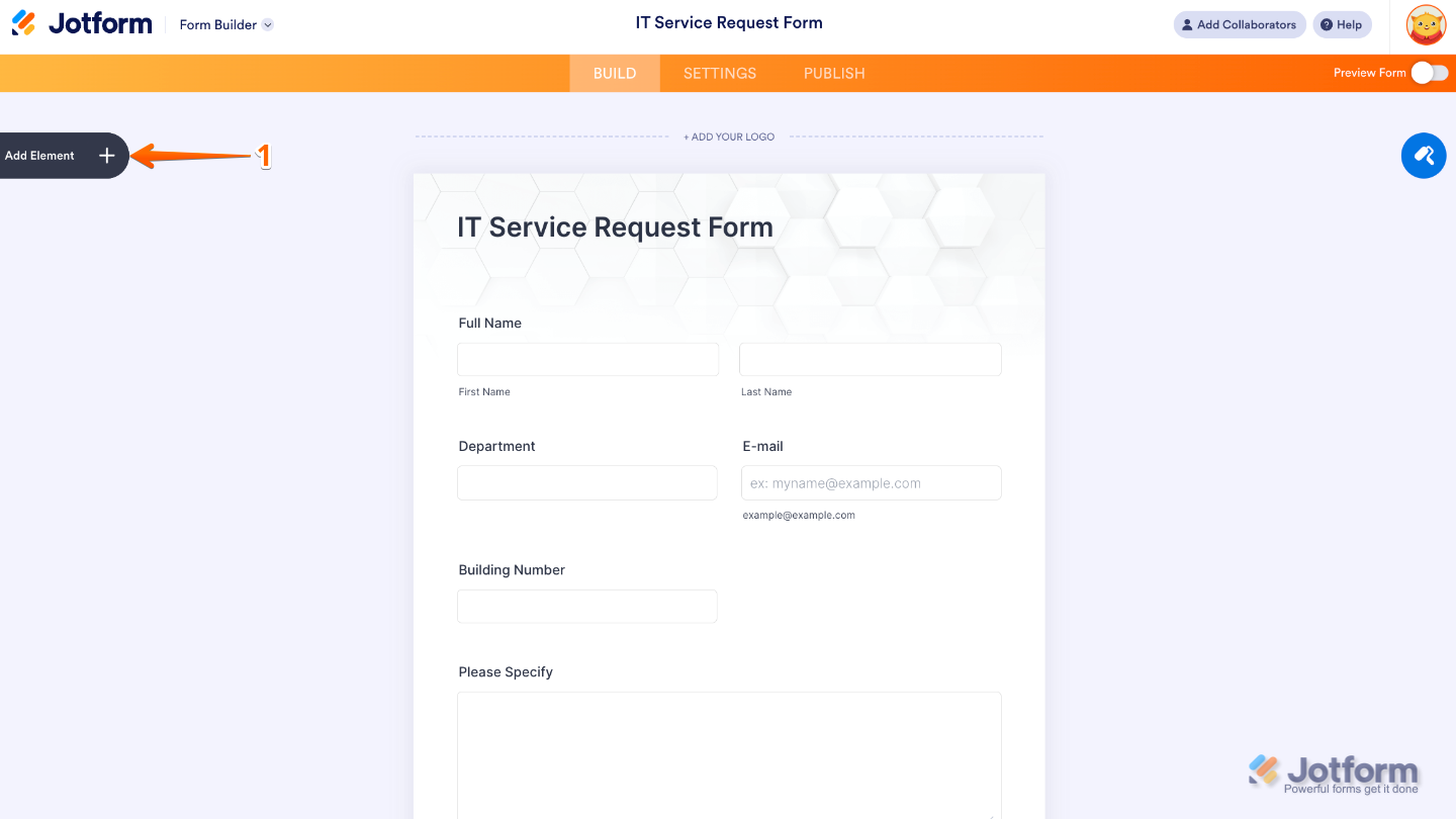
- In Form Builder, click on Add Element on the left side of the page.
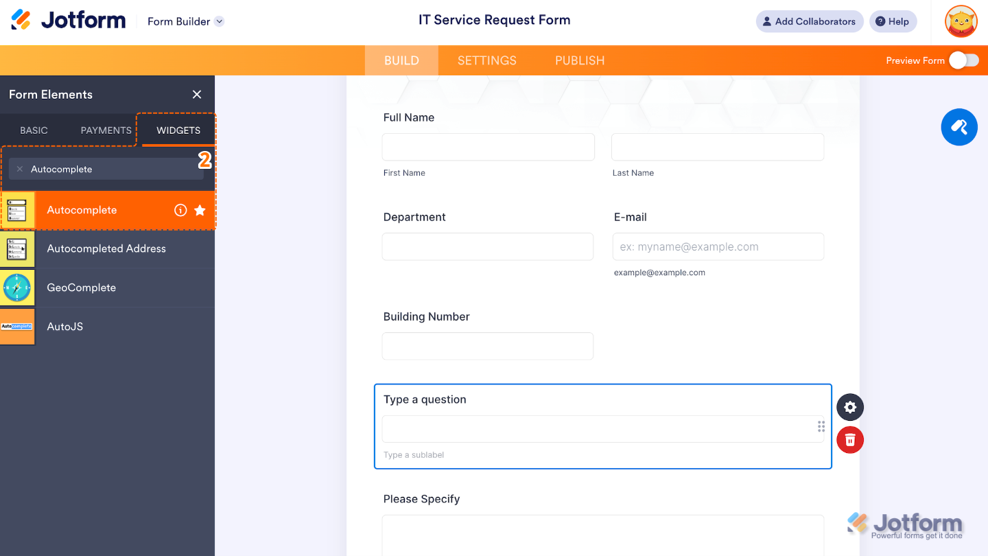
- Now, in the Form Elements menu, under the Widgets tab, search for Autocomplete and then click on it. Or, just drag and drop it to where you want it to be on your form.
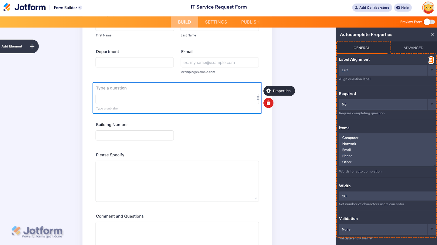
- Next, in the Autocomplete Properties window that opens on the right side of the page, under the General tab, set up the following options:
- Label Alignment — Adjust this if you want to control how the field label is positioned, you can align it to the top, left, or right of the field.
- Required — When enabled, this option forces users to select or type a valid response before submitting the form.
- Items — Enter your list (one per line) you want the field to show, and the widget will suggest matching options as the user types.
- Width — Great for adjusting the appearance to fit your form’s layout.
- Validation — Helps control data quality, depending on how strict you want the field to be. You can choose any of these options: None, Email, AlphaNumeric, Alphabetic, Numeric, or URL.
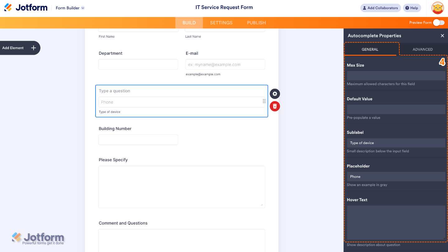
- Then, scroll down to the bottom and continue to set up these options:
- Max Size — Use this if you want to limit the maximum number of characters a user can type into the field.
- Default Value — Set this up to pre-fills the field with a suggested or common value when the form loads.
- Sublabel — Edit this to add a smaller text line below the field to provide extra context or instructions.
- Placeholder — Add a text here to display a light gray text inside the field before anything is typed.
- Hover Text — Shows a tooltip when users hover over the field, offering more info without cluttering the form.
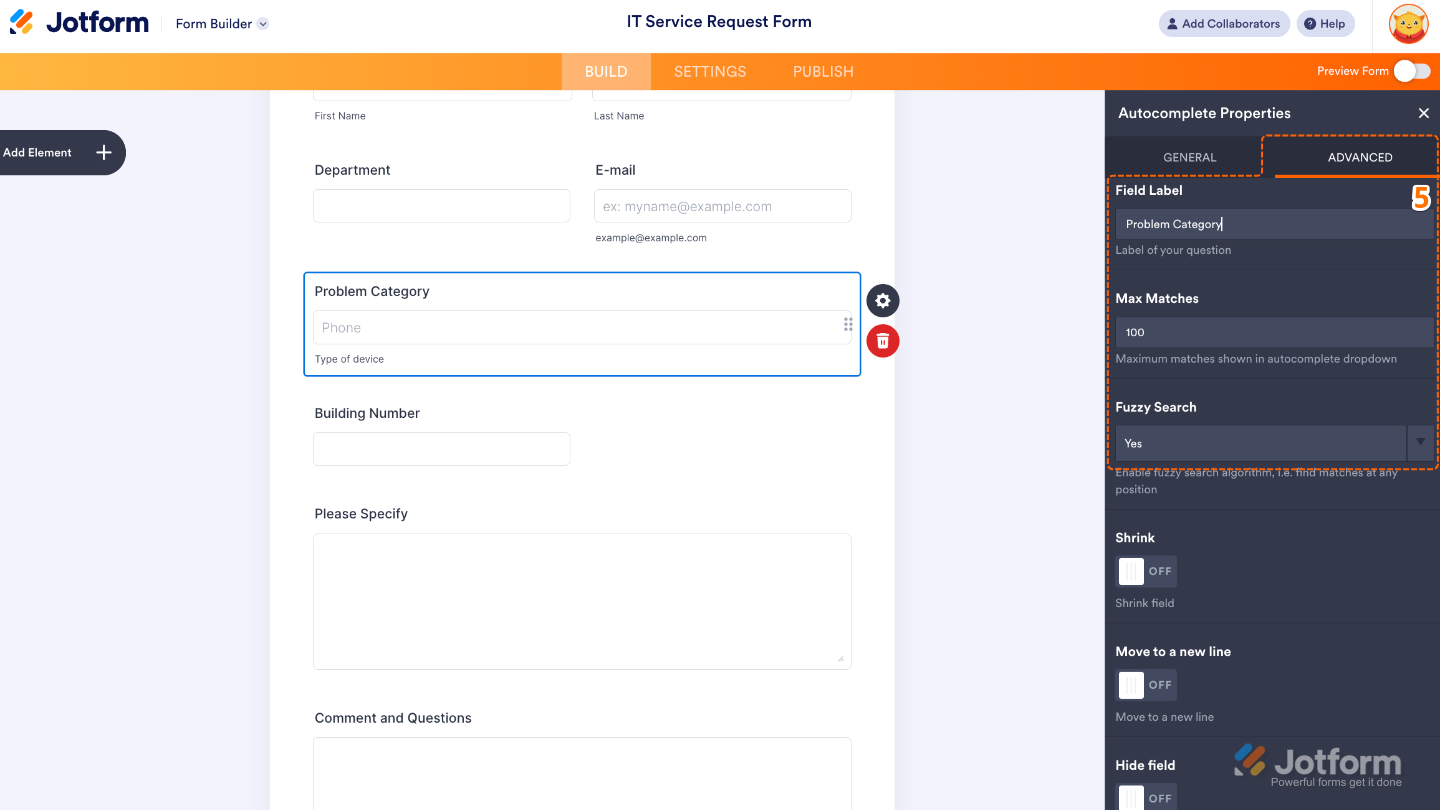
- Once you’re done, switch to the Advanced tab to set up these options:
- Field Label — Sets the main label or question title shown above the autocomplete field.
- Max Matches — Use this to a limit on how many suggestions appear when the user types.
- Fuzzy Search — When set to Yes, this option enables approximate matching, so users don’t need to type the exact letters or spelling to get results.
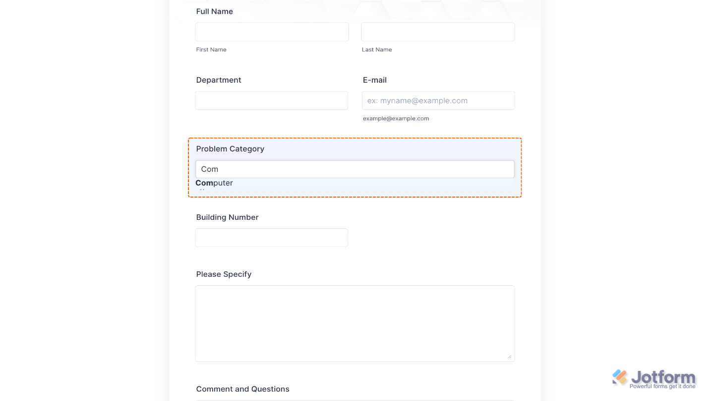
That’s it. You’ve successfully added and set up the Autocomplete widget to your form. Now, a certain field provides users with a list of suggestions as they type into it. It’s perfect for forms where you want to guide input, avoid typos, or speed up responses, such as for selecting countries, product names, employee IDs, or locations. Want to see it in action? Take a look at this Demo Form.
Pro Tips
- Keep your Items list short and clear so suggestions look tidy and are easy for users to tap or click.
- If your list is long or users might mistype, turning on fuzzy search helps them still find the right option.
- Show only what’s necessary, use a Max Matches limit so users see the most relevant suggestions, keeping things simple and stress-free.

Send Comment: