If you want time-strapped leaders to make use of your organizational data, it’s time to get familiar with data visualization. MIT neuroscientists have found that the brain can process images in as little as 13 milliseconds, so even the busiest executives will have time for a quick glance at your insight-filled visuals.
What is data visualization? Put simply, data visualization is the use of visuals to help people make sense of data. These visuals come in the form of charts, maps, graphs, and so on.
But how is data visualization used at different organizations? What challenges are involved? In this guide, we answer both these questions and more. Check out the chapter synopsis below to get a sneak peek, then keep scrolling for insights to inform your own data visualization efforts.
Chapter synopsis
- Introduction
- Why is data visualization important? Find out why data visualization is so widely used and the two significant ways it can help organizational leaders.
- Data visualization types. You can visualize data in many different ways (it’s not all about charts and graphs). Check out key visualization methods and best practices you can use to bring data to life in visual form.
- How is data visualization used? From showing frequency to changes over time, get an overview of how data visualization is used in today’s business world.
- Data visualization examples. This chapter takes a deeper dive into data visualization, putting it into different industry contexts with distinct use cases.
- Data visualization challenges. Data visualization is valuable, but it also has some challenges. Find out what they are — and how to overcome them — to get the most from the practice.
- Choosing a data visualization tool. The final chapter of this guide discusses aspects to consider before selecting a data visualization tool for your organization.
Remember to bookmark this guide for later reference.
Why is data visualization important?
Data visualization provides many benefits, such as informing decision-making and helping identify relationships between variables. Its visual nature is what makes it such an effective business tool.
“As human beings, we have a hard time wrapping our heads around large amounts of data,” says Alberto Cairo, journalist and Knight Chair in visual journalism at the University of Miami. When presented with a large data set, especially in table form, we can’t properly identify or extract patterns. That’s why data visualization is so important: It helps people compensate for that difficulty.
Information comprehension
Transforming data into visual elements like lines, bars, and maps alleviates the cognitive burden of analyzing data in numeric form. “Visuals help us with information comprehension, especially with numerical data. We can then more easily discover what hides behind the numbers,” says Cairo.
Justin Hatch, CEO of Reach Reporting, agrees with Cairo that visuals are essential for people to comprehend large amounts of data. He adds that, while visuals alone are often sufficient, adding other elements can be helpful. For example, consider displaying data from multiple perspectives: A line chart would be useful for establishing context, a table would reinforce the data, and a sentence or text would drive home the relevance.
“Visuals and text go hand in hand — they’re like best friends, leaning on each other for support. Using either format alone may leave room for interpretation,” Hatch explains. “Just try to keep at least a 60:40 ratio of visuals to text. When in doubt, go heavier on the visual side.”
Storytelling
“One of the most critical goals of big data visualization is to communicate stories,” says Hatch. What that story is will vary based on the data you’ve collected and the business context it concerns.
But it can be hard to identify the story and even harder for the audience to understand it. “There is a spectrum of knowledge for any subject,” adds Hatch. “Oftentimes, you may not be sure exactly where your audience falls on that spectrum. This can make it challenging to tell a story, even if you’ve created a stellar visual.”
To communicate stories through data, you first must understand what the audience needs to know. What are they trying to learn from the data you’ve collected, analyzed, and put in visual form?
“For example, an executive is going to want your visual to answer a simple question like, ‘What button do I need to press to produce X result?’ Other than a cursory summary, she likely won’t be interested in the details behind what she’s seeing,” says Hatch.
Continuing with that example, assume the result the executive wants is to increase profits. Many roads lead to this goal; the two main approaches are increasing revenue and reducing costs.
You may collect data about, say, your variable costs, and identify a specific expense that needs to be addressed. Simply presenting the executive with the tables of data won’t assist in the decision-making process because this will require significant time and energy to absorb.
Through data visualization, however, you can tell a story about how that expense is causing an unnecessary strain on the gross profit margin. The executive can then take action to solve the problem and achieve her goal.
“The importance of data visualization is that you can use it to absorb complexity so the audience doesn’t have to,” says Hatch. “Due to the vast number of decisions that need to be made, senior management especially needs analyzed data presented in appropriate visual form with a clear message. It’s the best way to make informed, swift business decisions.”
Now that you know why data visualization is important, let’s explore a few different types of commonly used visuals.
Data visualization types
Data visualization can make a mountain of data easily consumable. But just as you can collect many different types of data, you can also create different types of visuals. Which data visualization type works best depends on the underlying data.
Hatch says there’s something you should consider even before looking at potential visuals, a strategy that he refers to as “milk before meat.” It essentially means that your data story should start with the most digestible content (the milk), then move into the heftier and more complex elements (the meat).
“You need to tell your audience what’s happening first to provide context, then dive into the reasoning behind it. Not only does this help develop a clear narrative they can follow, but it also ensures they have an immediate takeaway if they only have a few moments to view the information,” Hatch explains.
For example, assume your company has high revenue, but also a high cost of goods sold (COGS) — the result may be subpar profits, but the solution isn’t as simple as increasing sales. In seeking a way to remedy this issue, you collect data about expenses and profits. After conducting an analysis, you present the findings to your executive team.
- Start by displaying the margins, gross and net. Both are likely less than ideal. This identifies the problem. Show how an increase in sales would not affect the profit, as the cost per unit sold is too close to the price charged for that unit. “This is the milk — the audience can clearly see that if it costs us a dollar to make a popsicle, and we sell it for a dollar, we’re not going to get very far,” says Hatch.
- Next, visualize the trend of COGS. Are they going up or down? How close is the cost of the popsicle to the price charged for the popsicle? The answers will indicate the severity of the problem and how quickly action should be taken.
- Last, you can take an in-depth look at the entire profit and loss statement, visualizing costs by category. “This is where you go into greater detail — the meat of your story. The audience already has context from your preceding narrative, so they’ll be able to more readily consume more complex visuals,” Hatch explains.
Hatch notes that companies too often jump to conclusions. “We assume that if we have no profits left over, we need to make more sales. This is an example of a common misconception that the right report will quickly and easily clear up.”
Keep Hatch’s advice in mind as you review the common visuals below and the types of data they typically represent.
4 types of data visualizations
Data visualization charts offer a way to organize or visualize a collection of data points. The term “chart” can refer to many visual types, including graphs, maps, infographics, and diagrams; data visualization tables can even be considered charts. Keep reading to learn about more specific types of data visualizations below.
1. Graphs
In data visualization, graphs are a subset of charts that showcase the relationships between numerical data. The most common graphs include
- Line graphs. This type of graph typically shows how related data changes over a given period of time. For example, you could use a line graph to show month-to-month sales for a specific fiscal year.
- Bar graphs. Bar graphs are useful for comparing values, such as inventory amounts or group sizes. The audience can easily gauge from the size of each bar whether one value is larger or smaller than the other.
- Pie graphs. A pie graph is used to show how different parts make up a whole. Each wedge represents a different item or segment, and all the wedges add up to a total (e.g., 100 percent). You can use a pie graph to visualize, for example, what segment of website visitors are using Chrome vs Firefox vs Internet Explorer.
2. Maps
For purposes of data visualization, maps show geographically related information. There are many kinds of maps, including regional maps, heat maps, and trajectory maps. As one example, you can use heat maps to illustrate air quality in certain geographic areas. The darker the color, the worse the quality of the air.
3. Infographics
An especially effective data visualization tool, infographics (short for information graphics) can help illustrate multiple data points about a given topic. For example, infographics are often used in marketing to showcase different stats.
For example, a company may conduct a study on employee engagement and use an infographic to walk through numerous stats from the study in visual form. Check out our post that curates a multitude of unique and aesthetically appealing infographics.
Despite their cool factor, though, Hatch notes that infographics are often not the best choice. “They’re typically used as data dumps. That can cause information overload, making it difficult for people to retain what they’re viewing. Infographics are also time-consuming to create, which presents a cost concern as well.”
4. Dashboards
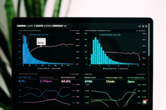
A data visualization dashboard is a business intelligence tool used to quickly communicate important metrics for decision-makers. Dashboards often compile several different visuals — charts, graphs, etc. — to communicate stories relevant to a department, line of business, or overall organizational performance.
Dashboards come in handy when you want to summarize a lot of data in visual form for different audiences and monitor it over time.
Next up we take a closer look at how data visualization is used in the business world.
How is data visualization used?
As you saw from the examples in the last chapter, data visualization can communicate data “stories” and inform decision-making in a variety of use cases. In this chapter, we take a broader view of the practice to find out how data visualization is used.
“First, it’s important to understand the foundation of data visualization: data analysis,” says Milo Ferenczi, director of analytics at Latticework Insights. There are two types of data analysis:
- Exploratory data analysis dives deep into raw data to unearth insights. Analysts structure and visualize the data so you can identify patterns, trends, outliers, and anomalies. The findings are typically too complex for a managerial audience, but they do go hand in hand with the other type of data analysis.
- Explanatory data analysis provides context for and helps explain the insights identified through exploratory efforts. It can give you the how and why behind the data. For example, it may help explain why customers aren’t buying a new product you recently launched.
“We often see these types of analyses, and the resulting visualizations, in marketing,” says Ferenczi. “Working with a CMO or another C-suite executive, we’ll pull in data from their media spend, advertising channels, CRM systems, accounting software, and the like. Then we’ll combine, analyze, and visualize all that data to provide a 360-degree view of their business.”
From a more general standpoint, data visualization can show
- Frequency. There are many instances where it’s helpful to know how often an event occurs or an item is consumed. For example, you may want to see how often certain products are purchased in a specific region. “Scatter plots work great for frequency. They’re easy to chop and slice how you want, and you can cluster things together or change the position of dots to suit your needs,” says Ferenczi.
- Relationships. Visuals can clearly show how different items are related. “Bar charts — or stacked bar charts — are a good option for showing relationships, even more so than a pie chart. Studies show that it’s harder for the brain to process differences between pie slices rather than bars,” Ferenczi explains.
- Changes over time. If your company has experienced a dip in sales, you’ll be able to see it through a time-series line graph. “This type of data visualization will let you know immediately that sales tanked, say, during the summer or fall months,” Ferenczi notes.
- Correlation. Sometimes you need to see an association between two variables, such as time spent preparing for sales presentations and close rates. Ferenczi says you can use a multi-series line chart for this purpose.
- Ranking. A bar chart makes it easy to show rankings by arranging data points in descending or ascending order. “And you can jazz it up a bit by changing the standard bars to something more fun,” adds Ferenczi. “For example, we once substituted lollipops for the traditional solid bars. It fit the client’s business and culture.”
In the next chapter, we explore examples that show how data visualization is used in specific industries.
Data visualization examples
Data visualization is industry agnostic — it’s beneficial to every organization, regardless of the market. Even within an organization, data visualization can be used in different departments to give leaders important insights. Below, we walk through several examples from different industry contexts and functional areas to showcase how data visualization is used in practice.
Data visualization examples across functional areas and industries
Sales and marketing
Ed Cook, Ph.D., visiting professor at the University of Richmond and president of The Change Decision, says a common use case for data visualization in sales and marketing is identifying outliers.
These functional areas tend to have a lot of data available, and it’s beneficial to see the impact teams’ efforts are having across channels and in different geographic areas. Discovering a channel that’s under- or over-performing gives leadership the signal to investigate further and identify a potential gold mine or deadweight.
If all a marketing manager has available is a large table of data, it would be a challenge for them to reasonably identify an outlier. Visualizing that data in a graph or chart cuts down the cognitive load of sifting through endless rows, helping the manager to “immediately identify a marketing channel with performance that’s off the beaten path because there’s a point or line that looks markedly different than the rest,” Cook explains.
Finance
“You really see the value of data visualization in finance when you’re tracking major marketing indexes,” says Cook. Visuals can help you understand the volatility of these indexes over a certain period. “If you’re an investor, knowing volatility helps determine the risk behind your investment decisions, which can help you build a more informed portfolio,” Cook adds.
For example, if you’re a day trader, volatility could be a good thing because you’re playing the “hills and valleys” of the indexes. However, if you’re an investor looking at the long term, you may prefer more stable options.
Still, Cook cautions against relying on any single graph to make investment decisions, even if you’re confident of the underlying data.
“You have to be careful when looking at visuals when investing, as they may make spurious or inaccurate correlations. For example, a graph may show certain stocks going up or down as oil prices change, but they may not have the same underlying cause. Even if the data is accurate, you may draw the wrong conclusion,” Cook warns. Bad data visualization can distort the message even when the numbers behind it are sound.
Logistics
For logistics, consider the flow of goods through the supply chain. There are numerous nodes goods pass through as they move from one place to another — manufacturer to warehouse to store and everywhere in between. “Data visualization can help you determine how solid (or fragile) your supply chain is,” says Cook.
If there are any bottleneck points or movement issues along the chain, it’s much easier to identify them through visuals. For example, if inventory is regularly being held several days longer than planned at warehouse C, visuals can help you see that quickly. Assume you use a bar chart that shows the number of days products spend in each warehouse; the bar for warehouse C would be noticeably higher than the others.
“You can then use different visuals that home in on the warehouse’s inventory flow by day and even by hour. Then you can investigate the cause, and formulate ways to prevent or at least reduce those holdups,” Cook explains.
Healthcare
For a healthcare example of data visualization, Cook points to the London cholera outbreak back in the 1800s. A physician named John Snow identified cholera as a waterborne disease through the use of data-based visuals.
“He tracked cases and deaths and plotted them geographically. Eventually, he traced the outbreak to a single source — the Broad Street water pump,” Cook says.
After using his findings to convince town leadership to remove the pump’s handle, cholera cases and deaths fell dramatically. Unfortunately, it took many years for the city to make any permanent changes to the water supply and associated infrastructure, but this outbreak showcases the impact data visualization can have.
In the next chapter, we cover the various challenges involved in data visualization.
Data visualization challenges
Despite its many use cases, data visualization isn’t without challenges. The visual creators, the data, and the audience are all factors that affect the success of your data visualization efforts. Below are a few of the most common challenges.
4 common data visualization challenges
1. Questionable data quality
“It doesn’t matter how cool your charts are if they aren’t accurate,” says Ferenczi. For your visuals to have value, the underlying data must be of high quality. Otherwise, you’ll be presenting visually impressive graphs and charts that, at best, don’t provide many insights. Worse, the visuals may make the audience draw the wrong conclusions, resulting in poor decision-making.
To ensure high-quality data, Ferenczi recommends having a solid process in place for acquiring and checking data. For example, his team uses a process called ETL — extract, transform, and load. This entails pulling data from one location, reshaping or reorganizing it, and moving or loading it into another location.
For example, consider the above process in a marketing context. Ferenczi’s team might collect data from a client’s social and Google ad channels, compile and reorganize the data, and move it into a centralized data warehouse.
The team then performs quality assurance by going back to the original data sources and verifying aspects such as the number of views and ad spend on specific days. They also use “gut check” methods, like considering the fact that it costs more to get views right before Black Friday. So an above-average spend around that time would make sense.
“Finally, we analyze. We may discover that it takes 20 views for a given ad to have its intended effect. And we can say that with confidence because we have verified the data’s accuracy,” Ferenczi explains.
2. Lack of data visualization skills
Even if you have 100 percent accurate data, it doesn’t mean much if you don’t have the tools to create appropriate visuals — and people who know how to use them. The larger and more complex the data set, the more advanced the tool typically needs to be.
While Excel is often the default choice for data visualization, you may have too much data for it to handle. There are plenty of other tools on the market, but they will require training for your staff to use effectively.
“Training presents a fairly large roadblock when it comes to data visualization, especially for smaller organizations,” Ferenczi explains. “It can be costly and time-consuming, not to mention the initial spend on the tool itself. Not all organizations can make that investment.”
While training can be a daunting data visualization challenge, Ferenczi says using a more advanced tool can help you get more out of your data compared to simpler options. “This is especially true if you choose a tool that’s specifically designed for the type of data you’re trying to get insights from.”
3. Limited scalability
“Scalability was once a fairly large issue, especially with big data visualization,” says Ferenczi. “However, advances in technology have helped alleviate this issue. Think of cloud data services like AWS that can handle huge data sets and computations.”
While Microsoft Excel is useful for many things, big data visualization isn’t one of them. There is a limit to how much data Excel can store, which means it might not be appropriate for all use cases.
4. Audience resistance
Your audience is a critical consideration when creating visuals. They must be willing to consider what you’re showing them.
People might assume the audience-related challenge would be the varying levels of understanding, but it’s more about their readiness and openness to receive the information than their ability to grasp it.
“A leader may be too busy or just lack care regarding data visualization. It depends on the organizational culture and how much data-driven decision-making is valued,” says Ferenczi.
According to Ferenczi, overcoming this challenge requires an internal champion. “You need someone within the organization to carry the data visualization ‘torch.’ They need to showcase [it] and convince leadership that the practice carries value.”
Next up is the final chapter, which discusses what you should consider when selecting a data visualization tool.
Choosing a data visualization tool
The preceding chapters solidified the concept of data visualization, how the practice is used across industries and functional areas, and typical challenges. Now it’s time to use that knowledge to choose a data visualization solution for your organization. Consider the aspects below before you start perusing the market.
5 considerations for data visualization tools
1. Reporting needs
According to Cook, before looking for a data visualization tool, you must determine your reporting needs. “First and foremost, talk to the people consuming the data first — they will drive the selection process. Learn about what they value, and the decisions they need to make. Otherwise, you may just be making pretty pictures that aren’t important.”
As for the talks themselves, Cook recommends being active in the conversations. Don’t just take whatever the data consumer says at face value because they likely don’t have much experience with data visualization. He suggests starting the conversation with what they know they need, then spurring them on with what you know visuals can do for them.
“The consumer should be talking 75 percent of the time, with you providing contributions about 25 percent of the time,” Cook explains. “You can share insights with them they haven’t thought of to spark new thinking and identify additional items your tool needs to address.”
2. Cost
Cook says there are a few questions you need to ask concerning cost:
- How big or expensive is the problem you’re trying to solve?
- What is the cost of solving it versus the value you get out of the tool?
- Will you get enough value out of a data visualization tool?
You need to consider not only the cost to purchase the software but training costs and any other costs associated with keeping your personnel up to speed on the product. With Excel, for instance, you probably already own it, so there’s no additional cost. You can also find someone already skilled in the software with relative ease. And even if you can’t readily find a skilled Excel user, it’s a fairly low learning curve compared to more advanced tools. Plus, there are plenty of resources available, including many free tutorials.
“Alternatively, more robust solutions come with a higher price tag, greater learning curve, and time and money for training. Not to mention the trained person could leave, forcing you to reinvest in someone new,” says Cook.
One of the questions above is about determining whether a more costly tool is worthwhile. “For example, if you’re facing a $10,000 problem, you can probably get by with a more affordable tool such as Excel. If it’s a $1 million problem, you’d be inclined to invest in a more expensive tool,” Cook explains.
3. Complexity
Tool complexity is another consideration. Sometimes you sacrifice user-friendliness for more advanced functionality.
Cook says one way to determine where on the complexity spectrum your tool should be is to think about your team. “Do they have a desire to learn what new data visualization tools can do? How willing they are indicates how complex the tool can be. Unwillingness means you should probably stick with simpler options.”
Keep in mind, though, that this could limit your ability to handle larger data sets and create sophisticated visuals. Typically, the more data points you have — say, hundreds of data points versus millions — the more robust the tool you’ll need. “You may need to motivate your team accordingly,” says Cook.
4. Integration capabilities
Does the data visualization tool need to integrate with other systems? Cook says that integration may be important if you’re doing a lot of operational analysis, as you may need to pull data from your current systems and create visuals frequently.
But if you’re only doing deep-dive, what-if analyses on an infrequent basis, integration may not be a must-have capability. “You can just pull the data from your systems as needed, then analyze and visualize it,” Cook says. “The burden of integrating typically isn’t worth it for smaller firms anyway.”
5. Sharing features
Depending on the size of your data team and how you share data across the organization, sharing features may or may not be important for a data visualization tool. For example, you can easily share data and visuals with Excel since everyone within your organization likely has a copy of the program.
More expensive solutions may not be as accessible, though there are alternatives, Cook says. “You may not be able to share live data, but you can probably copy the finalized visual and place it in, say, a presentation. This may suit your needs if only one or two people handle the underlying data, then showcase the visuals to leadership.”
If you’re ready to start looking for an appropriate solution, check out our roundup of several popular data visualization tools.
Meet your data visualization guides
Alberto Cairo
Alberto Cairo is a journalist and designer, and the Knight Chair in visual journalism at the University of Miami. He is also the director of the visualization program at the university’s Center for Computational Science. Formerly, he was head of information graphics at media publications in Spain and Brazil, and he has provided visualization training to the European Union, Eurostat, the CDC, and the Army National Guard. Alberto is also the author of the book How Charts Lie.
Ed Cook
Ed Cook, Ph.D., is a former Navy pilot and Fortune 200 executive. Currently, Cook is a visiting professor at the University of Richmond, where he teaches analytics. He is also the president of The Change Decision, a change and culture consultancy focused on growing joy at work.
Justin Hatch
Justin Hatch is the CEO of Reach Reporting, a finance reporting platform. Previously, Hatch was the VP of business development for a NASDAQ-listed oil and gas tech company. He spends his time creating solutions to enable a better world and is passionate about emerging tech and data analytics.
Milo Ferenczi
Milo Ferenczi is the director of analytics at Latticework Insights, a data science agency that aims to bring integration, analytics, and insights under one roof. His company specializes in custom integration, analytics, and data visualization to inform creative pitches, media buyers, and CMOs.





Send Comment:
2 Comments:
January 3, 2022
To whom it may concern. We are flattered that you quoted Justin Hatch in this article and wanted to reach out to san thank you. We noticed the links were non-follows. As we are growing we want to do all we can to continue our virtual footprint and was wondering is there a way we can convince you to turn the two Reach Reporting links you have in this article into follows? We would really appreciate it. Thank you so much for the opportunity to be associated with your blog.
Sincerely,
Jared Ballard - CMO Reach Reporting.
November 23, 2021
An informative website.