
Bad data visualization: 5 examples
- A 3D bar chart gone wrong
- A pie chart that should have been a bar chart
- A continuous line chart used to show discrete data
- A misleading geography visual
- A confusing graphic
Even when we have the best intentions in communicating data through visuals, they don’t always turn out the way we want. Sometimes it’s the result of a mislabeled axis or a poor choice of color. Other times, we may choose the wrong type of chart entirely. Whatever the case, a bad data visualization can derail the message we want to communicate to the audience — or lead them to draw inaccurate conclusions.
To help you identify what not to do when visualizing data, we’ve enlisted the help of Ed Cook, Ph.D. He is the president of The Change Decision and a visiting professor at the University of Richmond, where he teaches analytics and frequently uses and reviews visuals of all kinds.
Cook has rounded up several visuals that don’t quite hit the mark. See below for his examples and analysis.
Pro-Tip
Visualize and present your data in seconds with Jotform Report Builder. It’s free to sign up!
Bad data visualization: 5 examples
1. A 3D bar chart gone wrong

“Don’t ever use 3D bar charts,” says Cook. While they may look flashy, they rarely do a good job of communicating important information to your audience. Past the cool factor, 3D bar charts are often hard to read, making them more trouble than they’re worth.
“I’ve yet to come across a data set where a 3D bar chart was the best approach,” Cook says.
This particular 3D bar chart appears to be making a medical-related comparison, but as Cook noted above about these types of charts, it’s hard to read. You have to tilt the chart (or your head) to assess the data points. And the lines make it hard to draw an accurate comparison because the values and bars are too far apart to see the difference.
“If you compare your visual assumptions to the underlying data table, you’d most likely be incorrect,” Cook says.
2. A pie chart that should have been a bar chart
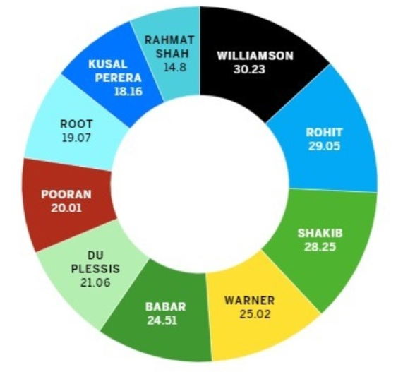
“Pie charts are fairly narrow in their usage. But they’re inherently meant to add up to a sum percentage. This one doesn’t follow that general rule,” says Cook. In fact, the numbers don’t appear to add up to any sensible total.
Cook believes the chart is comparing the top 10 salaries of different individuals. If that’s the case, then the creator of the bad data visualization should have used a simple bar chart. “Pie charts aren’t good for comparing non-summation data, especially if there’s an element of time,” Cook says. “A bar chart in this case would make for much easier comprehension.”
3. A continuous line chart used to show discrete data
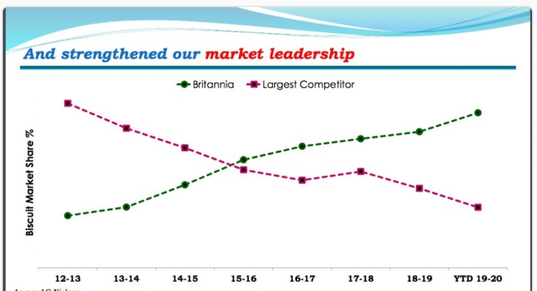
Cook says there are a few things wrong with this chart. For one, it’s a line chart that’s meant to show continuity, but the data points are discrete — they only have a certain number of values. In this case, the points appear to be marketing share percentages for a certain year.
“The years are also an issue because they appear to be inclusive, which is confusing. How much time does each data point include?” Cook asks.
There’s information between the points, so drawing a line from one data point to the next is misleading. According to Cook, “this data set would be better off as a bar chart. That way, each discrete value would correspond to a particular year.”
4. A misleading geography visual
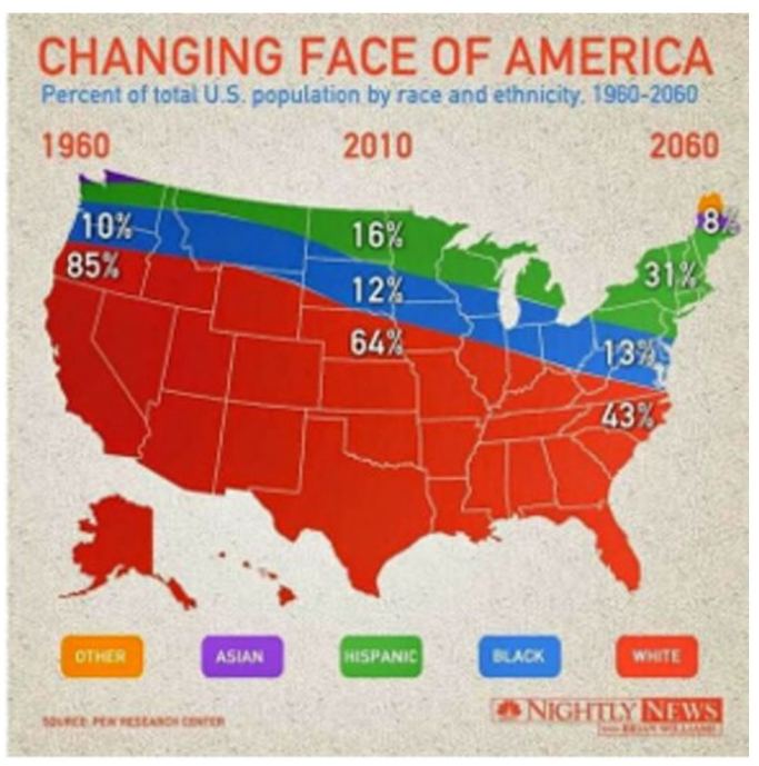
“While interesting to look at, using a map doesn’t help you understand what’s going on here,” says Cook. For example, the fact that Oklahoma is red or that other states are partially different colors doesn’t really mean anything. In addition, the racial and ethnic differences have no correlation to the states.
The creator is attempting to show a linear value over time but using an area-sized visual. This makes comparison difficult. Beyond that, the size of the color bands and associated percentages aren’t congruent with the geography. The 8 percent figure, for example, doesn’t represent 8 percent of the map.
“Lastly, was there a 0 percent Asian demographic in 2010? The map would lead you to believe so. Though, we can’t be sure, which is the problem,” Cook explains.
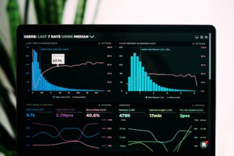
5. A confusing (and aesthetically unappealing) graphic
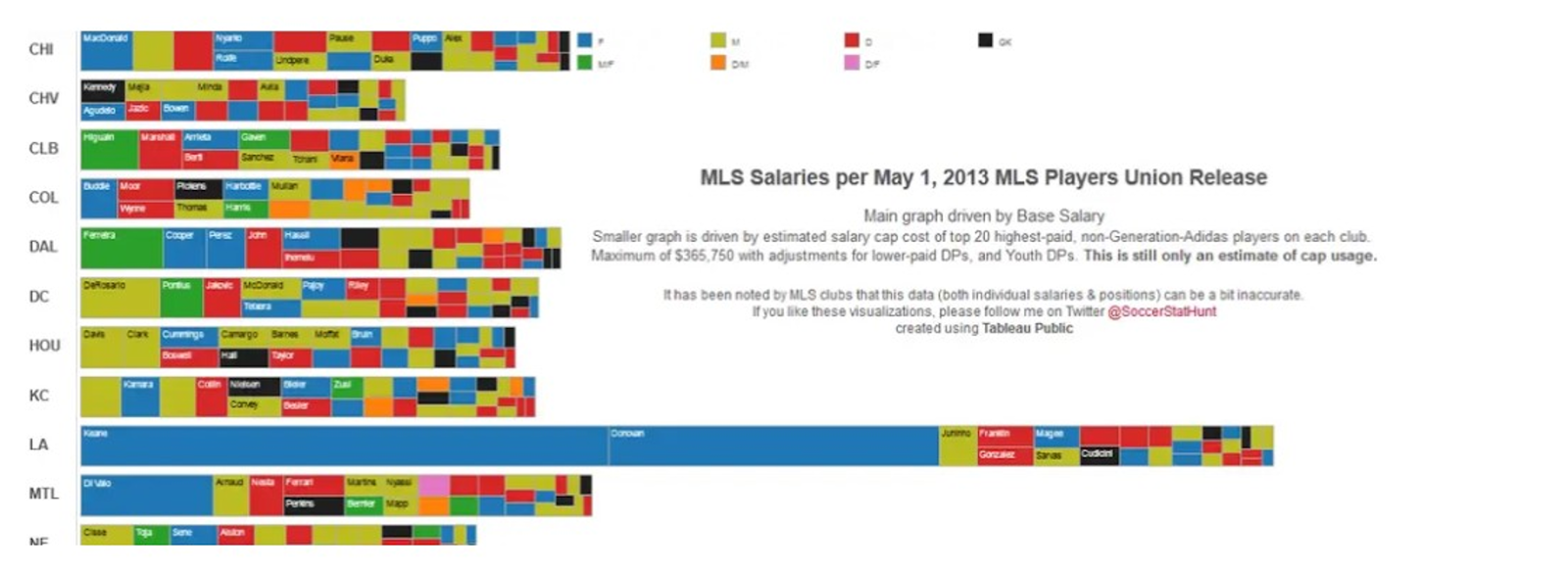
“This graphic is too busy. The audience is too overloaded with visual information to figure out anything of substance,” says Cook. It’s also visually unappealing, which by itself is not a major issue, but certainly something that a developer should consider in the design process.
“Overall, it’s just too difficult to read. It should be broken up into at least two visuals so the message isn’t lost,” Cook suggests.
Photo by rawpixel.com – www.magnific.com


Send Comment:
1 Comment:
February 26, 2021
Hello,
I have seen the number 5 graph (A confusing and aesthetically unappealing graphic) and I feel it is confusing, too. Is there any chance that could explain what the graph is trying to say and how can it be improved?
Thank you,
Neha