Top 8 data visualization tools
You can’t deny the widespread importance of data in our digital landscape. But data is nothing if it can’t be shared and understood. Humans gain most of their knowledge through vision, and data visualization capitalizes on this natural skill to enhance data processing and help us understand complex information.
What is data visualization?
Data visualization is a combination of three types of visualization — scientific visualization, information visualization, and visual analytics. Generalized data visualization involves a widespread collection of disciplines, such as information technology, natural science, statistical analysis, graphics, and geographic information says Towards Data Science.
Visually presenting your data in an effective way visually draws attention to your key messages and findings. It’s also an opportunity to uncover patterns and observations that may be overlooked in statistics on their own.
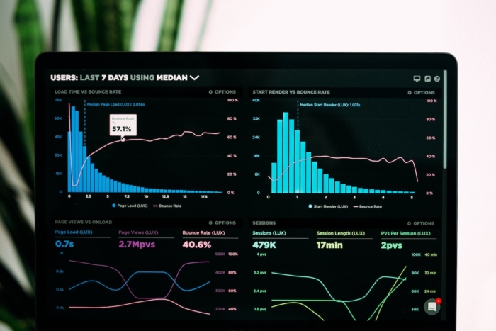
Data visualization tools and software are evolving rapidly, as is the rest of the tech world. From charts to videos to infographics — and even augmented reality — there are endless opportunities to showcase your data. We’ll cover some of the top data visualization tools below.
Top 8 Data Visualization Tools
The following tools can help transform raw numbers into engaging visuals, making your data easier to interpret, present, and act on.
1. Tableau
Many consider Tableau to be the head of the pack when it comes to data visualization software, which may be thanks to its huge customer base across a broad scope of industries.
The reason for this widespread use? Tableau is easy to use, produces interactive visualizations that surpass other general solutions, and is capable of handling huge, changing datasets.
Tableau integrates with a number of advanced database solutions like Hadoop, Amazon AWS, SAP, and Teradata, to name a few. Tableau creates easy-to-understand graphics and visualizations with your data, and optimizes them to be shareable.
2. Highcharts
Highcharts is an SVG-based, multiplatform charting library. It provides easy-to-add interactive charts to your web and mobile projects.
Why do people love it? It boasts a robust feature set, an easy-to-use interface, and thorough documentation. Data can be in any form, or loaded and updated live.
Highcharts is optimized for mobile use and can render thousands — or millions — of data points if needed. It’s one of the most widely used chart tools on the web.
3. Dash by Plotly
Plotly understands the challenge of delivering data science to business owners and integrating it into your day-to-day business. They’re also aware that interactive apps showcasing complex information in an easy-to-grasp way can make a huge impact.
Plotly’s analytics app creation tool, Dash, helps make your data understandable so your entire company can be on the same page, regardless whether they know code or not. Contact Plotly for pricing.
4. FineReport
FineReport is an enterprise-level web reporting tool that’s written in pure Java.
It offers three report design modes to satisfy your requirements. The General Report deals with complex professional reports, the Aggregation Report offers an innovative design for irregular reports, and Dashboard is a multi-perspective analysis for decision making.
FineReport has a convenient database connection that’s accessible with one click, requiring no code. The combination of data entry and visualization allows users to create complex reports and interesting dashboards. The personal version is completely free, and the interface is similar to Excel.
5. RAWGraphs
RAWGraphs presents itself as the missing link between spreadsheets and data visualization. It’s an open-source data visualization framework created with the goal of making the visual representation of data easy for everyone.
RAWGraphs is customizable and free to download. You can upload data safely from apps to computers, export it as an SVG or PNG file, and embed it in your web page with ease.
6. Modest Maps
Modest Maps is a free, lightweight, simple mapping tool for web designers that makes map integration and development for your website easy. As a data visualization tool, it’s straightforward — with a core set of features in a tight, clean package and opportunities for additional functionality. The simple platform is designed to be built upon and the code is well designed, tested, and widely deployed.
7. Power BI
Power BI is a set of business analytics tools that provide insights into your organization. Its function is similar to Excel’s desktop BI tool, but it’s stronger.
Power BI offers tight Excel integration as a Microsoft product, as well as built-in AI capabilities and prebuilt and custom data connectors. It can connect hundreds of data sources, simplify data preparation, and provide instant analysis.
Power BI allows organizations to view the reports it generates on both desktop and mobile.
8. Sisense
Sisense makes creating charts and more complicated graphics, like interactive visualizations, manageable with its easy-to-use drag-and-drop interface. Sisense also makes it possible to gather multiple sources of data into one easily accessible storage place.
Sisense is used across many industries — from developers to cloud data teams — to effortlessly combine complex data from a variety of sources and build analytic apps that provide understandable insights to everyone in your organization.
Dashboards created in Sisense can be shared with staff, even those who aren’t tech-savvy, so they can find the solutions to their problems.
Decisions, decisions
Deciding which data visualization tool will work best for you and your organization depends on the data you’re working with and how you want to portray it to either consumers or teams within your company. Data visualization is a huge field with many disciplines, presenting countless opportunities for you to showcase your data in a visual manner.


Send Comment: