
Information graphics, or infographics, are visual representations of information, data or knowledge. The graphics are used where complex information needs to be explained quickly and clearly, such as on signs, transit and metro maps, and in journalism, technical writing and education. Today, infographics surround us in the media, in published works both mainstream and scientific and in road signs and manuals. They illustrate information that would be unwieldy in text form and act as a visual shorthand for everyday concepts, such as “Stop” and “Go.” Infographics are a popular form of data visualization, helping audiences understand complex information at a glance.
Creating an effective infographic requires both artistic sense and a clear vision of what to tell the audience. The following are some cool infographics we have collected. Some are colorful, some are simple, but all are informative and visually pleasing. Not only do they provide information in a format that is easy to understand, but they are also artistic creations in their own right.
You may be interested in the following related posts:
- Showcase of Data Visualization and Infographics
- Data Visualization: Modern Approaches
- Award-Winning Newspaper Designs
Beautiful Infographics And Data Visualization
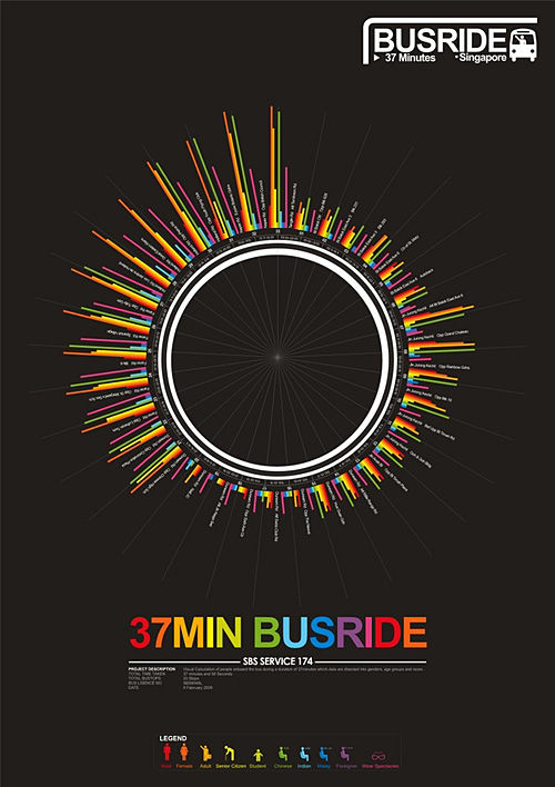
37 Minute Bus Ride
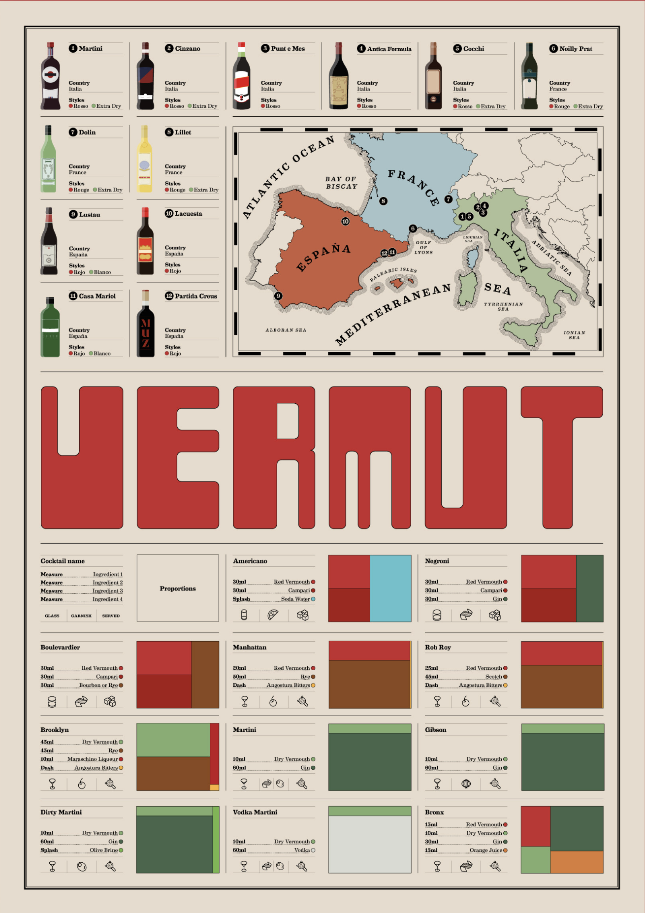
Vermouth
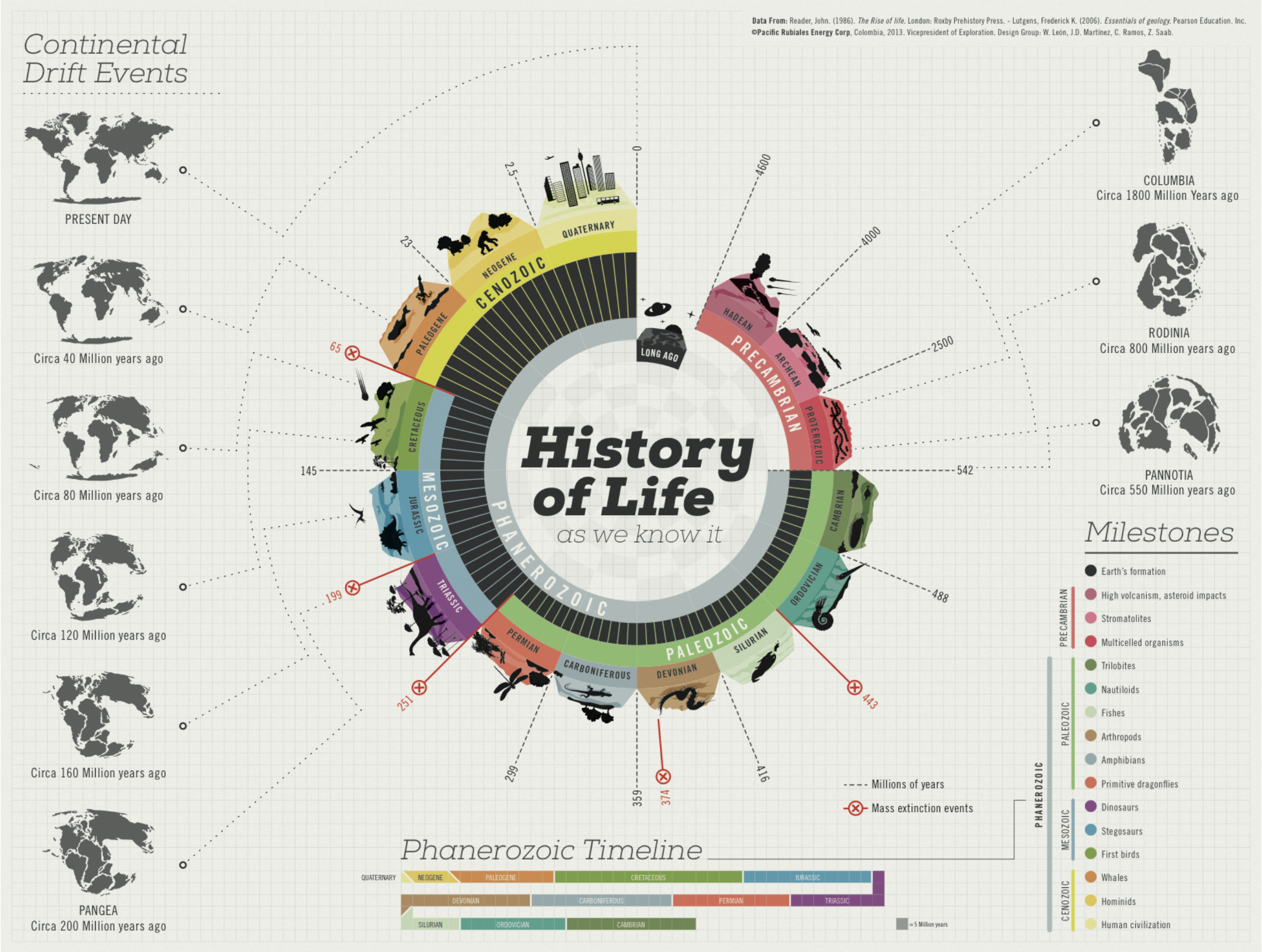
History of Life
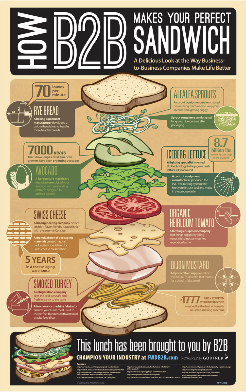
BBQ Sandwich
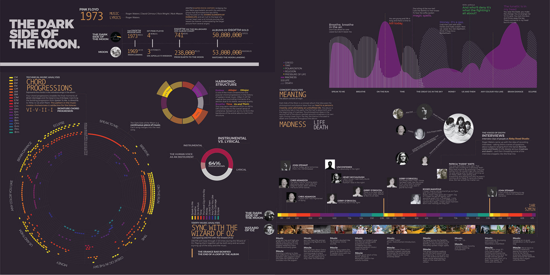
Pink Floyd Infographic
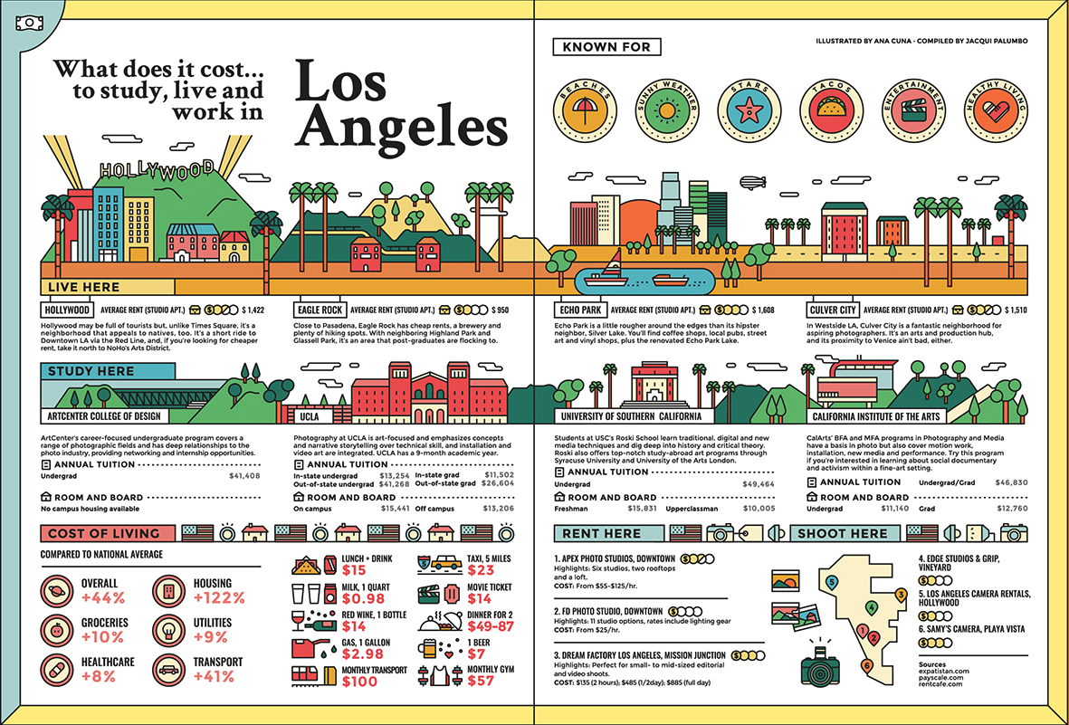
What Does It Cost…
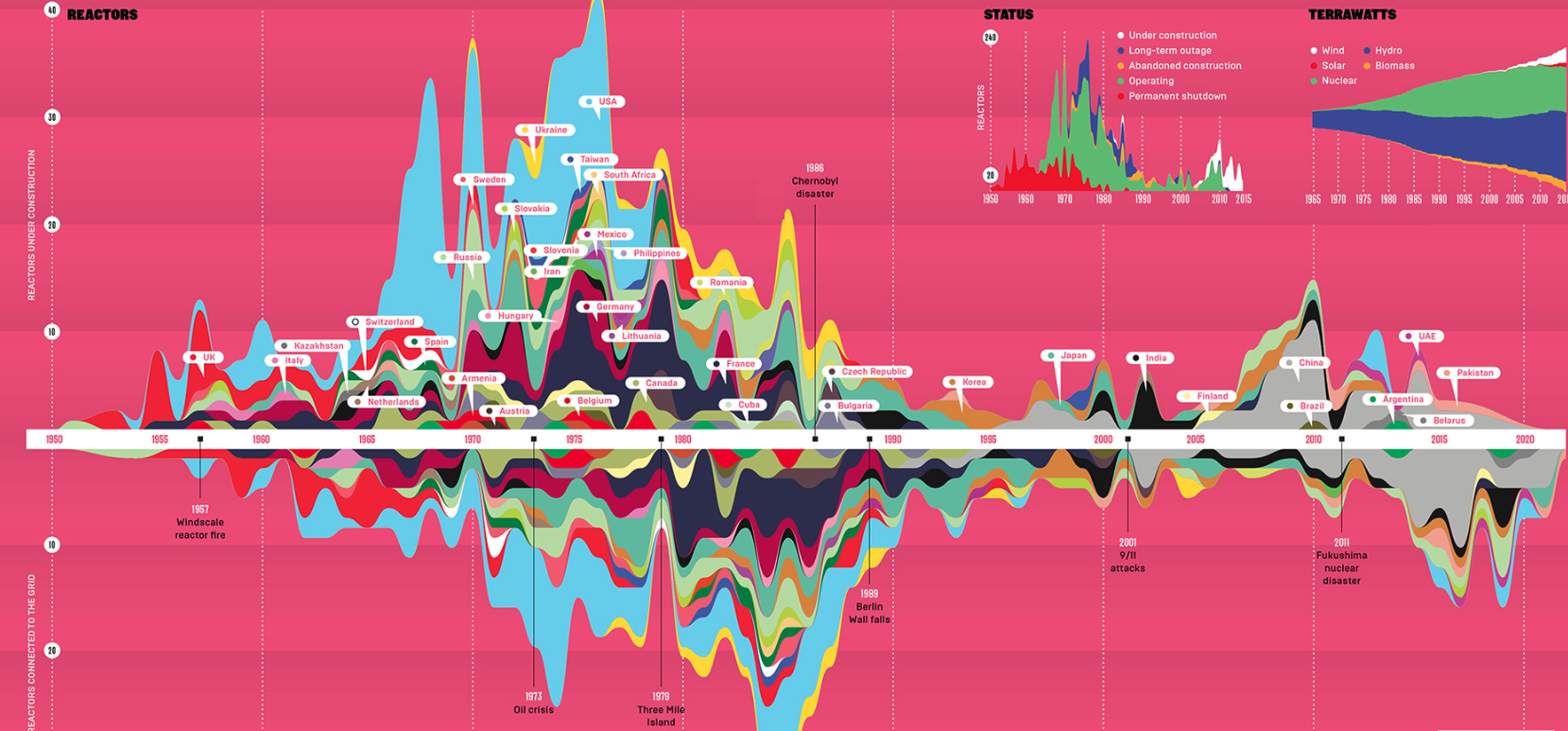
Nuclear Slowdown
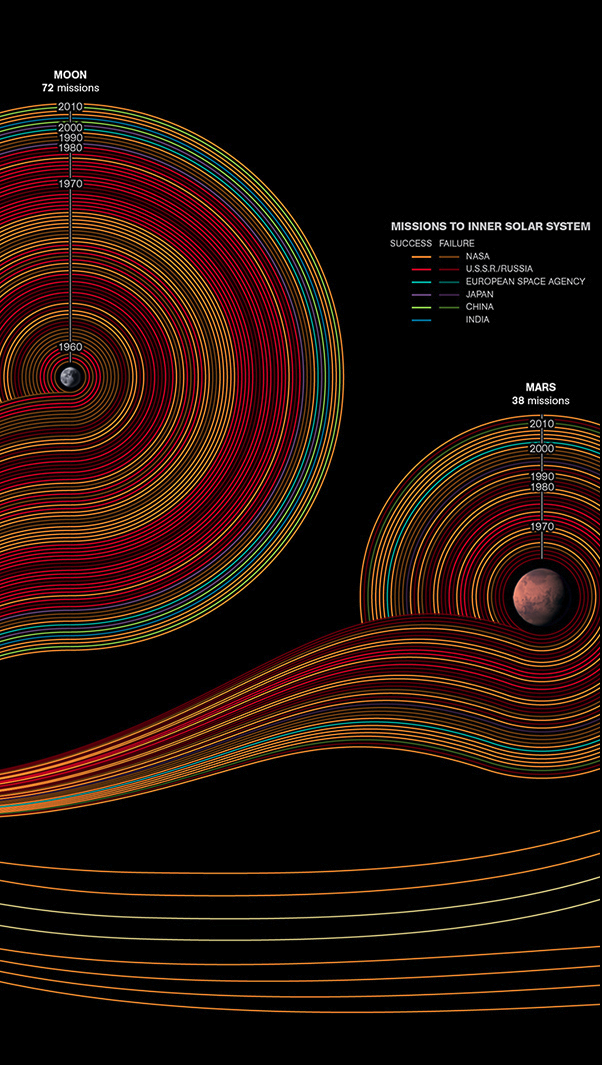
Cosmic Journeys
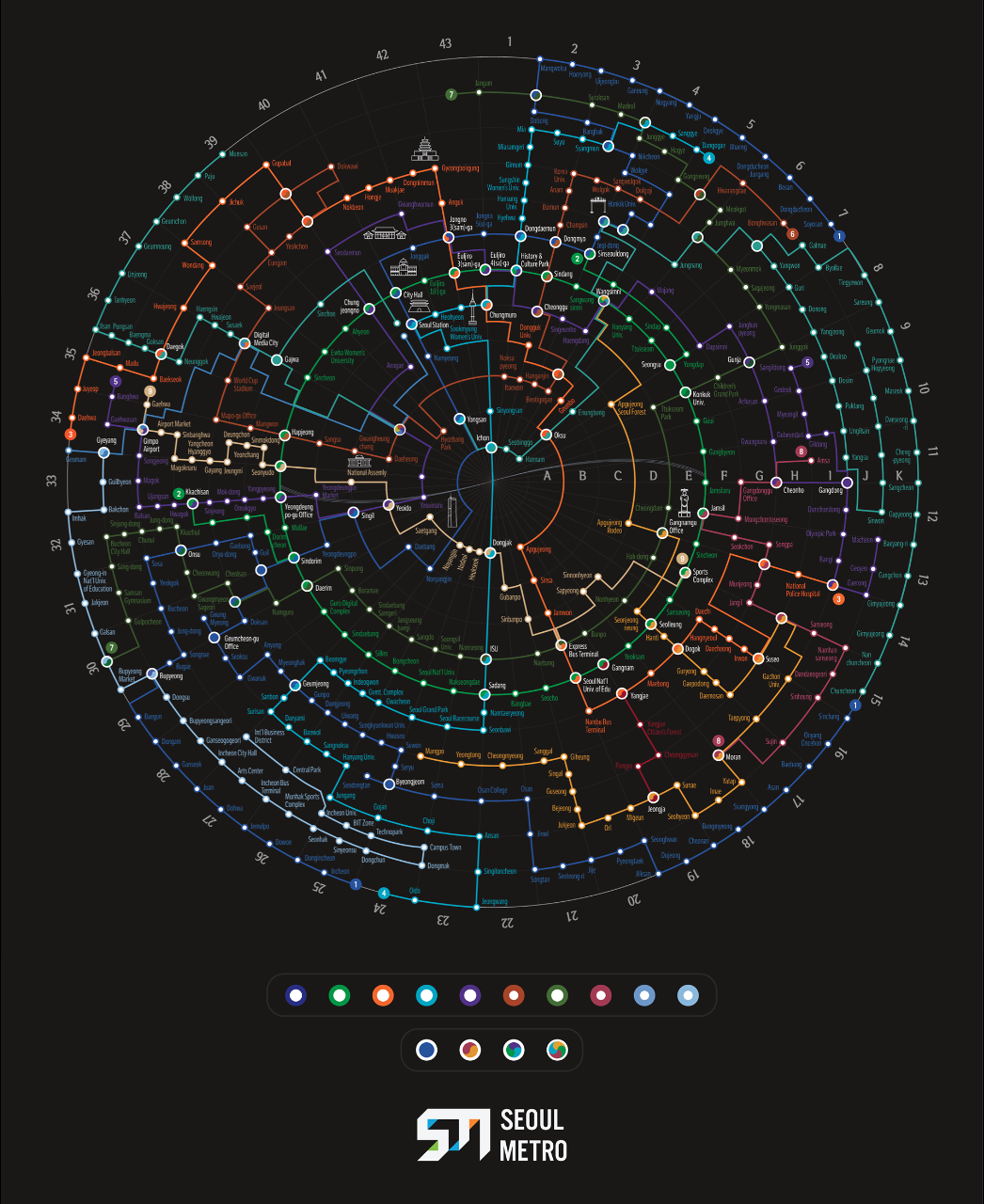
Reimagining Seoul Metro
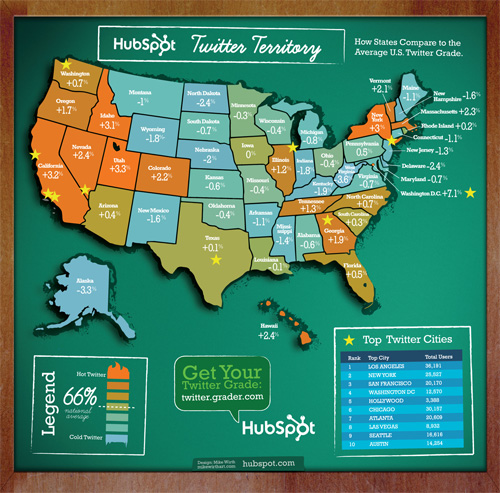
Twitter Territory
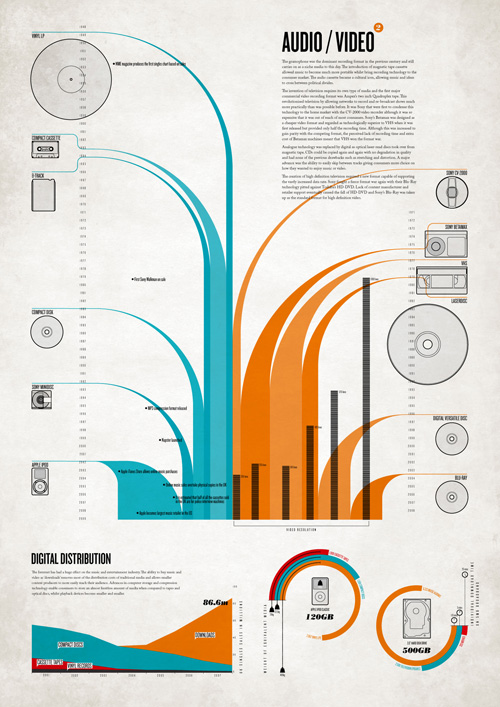
Digital Nostalgia
A set of infographic posters documenting the progress of technology and some of the social events that have been influenced by it.
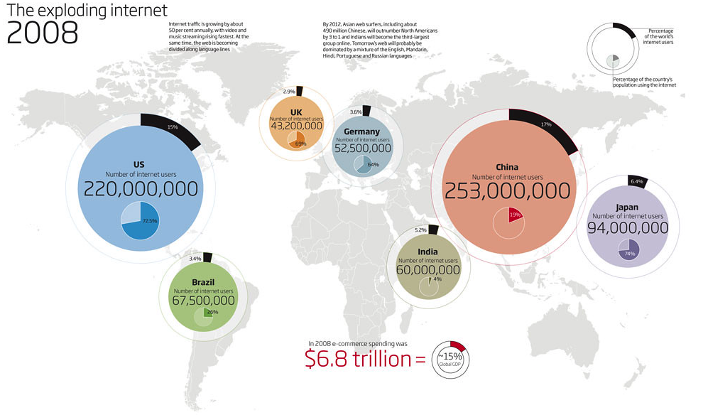
Exploding Internet
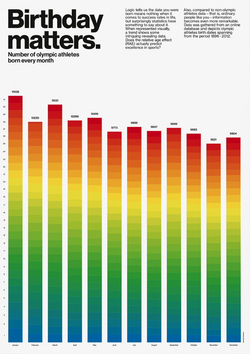
Olympic Matters
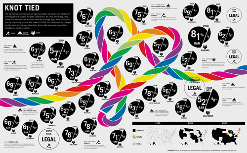
Knot Tied
A Design for the Foundation for the Development of the Education System
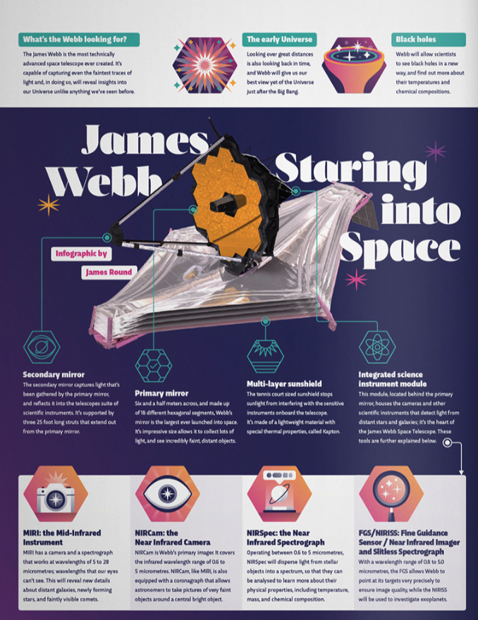
James Webb: Staring to Space
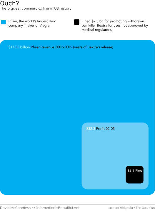
Ouch? The Largest Commercial Fine In US History
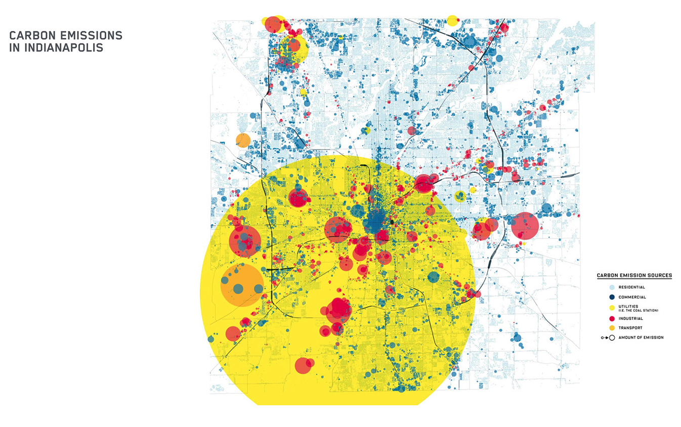
Carbon Emissions in Indianapolis
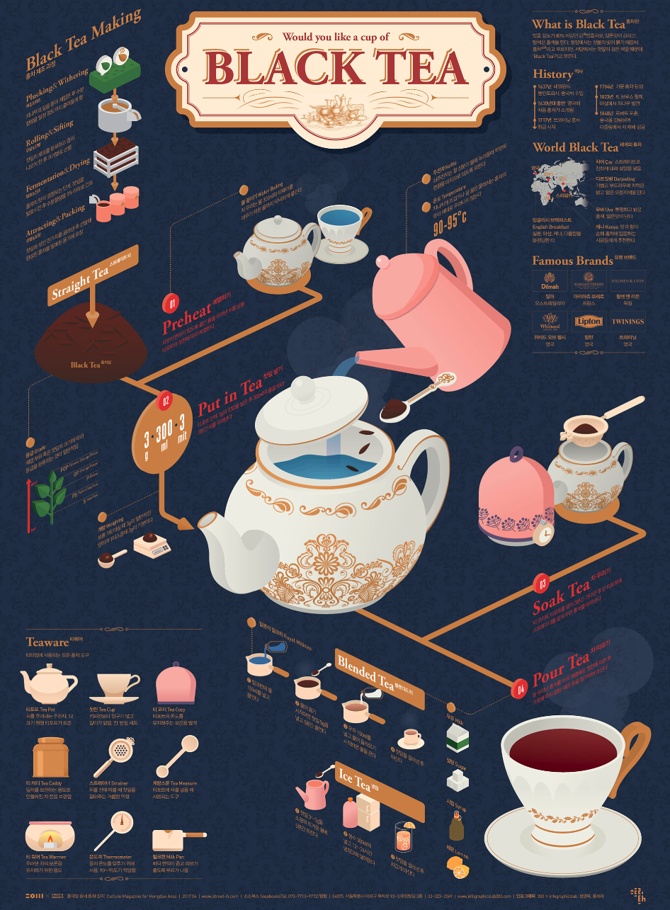
Black Tea Infographic Poster
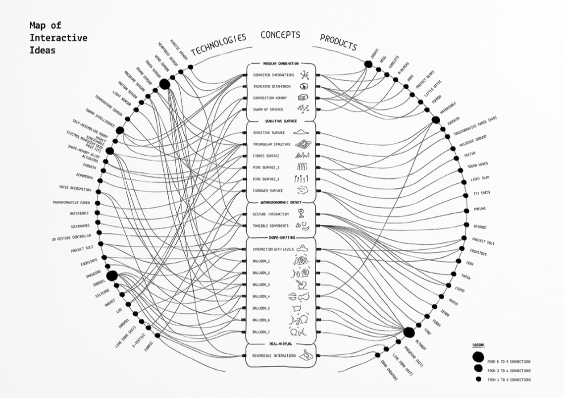
Map of Interactive Ideas
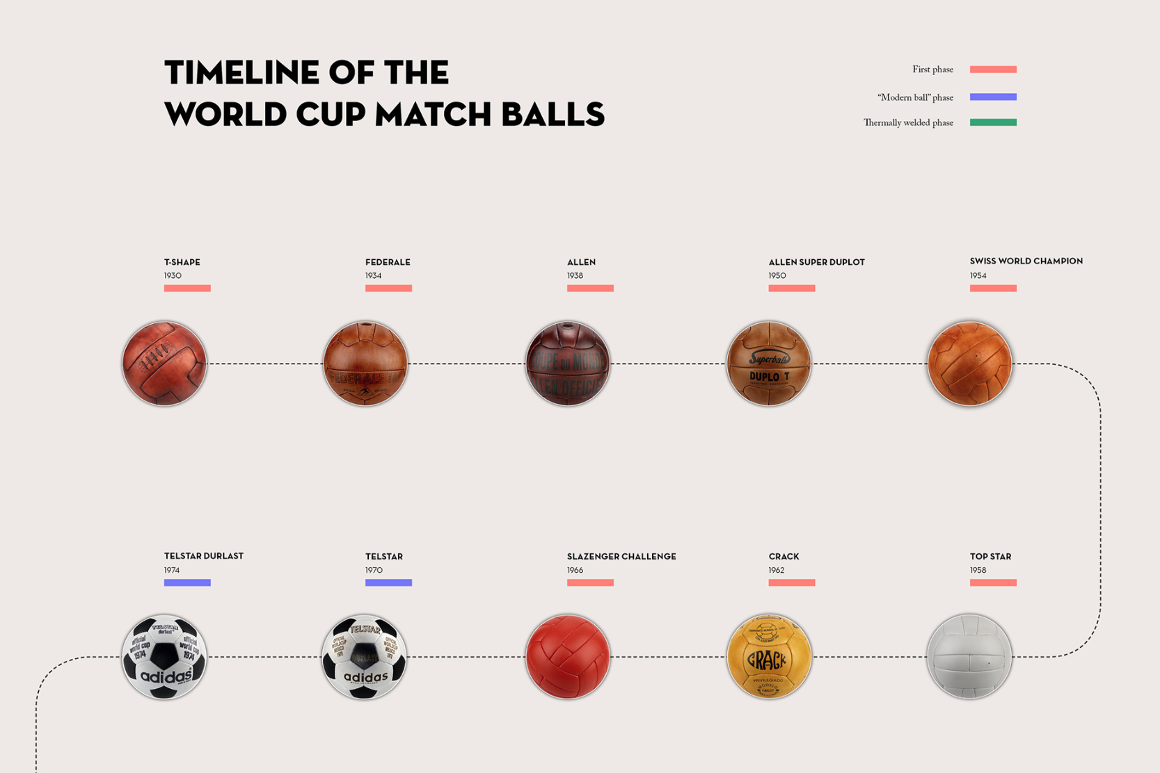
The Book of the World Cup Match Balls
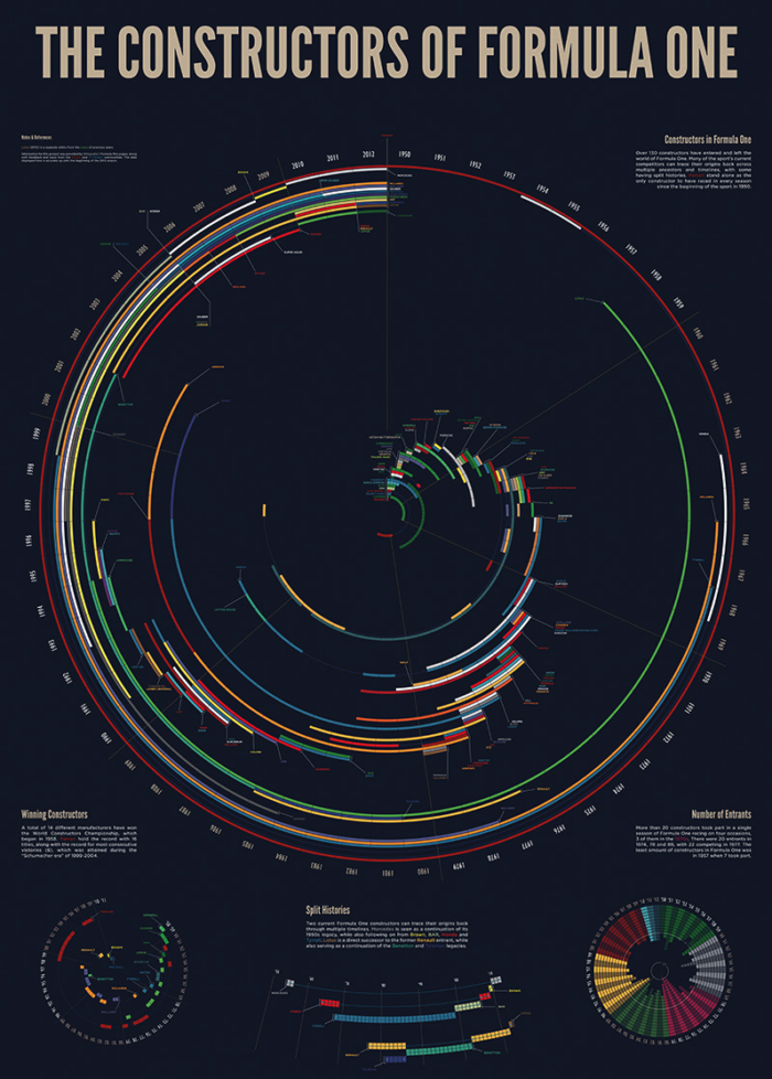
The Constructors of Formula One
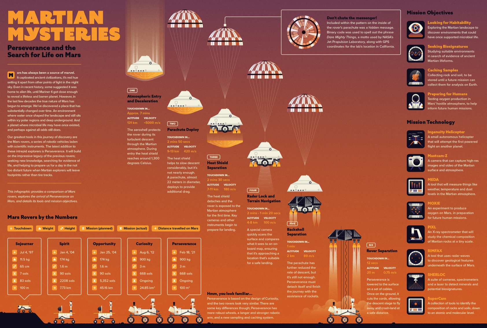
Martian Mysteries
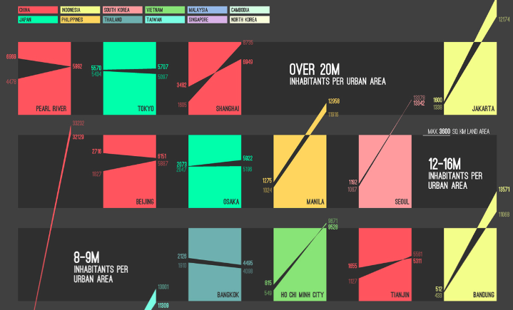
East Asia Urban Expansion
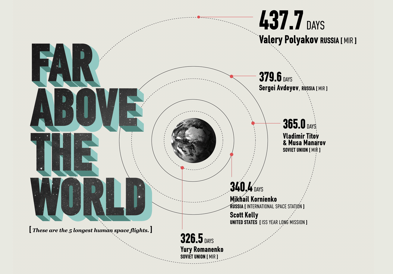
Far Above the World
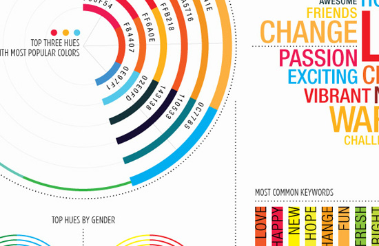
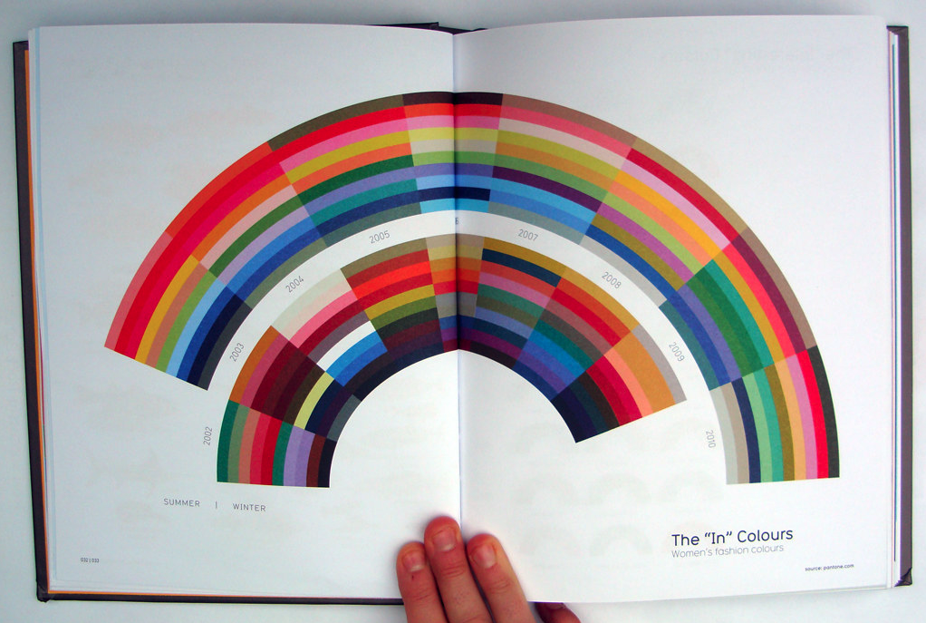
Top Voted Colors of 2010
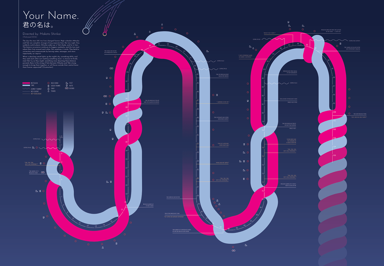
Visual Interpretation of Your Name, a Makoto Shinkai Film
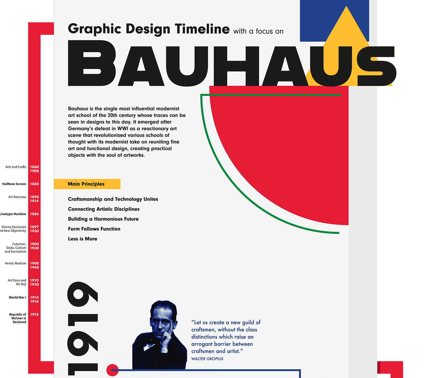
Graphic Design Timeline with a Focus on Bauhaus
Visualizing Complexity
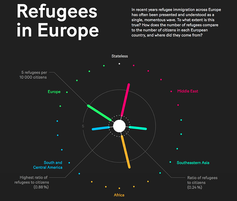
Refugees in Europe
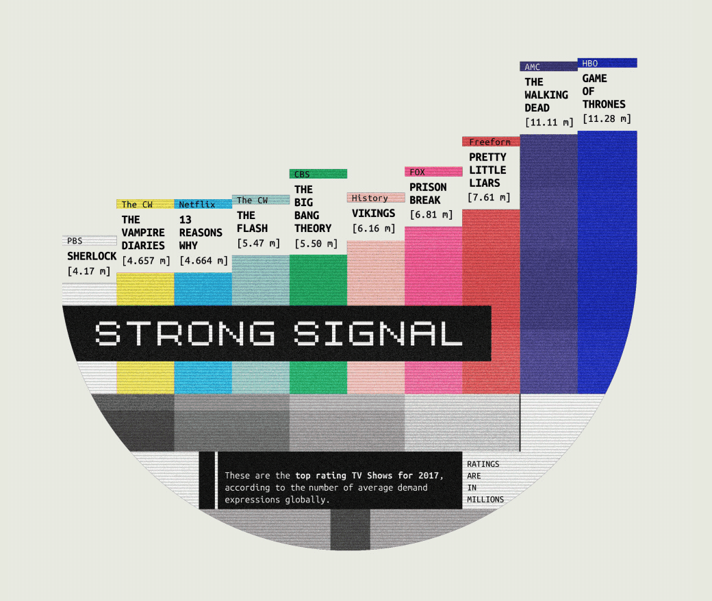
Strong Signal
Information Is Beautiful
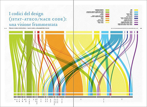
Codes of Design
Sources And Resources
You’ll find many more amazing infographics on the following websites:
- Info Graphics Flickr Group
Charts, graphs, facts, anything that is about information or visualizing information. - InfoVis Flickr Group
Information Visualization: The creation of something visual from something abstract. Graphs, maps, charts, numbers. The compression of data and the expansion of meaning. Scientific, creative, useful, worthless. - Milestones of Data Visualization
Milestones in the History of Thematic Cartography, Statistical Graphics and Data Visualization - visual-literacy.org
A Periodic Table of Visualization Methods
Related Posts
You may be interested in the following related posts:
- Showcase of Data Visualization and Infographics
- Data Visualization: Modern Approaches
- Award-Winning Newspaper Designs
- Creative Calendar Designs
- How to make your own stats using PHP, AJAX etc.
About the Author
This guest post was written by The Design Inspiration, a group of designers who are seeking various design inspiration for you every day. You can receive daily inspiration of logo, illustration, website, font, photo and pattern by subscribing to our RSS feed.
(al)


Send Comment:
38 Comments:
December 11, 2020
The "Nature" infographic is stunning. Does anyone who has created it or where I can find more info about it? Thanks.
September 27, 2012
Another nice range of infographic examples, many of these are stunning, thanks for sharing!
July 26, 2012
Awesome dude. Just what I was looking for!
April 3, 2012
I also have to agree. It's a very nice selection..
October 4, 2011
I second to Sarah Lynn, I've also seen many interesting infographic post but not one as impressive as this. I'm so inspired so that I made one my self on my blog
thank you for the share.
April 23, 2011
Real Good Collection!
Thanks for Sharing..
February 23, 2011
Really nice graphics!
November 1, 2010
yeah, 2 thumbs up !
June 24, 2010
This is really a good compilation of infographics. Great inspirations here... *thumbs up*
June 7, 2010
I have just created my first interactive ManyEyes map “Ease of doing business index in different countries” I posted the map as image in my blog Russian Sphinx
ManyEyes is user friendly so you do not need to spend a lot of time to create good chart or map, but I am not sure if it is good solution for me. I need good charts and maps for my blog. Interactive maps looks perfect but I am not able to place them as interactive on my blog, so I just post normal image and add link to ManyEyes. Maybe it will be a bit annoying for my visitors and I will have to focus on static maps.
I also use Tableau Public.
May 27, 2010
WOW.
March 20, 2010
Genealogy: Where you confuse the dead and irritate the living.
February 5, 2010
I'd assume most were done in Illustrator. That's how I make all of mine, but I rarely use the program's built-in chart tools. If I do, I make sure to touch up the charts so it isn't obvious what I used.
February 3, 2010
agree too!!!
February 3, 2010
I've done a couple of infographics--nothing quite as detailed as these--and I've found Illustrator to be perfect for it. Small files for big images and clean lines with full zoom on the PDF.
February 3, 2010
What a fantastic list! It must have taken forever to generate this list. I especially love the Simpson's one! :)
February 3, 2010
Fair enough!
I guess the fact they are labelled with price (not to mention in different currencies) makes it baffling enough for my simple brain.
After all that, it turns there isn't actually much difference in coffee price around the world anyway, so I wonder if it wasn't rather a pointless infographic in the first place.
Personally, the strength & quality of coffee is more important than volume ;-)
February 3, 2010
One of the most conceptually and visually stunning collections. Ever.
Thanks for putting this together!
February 3, 2010
I love the "Lord of the Gorillas"! Great design!
February 3, 2010
This is a great collection.
I love infographics as they make it easier for simpletons like myself to comprehend the meaning of data.
I prefer the simpler graphics like the Pfizer rather than the extremely complex and overpacked images.
Is there a rule in designing infographics that states: "Make one point and make it simple."
Thanks for collecting these.
February 3, 2010
Love how data can be visualized to help interpretation.
February 3, 2010
I admire the originality behind this post. Beautiful collection of infographics. Like others said, I've never seen anything like this floating around the internet before. So kudos! Some of these are tough to make out since they are so small, even when you click on them to enlarge. I really enjoy the more simplistic charts. The stats they compare make more of an impact when there is less information and design elements surrounding the key points.
February 3, 2010
nice article good stuff
February 2, 2010
would be nice to talk about the tools that produced these charts as well !
February 2, 2010
Amazing collection.......
Please more tuts about infographics...
Thx!