
Data visualization yields many business benefits — chief among them is faster decision making. But presenting data effectively takes a certain level of skill and a good amount of attention. How can you ensure your visuals communicate the right message? Below, several experts suggest ways you can accomplish this goal. Keep reading to see their insights.


1. Keep visuals simple
“Remember that less is more. You want to minimize the cognitive load of the audience when designing your visuals,” says Michael Yurushkin, CTO and founder of BroutonLab. Focus on removing clutter while still preserving the most vital elements of your data.
“It can be challenging to pare down a lot of data into a simple visual that still captures what you want to convey, but it’s necessary,” says Jen Hood, analyst and owner of The Career Force. The most effective visuals are clean and draw the reader’s eye to the message. Pick the simplest graphic that clearly communicates your message.
2. Make the visuals easy to understand
Kevin Bazazzadeh, former scientist and current owner of Brilliant Day Homes, says if someone can’t understand what you’re trying to say with your visual within a few seconds, it needs work: “Many times, we come up with an idea for visualizing data, and it makes sense to us. However, when someone unfamiliar with the visual views it, their interpretation may be different. Keep this in mind when designing.”
3. Limit the number of colors in your visuals
Monica Lent, founder of Affilimate, says that even though adding a lot of color to a visualization can make it attractive, it can also be a distraction. This is because excessive color can cause people to focus on the wrong thing — such as the number of colors instead of the relationship between the items those colors represent.
“One actionable way of reducing the number of colors is using the spectrum of a single color instead,” Lent explains. Using fewer colors makes the visual less overwhelming for viewers, helps them focus on drawing conclusions based on relationships, and makes your visualization accessible for a color-blind audience.
4. Make the visuals engaging
“In presenting data effectively, you should focus on conveying key ideas or insights in an engaging way. Focus on a strong narrative that builds a story for the audience,” says Elliot Simmonds, associate director at DJS Research.
For example, you may try starting with a general conclusion about the visual and move toward more specific conclusions. Or you could try taking a thematic approach, using fictitious characters to exemplify conclusions.
“Regardless of your chosen path, each piece of data should make sense within the context of what came before it, and each piece should add a new layer of insight or detail to the overall picture. If any data is not adding value, it’s a distraction — remove it or append it,” Simmonds recommends.
Pro Tip
Turn your data into interactive, voice-guided presentations with Jotform Presentation Agents. Help your audience follow along, understand key points, and engage with your insights in real time.
5. Use high-quality aesthetics
For your visuals, Simmonds suggests spending time thinking about aspects that give your visual a pleasing aesthetic. Consider things like good proportions, well-labeled axes, and so on. “For example, is there a reason why one bubble is another color, or is it just for design purposes? Missing these aspects can give the audience pause and detract from their ability to engage with what you’ve presented,” Simmonds says.
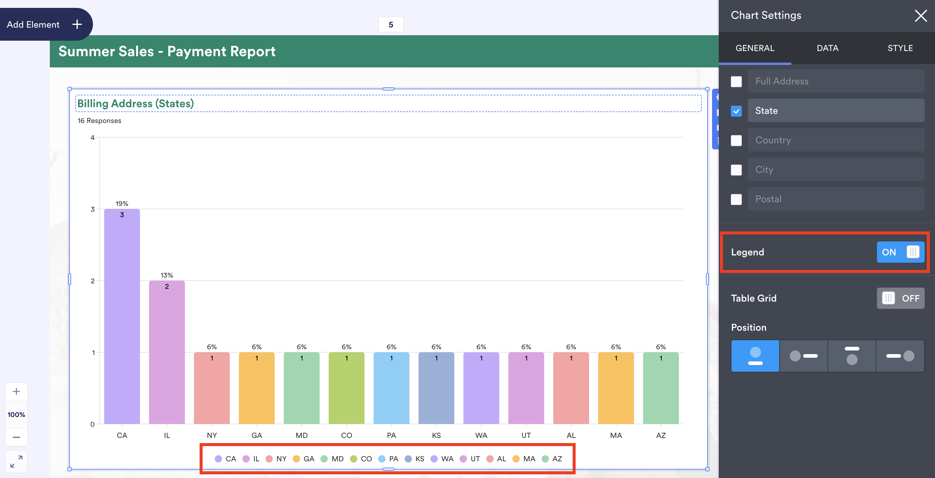
6. Add legends and navigation aids where appropriate
Drew Mandish, director of digital marketing at ROI Amplified, says that when you’re presenting data, the audience may need additional assistance to fully grasp what you’re showing them. In these cases, you can add a legend or navigation aids “to get the full picture of the report. This can also mitigate the need for the audience to ask what something means.”
7. Strike a balance in the visual appeal
“Make the data visually appealing, but don’t go overboard,” says Mandish. You want the visual to draw the audience in — and help them easily scan and digest the data — but focusing too much on the visual appeal can make the audience more focused on the coolness factor than on drawing important conclusions. “Worse yet, you may lose your message entirely,” warns Mandish.
Data visualization may seem like a daunting task, but if you follow the above tips, you’ll be presenting data effectively in no time.


Send Comment: