
Data is an invaluable resource. If you’re a data analyst or someone who works frequently with data, you may find it easy to appreciate complex data without much help. But this isn’t the case for everyone.
Often, different groups need help understanding the data presented to them — and some have to make decisions based on that data. Explaining data in an easy way to a nontechnical audience requires careful planning to ensure everyone understands the implications of the numbers they’re seeing.
In this article, we’ll cover how to explain data in ways that make it easier for all stakeholders to understand.
Tips for explaining data
Know your audience
This is important because you’ll need to present the same set of data differently depending on your audience. “Technical data can be confusing and hard to understand for anyone unfamiliar with it,” says Hosea Chang, CEO of Hayden Girls. To communicate data effectively, Chang recommends getting into your audience’s head and trying to think like them.
“Pretend you know nothing about the material and figure out how to present it in a way that will be understandable to someone with no experience with it. Remember, it’s not your audience’s job to rise to your level of sophistication on the topic; it’s your job as a communicator to present the information in a way that it will be understood and provide value.”
Put data into perspective
“Nontechnical professionals are predominantly interested in the impact of data on decision-making and work,” says Michael Sena, founder of Senacea, a spreadsheet consultancy firm. “They don’t like seeing vast spreadsheets of numbers without meaning. They prefer data that’s instantly related to the reality it reflects in a suitable way.”
In practice, this means presenting data using the right units of measurement and relating crucial data to relevant categories or benchmarking it against the competition.
“For instance, it’s good to know that annual sales are $3.4 million, but that information becomes much more valuable when presented along with the figures from the previous three years and the sales of major competitors,” says Sena.
Tell a story
People have told stories from time immemorial to improve understanding and build strong emotional connections. Storytelling techniques also come in handy when explaining data.
“The best possible way of explaining data is to assemble it into a comprehensive story. That ultimately puts data into a perspective and embeds it in real-world circumstances. Emphasizing causality and relating it to the principles (e.g., economic or marketing theories) well-known to the listener makes it digestible to nontechnical professionals,” Sena says.
A great example of data storytelling is this article by Nathan Yau, a statistician who tracked some personal metrics before and after his son’s birth. While he could have presented boring, matter-of-fact statistics about his research, Yau chose to tell a story with the data, combining text and visuals in “The Change My Son Brought, Seen Through Personal Data.”
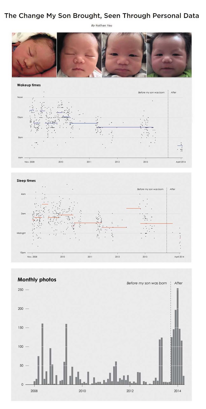
In a series of charts, Yau shows how becoming a parent impacted his personal life. In the image above, for example, we see how it affected his wake and sleep times.
Cut out irrelevant information
Presenting all the data available to you can be tempting, but it’s not a good strategy. When it comes to explaining data, less is usually more.
“Remember the story you’re telling. If some data doesn’t contribute to that story, then it’s noise that will distract and complicate, so don’t show it,” says Gareth Chapman, founder of Static Caravan Expert.
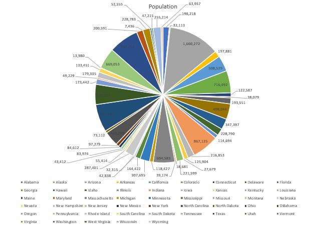
For example, there’s too much information in the above pie chart, making it difficult to understand. The data would be much more useful if it focused on the population of two or three major states that support the presenter’s narrative.
It’s also important to focus on one data type at a time. “If, for example, you’re showing car data, don’t present prices, colors, trim styles, and engine sizes at once. Focus on price comparisons, then later in your story look at engine sizes,” says Chapman.
Use analogies
“If you’re explaining something technical to a group of people who belong to a specific niche, it’s helpful to relate what you’re teaching to what they already know,” says Vans Pat of One Shot Finance.
“For example, if I’ll be explaining Ohm’s Law to grade-schoolers, I would research a game, a story, or a cartoon they’re familiar with and craft an easy-to-follow analogy.” Again, this emphasizes the importance of getting familiar with your audience.
Use visuals
Visuals are powerful tools for presenting data. The human brain is wired to process images faster than text. If you present data through detailed images, you can engage up to 67 percent of your target audience.
Sena explains that visual presentation of data enhances people’s abilities to comprehend it and spot trends. That’s especially the case for putting together a number of data sets that correspond with each other.
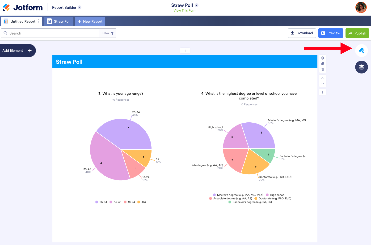
Jotform makes it easy to visualize and present data. With Jotform Report Builder, you can easily generate visually appealing reports using bar charts, pie charts, donut charts, form submission grids, images, and HTML text.
For a more engaging presentation experience, take your visuals a step further with Jotform Presentation Agents. Turn your data insights into interactive, voice-guided presentations — without needing a live presenter. Highlight key takeaways and guide stakeholders through your visuals, keeping them engaged with automated narration.
Visuals work for all audience types because they’re not only appealing to look at, but they also make data easier to understand.
Take your data presentation up a notch. Start visualizing data with Jotform today.


Send Comment:
1 Comment:
November 3, 2024
So, what is data? It was not explained.